Tag Archives: VMS palaeography

Palaeography – Double-c Revisited

1 March 2020

In April 2019, I posted a blog about double-cee shapes in the VMS text. This convention of combining two cees to create a different letter has a very long history but is not the custom in modern scripts. In medieval scripts, the tightly-coupled double-cee has a different meaning from two cee shapes slightly separated. Most of the time, the tightly-coupled cee represents a vowel. To identify which vowel, you have to look at position, as well. But first let’s look at the origins of some of these shapes…

Ancient Origins

To understand double-c and the Nota symbol, you need some familiarity with Greek and how it influenced Latin scribal conventions.

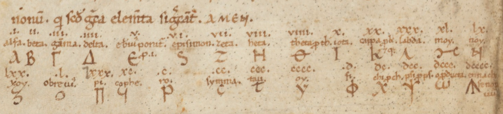
The Greek alphabet is found in handwritten Latin manuscripts up to about the 16th century, and was sometimes used in annotations in early medieval texts.

Here are a couple of examples from Latin manuscripts:

The Greek alphabet in a Latin manuscript from Southern Italy. [Source, Genève Cod. lat. 357]
Example of the Greek alphabet in a c. 1190s Latin text from southwest Germany. Note the shapes for nu (sometimes called “noy”) and omega as these were also used by Latin scribes. [Source: HHB Cod. Sal IX,39. A similar notation is in Einsiedeln Codex 29(878)]

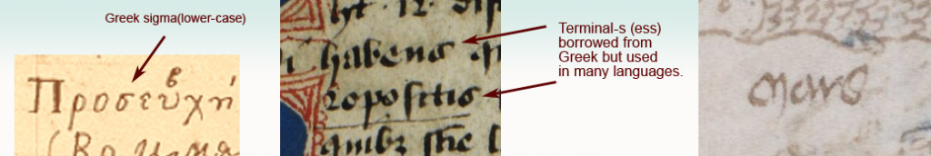
Some of the Greek shapes and scribal conventions were adapted by Latin scribes. For example, certain ligatures and letter-shapes such as the N in Nota were common. The lowercase form of sigma (sometimes called symma or summa) and variants similar to sigma evolved into a broadly used form of final-ess that has some relevance to the VMS.

Final-Ess

Medieval scribes used initial, medial, and final forms for certain letters. Some used the same initial and medial forms, but reserved other shapes for the final form. These distinctions still exist in Middle Eastern scripts, but have disappeared from most western alphabets:

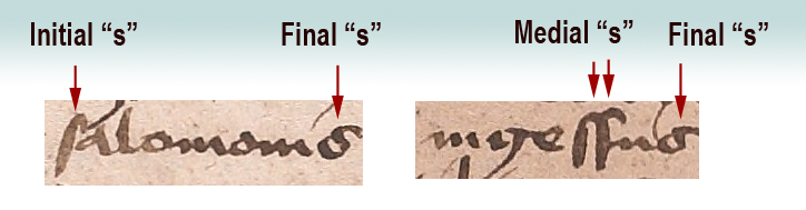
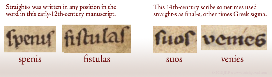
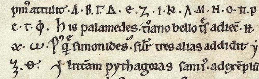
Here long-ess is used for initial and medial forms, whereas the shape loosely resembling Greek sigma is reserved for ess in the final position.

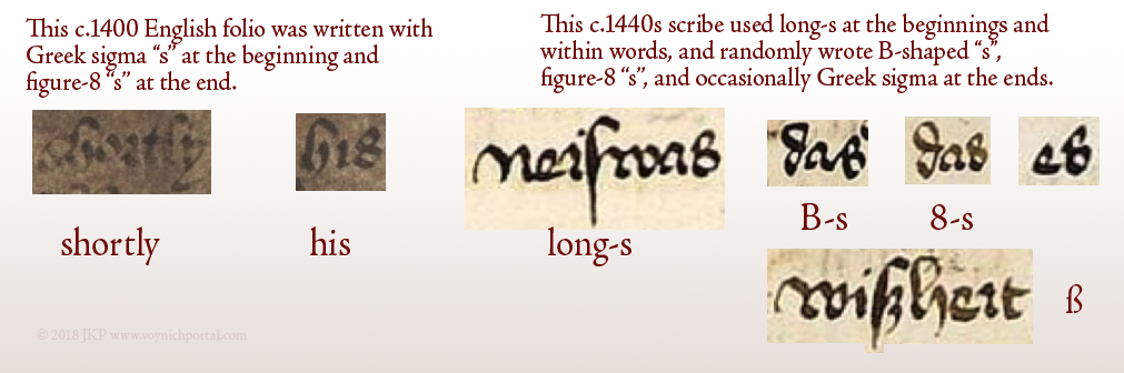
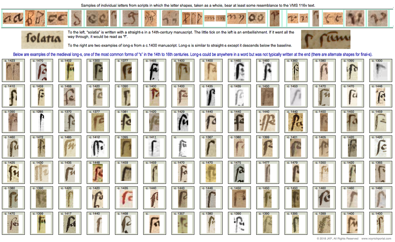
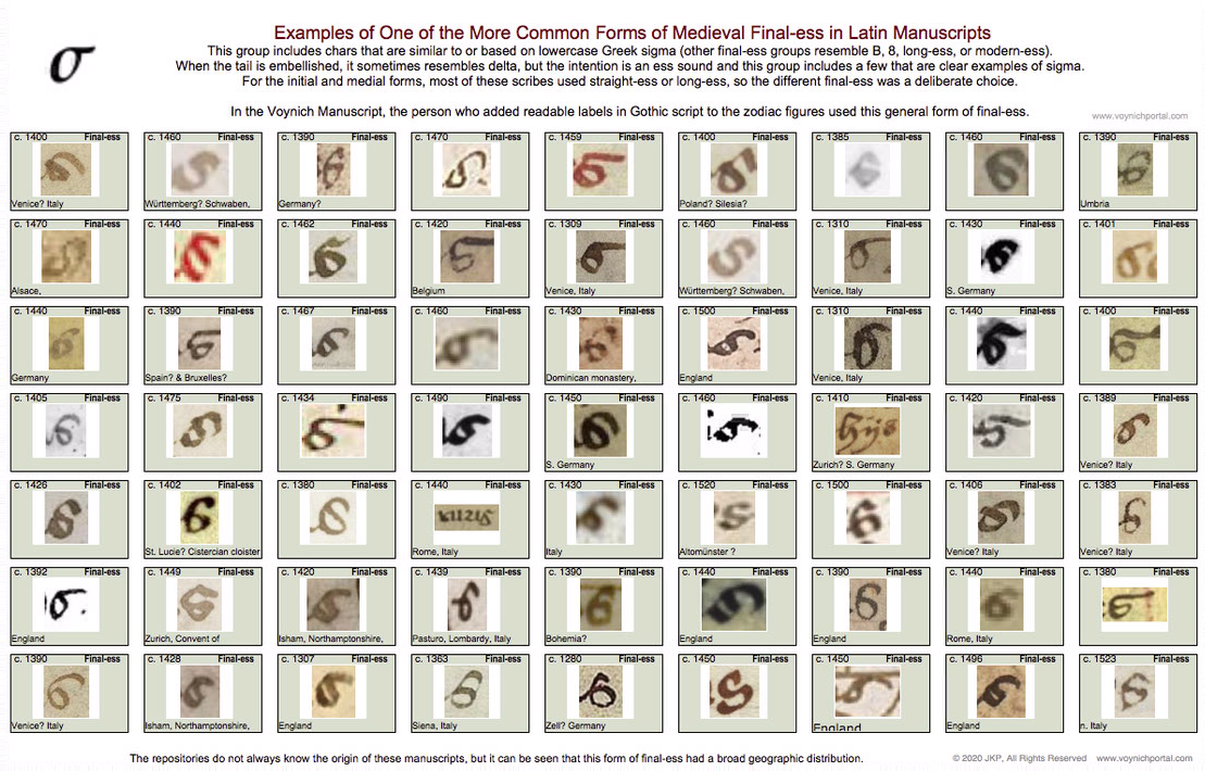
Not all scribes used the same shape for final-ess. There are several basic groups (long-ess/straight-ess, B-shape, 8-shape, sigma, and modern-ess). I will post examples of each in a future blog because the 8-shape relates to f116v.

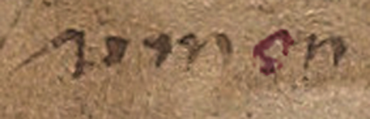
The following set represents one of the common groups of final-ess relevant to Voynich studies because the month labels added to the VMS “zodiac figures” use this general form:

Table of medieval final-ess characters that are similar to or include a shape based on Greek sigma.

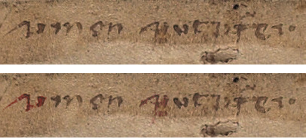
Here are examples of the sigma shape from a Greek manuscript, a Latin manuscript, and the “Mars” (March) label under the fish in the VMS:

The general style of final-ess that resembles Greek sigma, which shown in the chart above, can be seen in the labels added to the VMS “zodiac figures” drawings.

Latin Vowels (and the occasional consonant) Written with Double-Cee

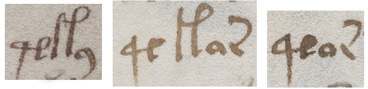
Another letter with Greek shape-mates (although not always the same meaning) is the double-cee. This is a loose term describing a group of symbols in Latin manuscripts. Why is it a loose term? Because some scribes wrote a tightly coupled “oc” rather than “cc”, but most of the time you’ll see “cc”.

In the early medieval period, there was very little distinction between a “t” and a “c” and they can be hard to tell apart. But, it depends on which script you are reading. Sometimes the “t” is distinguished from “c” by being doubled, so it looks like “cc”. The letter “a” was sometimes written this way as well, which can be even more confusing to those who haven’t learned medieval languages because you can only figure it out by reading the whole sentence.

Here are some examples that explain how to distinguish double-t, double-c and two cees in a row, but note that some are ambiguous unless you can see the words before and after:

Examples of various medieval letters that resemble two "c" characters.

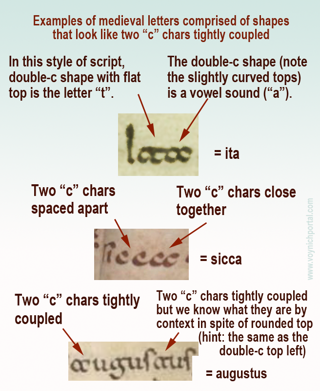
Note especially the second example (sicca) which includes both c + c and a tightly-coupled double-cee representing the letter “a”.

Palaeographic example of the double-c form of "a" in an early medieval manuscript from France.
Additional picture added 8 March 2020 to illustrate that the double-c form of “a” was not limited to southern Italy or Dalmatia. This Merovingian example is from eastern France, probably from the Abbey of Luxeuil.

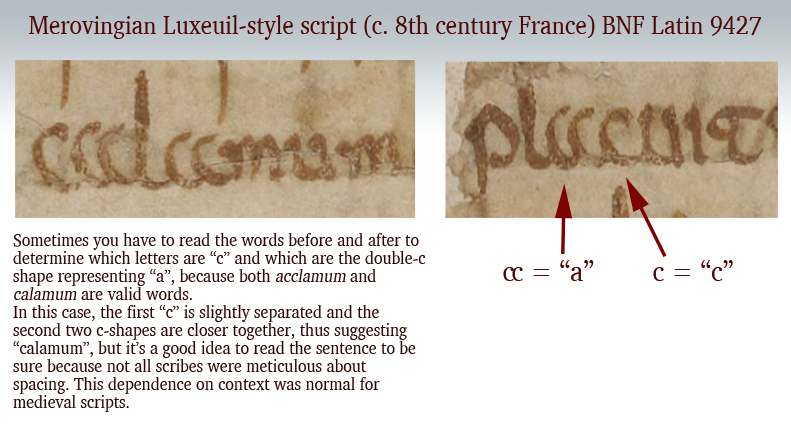
These loosely and tightly coupled cee shapes are also present in the Voynich Manuscript, but transcripts generally ignore the distinction (see my previous blog) and it is not yet known if it is a meaningful distinction. Now let’s look at another letter with similar characteristics…

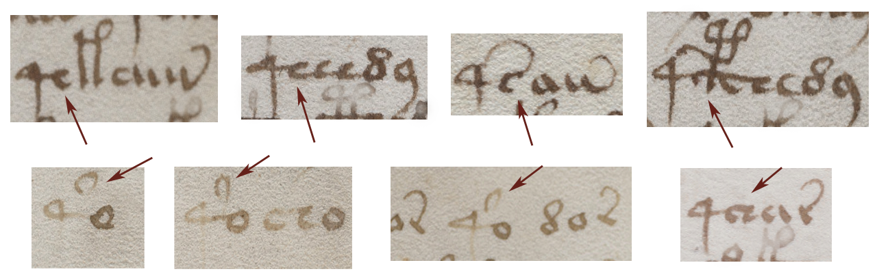
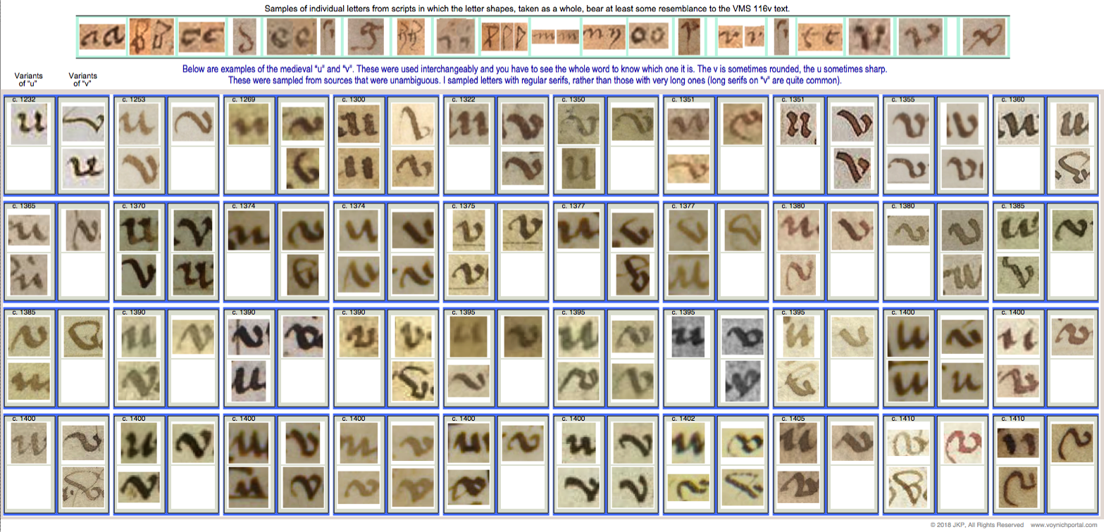
Double-cee as “oo” “wa” or “u”

The medieval concept of “u” was not the same as we know it. In English, we make a distinction between “u” and “v” sounds and shapes. In medieval Latin, the “u” and “v” shapes were interchangeable in most languages using Latin characters and the sound was closer to a breathy w’ than an English “u” (and was not like our “v”). It was sometimes written as a superscripted double-cee shape next to the letter “q”.

Remember that Latin characters were used to write many languages, so it’s unwise to generalize too much, and difficult to describe a sound in any given language from 600 years ago. It’s better to think of the double-cee shape as a vowel (except when it was “t”) rather than as a specific letter.

Double-cee can represent “a” but it can also represent “u” (in the same manuscript), as well as indicating an ordinal, which means it is sometimes closer to a symbol than a specific letter. Once you understand the context, you can work out which letter it represents. In medieval script, context was king and many symbols had dual or triple meanings.

Greek Nu or “Noy”

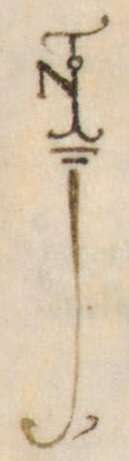
Another Latin letter that is similar to Greek is the letter N.

We know it with an angular crossbar, as in the example to the right, but it was sometimes written with a straight crossbar (see below). In modern English, this form looks more like H than N. Sometimes the crossbar was at the top of the ascenders (somewhat like VMS EVA-k). Other times the crossbar was in the middle (similar to English H).

The crossbar could be single, or double, like a gate. Here are examples using a popular medieval symbol for pointing out interesting passages, the NOTA symbol. It was frequently stacked or intertwined like a monogram. Usually all four letters are present, although occasionally it is abbreviated NT:

Examples of medieval letter N in the context of monogram-like NOTA symbols.

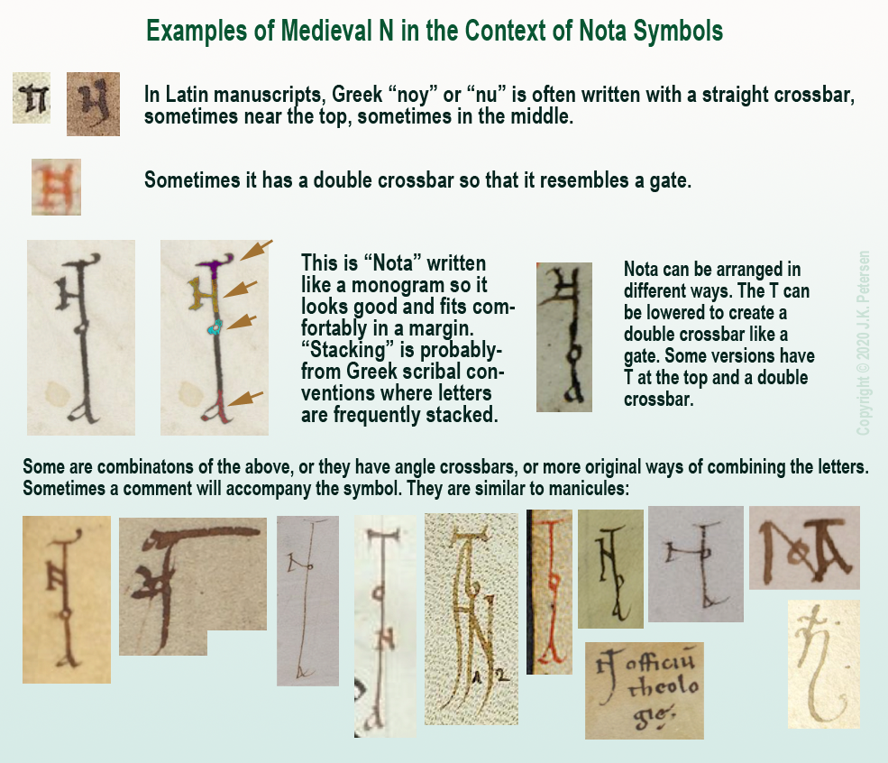
Clearly there was some creative freedom to arrange the letters and yet the meaning is quite clear. The N will sometimes be combined with a B to create Nota Bene (note well).
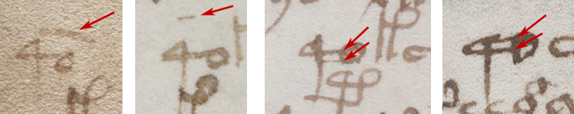
Nota with Double-C

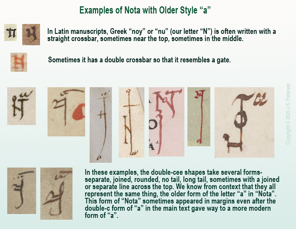
There is another form of Nota that uses more traditional forms.

Remember the “a” written as double-c mentioned above? Sometimes NOTA was written with the earlier form of “a” rather than the late-medieval “a”, as in these examples:

Examples of Nota with older style of "a" written like a double-cee.

A Less Obvious Example

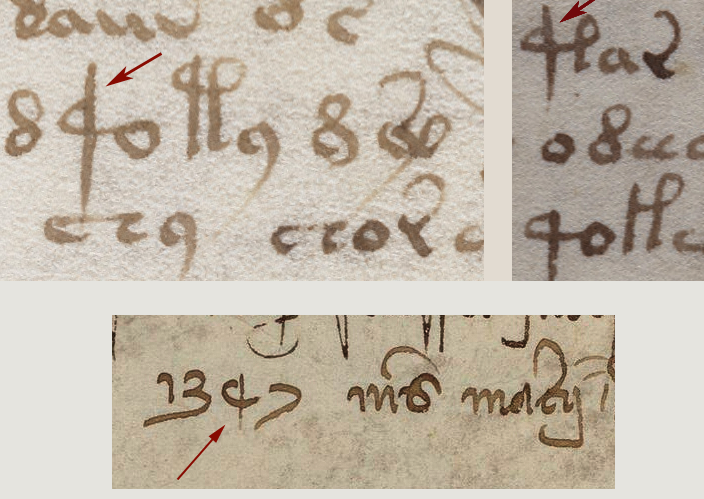
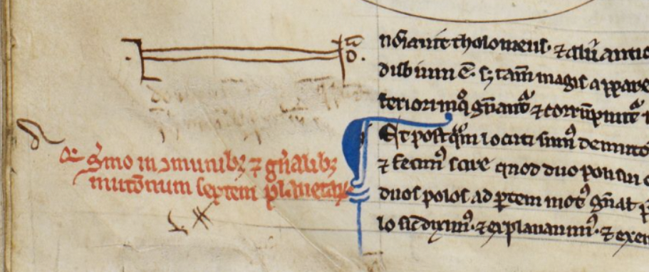
That should be enough background to help the reader interpret the more stylized symbol found in a 13th/14th-century scientific compilation.

BL Harley MS 1 includes treatises on astronomy/astrology and mathematics, and the first section is attributed to Abu Ishaq al-Bitruji al-Ishbili. In it there is a series of geometric drawings, and below the third second drawing we find a symbol in the left margin…

It is essentially the same as the old-style double-c “a” Nota symbols in the above examples, except the gate-style N has been stretched more than usual to encompass the comment directly below (which has since been erased). On the right side of the “gate” there is a tick for the T, an “o” and, above it, the double-cee symbol representing “a”.

Example of Nota symbol with old-style "a" stretched horizontally in the margin of BL Harley MS 1.

More Uses for Double-Cee

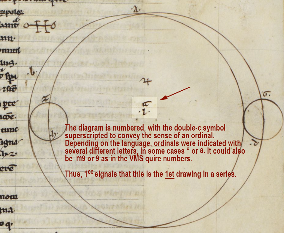
In Harley MS 1, the symbol that resembles double-c is used in other ways, as well. It can be found in each of the geometric diagrams.

Here the double-cee symbol superscripted next to the number 1 introduces this as a series of drawings. You can think of it as an ordinal symbol and this diagram as the http://shanghaikiteboarding.com/community/tag/wisconsin/ 1st:

As would be expected, the diagrams that follow are numbered in sequence as follows:

Examples of subsequent ordinal numbers used to label a series of geometric diagrams in a 13th/14th century manuscript.

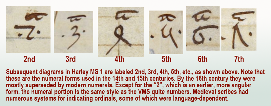
In a series of ordinals, sometimes the same symbol is used for all of them. Other times, the ordinals are individualized for each number, as in English (1st, 2nd, 3rd, etc.).

Here is an example showing the individualized ordinals of the VMS quire numbers compared to a set that uses only “m”:

Examples of Voynich Manuscript quire numbers with individualized ordinal symbols compared to a system with only one ordinal symbol.

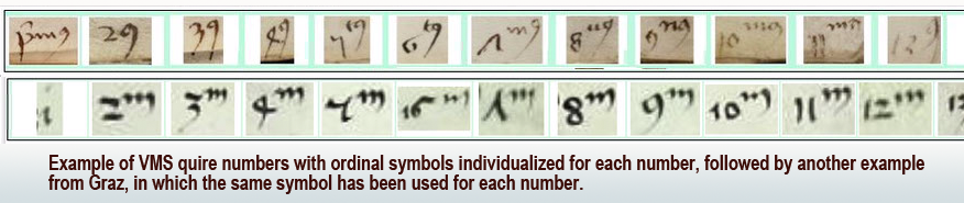
Other common ordinal symbols are ° and superscripted-a.

This aspect of the VMS is, in a sense, a gift. If this ordinal system can be identified in other manuscripts, it might provide some clues to the early life of the VMS. Unfortunately, quire numbers are very difficult to find. I’ve been searching since 2008 and only have a handful of examples. They are usually trimmed off or bound inside the signatures where they can’t be seen. When I have time, I’ll post the ones I have so far.

Summary

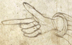
The double-cee shape was disappearing by the 14th century and by the 15th century, the Nota symbol was often replaced by a manicule. By the 16th century, final-ess was beginning to disappear, as well, which means Greek influences were gradually replaced by early modern forms.

Even so, it helps to know these earlier conventions because there are aspects of the VMS that hint at some of these characteristics. Plus there are glyphs in the main text that may have been influenced by early-medieval conventions.

Also… there is a possibility that the separate cee shapes and tightly-coupled cee shapes in the VMS are not the same, which might partly explain why there are sometimes four in a row. If cee-gap-cee and double-cee are different, it might add some variety to the oddly monotonic script.

J.K. Petersen

© Copyright March 2020, J.K. Petersen, All Rights Reserved

The Ligature Legacy

“…some symbols in the Voynich Codex show similarities to letters found in sixteenth century codices from New Spain (Tucker and Talbert 2013; Comegys 2013) particularly the Codex Osuna (Valderrama 1600; Chávez Orozco 1947).”  —Janick and Tucker, Aug. 2018

The authors are talking about shapes that roughly resemble EVA-k and EVA-t. The following statement is much more surprising:

“We thus conclude that the author of the Voynich Codex made up his syllabary/alphabet, and the letters were borrowed from contemporary post-Conquest MesoAmerican manuscripts such as the Codex Osuma.”

In scholarly circles, “conclude” is a strong word—a word that needs to be backed up with solid evidence. Unfortunately, I find this conclusion highly questionable. The examples the authors use in their arguments are conventions that originated in Old World Latin scripts long before the 16th century. How can one use Old World scribal conventions to argue for a New World conclusion?

Is There a Preponderance of Evidence to Support the Conclusion?

Perhaps the authors felt that if the glyph shapes are taken together with botanical and biological identifications, there is enough evidence to support a New World origin, but the botanical and biological identifications of Tucker, Talbert, Janick, and Flaherty are highly questionable, as well. If you haven’t been following this discussion, then at least scan-read the previous blogs:

Even though the VMS 93r “sunflower” has a number of possible identifications (both New and Old World), Janick bases broad conclusions on this unproven ID as though it were fact:

“Simply put, there is no way a manuscript written on vellum that contains a sunflower and an armadillo could have been written before 1492,” —quoted on Purdue The Exponent news site, 10 Sep. 2018

There isn’t any proof of the identity of the “armadillo” either. It looks more like an Old World pangolin than a New World armadillo, but even this identification can be contested.

What I see in the papers and book by these authors is a collection of inadequately researched suppositions combined in a circular argument to support a New World theory. They pick out a few similarities and ignore the larger body of contrary evidence. They identify two completely different fish as the same fish. One of the plants they identified doesn’t even grow in MesoAmerica. They ignore numerous significant details like the cloudband under the “armadillo”. They ignore alternate IDs for the sunflower.

Unfortunately, the authors’ identification of Voynich-like glyphs suffers the same lack of critical evaluation as the plant and animal IDs, so let’s take a closer look at those.

The VMS-like Letters in the Codex Osuna

Here are examples of the Voynich-like glyphs cited by Janick and Tucker (and by Tucker and Talbert in a previous publication) in the Codex Osuna.

EVA-k is at the top, and EVA-t is at the bottom. Note that the handwriting is different:

Before you say, “Oh, those are similar”, make sure you read the rest of this blog. Bats and owls might look similar to a visitor from another planet, but one is a mammal, the other is a bird, and they are not closely related.

wildly Visual Similarity is Not Enough (especially when they’re not actually that similar)

Something important Janick and Tucker did not mention is that the letters that appear to resemble EVA-k and EVA-t exist in two different scripts in two different languages. Failing to mention this distinction obscures the origin of these shapes, so I will fill in the missing pieces:

  • The EVA-k shape is in the sections written in Nahuatl.
  • The EVA-t shape is in the sections written in Spanish.

There are simple reasons for this, but they are important ones because there is no specific relationship between the Spanish and Nahuatl shapes. The similarities are coincidental, but some background might be necessary to make this clear…

Nahuatl Version of EVA-k

If you’ve heard the Bushmen click language, you know it can be very difficult to express this with Latin letters.

Similarly, there is a sound in Nahuatl that is hard to write. It’s made with the tongue against the back of the teeth, so the Spanish missionaries chose to represent the sound as the letters t + l and they wrote it as a ligature tl, with the crossbar of the “t” connecting to the loop of the “l”.

This ligature is not specific to Nahuatl or to the New World. It exists in Old World words like “atlas”, “battle”, “gatling”, etc. Note that the crossbar in the first letter “t” always extends some distance to the left of the stem, which is different from the way EVA-k is written:

It’s possible EVA-k is a ligature (two shapes combined) but if it is, then it follows age-old scribal conventions that are not specific to the New World (or to Nahuatl script). It doesn’t seem likely that VMS EVA-k was copied directly from Nahuatl if one goes by shape alone. It is more similar to some of the European ligatures and abbreviations such as “Il” (French) or “Item” (Italian, German, Latin) than the ligature on the left.

What About EVA-t?

Another common ligature in Old World languages that used Latin characters was the d” + “e” and since the letter “d” was written a dozen different ways, the “de” ligature is quite variable. A similar ligature combines “d” and “l” as in words like “headless”. Sometimes they are hard to tell apart from each other and from ligatures like “il”, but the concept is the same—two letters are combined so they can be written faster or in less space.

Here are examples of how “de” and related ligatures were sometimes written in Spanish scripts from the 14th to 16th centuries. The two on the right are from the Codex Osuna. The faster and loopier the writing, the more it resembles EVA-t (sort of):

The examples on the right illustrate how loose a ligature could be and how combinations like “de” or “dl” or “Il” or “Ie” need to be seen in context to be distinguished from one another, especially if it is an open-loop “d” followed by a very round “e” or “l”.

It has been suggested by Janick and Tucker that the glyphs above-right inspired EVA-t in the VMS, but this seems unlikely. EVA-t has long straight stems:

It’s possible the VMS char is a ligature, but even if it was inspired by “de” (I highly doubt that “de” was the inspiration but let’s pretend for a moment that it was), this ligature was common in many Old World languages.

The authors of Unraveling the Voynich Codex didn’t mention that the two shapes that resemble VMS glyphs are taken from two different sets of scripts (one in Nahuatl, the other in Spanish) and, more importantly, that these shapes were part of the normal scribal repertoire of Old World Europe and thus might have been seen by the creator of the Voynich Manuscript long before the conquest of MesoAmerica.

Summary

The authors didn’t provide any solid evidence that the inspiration for these shapes was specifically New World sources. In fact, the position of EVA-k and EVA-t within VMS tokens doesn’t match well to Nahuatl letter order, either, which further weakens the authors’ interpretation of the VMS script as a Nahuatl substitution code.

I’m not entirely opposed to New World interpretations. I think the VMS is probably Old World, but I will listen to New World arguments, as long as they are good ones. Unfortunately, many New World theories are marred by faulty logic and hasty conclusions.

J.K. Petersen

© 2018 J.K. Petersen, All Rights Reserved


Four Play

I have written numerous times about Voynich “4o”, on my blog, on the forum, in comments on other blogs, but I have a feeling it needs to be done again because there may be misunderstandings about how the “4” glyph relates to others in Voynichese and to ciphers in general.

I’ve often seen Voynich researchers say that “o” usually follows “4” and, from a visual point of view that may be true but, in terms of understanding the VMS “4” character, it would be wiser to say that “o-tokens” are frequently prefaced by “4”. The idea that the “4” and the “o” are inextricably linked is not completely true and the idea that they are a unit, in essence one character, is not supported by evidence.

Does 4o Relate to Diplomatic Ciphers?

The diplomatic cryptography systems documented by Tranchedino are based on many-to-one and one-to-many substitution schemes, which means there are sometimes hundreds of characters per cipher system. The cipher on folio 1r of Diplomatsche Geheimschriften packs almost 340 glyphs into a single cipher system.

Think about that… 340 shape-combinations for a single cipher. This is in stark contrast to the VMS, which renders most of the text with 22 glyphs.

Diplomatic ciphers also coded names and common words into symbols and cipher pairs. For example, the cipher glyph for “Papa” is the Latin abbreviation symbol v + “-is”.

This creates a huge demand for shapes, but many were based on a core set. Here are the most familiar characters used to create the cipher system on f1r of Tranchedino’s collection:

medieval diplomatic cipher characters derived from Latin

It’s clear that Cipher 1r relies heavily on Latin letters, numbers, and abbreviations. Arabic and Hebrew letters (other than kabbalistic loops and lines) are conspicuously absent.

The straight and wiggly lines above some of the letters (not shown) are Latin macrons (the medieval version of the apostrophe). In fact, there are dozens of Latin abbreviations, too many to include on the chart. There is also a smaller percentage of Greek letters and abbreviations, and math/astrology/kabbalah/runic symbols. Sometimes Greek letters are combined with Latin endings (e.g., Greek letter theta + Latin “is” abbreviation), which is not uncommon in Latin texts.

The cryptographers created many new shapes by adding an extra line to a common shape. Or they would remove a stem or add a loop, as in these examples:

pic of letters modified to create new cipher shapesThere are very few shapes that are pure inventions. Most are common shapes, combinations of common shapes, or common shapes altered in regular ways, as in the above examples.

So what inspired “4o” in diplomatic ciphers?

In Latin, it is a common convention to add a small “o” to represent words that end in “o” like “modo”, “quomodo”, “quo”, “libro”, “ergo”, “tertio”, or “quarto”. Latin abbreviations are also applied to homonyms, so go can also represent “gradu”. Thus, we have mo or mo (modo), go or go (ergo/gradu), quo or qo (quo), and 4o or 4o (quarto), etc., several of which are included in Cipher 1r.

One of the more common of these abbreviations, often seen in herbal manuscripts, is “gradu” (grade/degree). It is typically written like the character highlighted below-right.

This is highly abbreviated Latin, so I have transliterated it to make the ordinal number (tertio) and the “o” abbreviation (gradu) easier to see. Both are abbreviated in the same way. Note that the “g” has the “o” attached:

Latin scribal abbreviations primo and gradu

The abbreviation “o” can be placed in almost any position and still mean the same thing. It can be directly above the letter, superscripted to the right of the letter, or attached directly to the letter.

Diplomatic Cipher 1r includes abbreviations for “modo”, “secundo”, and “quarto” (4o). The 4o is not an invented shape. It is used to represent ordinal numbers in several languages.

Related Abbreviations

Here is an example of a related abbreviation (4or ) so you can see that this is a generalizable pattern. Even if you’ve never seen it before, you can figure out what it means because it is constructed in the same manner as mo, go, and 4o:

I chose this example for a second reason… it is written by two different scribes, one using the older form of “4”, the second using the newer. Note the “soft-4” (the older form) and the “sharp-4” (the one that became popular by the mid-15th century). In the VMS we see the “4” character written both these ways, and there is also an in-between shape that resembles “q” more than “4”:

pic - rounded and sharp 4 and Voynich Manuscript 4o pattern

Pic of VMS 4 that looks like q

This variability could have a number of explanations… different scribes, subtly different glyphs (possibly with different meanings), or scribes from the early 15th century who were transitioning to the newer form (I’ve seen foliation where the scribe changed the older rounded 4 to the newer one and then continued the rest of the numbers with the newer form, as though someone had told him to update the style).

Here is an example of how “quarto” was abbreviated in the 14th century, with the rounder form of “4” that was popular at the time:

medieval abbreviation for 4o

The following examples, dating from the 14th and 15th centuries, illustrate how the shape of the four gradually changed from the rounded form to the sharper, more modern form. Note how the sharper form starts to show up in the late 14th century and is more frequent by the mid-15th century:

Picture of medieval numeral 4 and how it changed during the 15th century.

Is 4o one character or two?

In the VMS, “4” and “o” are strongly associated, just as “th” or “ly” are strongly associated in English, but I don’t see anything that points to them being one character. If you write t + h to create a “th” ligature, they are still two different letters. The same applies to 4 + o in languages that use Latin conventions—they are written together but still represent separate characters.

As I have illustrated in previous blogs, the VMS “4” glyph is not always followed by “o”. Sometimes it is followed 1) by other glyphs, 2) by a macron (which, if it were Latin, would indicate missing letters), or 3) by a shape that resembles a small Gothic “l” or the right leg of EVA-k or t:

variations on the 4o pattern in the Voynich manuscript

macrons on the 4o pattern in the Voynich manuscript
Another picture I’ve posted before is the long-stemmed glyph that is similar to the “4”. Is it the same glyph or something different?

I’ve updated the sample by adding a date from a 14th-century manuscript that doesn’t completely answer the question but shows how diverse numerals could be in the Middle Ages. It’s not even clear if the marked letter is a 4 or a 9. It’s an oddball numeral that I’ve only seen once, yet it struck me as similar to the oddball character in the VMS, with a shorter stem but a similar swooped curve. At least we know from the context that it’s a number:

unusual patterns similar to 4o in the Voynich manuscript

Is 4 a prefix that doesn’t require “o”?

There are many “o” words in the VMS and the “o” character sometimes stands alone. It’s possible “4” has an affinity for “o” words rather than “4o” being a character. Perhaps it’s a marker or modifier. Maybe it’s a number.

The 4 char has some interesting properties.  It appears only once on f1v, yet is numerous on f3r. Voynichese is highly repetitive, but it’s not like homogenized milk, there are peaks and valleys, and 4 is not always at the beginning of tokens.

To really understand it, it has to be determined if sharp-4, round-4, and long-stemmed “4” represent the same thing, and it should be remembered that the “o” that follows “4” might relate more strongly to what follows than what precedes it.

J.K. Petersen

© 2018 J.K. Petersen, All Rights Reserve

I C U

In his most recent CipherMysteries blog, Nick Pelling zeroed in on a shape on the top line of f116v in the Voynich Manuscript. The letter in question (there are plenty of questions) has been interpreted in more ways than I realized. Pelling has suggested that it might be, “…a rare way of writing a Gothic ‘s’ shape”. I have to admit, “s” never occurred to me when I examined the letter. Not even once.

Here is a snippet that includes the mystery letter (focus on the first character). Underneath, I include a color-enhanced version to make it clear which shape(s) we are talking about and what I see when I look at it.

Pelling says he proposed in 2009 that it might be read as “simon sint (something)”. I found this  puzzling. No matter how I look at it, or split up the pen strokes, I don’t see a medieval “s” at the beginning (I’ll post examples of Gothic “s” further on):

To clarify my thoughts on this…

First, I do not see the first letter in the first word and the first letter in the second word as necessarily being the same. To me, the second one might have a faint descender and a horizontal line just to the right of the descender (under the smudgy part). It’s more squished than the first one (in the horizontal direction). It might be the same letter and it might not. The serifs at the beginnings of words often look similar on different letters.

I couldn’t see any descenders in the multispectral scans, but whether a descender shows depends partly on resolution and partly on which spectra are chosen. The first letter doesn’t appear to have a descender, however. The one on “put?fer” might. The letter on the right word looks vaguely like a “p” but I’m not sure, so most of my comments will be about the first word and the mystery letter on the left.

Sorting out the Letters in the First Word

I usually refer to the first word as “umen” or “umon”, but ONLY for communication, not because I’m committed to any particular interpretation. I have a list of possibilities and I don’t assume it’s a word—it could be a string of characters (e.g., vmçn), or an abbreviation.

The “e/o” letter is indistinct. It could be “o”, “c”, “ç”, or “e” (or something else). When I enlarge it, looks like there might be a couple of pen skips, so it’s possible it is an incomplete “o” (right). Letters 2 and 4 look like “m” and “n”, but I’m not sure about “m” because the humps are different from all the other “m” letters on the folio. Could it be “in”?

Scribal Habits

Before going into detail about the mystery letter, I’d like to point out that whoever wrote this (assuming a specific individual authored most of it) habitually used leading serifs, some of them quite long. It’s possible the writer learned both bookhand (the more formal handwriting) and cursive hand (for rapid writing). There are many hybrid hands with elements of both (see previous blog about the letter “g” which has a bookhand tail and low end-serif).

Here are examples of letters with leading serifs. The serif on the letter “i” is longer than average for scripts of this style:

Now here comes the surprise…

I couldn’t figure out why Pelling kept referring to the first letter as “^”. I assumed he was trying to be neutral about the letter’s identity by choosing a symbol instead of a letter, which is actually a good idea. It was several hours before it hit me that maybe he was interpreting only the serif as a letter. My reaction was, “Whoaaaaaaa!!”

It’s been a week of surprises palaeography-wise. I did not fully appreciate, until the last few days, how differently each researcher sees these characters.

Here are my feelings about it…

The serif at the beginning of the shape on the right is not a letter. If it were, the only typical letter it might be in Gothic script would be an undotted “i” with a very long serif.

An extra-long serif is not  unusual at the beginning of a word, but it still doesn’t look very much like “i”, in my opinion, it looks nothing like “s” either. Also, if the “^” shape were a letter, then what is the blob attached by a stroke on the bottom? The right stroke is not written like the other “i” shapes. NONE of the other “i” letters on the folio has a crooked stem or connects to the previous letter along the bottom. I think this is one letter, not two—one letter with a long serif.

So what letter is it?

You may have noticed that the longest serif of all is on our mystery letter, but is it unusually long? That depends on the identity of the letter. A long leading serif is unusual on the letter “i” but completely normal on “u” and “v” shapes.

Before I post the v/u examples, I’d like to clarify the medieval letter “s” to explain why I don’t think the beginning of the word is “s” (not even a rare one)…

Examples of Medieval “s”

Based on direct observation and sampling thousands of medieval manuscripts, I have identified seven primary forms of “s” in scripts of the same basic style as 116v:

  • straight “s”
  • long “s” (essentially a straight “s” plus a descender)
  • final-“s” sigma (inherited from Greek)
  • final-“s” B shape (similar to modern ß but usually representing one “s”)
  • final-“s” snake shape (like our modern “s”—not common in most countries, although Spanish manuscripts often have this form of “s”)
  • figure-8 “s” (a true figure-8, not one that is deliberately skewed like a cursive “d” or accidentally similar to “8”—this was not common in cursive hands, but is sometimes found in book hands)
  • esszett (commonly expressed on computers as ß, this character had slightly different meanings in different languages but was frequent in central European manuscripts)

The straight-s (which modern eyes can easily mistake for “f”) was more popular in the early medieval period. The stem does not go below the baseline. The long-s has the same hook shape as straight-s plus a descender.

In the early medieval manuscripts, the straight-s was sometimes the only form of “s” used (which means it could be in any position in the word). In other manuscripts, a different “s” (final-s) was used at the ends of words. By the late medieval period, most scribes used a different “s” at the ends of words and some used multiple forms of “s”, as the example below-right:

The straight-s was gradually replaced by long-s. Straight-s is not very common in scripts that are similar to the 116v text, most of them use long-s.

Sometimes scribes added loops or flourishes, but the general form was the same. This chart illustrates that the VMS long-s is quite ordinary:

I’m not aware of any “s” shapes that resemble the first letter or even the first two penstrokes of “umen” but the above forms match well with the first letter of “six”, the last letter of “gas/gaf” and the last letters of “oladabas/oladabad”, “imiltos/multos/miltos” and portad/portas”, so the 116v script is reasonably conventional.

Summary

I don’t have a definitive ID for the mystery letter. It looks like the top of an open-p with a long leading serif, but I can’t see a descender (at least not on the first one) or any rubouts under the letter.

It comes closer to a flat-bottomed “v” than the remaining letters of the alphabet but I haven’t found a close match (the flat-bottomed variant is not as common as those with pointed bottoms). The vee on the right is a little too flat—it has lost the “v” shape.

Here is a chart of v/u letters common throughout the medieval period. There are a some flat-bottomed versions circa 1355, 1395, 1400, 1402, and 1410, so it’s possible this style was more prevalent after the mid-14th century, but I haven’t had time to confirm if this is true:

Coming back to the second letter… if this shape is “in” instead of “m”, it might be read as “vinen”, which has meanings in several languages (come, they come, the wine, the vines).

If the last word is “putrifer” then “vinen putrifer” (the grapes ferment/the wine ferments) would be hard to ignore as a possible interpretation. In certain germanic dialects, the “n” at the end of “vinen” is like adding the article “the”.

But what if it’s an “o”? Then it might be vinon or uinon which is harder to pin down than vinen. Vinon is a place in France, but a place name doesn’t seem like the best fit with the other words on the line.

Is anything gained by studying unknown letters?

Even if we can’t make out the letter, the serif on the mystery shape has a calligraphic “brush stroke” feel to it, as does the tail and dipped oval of the letter “g” on the last line. And yet, it’s not professional calligraphy. Maybe these clues hint at other skills…

Was it someone who could draw or who used a brush for some other craft? Medieval artists and illuminators were sometimes illiterate or semi-literate. Perhaps the writer contributed the nose on Aries, painted some of the plants, or inked the secondary breasts on the nymphs. The style of writing is 15th century and might even be earlier in the century if the “a” in 17r “mallier” is a double-story “a”.

I’ve never assumed the writer had any involvement in the creation of the VMS—notes on back pages were often added decades later—but the possibility is there… and that makes it more interesting.

J.K. Petersen

© Copyright 2018 J.K. Petersen, All Rights Reserved