23 April 2020
Usually when I look at VMS text, I am trying to unravel the meaning (assuming there is one) or puzzle out some of the ambiguous shapes, but a while ago I noticed something about the pen strokes that reminded me of the text on folio 116v…
The Speed of the Quill
Medieval scribes wrote using a quill or stylus. Some wrote faster than others. A faster, lighter stroke dispenses less ink. There are other differences… some scribes pressed harder, and some pressed harder on the downstroke than the cross-stroke (for artistic effects). Some sharpened the quill to a finer point, which creates a different kind of line and overall look. Some sharpened the quill more frequently than others, which improves consistency. Usually goose quills were used, but other feathers were sometimes good for fine lines.
Adhesion holds the ink within the curve of the quill. When you press on the tip to spread the groove, gravity tugs the droplet and ink runs downward. You have to hold the pen at a certain angle, use exactly the right pressure, and pull the tip away from the topside for the ink to dispense evenly.
Here are the basic parts of a nib. It is a protein material that wears down. A scribe needs many quills to complete a long project.
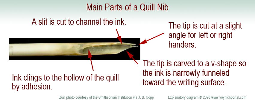
A quill is not like a ballpoint pen. A ballpoint can draw loopty-loops because each part of the ball dispenses ink in the same way. It takes practice to pull a quill in the correct direction and, if you don’t do it right, the ink stutters or blobs. It takes a few years for calligraphers to really master the art.
Cutting a Quill
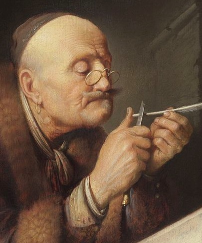
To create a quill, you harvest the feathers, scrape away the soft tissues, and age the feathers to “harden” them (in later years this was accelerated by heating). Artists and modern users have a romantic attachment to the feathery parts, but professional quill-makers and scribes usually removed them.
Use a sharp knife to shape the tip. The width of the tip is related to the width of the stroke. The tip is cut at a slight angle to accommodate the right or left hand. Even the curve of the feather is chosen for right- or left-handedness. A vertical slit is added to channel the ink in small doses from the inner curve of the quill.
If it is a feather quill, it needs to be re-dipped every few words and re-sharpened every few lines. (Don’t sharpen a quill as shown in this painting or you will cut your thumb—carve away, not toward your finger. What I do is press the quill-end alongside a small wooden block and shave toward the block—more control and less risk).
Because a quill needs to be pulled toward the side that holds the ink, a loop is usually drawn in two strokes—from top-to-bottom on the left, then top-to-bottom on the right. This prevents spattering or skipping.
Occasionally a scribe will draw a full loop if the nib is very fine and the loop is very small, but pushing against the direction of the pen is risky—the consequence may be a blob, pen-skip, or broken quill-tip. Similarly, straight strokes are drawn top to bottom to avoid going against the direction of the quill.
How Do Quill Mechanics Relate to the VMS?
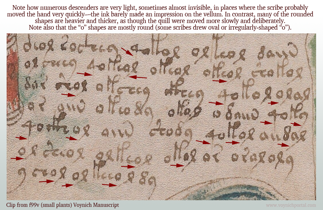
If you pull a quill very quickly on the downstroke and start lifting in anticipation of moving to the next letter, the descender becomes very thin and light. Calligraphers are discouraged from doing this because it makes the script look uneven and a “g” might look like an “a”. Nevertheless, it happens, and appears to have happened in parts of the VMS.
On folio 99v, I noticed many of the downstrokes were barely visible. The scribe probably moved fast and reduced the pressure compared to other parts of the glyphs.
Note how many of the descenders are unusually light:
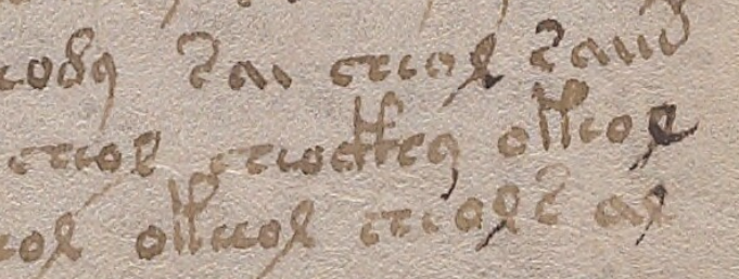
Compare it to this script on 103r where the descenders are darker and more clearly written:

On 116v, at the end of the manuscript, there is some distinctive lightening of descenders, possibly from the pen being moved quickly or possibly from some text that has been expunged below the last visible line:
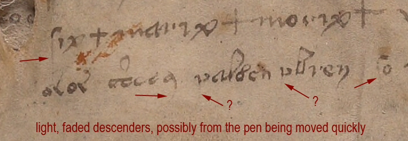
I am not sure if the two arrows marked with question marks are faded descenders, but the tops of the letters look more like medieval “p” than “v”.
Unfortunately the 116v text does not match the handwriting style of the scribe who wrote the light descenders on f99v. I wish it did—it would be evidence that the 116v scribe might have helped with the manuscript. But the 99v example has rounded c-shapes, not as squeezed as those on 116v, and the descender on EVA-y on 116v is distinctly rounded and arced, so it’s probably a different scribe.
Identifying the Ambiguous Letter
So what is the strange letter on 116v? A “v” or the top of a “p”?
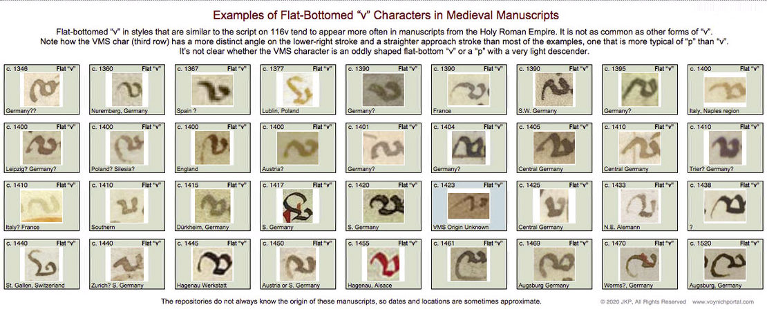
I looked for examples of flat-bottom “v” in medieval manuscripts and found quite a few, but it was definitely not as common as other forms of “v” with pointed or round bottoms.
Below are samples specifically culled from scripts that are similar to the overall script on 116v. These samples don’t match the shape of the VMS char as well as similar examples of the top of the letter “p”, but the differences aren’t sufficient to determine the identity of the VMS char:
So let’s move on to sections where the VMS text has been corrected or changed…
Amendments to the VMS Text
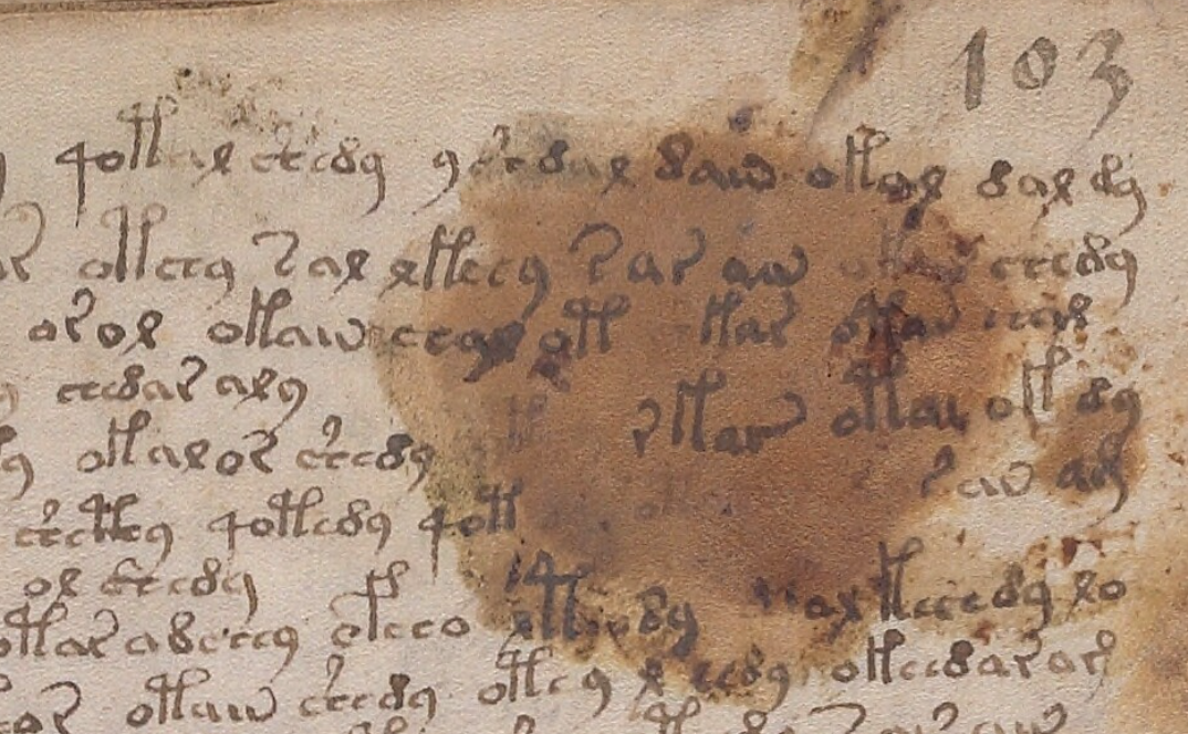
This is one of the more obvious examples where something spilled and someone tried to re-create the damaged text on top of the stain. The text is a bit awkward, the stain may have impeded the quill, but it appears to be added by someone familiar with VMS glyphs:
Less Obvious Examples
Some corrections are more subtle. You have to hunt for them. There are many edits in the VMS. I tried recording them, but it was taking too much time and there isn’t space to enumerate them all here, but I’ll point out a couple of interesting examples.
Apparently someone didn’t like the overly-light descenders on f100r (small-plants section) and tried to fix some of them. Note the light descender marked with a blue arrow. Some of the others have been overinked to add the missing stroke (marked in red).
Whoever over-inked wasn’t very expert. The lines are tentative and shaky. The thickness of the nib doesn’t match. The ink doesn’t match well either:

Medieval inks were not always brown. Some were closer to black when first applied and gradually faded to brown, so you can’t always go by color. Only testing can determine when the extra strokes were added. But the added ink isn’t just a different color, it’s a different kind of stroke, thin and spidery. It lacks the thick-thin characteristics of lines drawn with a quill. It resembles ink from a different kind of pen, maybe a metal stylus or something that can create thinner lines.
Darker ink also occurs at the bottom of f100v, on one of the small-plant folios, but the difference isn’t as great. One has to be careful in evaluating examples like the one below, because sometimes medieval ink was not mixed well and certain components in the ink faded while others remained dark.
I’m pretty sure the text on 100r in the previous example has been over-inked, but it’s harder to tell if the following example is over-inked or badly mixed ink where some components faded more than others:

Changes to Content
Darkening a too-light line is a superficial change that doesn’t alter the intention of a glyph, but there are places where lines have been added to change the shape of a letter. For example, on 100r in the middle, we see a shape that looks like a straight “d” changed into EVA-d with the addition of a loop.
In contrast to the overinked examples shown earlier, the added loop looks like a quill stroke. Even though it is darker ink, it has the thick-thin characteristics and more fluid style of the rest of the text:

So it’s possible that more than one person made changes to the text or that the scribe had difficulty with very fine lines and used a different, perhaps unfamiliar, kind of pen.
These revisions suggest that 1) someone cared about the legibility of the text and tried to fix the parts that were faded, and 2) someone comfortable with a quill cared about the consistency/accuracy of the VMS glyphs and corrected errors.
Here is another example with dark and light inks in which descenders have been fixed and one letter appears to have gained a longer lower-right stroke (100r lower-right):
The text is not the only thing that has been amended. Some of the drawings have, as well.
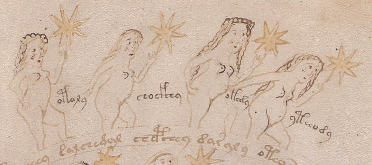
There are numerous places where a breast has been added to a nymph in a slightly darker ink. Usually it is the one closest to the viewer:

So who added it? Was it a production-line process where one person drew the outline and someone else added the inner details? Or was it a master-apprentice situation where a young apprentice was asked to do something “safe” that wouldn’t ruin the drawings, like adding a second breast?
The added breasts are usually in the same style as the original breast. In this case, the first is pointed, the second is somewhat rounded, the third is shaped like a thumb, and the fourth is larger and distinctly rounded. So… either it’s the same person who added them, or someone else made an effort to copy the original style.
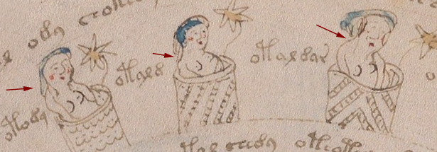
Sometimes other parts of the body look like they are drawn by a different person. For example, the arms of the second nymph are different from the others.
One of the characteristics of many of the nymph drawings is that there is no shoulder on the side facing the viewer—the arm grows out of the neck. This is particularly noticeable on nymphs in 3/4 view. It’s a distinctive characteristic that can be seen on nymphs 3 and 4 in the example above. In contrast, Nymph 2 has an angular shoulder and smoother, darker arcs to the curve of the arms. Note also that there is no elbow on #2. The arms of the second nymph look like they were drawn by a different person.
Here are more examples of nymphs with non-anatomical shoulders. The arm on the right is almost growing out of the ear:
Places Where Both Text and Images Were Amended
On folio 73r, someone has added both text and breasts in a darker ink, using a finer writing implement than the original text. The text is consistent with other text on the folio in both style and glyph-arrangement, so perhaps the lines were added close to the time of original creation.
Here is a sample from the top of the folio, but there are numerous other additions below it:
A second breast has been added in darker ink in much the same way in the zodiac-figure folios and the pool folios, which suggests some kind of continuity between sections, if the dark ink is contemporary with the rest of the manuscript.
One important thing to note… the glyphs in the darker ink are written in legal Voynichese. Did the person know the system for generating tokens? Or did they copy others that already existed? If they knew the system, these marks may have been added in the 15th century.
There are numerous amendments to the drawings on 71v, one of the zodiac-figure folios. Ten of the 15 figures have been touched up with darker ink (or ink that has faded less over time). Most of the changes are to the hair and breasts:
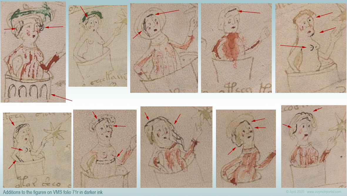
In this group of nymphs, there is an interesting anatomical difference between the nymph with two original breasts (#2) and the two nymphs with added breasts (#5 and #6)…
On the original drawing (#2), the contour of the breast is defined by a line underneath, and the general direction is facing the viewer straight on. The added breasts on #5 and #6 are drawn differently. The direction is more of a side or 3/4 view and the line that defines the contour is on the side rather than underneath. The “touch-up” person may have been different from the original illustrator.
Less-Explainable Amendments
The changes or additions in the above examples are understandable. Light strokes were darkened, missing information was added. But the following example is harder to explain.
On f86r, there is an instance of “daiin” in which the last minim doesn’t have the usual tail swinging up to the left. Instead, someone with a narrower quill and a less steady hand added a large angular shape that is inconsistent with the rest of the text on the folio. The last minim has been awkwardly changed into an ambiguous shape that is not typical of Voynichese:

The amended shape is not round enough to be EVA-y and lacks the loop that is usual for EVA-m. The “dain” block doesn’t usually end this way, so the amender either added the wrong kind of tail (facing the wrong direction), or didn’t know how to draw one of the other VMS glyphs correctly and turned the tail-less minim into something strange.
In a previous blog, I posted some other examples in which atypical text was added to the beginnings or ends of lines.
Summary
The VMS includes numerous adjustments to the text and drawings; most of them are fixes to the original in a similar style. In some cases, however, textual additions seem out of character with the rest of the folio and it’s unclear why it was changed.
Most of the amendments were probably done around the same time the VMS was created, but some of the textual changes may have been added later. The proportion of changes isn’t high, but there are enough to make you wonder what happened to the VMS during the gaps in its provenance.
Changes or additions are not especially frequent, however, considering the length of the manuscript. It seems likely that a draft version was used to design the script first. It would be remarkable if it eventually turned up somewhere in the forgotten corners of a library or private collection.
J.K. Petersen
© Copyright 23 April 2020 J.K. Petersen, All Rights Reserved

Very interesting. For someone like me without any experience writing with quills, it is important to learn about the consequences and difficulties of the process. For example I did not notice before that there was such a difference between descenders.
There’s a certain carelessness to it, maybe because he just saw them as flourishes? Although it could be just due to writing style and nothing more.
It might be nothing more than the writing style, but the point you make about flourishes is interesting.
We do tend to put less attention to details that are not as crucial to comprehension. It’s an unknown writing system, and we don’t know yet whether part of a glyph or the whole glyph carries information.
The supposition that the creation of the VMs is the product of a ‘professional’, “get it done expediently” type of situation will lead to certain conclusions. In contrast, different parts of the VMs could have been produced over a period of several years, over part of a life-time, and by the time the later parts were getting finished, the earlier parts needed some touch up, or a few alterations. Is there a way to tell the difference between these two possibilities?
Codicology studies would certainly help with questions like…
Is there consistency in the composition of the skin in the different sections, in the insect trails, the pigments, the trimming, or the stains?
Questions like this might help us understand whether the VMS was conceived as a book or as a series of booklets. It might also offer clues as to whether the VMS creation time was short or long. I’m sure it must have taken at least a few months.
Unfortunately, the VMS is becoming so fragile that access is severely restricted. Otherwise I could see a PhD student delving into some of these questions.
When I looked at the amendments in the VMS, I wasn’t sure what I would find. I was aware that darker ink had been used in a number of places but I hadn’t looked closely enough or thought about it enough to note if there were patterns.
Now that I’m more familiar with it, i have the sense that a number of the touchups were probably by the original creators, but I honestly can’t tell if someone was touching up a project that was put aside and then revisited or if it was done simultaneously with its creation.
There are a few textual additions that are suspicious. They are not drawn like the other VMS glyphs and they tend to be at the beginnings of lines, as though they were added to straighten out the justification, but they appear to be added with a quill, so it’s hard to say when they might have been added. Quills were used up until the 19th century and sometimes even in the early 20th century.
It’s certainly possible that the VMS was created over a period of years, especially if it was a part-time project. A subsequent owner could have added some details but, if so… I suspect it was someone familiar with the original intention. I would be surprised if anything significant were altered after the 15th century, except maybe the over-inking of the light descenders—thin black lines are out of character with the main text, so perhaps it happened later.
There are a few dashes that resemble the ambiguous ‘dain’ minim in MS 10a 131 at the Historical Medical Library of The College of Physicians of Philadelphia, i.e. on pages 49v through 50v of volume 2 they appear a few times. I am not very experienced in reading MSs of any language, let alone Venetian dialects of Latin, so I can’t tell their purpose. Mostly they’re at the end of lines but not all, disconnected from the preceding word but not as snug to it as the unusual Voynich minim.
I’m sure you’re familiar with the MS already, JKP! 🙂 The name alone is so tempting, Secreti Medici. The more I look it at, the more Voynich-ian elements I see. The naïf way the hands are drawn in the margins in the second volume, the drawing of the alembic vessel on 16r in volume 1, and of course different letters from both volume 1 and 2! That must mean I have my late-night Voynich eyes on, and it is time to go to bed, because they are not similar hands. The description claims both volumes are by the same scribe, but doesn’t explain why, and I don’t see why that would be the case. They were produced a long time apart according to the description so it seems an odd claim to make.
Sorry to rant. Just wanted to bring up the odd little “close brackets” in Secreti Medici.
I am familiar with it, but thank you for bringing it up nevertheless. There may be readers who haven’t seen it and your comment inspired me to add a link so everyone can take a look:
https://bibliophilly.library.upenn.edu/viewer.php?id=10a%20131#page/30/mode/2up