Tag Archives: Voynich manuscript nymphs

The Quicker Hand…

San Ramon 23 April 2020

Kelkheim (Taunus) Usually when I look at VMS text, I am trying to unravel the meaning (assuming there is one) or puzzle out some of the ambiguous shapes, but a while ago I noticed something about the pen strokes that reminded me of the text on folio 116v…

The Speed of the Quill

Medieval scribes wrote using a quill or stylus. Some wrote faster than others. A faster, lighter stroke dispenses less ink. There are other differences… some scribes pressed harder, and some pressed harder on the downstroke than the cross-stroke (for artistic effects). Some sharpened the quill to a finer point, which creates a different kind of line and overall look. Some sharpened the quill more frequently than others, which improves consistency. Usually goose quills were used, but other feathers were sometimes good for fine lines.

Adhesion holds the ink within the curve of the quill. When you press on the tip to spread the groove, gravity tugs the droplet and ink runs downward. You have to hold the pen at a certain angle, use exactly the right pressure, and pull the tip away from the topside for the ink to dispense evenly.

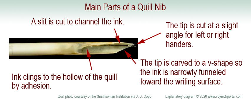
Here are the basic parts of a nib. It is a protein material that wears down. A scribe needs many quills to complete a long project.

Diagram of the basic parts of a quill pen tip.

A quill is not like a ballpoint pen. A ballpoint can draw loopty-loops because each part of the ball dispenses ink in the same way. It takes practice to pull a quill in the correct direction and, if you don’t do it right, the ink stutters or blobs. It takes a few years for calligraphers to really master the art.

Cutting a Quill

Shaping the tip of the quill. Often goose feathers were used. [Painting by Gerrit Dou c. 1633, courtesy of the Leiden collection.]

To create a quill, you harvest the feathers, scrape away the soft tissues, and age the feathers to “harden” them (in later years this was accelerated by heating). Artists and modern users have a romantic attachment to the feathery parts, but professional quill-makers and scribes usually removed them.

Use a sharp knife to shape the tip. The width of the tip is related to the width of the stroke. The tip is cut at a slight angle to accommodate the right or left hand. Even the curve of the feather is chosen for right- or left-handedness. A vertical slit is added to channel the ink in small doses from the inner curve of the quill.

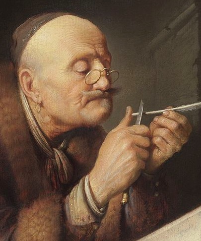
If it is a feather quill, it needs to be re-dipped every few words and re-sharpened every few lines. (Don’t sharpen a quill as shown in this painting or you will cut your thumb—carve away, not toward your finger. What I do is press the quill-end alongside a small wooden block and shave toward the block—more control and less risk).

Because a quill needs to be pulled toward the side that holds the ink, a loop is usually drawn in two strokes—from top-to-bottom on the left, then top-to-bottom on the right. This prevents spattering or skipping.

Occasionally a scribe will draw a full loop if the nib is very fine and the loop is very small, but pushing against the direction of the pen is risky—the consequence may be a blob, pen-skip, or broken quill-tip. Similarly, straight strokes are drawn top to bottom to avoid going against the direction of the quill.

How Do Quill Mechanics Relate to the VMS?

If you pull a quill very quickly on the downstroke and start lifting in anticipation of moving to the next letter, the descender becomes very thin and light. Calligraphers are discouraged from doing this because it makes the script look uneven and a “g” might look like an “a”. Nevertheless, it happens, and appears to have happened in parts of the VMS.

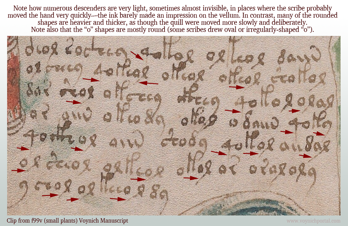
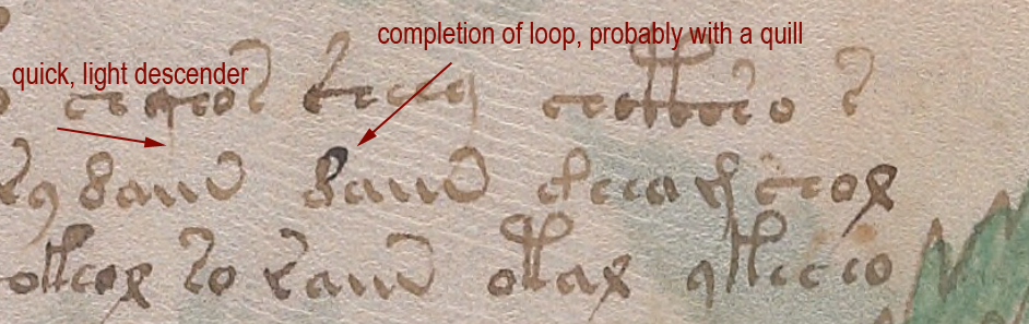
On folio 99v, I noticed many of the downstrokes were barely visible. The scribe probably moved fast and reduced the pressure compared to other parts of the glyphs.

Note how many of the descenders are unusually light:

Examples of overly-light descenders on VMS folio f99v.

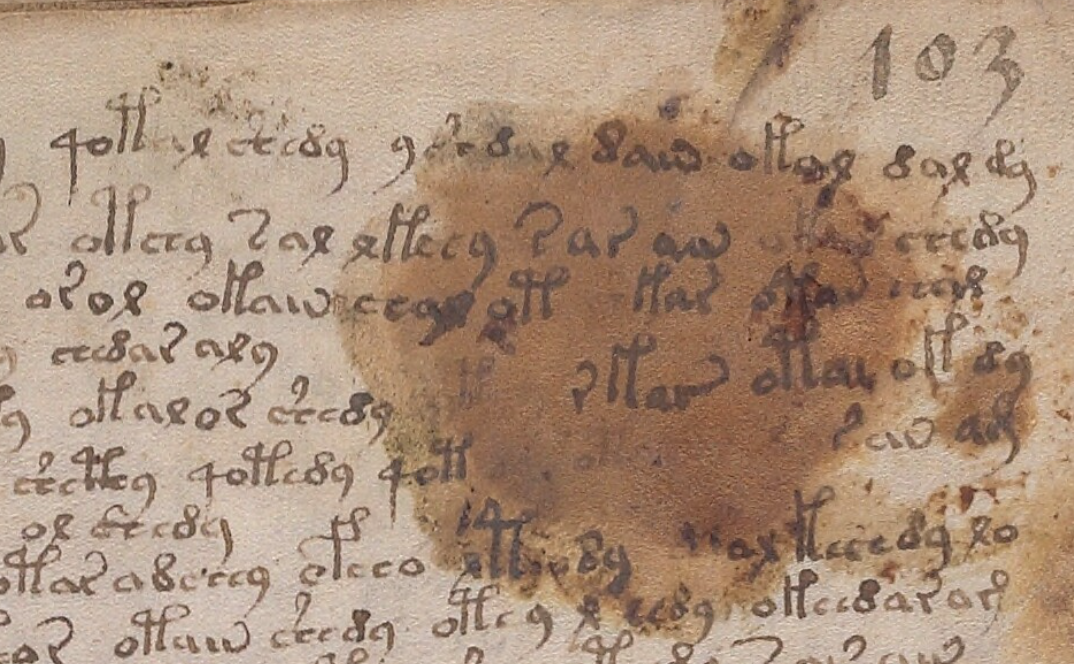
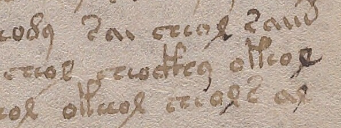
Compare it to this script on 103r where the descenders are darker and more clearly written:

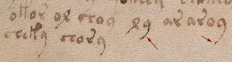
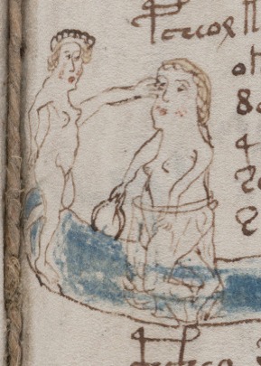
On 116v, at the end of the manuscript, there is some distinctive lightening of descenders, possibly from the pen being moved quickly or possibly from some text that has been expunged below the last visible line:

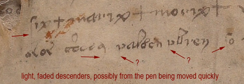
I am not sure if the two arrows marked with question marks are faded descenders, but the tops of the letters look more like medieval “p” than “v”.

Unfortunately the 116v text does not match the handwriting style of the scribe who wrote the light descenders on f99v. I wish it did—it would be evidence that the 116v scribe might have helped with the manuscript. But the 99v example has rounded c-shapes, not as squeezed as those on 116v, and the descender on EVA-y on 116v is distinctly rounded and arced, so it’s probably a different scribe.

Identifying the Ambiguous Letter

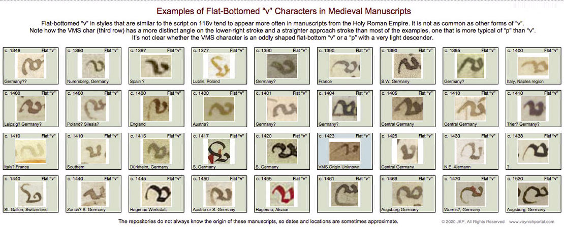
So what is the strange letter on 116v? A “v” or the top of a “p”?

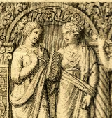
I looked for examples of flat-bottom “v” in medieval manuscripts and found quite a few, but it was definitely not as common as other forms of “v” with pointed or round bottoms.

Below are samples specifically culled from scripts that are similar to the overall script on 116v. These samples don’t match the shape of the VMS char as well as similar examples of the top of the letter “p”, but the differences aren’t sufficient to determine the identity of the VMS char:

Palaeographic examples of medieval flat-bottom "v".

So let’s move on to sections where the VMS text has been corrected or changed…

Amendments to the VMS Text

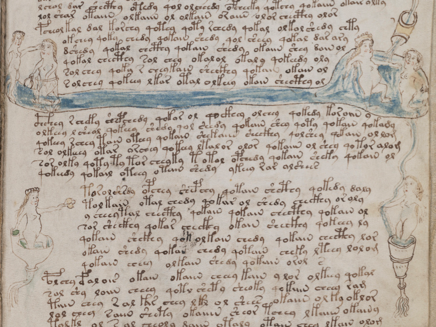
This is one of the more obvious examples where something spilled and someone tried to re-create the damaged text on top of the stain. The text is a bit awkward, the stain may have impeded the quill, but it appears to be added by someone familiar with VMS glyphs:

Less Obvious Examples

Some corrections are more subtle. You have to hunt for them. There are many edits in the VMS. I tried recording them, but it was taking too much time and there isn’t space to enumerate them all here, but I’ll point out a couple of interesting examples.

Apparently someone didn’t like the overly-light descenders on f100r (small-plants section) and tried to fix some of them. Note the light descender marked with a blue arrow. Some of the others have been overinked to add the missing stroke (marked in red).

Whoever over-inked wasn’t very expert. The lines are tentative and shaky. The thickness of the nib doesn’t match. The ink doesn’t match well either:

Example of over-inked descenders on VMS Folio 100r.

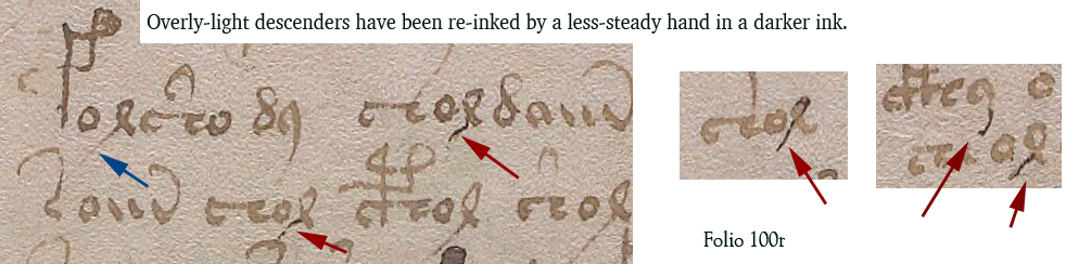
Medieval inks were not always brown. Some were closer to black when first applied and gradually faded to brown, so you can’t always go by color. Only testing can determine when the extra strokes were added. But the added ink isn’t just a different color, it’s a different kind of stroke, thin and spidery. It lacks the thick-thin characteristics of lines drawn with a quill. It resembles ink from a different kind of pen, maybe a metal stylus or something that can create thinner lines.

Darker ink also occurs at the bottom of f100v, on one of the small-plant folios, but the difference isn’t as great. One has to be careful in evaluating examples like the one below, because sometimes medieval ink was not mixed well and certain components in the ink faded while others remained dark.

I’m pretty sure the text on 100r in the previous example has been over-inked, but it’s harder to tell if the following example is over-inked or badly mixed ink where some components faded more than others:

Changes to Content

Darkening a too-light line is a superficial change that doesn’t alter the intention of a glyph, but there are places where lines have been added to change the shape of a letter. For example, on 100r in the middle, we see a shape that looks like a straight “d” changed into EVA-d with the addition of a loop.

In contrast to the overinked examples shown earlier, the added loop looks like a quill stroke. Even though it is darker ink, it has the thick-thin characteristics and more fluid style of the rest of the text:

So it’s possible that more than one person made changes to the text or that the scribe had difficulty with very fine lines and used a different, perhaps unfamiliar, kind of pen.

These revisions suggest that 1) someone cared about the legibility of the text and tried to fix the parts that were faded, and 2) someone comfortable with a quill cared about the consistency/accuracy of the VMS glyphs and corrected errors.

Here is another example with dark and light inks in which descenders have been fixed and one letter appears to have gained a longer lower-right stroke (100r lower-right):

The text is not the only thing that has been amended. Some of the drawings have, as well.

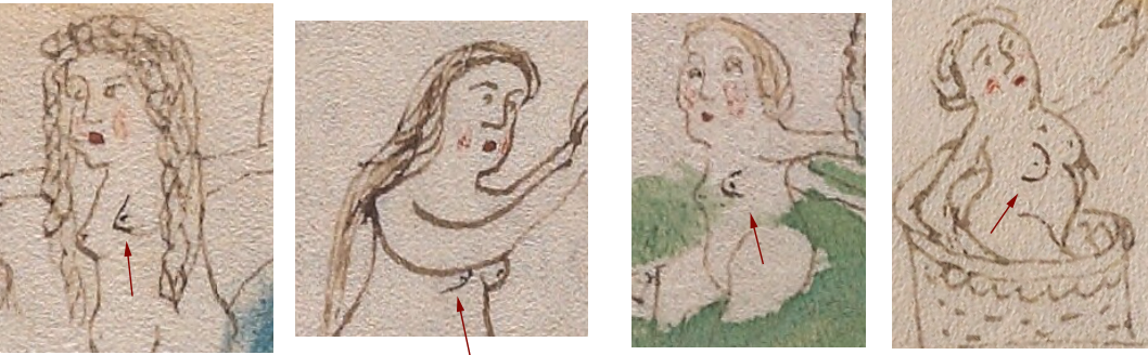
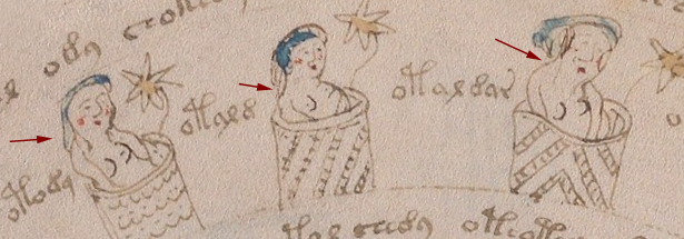
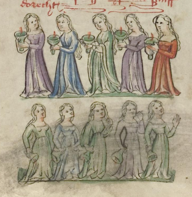
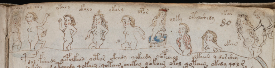
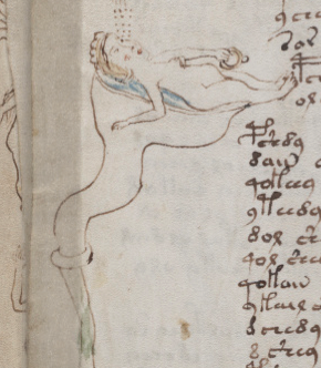
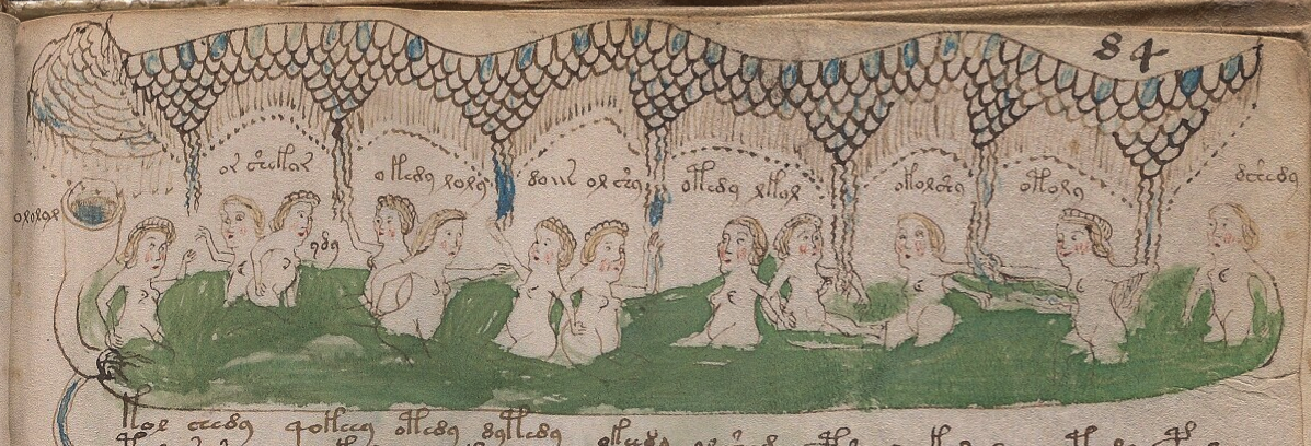
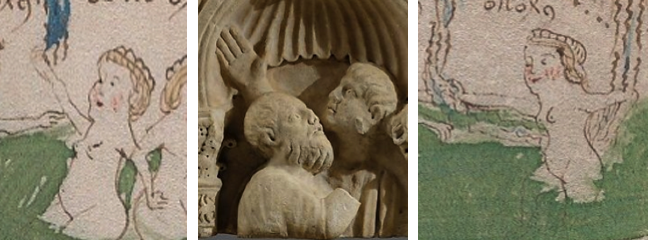
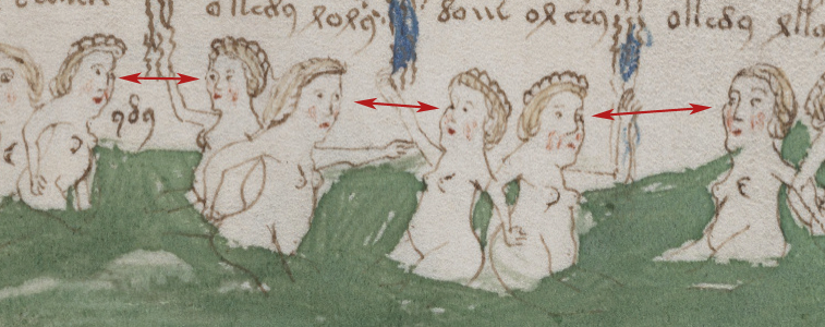
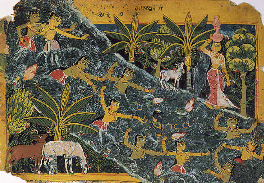
There are numerous places where a breast has been added to a nymph in a slightly darker ink. Usually it is the one closest to the viewer:

Nymph 1 Nymph 2 Nymph 3 Nymph 4

So who added it? Was it a production-line process where one person drew the outline and someone else added the inner details? Or was it a master-apprentice situation where a young apprentice was asked to do something “safe” that wouldn’t ruin the drawings, like adding a second breast?

The added breasts are usually in the same style as the original breast. In this case, the first is pointed, the second is somewhat rounded, the third is shaped like a thumb, and the fourth is larger and distinctly rounded. So… either it’s the same person who added them, or someone else made an effort to copy the original style.

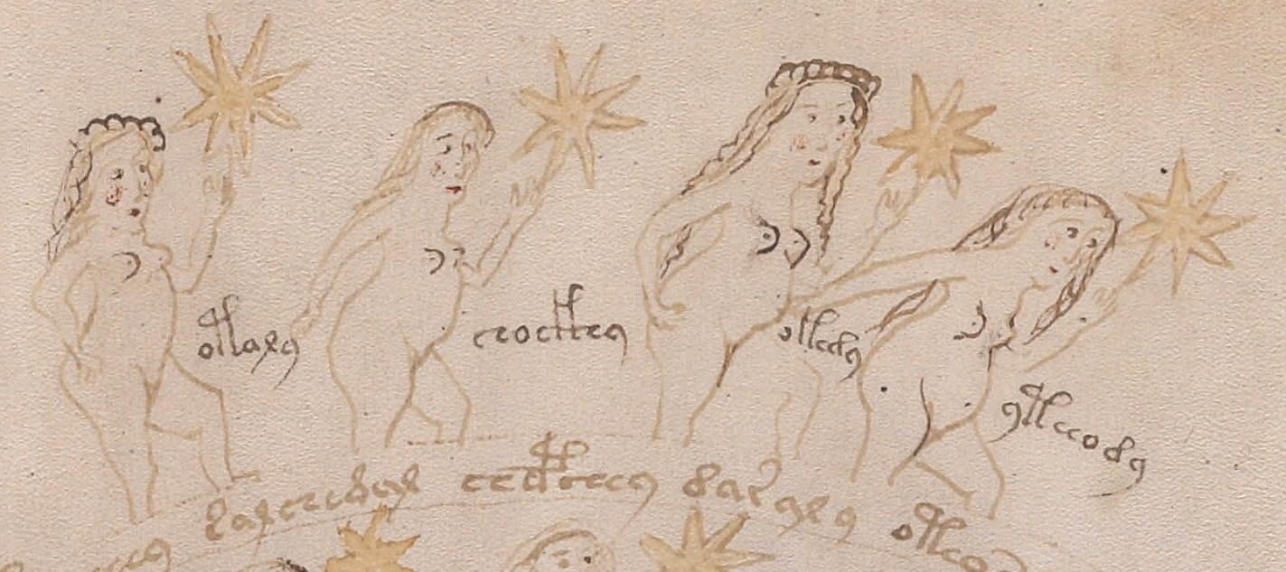
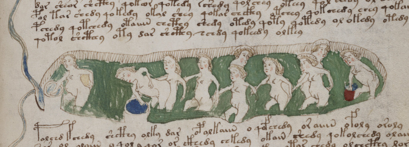
Sometimes other parts of the body look like they are drawn by a different person. For example, the arms of the second nymph are different from the others.

One of the characteristics of many of the nymph drawings is that there is no shoulder on the side facing the viewer—the arm grows out of the neck. This is particularly noticeable on nymphs in 3/4 view. It’s a distinctive characteristic that can be seen on nymphs 3 and 4 in the example above. In contrast, Nymph 2 has an angular shoulder and smoother, darker arcs to the curve of the arms. Note also that there is no elbow on #2. The arms of the second nymph look like they were drawn by a different person.

Here are more examples of nymphs with non-anatomical shoulders. The arm on the right is almost growing out of the ear:

VMS nymphs in barrels with poorly drawn shoulders
Places Where Both Text and Images Were Amended

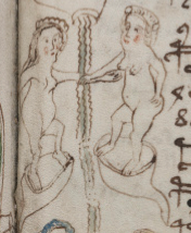
On folio 73r, someone has added both text and breasts in a darker ink, using a finer writing implement than the original text. The text is consistent with other text on the folio in both style and glyph-arrangement, so perhaps the lines were added close to the time of original creation.

Here is a sample from the top of the folio, but there are numerous other additions below it:

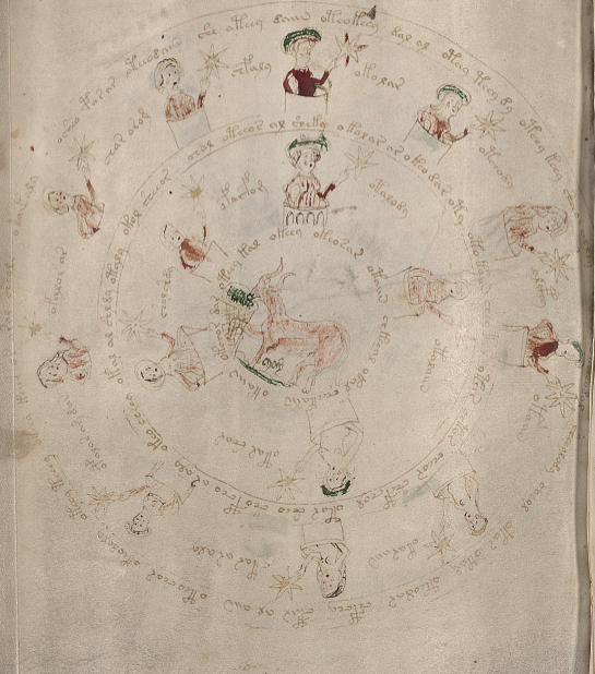
A second breast has been added in darker ink in much the same way in the zodiac-figure folios and the pool folios, which suggests some kind of continuity between sections, if the dark ink is contemporary with the rest of the manuscript.

One important thing to note… the glyphs in the darker ink are written in legal Voynichese. Did the person know the system for generating tokens? Or did they copy others that already existed? If they knew the system, these marks may have been added in the 15th century.

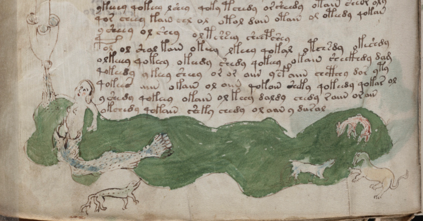
There are numerous amendments to the drawings on 71v, one of the zodiac-figure folios. Ten of the 15 figures have been touched up with darker ink (or ink that has faded less over time). Most of the changes are to the hair and breasts:

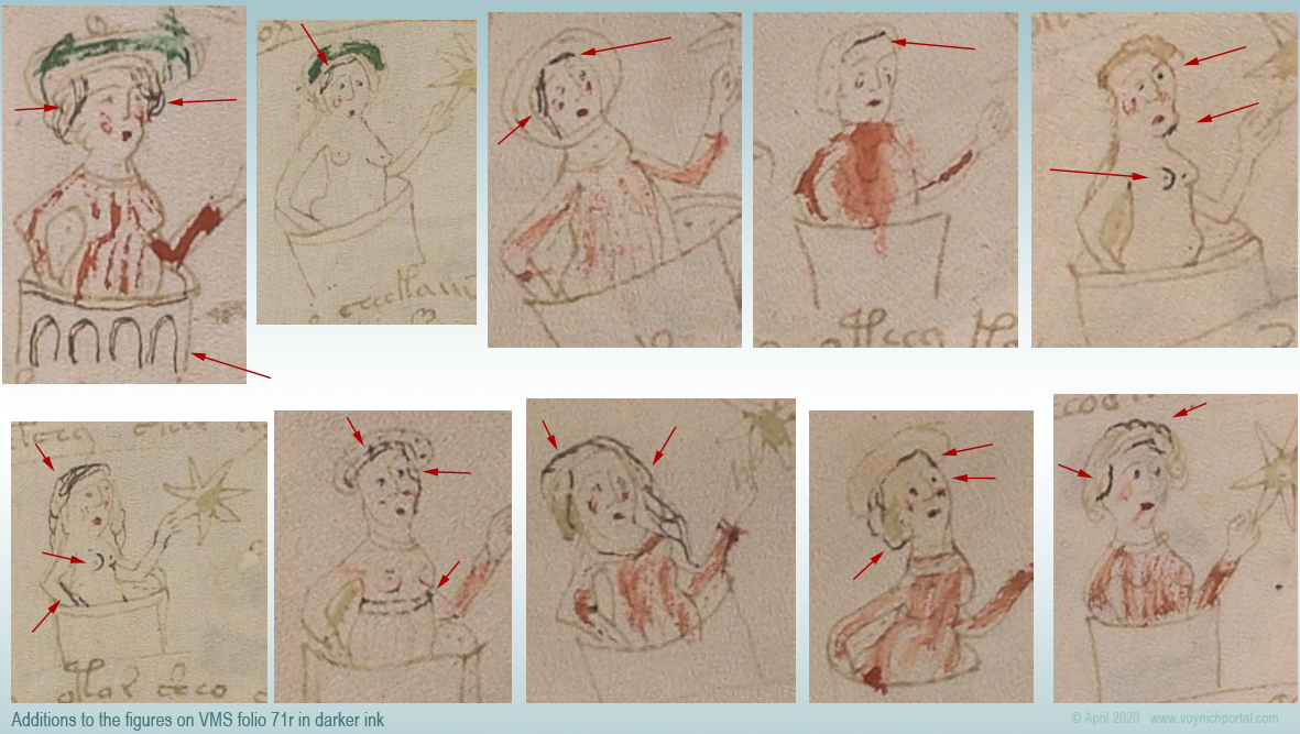
In this group of nymphs, there is an interesting anatomical difference between the nymph with two original breasts (#2) and the two nymphs with added breasts (#5 and #6)…

On the original drawing (#2), the contour of the breast is defined by a line underneath, and the general direction is facing the viewer straight on. The added breasts on #5 and #6 are drawn differently. The direction is more of a side or 3/4 view and the line that defines the contour is on the side rather than underneath. The “touch-up” person may have been different from the original illustrator.

Less-Explainable Amendments

The changes or additions in the above examples are understandable. Light strokes were darkened, missing information was added. But the following example is harder to explain.

On f86r, there is an instance of “daiin” in which the last minim doesn’t have the usual tail swinging up to the left. Instead, someone with a narrower quill and a less steady hand added a large angular shape that is inconsistent with the rest of the text on the folio. The last minim has been awkwardly changed into an ambiguous shape that is not typical of Voynichese:

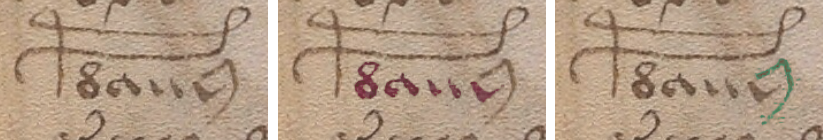
The amended shape is not round enough to be EVA-y and lacks the loop that is usual for EVA-m. The “dain” block doesn’t usually end this way, so the amender either added the wrong kind of tail (facing the wrong direction), or didn’t know how to draw one of the other VMS glyphs correctly and turned the tail-less minim into something strange.

In a previous blog, I posted some other examples in which atypical text was added to the beginnings or ends of lines.

Summary

The VMS includes numerous adjustments to the text and drawings; most of them are fixes to the original in a similar style. In some cases, however, textual additions seem out of character with the rest of the folio and it’s unclear why it was changed.

Most of the amendments were probably done around the same time the VMS was created, but some of the textual changes may have been added later. The proportion of changes isn’t high, but there are enough to make you wonder what happened to the VMS during the gaps in its provenance.

Changes or additions are not especially frequent, however, considering the length of the manuscript. It seems likely that a draft version was used to design the script first. It would be remarkable if it eventually turned up somewhere in the forgotten corners of a library or private collection.

J.K. Petersen

© Copyright 23 April 2020 J.K. Petersen, All Rights Reserved

Synecclesia

14 August 2019

The transition from Judaism is marked in Christian history by the crucifixion and resurrection of Christ. These events are illustrated in ways that were surprisingly similar in distant lands such as Ethiopia, Armenia, and northern Germany. But there were also traditions specific to certain areas, so, I’ve been wondering if parallels exist in the VMS.

Ecclesia

Let’s look at Ecclesia. She personifies the church and shows up in medieval art a couple of centuries before she was paired with the second figure in this drama.

This is how to recognize her…

In these four interpretations Ecclesia carries a wine chalice (which holds the blood of Christ) or a monstrance, which in turn supports the “host”, a round bread-like object symbolizing the body of Christ. Note the cross and two lines on either side lightly inscribed on the host in the image on the right. Sometimes the name of Jesus is abbreviated around the image of a cross, sometimes a drawing of the Christ child is attached to the host (usually in Eucharist drawings).

In the two images on the left, Ecclesia holds a cross-staff. Sometimes she is nimbed, but often the halo is reserved for Mary and St. John and helps distinguish them from Ecclesia and her counterpart. Ecclesia is virtually always wearing a crown:

Ecclesia with her attributes
Ecclesia representing the Christian church, with common attributes such as the cross-staff, wine chalice or monstrance, and host.

In this VMS image, a nymph holds out a stick with a cross shape. It might be a tool (like a sighting stick) or a cross, or a cross-staff. We can’t tell if she’s wearing a crown. I’m beginning to think the nebuly-like parasol represents religious authority:

Voynich Nymph holding out a cross under a nebuly-like canopy.

Maybe there are other elements on the folio to help identify her, but we’ll come back to that after we meet her partner…

Synagoga

Typically, Ecclesia is paired with another figure known as Synagoga. In a specific illustrative branch of the crucifixion, Ecclesia and Synagoga are paired on either side of Jesus on the cross.

Synagoga is always placed on the right and wears a blindfold (a Christian political symbol of her inability to see the message of the Messiah). She is frequently shown with a tablet in one hand, a broken staff, and sometimes a crown falling from her head. In contrast to Ecclesia, her posture is slouched and defeated:

Iconographic images of Synagoga with blindfold, broken staff, and fallen crown.

Early depictions of the two women were not openly hostile but the intended message of the Christian religion being superior to pre-Christian beliefs was made iconographically clear.

In the next example, Ecclesia is shown in a variety of poses in the top panel. She stands tall and proud, carrying the torch that doubles as Christ’s blood in a wine goblet. On the left is a chalice with the crossed host, and a cross-staff.

In the panel below Ecclesia, Synagoga wears her customary blindfold (a reference to the veil of Moses). She looks tired and beleaguered and has lost her crown.

The odd “thing” in her hand on the far left might be hard to recognize unless you knew the story, but it is the head of a goat or ram, representing ancient rites of sacrifice. In her other hand is something resembling a bell (this is usually a tablet, but this odd detail might be important later). In this case, it is an overturned torch-chalice, like the one in the upper panel, except now it is hanging empty:

Illumination of a parable in the Speculum Humanae Salvationis of c. 1360 (Darmstadt). Below this panel, King Balthasar motions up at the women to make a point to Daniel, who stands nearby.

Postscript 17 March 2020: Here is essentially the same image (which I personally find distasteful now that I know what it means) from a c. 1420s Rheinland manuscript (Cod. pal. germ. 432):

Ecclesia and Synagoga with burning and spent troches, Cod Pal Germ 432.

This scene of the crucifixion shows the two women in context. Ecclesia catches Christ’s blood in her chalice while Synagoga, on the right, is losing her crown:

German Psalter with a pelican at the top feeding its babies with its own blood, workers nailing Christ to the cross, and Ecclesia and Synagoga flanking him on the left and right. The nimbed figures are Mary and Saint John.

In an earlier crucifixion from Hildesheim, Germany, Synagoga is identified with a conical hat, while Ecclesia, on the left, wears a crown:

Hildesheim manuscript image of the crucifixion, c. 1170.
Detail of the crucifixion, with Ecclesia and Synagoga in a cone-hat flanking Christ. Above are the sun and moon with faces. Hildesheim, c. 1170 [Courtesy of Getty Open Content Program]

An Armenian manuscript from the 14th century shows Ecclesia with crown and chalice, while Synagoga has had her crown lifted off by an angel. You can view this version on Getty Images.

Sculptural Media

The theme of Ecclesia and Synagoga appears in medieval in church architecture, as in this blindfolded Synagoga with tablet in one hand and a broken staff in the other:

Synagoga, Cathedral of Bamberg [Johannes Otto Först, public domain]

Are Ecclesia and Synagoga in the VMS?

Compared to many medieval manuscripts, the VMS is conspicuously nonviolent. There are smiling animals, clawless felines, and a notable lack of weapons. Yet one of the few images that has been interpreted as violent (at least by some) might, in fact, be our iconic pair.

In this drawing on f82r, the nymph on the left looks like she is poking the other one in the eye. But I’m not sure. Maybe she’s pointing at the eye or brushing away a tear. She is wearing a crown or some kind of fancy head-dress. Could she be Ecclesia indicating blindness?

I always thought the nymph on the right was carrying a pair of pincers, or a badly drawn compass. But what if this is Synagoga’s tablet, or an overturned empty torch or chalice as in the Darmstadt manuscript above? If it is an empty torch or tablet, it is artfully hidden in plain sight by not having a dark line across the bottom to distinguish it from the water:

I’m really not sure whether the nymph on the left is pointing or poking out an eye—blinding or indicating blindness in the other nymph. The only somewhat aggressive version of Ecclesia and Synagoga I’ve found so far is this one, by Pisano.

On the left, an angel escorts Ecclesia with her chalice toward the cross. On the right, another angel escorts the aging Synagoga away from the action:

The Crucifixion by Giovani Pisano, c. 1300 [Jollyroger, Wikimedia Commons, CC 3.0]

It’s not exactly on the same level of aggression as poking out an eye. Assuming for a moment that the nymph on the right might be Synagoga, can we confirm it by examining the other elements?

Is the “thing” in her hand an empty torch? Or is it a tablet?

If it’s a tablet, it’s a direct reference to Moses in the Old Testament. When Moses was a baby, he was set adrift in a basket so he would not be killed by the king. Could the nymph’s “skirt” be a basket? Is this why her hand looks like it’s inside the rim instead of outside? Is she standing in the river where Moses was found?

Has the illustrator combined Moses and Synagoga, male and female references to the Jewish faith, into one nymph? Is this why several of the VMS nymphs are sexually ambiguous (because they represent more than one thing)?

We know that Ecclesia is usually depicted on the left wearing a crown, Synagoga on the right without a crown (or in the process of losing it) and the nymphs happen to follow the same pattern.

Context

What about the other elements on the page?

I like K. Gheuen’s suggestion that the figures across the top of this folio might represent a story from Ovid. Most medieval scholars were familiar with classical history and myths, including Herodatus, Virgil, Ovid, Hesiod, and others, so I wouldn’t be surprised if this turned out to be Philomela’s story. The part that Gheuens quoted about the king seizing her hair and using it to tie her hands behind her back is especially convincing:

I couldn’t find a better explanation for the series, not even in Bible stories. It’s true that Eve was often drawn with long hair, and the spindle became her avatar when she was expelled from the garden, but I couldn’t find a good explanation for the other figures in relation to Eve.

Would the creator of the VMS have transitioned from Ovid at the top of the folio to Biblical references in the middle? I’m a bit uncomfortable with that idea, but given that the story changes from thread and spindles at the top to water and matched pairs of nymphs in the middle, maybe it’s possible.

So, moving down to the center of the page, we have the eye-poking nymph and a long river linking two nymphs on the right who look like they might be the same pair of nymphs repeated (this would not be unusual in medieval drawings)—the main difference is that the nymph on the far right has no attributes:

The nymphs on the bottom also look like the nymphs on the middle-left repeated, except that they are now shown separately, in elevated loges, rather than standing together in a river. The nymph on the left is holding another of the mystery items (or possibly three mystery items) but it doesn’t look like a host or chalice.

Can these two figures be found elsewhere in the VMS?

If we move to an earlier section of the quire, there is a nymph on 70r with the same kind of headdress as the nymph on 82r, and her counterpart is also like the nymph on the right on 82r—she’s slightly heavier, has no crown-like head-dress like the nymph on the left. In the earlier image, their arms cross.

If this is Ecclesia and Synagoga, might this symbolize the beginning of the transition from Judaism to Christianity?

More Instances of Possibly the Same Nymph

The nymph with the fancy headdress shows up again on 79v and this version really caught my attention because she’s on a wide elevated loge holding a ring, and she’s lying down. She’s not wrapped in a shroud, so I don’t think she’s dead. Is this a marriage bed?

If this nymph is Ecclesia, then the picture fits, because Ecclesia was expressly described in medieval literature as the bride of God.

Above her is the nymph holding out the cross (possibly a cross-staff?). The cross-staff was one of Ecclesia’s attributes, but the celestial parasol is hiding the top of her head, so it’s hard to know if it’s the same nymph.

The nymph on the lower rung is drawn more like the one that might be Synagoga and doesn’t have a head-dress. The position on the lower rung would fit with how she was treated iconographically in Christian literature—slouched, defeated, or in a lower panel as in the Darmstadt illustration.

Is there a larger story being told across a series of folios? The story of a transition from the Old Testament to the New, from the old religions to Christianity, with Ecclesia, the bride of God becoming the dominant nymph and expressing anger that Synagoga doesn’t want to “see” the Christian point of view?

What happens on the rest of the folio? Can it help us confirm or deny any of this?

Below the nymph with the ring and the one without a crown is the famous wide-mouthed fish in a pond full of strange critters:

Voynich Manuscript big-mouthed fish and strange pond critters

I’ve always been reluctant to interpret this as the story of Jonah. For one thing, it just seems too easy. For another, some of the critters don’t look like sea monsters (except for the giant fish). The Creation cycle often includes a variety of animals, but not a giant fish (and this image doesn’t fit creation stories as well as some of the other drawings of the VMS).

If it’s two narratives rolled into one (if the imagery on the left is a different place or time from that on the right), it would be even harder to guess what it represents. I’m not sure what to make of it, but let’s see if it might be Jonah…

If the nymph in the fish’s mouth is Synagoga (note how the uncrowned nymph in each of these panels has shorter, colored hair and a slightly bigger belly and hips to distinguish her from the one with the longer hair and fancy head-dress), then perhaps the Jonah story is appropriate.

When a storm boils up at sea, Jonah’s companions question him, suspiciously trying to determine who is responsible for unleashing God’s wrath on the tossing boat, but Jonah answers quite simply as a God-fearing man, “I am a Hebrew”. What could encapsulate the identity of Synagoga more succinctly than, “I am a Hebrew”?

Classical Stories Mixed with Bible Passages?

It seemed strange to me that the VMS might mix classical history (e.g., Herodatus, Ovid, etc.) with Bible stories… until I came across Speculum Humane Salvationis, which freely combines them.

In the Speculum Humane Salvationis, which was popular in the 15th century, the story of Adam and Eve, the Deluge, and Anna and the Annuciation are immediately followed by the less-familiar prophetic vision of Astyages, the last king of Media. Astyages dreamed of a vine growing from the belly of his daughter Mandane, a vine that would spawn a boy (Cyrus) to challenge his grandfather for the empire. In a Persian version, Cyrus was suckled by a dog, similar to the infants Romulus and Remus.

Our information about Astyages comes almost entirely from Herodatus. The Bible includes only this one brief reference from the Book of Daniel:

And king Astyages was gathered to his fathers, and Cyrus the Persian received his kingdom.

Connections?

The idea of a vine growing out of Mandane’s belly to symbolize her son’s growth and eventual possession of the empire is echoed in the story of Jesse, in Isaiah 11. Jesse is shown lying down, at the base of the folio, with a vine growing from his “root” (it usually grows from his chest or belly).

This symbol of biblical genealogy came to be known as the Jesse tree.

Jesse tree from Amiens manuscript
A Jesse Tree next to a picture of Madonna and Child, from the Amiens region, c. late 15th century [BNF L’Arsenal MS 662]

I’ve always wondered if the clothed figures around the bull in the VMS zodiac-figures section are related to genealogy. Could it be a VMS version of a Jesse tree?

VMS folio 71v with concentric circles of clothed figures in loges

Jesse trees came in many different formats, some almost menorah-shaped (a reference to the tree of life). Often the figures are shown only from the waist up. But the main difference between a Jesse tree and the VMS drawing above is not the absence of a tree, but the absence of Jesse himself, who is usually shown as a man with a beard under the figures, dreaming.

So perhaps this is not a Jesse Tree, but there might be one somewhere in the VMS, just as Jacob’s ladder might be included (e.g., the image of nymphs one on top of the other within a green “waterfall”).

I have much more information on this line of thought, but it’s far too much for one blog. I will have to split it into two sections.

Summary

I am beginning to believe that some of the VMS nymphs appear more than once in several places, acting out a story that stretches across multiple sections or folios. There is a certain consistency to the way some of the pairs have been drawn.

I am not entirely sure that the pair described in this blog is Ecclesia and Synagoga, but I think it’s possible and I will discuss this more in Part 2. I also think it’s possible that more than one person might be represented by a single nymph, but this is harder to ascertain, so I will tackle that after some of the easier questions have been solved.

J.K. Petersen

© Copyright 2019 J.K. Petersen, All Rights Reserved

Nymphs in Niches

27 June 2019

On folio 84r of the Voynich Manuscript, there is a drawing of textured niches, with a row of nymphs below its arches. Between groups of nymphs one might expect columns, but instead there are wavy lines painted blue, resembling a flow of liquid. The nymphs are thigh-deep in water that has been painted green. As with some of the other water-related drawings, the textures and “drips” give it a grotto-like feeling.

VMS nymphs in a pool under archways

To the left is a pipe-shape with a large opening at the top and a smaller one at the bottom. A thinner rivulet connects the image to another pond pic at the bottom. Note that the water-like pools and rivulets on the left are blue.

In the top-left is a scaly textured mass that reminds me of the shape in the corner of 86v (right). It holds a high position and appears to have something pouring out of it (air? water? spiritual emanations?).

Each archway is adorned with hanging-bead curtains, but since I don’t think the VMS is a drug-induced 1960s-era hallucination, perhaps the “curtain” shapes represent dripping water or an artistically shadowed backdrop.

Pinpointing the Poses

To me, the nymphs have always looked very posed, like actors demonstrating something, or as though they were frozen in time. When I first saw it, the middle illustration on 84r reminded me of frames from an animation, or a sequence of movements in which one nymph’s motion follows from that of the previous, as though each one were waiting her turn in line:

Middle pool with nymphs on Voynich Manuscript folio 84r

Part of the reason they look so posed is the formulaic way in which they are drawn, but these poses have always intrigued me because they seemed somehow familiar.

Here is a 13th century image of Tisbe and Piramus, the famous lovers who whispered sweet nothings through a crack in the wall—the forbidden love that inspired Shakespeare’s Midsummer Night’s Dream:

Ovid's Tisbe and Piramus in a 13th century manuscript

Even though they are quite posed, I don’t get the feeling the nymphly pool party was inspired by this story, so I looked for other examples.

There is too much on this folio to cover in one blog, so I’ll constrain my comments to the nymphs at the top, under the arched textures.

Posing in Pairs

Let’s look at how the nymphs are arranged…

At the top of 84r are four tightly coupled pairs and two nymphs who look like they might be holding hands from farther away. Flanking them are two additional nymphs that seem slightly set apart from the others, as though engaged in a different role.

Some of the nymphs are partly obscured by their pair-mates, and the paired nymphs are back-to-back as though they just passed each other.

I can’t quite tell if some of the couples have their elbows entwined, because the drawing isn’t very good, but there is almost a suggestion of this in at least one of the pairs. Their gestures are distinctive because they are expansive and seem to point beyond the confines of the niche:

VMS archway nymphs posed in pairs

It was the pairing and extended hands that drew my attention to a Byzantine relief sculpture with archways and paired figures:

Christ giving the law to St. Peter, with apostles in niches, late 4th century
Byzantine marble sarcophagus courtesy of The Met [public domain]. This fragment may have originated in Rome, but also passed through Paris and New York so it’s difficult to know where it might have been seen and how many artists it might have influenced.

Note the shell-like “curtains” at the back of the niche, with their downward-pointing lines and lightly scalloped edges, and how the gestures of some of the figures seem to point at something beyond the archways:

Comparison of gestures between the VMS and figures on a Roman sarcophagus.

The nymph on the left is posed similarly to the figure on the sarcophagus, but the one on the right seems to be in some kind of LSD-induced reverie. She looks like she is about to serenely leap off a cliff. Or perhaps, in a moment of zen, she knocked her opponent to the ground with the heel of her board-breaking hand. Well, maybe not. There might be other explanations…

For some interesting ideas on VMS poses, refer to K. Gheuen’s blog.

Is there some overall pattern to the nymphs’ gestures that might explain the poses? Are these poses typical or uncommon?

Pairs and Poses on Sarcophagi

This row of figures, similar to the fragment in The Met, is on a sarcophagus from the Alyscamps cemetery, in Arles, Provençe:

Christ with scroll and figures in groups of two and three on the Alyscamps c. 4th century sarcophagus [courtesy of Ad Meskens, Wikipedia].

Christ stands in the center, flanked by figures in twos and threes within scalloped archways, but the gestures and poses in this relief are not as close to the VMS as the relief in the Met.

The arrangement of the figures in pairs, with one obscured by the other, and the slightly more expansive gestures, is similar to another 4th-century sarcophagus in the Gregoriano Profano Museum, but it lacks the shell-like embellishments and archways:

The theme of many of these sarcophagi is traditio legis and Christ is often shown at the center of apostles and evangelists handing a scroll to St. Peter. There are twelve nymphs, a number associated with apostles, but there is no suggestion of a Christ-like figure or evangelists in the VMS pool party.

This example of traditio legis, from Chartres cathedral, differs from the VMS and The Met sarcophagus in a number of ways, including the elevated position of Christ and symbols for the four evangelists. Below them, each apostle has his own archway, in groups of one or three between the pillars. The poses are constrained, and the gestures do not point to a distance beyond:

Chartres frieze, traditio legis
Traditio legis relief carvings in a portal of the Chartres cathedral [source Urban, Wikipedia].

The tympanum of the south portal of the Abbey Church of St. Pierre, Moissac (12th century) is similar in arrangement to the one at Chartres, except that the apostles are sitting, and a wavy cloudband (instead of arches) separates the Christ imagery from the apostles:

Moissac Tympanum with apostles, evangelists, and Christ top-center.

The figures of a sarcophagus from the Basilica of S. Ambrogio, Milan, are also quite constrained. They are arranged in a tidy row, slightly overlapping, and there are no fully-extended hand gestures. There are archways, but they are narrow, and placed behind (rather than around) the figures:

There is a large, very ornate relief in the tympanum of the abbey S. Foy à Conqes in France. The lower left corner feature twelve figures in pairs within archways, surrounding a Christ figure with his arms around two smaller figures:

Tympanum of the Abbey St. Foy in Conque [Daniel Villafruela, Wikimedia]

But the figures all look very respectable and constrained, no expansive gestures.

What we find is that pairs of figures within archways, combined with expressive highly extended gestures, are not common. It also seems to be easier to find VMS-like paired-poses in relief sculptures than in manuscripts, a situation that is reminiscent of some of the earliest VMS zodiac themes, which appeared on churches before they became common in manuscripts.

Another Viewpoint

Moving away from the arches for a moment, could there be another reason the nymphs are extending their arms and shown in pairs? Is it possible they are dancing?

The two VMS nymphs to the right look like they might be holding hands through the stream of liquid, and the two on the left look like they might be about to touch hands, so there is a hint of interaction between them. In fact, pairing may exist in two different senses. There are pairs in which the nymphs are very close together, but back-to-back, and there might also be pairs where the nymphs are farther apart but making eye contact:

VMS bathing nymphs possibly making eye contact.

Are these poses similar to historical images of dance?

In this c. 480 BCE cippus (tomb-marker), a piper stands in the middle as two toga-clad figures dance with gestures that are reminiscent of Egyptian styles, and similar to today’s Middle Eastern and Eastern dances (note the angles of the elbows and wrists). The style of pose is even more apparent on the accompanying face (right) with three dancers:

Limestone dance cippus, Italy, c. 5th century BCE.
Greco-Roman cippus (Etruscan period) courtesy of The Trustees of the British Museum.

This style of cippus and dancing pose was commonly depicted on funerary art in central Italy around the 5th century BCE, when Etruscans flourished in this area.

It has been asserted that the Etruscans came from a different language-family than Indo-European and that their DNA history is somewhat diverse (with a segment originating in Turkey). It is, in some cases, unique (neither European nor Middle Eastern). It has also been suggested that the Etruscans originated from the Sea Peoples, some of which are said to have migrated to the Middle East. Whatever their origin, these poses are more similar to Middle Eastern than to early modern European dance styles, perhaps through the Turkish connection.

If the VMS nymphs are dancing, the cippus style is not the style we see in the drawings.

And where are the women?

Woman in Motion

By now it should be apparent that most of the previous examples of figures in archways are male

Are there women in archways posed like the VMS nymphs? Do they compare to the VMS in terms of organization and gestures? Are the nymphs symbolic of mythical figures, people in general, or are they specifically meant to be female?

Here is an early Roman relief with three nymphs dancing:

Roman relief three nymphs dancing
Early Roman-era relief, three nymphs dancing [Christelle Molinié, Wikidata & SBMA]

The background is plain, no archways or shells. The head poses are provocative, but otherwise these nymphs look very chaste, dressed from head to ankle, with their hands barely showing, and the hands are simply clutching the drapes of the nearby nymph, not calling attention to themselves.

Women within Archways

This old Pagan relief found in Carrawbrough features three water nymphs each with her own containers—one held high, the other illustrating the flow of water, each within her own archway:

Nymph relief from Coventina's well, Carrawburgh
Three nymphs with jugs within archways, from Coventina’s well, Carrawbrough

This imagery probably descended from Pagan representations of the three water-nymphs (a trio of nymphs was a very common theme in Roman art) flanked by the god Zeus and Pan, but this older example does not include archways and the figures look at the viewer rather than interacting among themselves:

Three Nymphs with shell-like vessels flanked by Zeus and Pan [Photo of Limstone relief of The Trustees of the British Museum (CC BY-NC-SA 4.0)]

There is a relief of three dancing nymphs from Saladinovo (c. 2nd century BCE) in the Archaeological Museum of Sofia where the nymphs are more animated and the scarf-like fabric that flows around them almost has the effect of archways (the image is copyrighted by the Lessing archive, but you can view it here).

Here is a scene with Apollo, Athena, and the nine Muses, with two pairs on either side of the central figures, but the gestures are not expansive and the figures are not within archways:

Apollo and Muses [The Trustees of the British Museum (CC BY-NC-SA 4.0)]

Another Christian-themed example of figures within arches is the story of Adam and Eve and their expulsion from the garden, shown here in a Modena relief by Wiligelmo:

Adam and Eve story by Wiligelmo in the Cathedral of Modena, Italy
The creation of Adam and Eve and their expulsion from the garden on the Cathedral of Modena in Italy [Photo Sailko, Wikipedia]

The Modena relief is interesting because it doesn’t just show a static event, it is, in a sense, a cartoon-strip style, with each section representing a different event in time. In other words, this storytelling format existed not only in medieval manuscripts, but in relief carvings as well, lending strength to the possibility that the multitude of figures in the VMS might not always be different people, perhaps some of them are the same figure in different points of time.

Myths and Muses

Something a little closer to the VMS pool party is an Italian sarcophagus with nine muses. In the center is a single figure separated from the paired nymphs on either side by two theatrical masks. It is similar in form to the traditio legis except it has a Pagan rather than a Christian theme.

So one can find women in pairs in archways, but the figures don’t overlap as much as the VMS characters and the gestures are less expansive:

British Museum row of muses in archways in pairs.

As we go farther east, we see increasing differences in clothing and the ethnic features of the figures, but there are some similar themes. Here is one with figures in groups of two to four within niches, but there are no arches or out-reaching hands

Eastern stone relief with figures in niches

It seems that groups of woman in motion are largely dance-themed.

There is a pre-Roman Peucetian fresco in Ruvo di Puglia, Italy (c. 5th century BCE) that features a row of fully robed women dancing, each one holding hands with the second person behind:

c. 5 BCE Peucetian frescue of  figures dancing
Peucetian tomb fresco of a row of women dancing, Le Musée absolut, Phaidon, Wikipedia. Note the similarity to the Greek tomb painting shown farther below.

There are no arches, but the gestures are a little more expansive and interactive than most of the relief sculptures.

In the next example, male and female dancers alternate and the action of their feet is more lively (this particular theme of “line dancing”, with hands touching, is quite common in ancient Greek art):

Greek tomb painting, dancing c. 400 bce
From a Greek tomb painting, c. 400 BCE

And this example from the 4th century BCE is quite unrestrained, one of the few with truly expansive gestures (perhaps a little too much Retsina), although there’s no actual physical contact between the figures:

There is a legend about the nine muses dancing with Apollo, and here we see them in a painting by Baldassare Peruzzi (c. 1510) based on traditional imagery:

Apollo and muses painting by BaldassarePeruzzi

In some of the earlier depictions, Apollo was to one side of the muses, playing a lyre.

Stylistically, these western dances are quite different from eastern depictions, some of which can be seen here.

Illuminations

The above images are mostly on frescoes and relief sculptures. What about imagery in manuscripts? As I’ve mentioned before, when writing about the zodiacs, it was easier for most people to view architectural art than to have access to a manuscript. A manuscript cost about a year’s wages, sometimes much more. There were a few chained libraries, but most of the manuscripts were in the private collections of kings and nobles. Embellishments on public buildings and open-air sarcophagi were free.

Nevertheless, I tried to find examples that might bear some relationship to the VMS in manuscript art.

In the Florentine Homer (1466), Homer is surrounded by nine muses (one behind his shoulder) and four wise men. There are roundels rather than arches, and each nymph is in a different pose. In total, there are 14 figures, so it doesn’t quite match up with numbers in the VMS:

British Library. In this title page to the Florentine Greek “Iliados”, Homer surrounded by nine muses and four additional figural medallions, 1466 [Harley MS 5600].

But muses would only account for nine dancers and the VMS has 12. If there is any connection between the VMS and classical literature, that discrepancy might be resolved by the three graces, who were sometimes shown together with the nine muses:

Apollo plays music while nymphs and graces play music and dance.
Dance of the Muses at Mount Helicon (1807). “For it is through the Muses and far-shooting Apollo that there are singers and harpers upon the earth…” –Hesiod, Theogony [Bertel Thorvaldsen, Alte Nationalgaleirie, Wikipedia].

And then, of course, to come back to a more literal interpretation of the VMS drawings, there are images of bathers in outdoor environments.

In the Bhagavatapurana, in a tropical locale with fast moving water, the gestures of bathers are quite expansive and almost like dancing. However, this version postdates the VMS by about a century-and-a-half. In general, expansive gestures are easier to find in later manuscripts than in earlier ones:

In De Balneis Puteolanis from the 14th century, bathers are shown within archways, in groups of two or three. This spa in the Naples region was still in operation at the time the VMS was created (it was destroyed by a volcanic eruption in 1538):

Bathers within archways, BNF Latin 8161.
Bathers within archways in The baths of Pozzuoli, BnF Latin 8161 [c. mid 1300s]

This c. 1400 version of De Balneis from Italy not only has bathers within arches, but the gestures are fairly lively:

The figures don’t quite have the “posed” look of the VMS nymphs, however. The Pozzuoli image looks more like recorded history than a morality play.

It is interesting to note, however, that the image expresses two sets of activities. At the top are people rinsing their faces and talking, on the bottom are people more fully immersed, some of whom might be swimming.

The VMS also has levels. In the top image, the nymphs seem to be dancing. In the second one, below it, they look more like they are washing. In the third, one is bent over with her hand on her buttocks (washing her butt?) and most of the others have their hands by their butts, as well. A nymph on the left holds out an object… is it a sponge?

Here is a 17th-century depiction of nymphs bathing in arched grottoes, with the natural structures enhanced with added stonework. Could the VMS setting be based on something like this?

Nymphs bathing in arched grottoes by Van Culenborch.
Nymphs bathing by Abraham van Coylenborch, 17th-century Flemish painting.

Summary

I can’t tell if the top pool of the 84r is meant to be literal or allegorical, but I think there’s something extra going on in the arrangement of the nymphs. If it’s a literal representation, maybe the pool party included dancing. Dancing was a very popular form of entertainment before television was invented, and every well-born person was expected to know basic steps.

Or maybe the nymphly poses are telling some kind of a story, as in the panels of Piramus and Tisbe. Either way, pictures of dancers with expressive gestures in the style of the VMS, set within archways, were not common in the early 15th century, so it might be significant that the closest parallel I have found so far for the gestures, was on a Byzantine sarcophagus that traveled from Rome, possibly through Paris, and eventually ended up in the United States.

J.K. Petersen

© Copyright 2019 J.K. Petersen, All Rights Reserved