Author Archives: J.K. Petersen

A Bevy of Beasts

Wilderness land was far more abundant in the Middle Ages than it is now. If you moved 80% of humans to another planet (along with their houses, roads, schools, and offices) and then spread the remaining 20% over the entire globe, that is how the planet was populated in the year 1400.

There was much more undeveloped land and contact with animals in those days. Most people lived on or near farms. Milk came from a cow or goat, not from a supermarket. Pigs and pigeons were purchased in the marketplace and slaughtered right there in the stall or in the back yard at home. A “taxi” was a horse, donkey, or ox-cart. Animals were everywhere—a king with bow and arrow could shoot hundreds in a single day without straying far from the castle.

And yet medieval illustrations of animals are weird—cows look like horses, ants look like bears, and reptiles/amphibians look like dinosaurs.

There are a number of possible explanations for this…

  • There were no television sets, Internet, or public libraries displaying images of animals from outside the person’s local area, and illustrated books were scarce (they were luxury items tucked away in monastic and private institutions). It’s hard to draw something you have never seen and even a good verbal description is sometimes not enough.
  • The medieval person’s sense of reality was different from ours. There were no public schools and the populace was mostly illiterate. Education was based on traditional folklore rather than scientific observation. If people were told the sun revolved around the earth, they believed it, and if they didn’t believe it, they risked death or imprisonment because conformity was strongly enforced.
  • There were religious taboos against drawing certain things in certain ways. To avoid idolatry, humans were often drawn as hybrids, and legends about an animal often influenced how it was drawn more than physical reality. Sometimes a drawing was thought to contain the spirit of what was drawn.
  • Some mythical creatures were believed to be real.
  • Some illustrators and scribes worked in scriptoria where division of labor, or the presence of servants, separated them from daily tasks such as catching and slaughtering animals. Their concept of animals came from copying other texts, not from first-hand experience. Even if they knew a better way to draw something, tradition often demanded conformity to earlier exemplars.

But enough background… let’s look at some pictures. Here are some medieval critters that might make you smile. The first one is the leucrota:
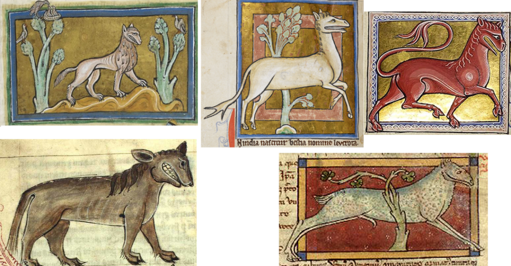
Leucrota images courtesy of the Kongelige Bibliotek (lower left), Bibliothèque Nationale de France (lower right), and the British Library.

The leucrota was believed to be a cross between a lion and a crocotta (a “dog-wolf”), with hind-quarters like a deer. The drawing top-left somewhat conveys this idea, it has claws and a more lion-like mane, but the drawings top-right scarcely resemble the offspring of a dog-wolf and lion—they have the head of a horse and the feet of a deer, and the bottom one looks like a cross between a sheep and a deer. The leucrota in Ms Bodley 533 doesn’t even resemble the images above, it looks like an angry sheep.

The only feature the various leucrota have in common is the distinctive long grin.

The leucrota isn’t necessarily mythical. It is sometimes described as a cross between a lion and a hyena, which may originally have been an attempt to describe a different species of hyena. The brown hyena (right) is quite a bit larger and furrier than the more familiar spotted hyena:

Left; Spotted hyena with mane, stubby tail, and fearsome grin, courtesy of PBS.org Animal Guide. Right: Brown hyena, which is quite a bit larger than other hyenas, and may have inspired descriptions of the “leucrota” (described as a cross between a lion and a wolf-dog (hyena). Image courtesy of Bernard Dupont on Wikipedia.).

If you look at the individual features of the leucrota in medieval drawings, the features seem a little less strange—the hyena is a doglike animal with a mane like a horse, the aggressive temperament of a lion, a moderately short tail used for signaling (like a deer), long legs with hoof-like paws, and a ferocious toothy jaw. In a way, medieval drawings are descriptive of individual parts even if the overall composition goes slightly awry.

Note that the drawing of a hyena in the manuscript below-left is more realistic. The illustrators of Arabic manuscripts lived closer to hyenas than those in central and northern Europe and were more likely to have seen them. Northerners tended to stylize or completely fictionalize the animal.

Using Props to Tell the Story

The hyena is both predator and scavenger. Its scavenging instincts were often expressed by drawing the animal stealing a corpse (bottom-right). Once the meme of the corpse-stealer became familiar, the illustrator could take liberties with the way the animal was drawn. Visual memes and attributes served as visual memory aids:
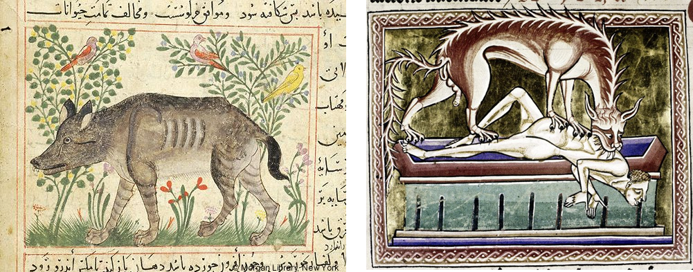
Left: a more naturalistic rendition of the hyena in an Arabic manuscript. Right: A stylized version of a hyena-monster desecrating a grave and stealing a corpse, a reference to the hyena’s scavenging habits.

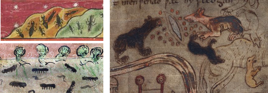
In a previous blog about castorum, I included drawings of beavers that are quite fanciful, and here is one of my favorite drawings… ants that look like dogs and bears, from Cotton Vitellius A XV:

It’s a Croc

Equally strange are medieval drawings of crocodiles.

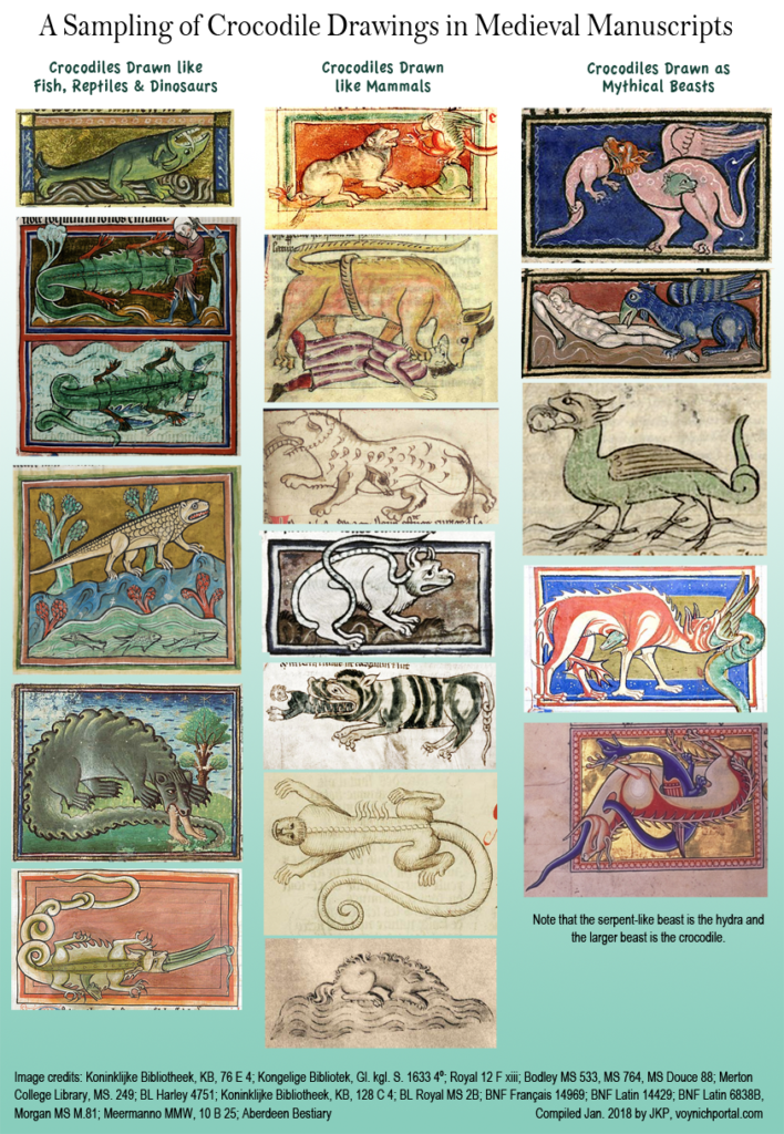
The smile of the crocodile is similar to the hyena’s toothy grin, but that’s where the resemblance ends. The medieval crocodile is sometimes drawn like a fish, sometimes like a lion, giant dog, monkey, or furry hedgehog, and sometimes like a basilisk, dragon, or dinosaur. There are even some that look like leucrotas.

The only way we know for sure it’s a crocodile is because it says so in the text, in combination with familiar legends, such as the crocodile eating a man (and crying crocodile tears after doing so), and the crocodile being outfoxed by the hydra.

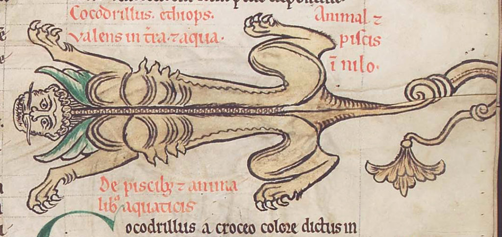
There are several medieval crocodiles that look like monkeys, and one of them is slightly more reptilian than the others, but even it has a primate face rather than a reptile face. There is also one that looks more like a human-faced lion than any kind of reptile:

The crocodile carving on the wall of Chichester Cathedral (c. 1330) looks like a big fat beagle with a somewhat human face. You would never guess it was a crocodile.

There are many crocodiles drawn like mammals, I couldn’t fit them all, but the examples above should be enough to get the idea across—you can’t tell what they are just by looking at them.

What about lizards and salamanders?

Voynich researchers are probably wondering how lizards and amphibians are drawn because the VMS Scorpius looks more like a reptile/amphibian than an arthropod.

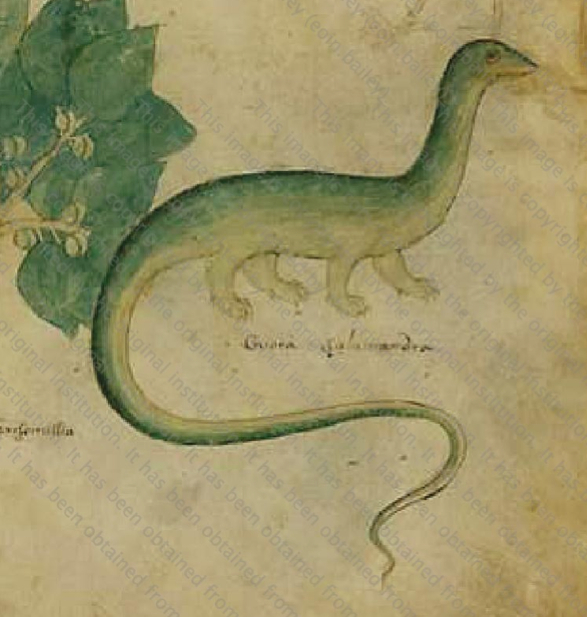
Sloane 4016 is a well-known herbal manuscript that includes a brontosaurus-like salamander standing on fat, upright legs (rather than splayed legs), labeled “salamandra”:

Here’s an even more extreme example from Montpellier H 437:

[Image of medieval salamander that resembles a kangaroo]

This might look like kangaroo road-kill but it’s clearly labeled “salamandre” [Montpellier H 437].

The giant dog-kangaroo in H 437 is labeled “salamandre” (salamander) and has the “fire salamander” flames to confirm that the text and image are in synch with one another.

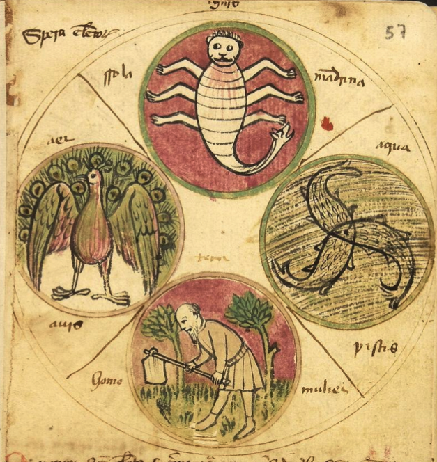
The following illustration of the elements in Biblioteca de Catalunya. Ms. 1452 (based on Ramon Lull’s 13th-century astronomy/astrology) makes this association between fire and salamanders even more explicit. In this diagram, earth is represented by a man working the soil, water is a trio of fish, air is a peacock (which ironically can’t fly very well and rarely takes to the air), and fire is a salamander that looks more like a scorpion than an amphibian with the deeply curved tail and extra legs, but is clearly labeled “mandrina” which is short for “salamandrina”—an amphibian:

Crocodiles and lizards are reptiles and the drawing of Scorpius in the VMS and a number of other manuscripts that include zodiac symbols are drawn as reptiles/amphibians, dragons, turtles, and frogs. Here is version 1.1 of a map I created of the zodiac symbols that most closely resemble the reptilian creature in the VMS (originally posted on my 2016 blog about Scorpius symbols):
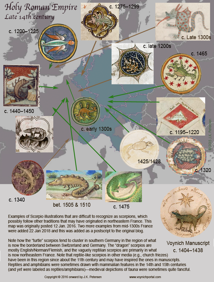
As can be seen by these examples, Scorpius symbols of a vaguely repitilian/amphibian character with upright legs occur in European manuscripts in the 14th, 15th, and 16th centuries, especially in France. I did locate one more lizard-like creature from the 16th century, and an earlier example of Scorpius-as-serpent, but opted to leave them out of the map.

Can We Tell Them Apart?

The medieval lizard-like Scorpius can usually be distinguished from medieval crocodiles by thinner legs, overall smaller size, and a milder expression on the face (crocodiles are frequently shown biting a human or a hydra). It’s not a big difference, but clearly none of the zodiac-Scorpios look like kangaroos, boars, monkeys, dogs, or lions.

As can be seen from the map, turtle-Scorpios tend to be from southern Germany and the Alsace, dragon-Scorpios from England/Normandy, and the zodiac symbol that most closely matches the VMS Scorpius in general proportions and uprightness of the legs is from Paris, France.

It seems very likely that the VMS zodiac illustrator had seen Parisian manuscripts or had visited churches with zodiac friezes in the north-east of France, where lizard-like Scorpios were cast into stone as early as the 11th century.

J.K. Petersen

Copyright © 2018 J.K. Petersen

_________________________________________

Postscript 7 June 2019 [addition]: I found this drawing in an early 14th-century English manuscript and felt it was appropriate to add to this blog.

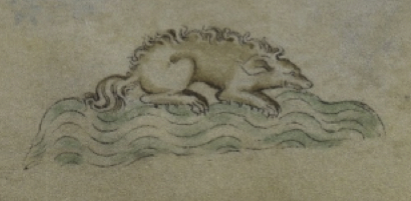
It has long ears, a long nose, a ridge of wavy fur along its back, and a fluffy tail. Can you guess what it is?

C. 1315 English MS crocodile

British Library MS Royal 2 B VII (a crocodile).

Roundup of Past Blogs

23 January 2018

I realized today it might be a good idea to post an occasional roundup of blogs to make it easier for readers to find related information. Most of the topics discussed on this site are too long to present in one post, so they are split up over a series of blogs. When read individually without the previous background information, they don’t make much sense, so hopefully this will make it easier to find related topics.

Voynich Text

Could some of the glyphs with ascenders be pilcrows?

Some observations on transcriptual interpretations of “dain” (this is very introductory, I have much more information on this, including statistical charts)
Observations on individual characters with parallels in Latin and Greek scripts:

A sample of Voynichese that illustrates how the text is heavily rule-based

General observations on paleography – some notes on two very similar scribal hands

Introduction to entropy for those who are unfamiliar with the term and want some clarification so they can explore some of the VMS computational attacks


Voynich Marginalia

Trying to discern the column text on f1r (Colorizing the text so it’s easier to see the letter forms)

Marginalia and possible color annotations on f1v

The marginalia on 66r (the prone figure with the pot)

Marginal Notes on f17r (I’ve written about this several times and have posted additional information on the voynich.ninja forum and I keep coming back to it, hoping to improve the interpretation, so this is a work-in-progress)

Folio 116v (the last page):

  • The “plummeting rock” (Some observations on the strange rounded shape on the last page)
  • The text on the last page (I’ve blogged about this several times. I keep coming back to it, hoping I can see it with fresh eyes and a different point of view.)
  • Introduction to healing charm (Abracula) and the last page marginalia (July 2013)
  • Introduction to the last page script and the handwriting on the last page (These blogs are from 2013 and are a bit dated—I have a huge amount of new information on this topic that I will post when I can find time.)
  • Is the last page a healing charm? (A 2016 continuation of the July 2013 post on the text and healing charm)
  • more on Pox Leber/Leben
  • what if it were French instead of German?
  • A paleographic investigation of the last-page marginalia text, Sept. 2017 (I have more information on this now that I will post when I can find time)

Parallels in scribal conventions between medieval Latin and Indic scripts

The conceptual basis of relative music systems and how they might be applied to ciphertext


Voynich Imagery

The Nymph on 77v (some possible interpretations of the arms-spread nymph… note that Cassiopeia has also been suggested by other researchers, and explored in some detail by K. Gheuens)

The Baths of Puteolanis (interesting parallels between the ancient baths near Naples and the VMS drawings)

Do the nymphs around the zodiac symbols represent a series of cycles?

Some of my earliest ideas about the top-left circle on the “map” foldout (note that these were some of my initial ideas from 2008, since then I have had several more and have also seen some fascinating visual parallels posted by other researchers such as a scallop shell recently posted by K. Gheuens)

Interesting parallels between water gardens and the VMS “map” page. I was hoping to find the water garden that inspired the Villa d’Este which might, in turn, have inspired the “map” page.

Interesting Visual and Cultural Traditions:

Examples of mnemonics in an herbal manuscript (Palatino 786)


Voynich Zodiac-Symbol Shapes

One of my earliest posts on the zodiac symbols and their marginalia labels from 2013 (subsequent blogs include much more information on the imagery)

Brief introduction to astrology and the history of zodiac imagery, including a map.

Trying to make sense of the VMS “zodiac” section – one possibility


Commentary on Various “Solutions”

General statements on code-breaking (not a solution) by Cicco Simonetta


Physical Characteristics

Brief list of manuscripts similar in size and dimensions to the VMS


History & Provenance

The item put into auction was a Kraus catalog mentioning the VMS, not the VMS itself

Guglielmo Libri catalog


General Cryptology

Glyphs from the mysterious note in the dictionary (not directly VMS-related)


This is a not a full set of links. I haven’t included most of the early blogs from 2013 (they’re mostly about plants and it would take too much space), but if I have missed some of the more recent ones (which is quite likely), I’ll update this page as I come across them.

J.K. Petersen

Ka Nu Se Me?

18 January 2018

I’ve tried to avoid cipher-related puzzles other than the VMS. I wouldn’t mind looking at the Dorabella cipher, but even that is on my stay-away list—there aren’t enough hours in the day for all of them… but last night, just before going to bed, I was tugged into Klaus Schmeh’s blog by the following image. He has been mentioned a few times by Voynich researchers, so I have glanced at his site once or twice, but haven’t had time to read the articles. Last night I couldn’t resist because I noticed shapes in this note that looked familiar..

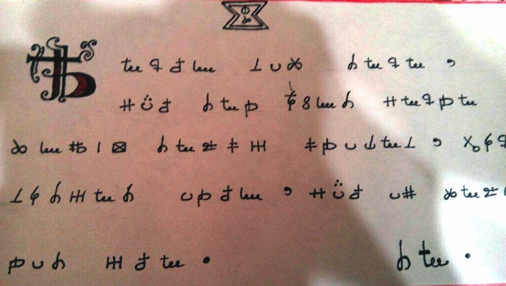
Schmeh posted the following note at the beginning of January 2018 and explained that it was originally uploaded to Reddit in November 2017:

I don’t know how much discussion there has been since November (or if the mystery has been solved since Klaus posted it at the beginning of January), but I wanted to jot my first impressions because it jumped out at me as having shapes similar to Japanese Hiragana and Katakana, which are syllabic character sets used for words that are not easily expressed with Kanji characters in the Japanese language.

A Little Housekeeping…

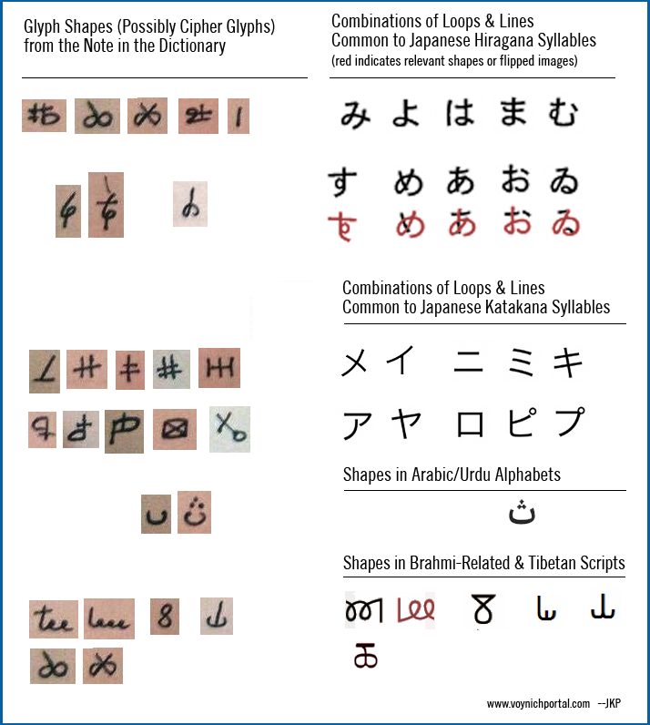
Sometimes the easiest way to explain something is to rearrange the shapes according to how they are constructed. Note that I have not studied these word-tokens grammatically other than to notice some are short (1 character) and others are longer. The chart below is a record of my first impressions after looking at the note for a few minutes. At first I thought it might be a straight substitution code but moments later realized the symbols may represent syllables rather than letters. The text on the bottom right looks like it might be a signature and the logo-like image at the top reminded me of the letterhead for a frat/sorority house or secret society. The note must have had some significance to the creator because he or she took extra time to draw the embellished initial.

Note that glyph shapes P, X, and 8 are common to many languages—it’s difficult to classify them, but there are many shapes in this short note that are similar to Japanese phonetic symbols. I’m not positing any direct analogies to Japanese script, the note is probably cipher text, but the shapes have proportions and combinations of loops and lines not unlike Hiragana and Katakana and may have been inspired by Japanese script or was devised by someone with an Asian background:

Unfortunately, I don’t have enough time to really delve into glyph-frequency or grammatical structure to see if the shapes match related sounds in Japanese, Arabic, or Brahmi languages (all of which are syllabic languages). Part of the problem is that shared symbols in natural languages are often assigned different sound values, depending on the region. For example, the Arabic alphabet is used to write many languages, from Africa to eastern India, that are mutually unintelligible.

I don’t see anything in the note to indicate a Korean origin for the glyph-shapes. Any resemblance to the Korean alphabet is small and probably superficial.

I see no strong evidence that these shapes are based on western alphabets, either. Even the shapes that look like “tee” or “leee” in English aren’t necessarily western; these little loops are found in several Asian alphabets, drawn in several different directions.

I did wonder if the three glyphs on the bottom right might be a name. If the note were ciphered Japanese, for example, there are many possibilities such as Haruma, Hinata, Ryota, Hiroto, Himari, Akari, Haruka, and others—all of which are represented by three characters. There are just as many possibilities in Indic languages or one of the Asian languages written with Arabic glyphs.

Regardless of the inspiration for the shapes, if it’s ciphertext, the underlying language could be anything, perhaps even Hawaiian.

One thing I noticed is that if you take the looped symbol for “te” in one of the Brahmi scripts and flip it and add a cross-bar, it looks like the shape in the note that resembles “tee” in English. A coincidence? Maybe. Where in the book was the note found? How old was the book? How old is the paper on which the note is written? Was it scented? Where exactly was it hidden? Was there anything on the other side? Are the edges straight or deckle? What are the letters that were cut off in the scan?

In the absence of details, it’s just one guess after another…

Where was the book found? Europe? Asia? the Americas? Could it have been written by someone in Asia to someone outside of Asia? A love letter perhaps? Or a letter from a penpal in ciphertext? Pure guesswork at this point, but still an interesting riddle.

J.K. Petersen

Copyright © 2018 J.K. Petersen, All Rights Reserved


Postscript Feb. 2, 2018: Something I didn’t mention when I originally posted this is that the symbol that looks a bit like a pair of scissors resembles a Mandaic character if you flip it 180°.

The reason I was reluctant to mention it, is because it’s an isolated character. The rest of the Mandaic character set doesn’t match the shapes and structure of the ciphered note as well as Hiragana and Katakana.

If you look at Hiragana syllables as a group, you will see an overall lines-and-loops design that differs from the straighter more sparse Katakana symbols. This is how native words in Japanese are distinguished from foreign words. It’s similar to the way we use italics in English to distinguish foreign words from the rest of the text, except that in Japanese, a separate set of shapes is used.

I suppose it’s possible that whoever wrote this might have selected a single shape from the Mandaic alphabet, as they did with Arabic/Urdu.

Final Page, But Probably Not the Finale

9 January 2018

Like an ancient whale surfacing for air, discussions of the marginalia on folio 166v re-emerge from time-to-time. The subject this time was a possible French/Catalan interpretation, something Nick Pelling has apparently written about in the past and commented on in his Cipher Mysteries blogs.

I haven’t seen Pelling’s earlier writings about this folio, but I’m fairly certain the marginalia at the top of f17r is the same hand as the final page. Also, the f17r marginalia includes a word that looks to me like mallier (an ending often found in French), so I’m perfectly willing to consider a French interpretation, especially since porta?/portas/portad on the last page is a construction common to Romance languages.

If we evaluate the top line as French/Provençal, there are a number of possibilities. But first, I should mentioned that I thought for a long time that the last letter in this line was “r”. Now I am not so sure. The more I look at it, the more it resembles some kind of i-like blip followed by a worm-hole. If that’s a wormhole, then it’s probably not an “r”. I wish it were, so this line might be interpreted as a piece of verse. Then one might get something like this:

por le ber [o]u mon votr[e] fer   or   por le ber [o]u mon votr[e] fe

Yes, I know, this isn’t good French or Provençal, it’s as much of a potpourri as any German interpretation, but it shows that the top line is not necessarily germanic in the same sense as “so nim[m] gaf/gas mich” on the last line.

The words in the middle are by no means clear. It could be “um en” or “urien” or “uri on” or “[o]u mon” any number of odd interpretations. The second letter looks like an r that was turned into an m and the third letter is nothing I recognize except perhaps ç (which would not normally be followed by “n”).

The last word isn’t much better. The first letter looks like v, or p with the stem partly erased. The next letter is bizarre, neither “u” nor “o” but a somewhat Voynichese-backwards-leaning “u”. The next letter is unclear, but perhaps a p or a badly formed “r”. The f has part of the top erased, the “e” is clear and then the last letter is ambiguous, somewhat like “r” and yet not.

What could it mean? In Provençal, “le ber” refers to a noble and eventually became a surname, and “fe” is faith. If it’s “fer” then it’s something that is done. If one then looks at the second line through the same lens, we might end up with something like this:

au chi/qui ton o la dabas + imil tos + te/re +  c?e + cere/céré + portas + m

In some Provençal dialects, “qui” (who) was written as “chi”. Unfortunately, even though there are some Romance-language words here and “au qui ton” isn’t completely weird, the sum total of the line doesn’t make any grammatical sense.

If it were Spanish, one might be able to wrestle something out of “oladabas” if one assumes the first “d” is an “s” with a pen skip. Then it could be interpreted as “o las [h]abas” (or the beans).

So, it still comes out as a gobbledy-gook of French, Spanish, Latin, Voynichese, and German, with no cohesive meaning.

The only place I can think of where they might have spoken like this would be the borderlands between Switzerland (French and German), Provençal (Spanish/French/Italian), and Italy, where blended versions of French, German, and Romance languages were spoken and were mixed with Latin in scholarly circles. Either that or the writer used a set of tables in a variety of languages, with words selected and combined according to some system that’s not easy to discern.

Two or More Hands on the Last Page?

It’s important to note that the ink on the top line is slightly browner than the three lines lower, and if you look at the way the letter ell is drawn on the top line, with an added straight bar across the top loop, rather than a connected, angled bar as on the second line, there’s no guarantee these were written by the same person. Note also the smaller, more angular “e” on the top line, compared to the larger, rounder ones on the other lines. It’s the same style of handwriting, one that was extremely common (Gothic), but was it the same person?

It’s really hard to tell, especially when the marginalia on f17r illustrates both styles of ell (angled tops and straight tops):

A straight, disconnected loop on the top line is rare enough in Gothic hands that I hoped it might provide clues to the cultural identity of the scribe. For years I’ve searched for straight Gothic-style loops, and only found four that were were similar enough that I thought them worthy of note. One is in a manuscript of unknown European origin, one is thought to be from Germany, the third is attributed to Nuremberg, the fourth is possibly Venetian.

There are two that are not quite as distinctly similar, one from Clairvaux, France, and one from Germany. Perhaps one day I’ll hit a bingo and find a perfect match. In the meantime, I’m not any wiser as to the meaning of the text, but it’s always interesting to look at it from another point of view.

J.K. Petersen

Copyright © 2018 Jan, J.K. Petersen

Eyes, Ears, Nose, and Tropes

7 January 2018

What are those eyes, faces, animals, dragons, demons, and other oddities added to plant drawings in herbal manuscripts? In medieval society, there were no encyclopedias, nature shows, or PDAs, and a very high proportion of the population was illiterate, so these added details served as memory aids to help the reader understand the plant.

Palatino 586, an herbal manuscript created around the same time as the VMS, has a large number of figural drawings associated with the plants, but they are hard to see due to the low resolution of the scans. Hopefully some day better scans will be available so we can fully appreciate their intricacy and significance. A few years ago, I did my best to read the text and interpret the drawings and was able to puzzle out some of the enigmatic additions.

This small selection of examples provides basic tips on interpreting the drawings.

Let’s start with one of the easier ones…

Page 10, Lower Left and Right

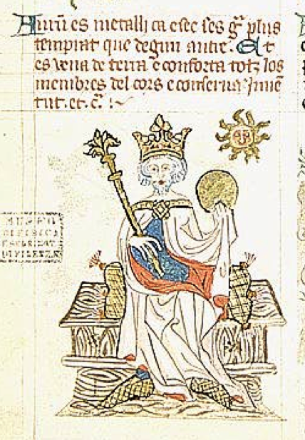
On page 10, the text introduces Auru’ (Aurum), which is Latin for gold. Underneath is a royal figure with gold scepter and crown. It was not uncommon for metals and minerals to be included in herbal texts, as some were used for medicinal purposes or as ingredients in composite formulae. In this case, the memory trigger is not medicinal uses, but common uses—the king holds a large gold coin, orb, or platter. The sun, suggesting a golden color or light, shines close by.

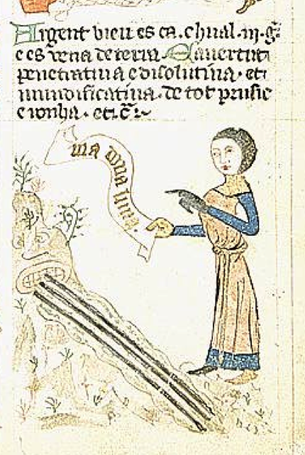
To fully understand this drawing, however, you have to look at the next one, which describes Argent (silver). It won’t surprise modern viewers to see gold and silver together, as they are both precious metals used for similar purposes, but in medieval times, there were additional reasons for pairing these metals and the drawing helps to explain this. We see a personified mountain, indicating that silver is an ore that must be mined, but the figure next to it is pointing to a scroll that refers to luna (the moon) because plants, metals, and minerals were considered to have governing bodies up in the heavens. They believed that gold and silver were ruled by the sun and the moon and shared some of their properties.

Page 11 Top Left and Right

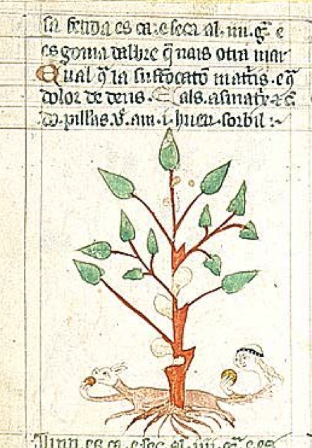
On page 11 is a slightly more enigmatic drawing—a woman and a dog consuming round objects next to a plant with lumps on the stem. Reading the text we see [A]sa fetida, now known as Ferula asafoetida. This is a large resinous herb that exudes sap from the lower stem and root. Dried and crushed, the resin has long been used as a flavoring agent and medicinal substance. Thus, the illustration indicates that this is consumed by humans, but why the dog? As it turns out, in both eastern and western medicine, asafoetida was used to treat digestive difficulties in dogs and horses. It can be found as a remedy in historic copies of Materia Medica that were adapted for veterinary use.

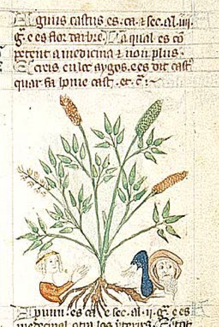
To the right, on page 11, is a plant clearly labeled Agnus castus (Vitex agnus-castus), a name found in many herbal compendia. It’s an attractive shrubby tree with long lilac-colored spikes.

The drawing is quite amusing. On the left is a pretty young damsel extending a friendly hand. On the right, the fellow is turning a shoulder, averting his eyes, and trying to wave her away. The common name for this plant is “chaste tree” as it was believed it could subdue sexual passion. It also earned the name of “monk’s pepper” in religious orders that promoted chastity.

Most of the mnemonic figures in Palatino 586 are not found in other manuscripts with similarly drawn plants—they are unique to this codex.

Page 12 Lower Left

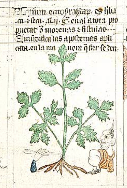
The name Apium emoyraydarum/hemorodarum is obsolete but Apium (usually A. graveolens) is historically used as a food, flavoring, and treatment for hemorrhoids and fistulas. Knights in armor frequently suffered various forms of sores and abscesses in the groin from long chafing horseback rides.

The diagram rather graphically shows a hand with a pointed object (probably a doctor’s hand with a surgical tool) and the patient with his butt and anus exposed. After a fistula was pierced or tied off, a salve that included Apium was used to coat the area to soothe the skin and help prevent infection.

Page 14 Bottom Right

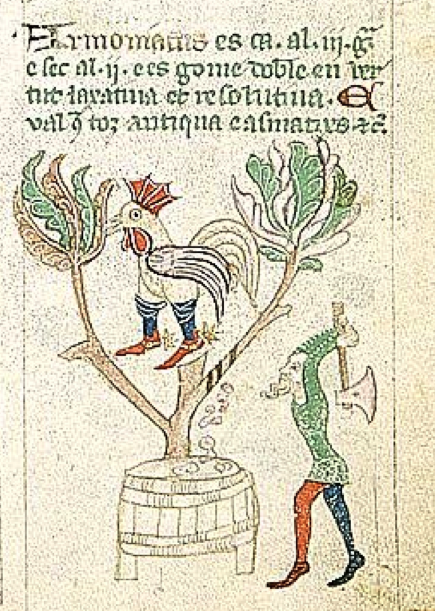
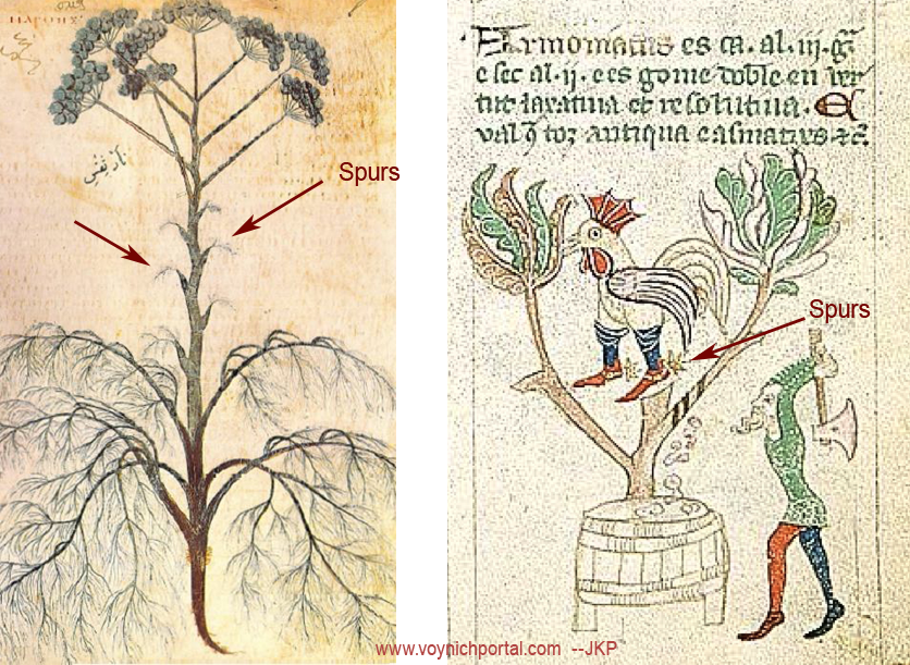
The next image is a bit more challenging to interpret, partly because of the rooster, and partly because scholars long disputed which plant might be the source of the gum called Armoniacus/Ammoniacum.

You might notice in the picture that the plant is large, and the fellow with the axe confirms that this was a tree-like herb of considerable size compared to other similar species.

Note the three stripes on one of the branches. Cuts are made to encourage the sap to ooze out and as it dries, it forms lumps of resin which, in this drawing, are collected in a barrel.

There are a number of plants that exude gum from their stalks or roots and asafoetida has already been mentioned on Palatino 586, page 11, so the plant on page 14 is probably one of the Ferulas or fennel plants, several of which were known in the Middle Ages.

So far, so good, but what about the rooster?

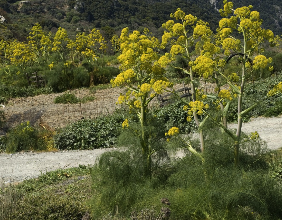
The gum resin called ammoniacum is obtained from Dorema ammoniacum (a plant that can grow to nine feet). It was imported from India through Persia, but this form of gum was probably not known in the west in the Middle Ages. Instead, medieval herbals make reference to a gum from Africa. One possibility is Ferula tingitana, a south and east Mediterranean tree-like plant called Giant Fennel, but scholars have long doubted this. In the 18th and 19th centuries they proposed Ferula linkii and Ferula communis as better options. Some even suggested ammoniacum might come from Sylphium, the famous plant on ancient coins that is thought to have gone extinct due to over-harvesting (it was reputed to have chemicals effective for birth control).

The dispute was finally settled (or so they thought) by growing one of the plants in the famous Kew gardens, and waiting until it bloomed to discover its species. The verdict was Ferula communis, a plant that grows in two common forms.

Ferula communis, also known as giant fennel, narthex, or laser, is thought to be the source of gum ammoniac in the Middle Ages. However, some of the ancient herbals indicate another possibility. [Photo credit: Jan van der Straaten]

I’m not so sure the identity has been settled, and Palatino 586 adds a fascinating piece of history not found anywhere else by including a rooster with spurs. When I first saw it, I wondered if the spurs might be related to the slices on the trees, but some investigation of historic herbals revealed another possibility…

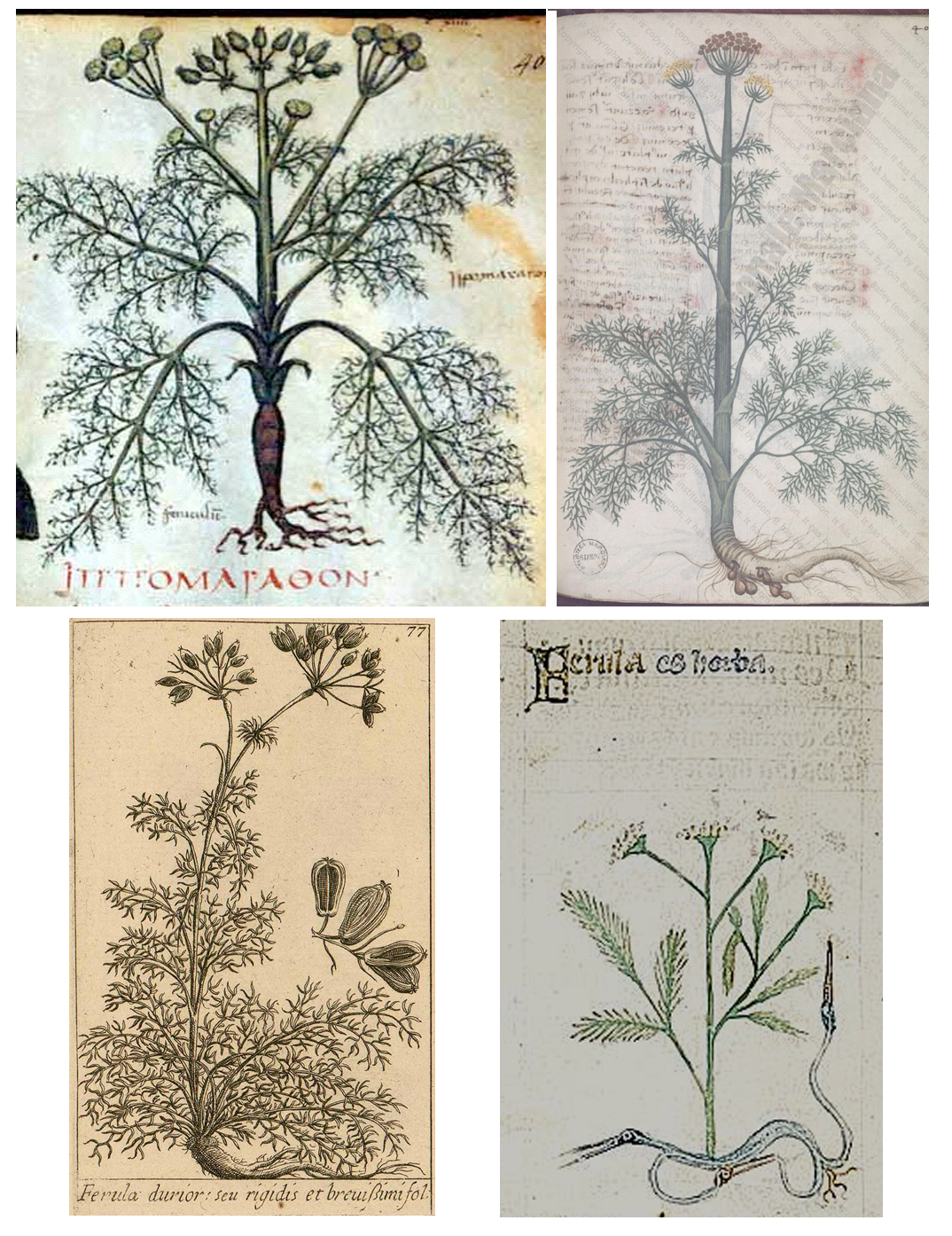
I haven’t seen anyone else mention this, but if you look at drawings of Ferula in herbal manuscripts, you will notice they are usually drawn like the following examples. Even Palatino 586 includes a plant labeled Ferula that has this form:

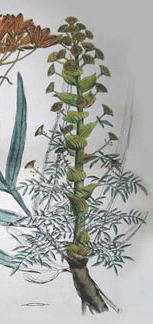
None of these images gives a clue as to why “spurs” are emphasized in Palatino 586, but this one might:

In a previous example, a dog was used to illustrate the use of the plant. In this case, I think the rooster is intended to help the reader identify the plant.

Ferula communis sometimes has spurlike projections, but it’s not a defining characteristic of the plant. Ferula tingitana is more spurlike than F. communis—it has leaf-like projections at the points where the stems branch—but they may not be prominent enough to inspire someone to draw a cowboy-rooster. However, there is another plant that is harvested for gum that is used medicinally that may be intended by these drawings.

Ferula narthex (right) is sometimes assumed to be another name for Ferula communis, possibly because the name narthex was loosely applied to many species of Ferula. However, F. narthex is a tall west Asian plant with thick stems that is more upright than F. communis, with very distinctive “spurs” at each node. It was probably known in Europe long before Dorema ammoniacum was imported.

Page 15 Lower Left

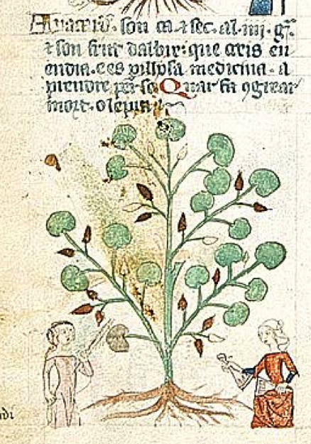
Anacer’u’ on page 15 probably refers to Anacardium and the maiden on the left is using a stick to knock the nuts from the tree. This is not the New World cashew, known as Anacardium orientale, but a cashew-like tree from India (Semecarpus anacardium) that was used for a wide variety of culinary and medicinal purposes. When black, the fruit is toxic, so it is harvested when it is a reddish color. I’m not sure what the maiden on the right is holding—it’s hard to see the details. It might be two bell-like vessels, or two pieces intended to fit together.

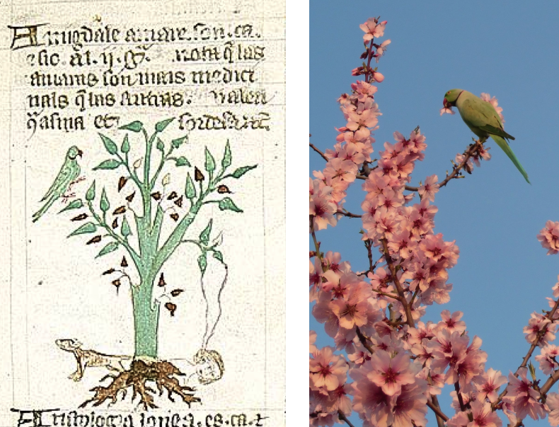
On page 16, the drawings are quite interesting. On the top left is Amigdale amare—bitter almond, a plant with a toxic seed. There’s a bird from the parrot family top-left, a dog by the base of the tree, and a woman’s face with something streaming out of the tree toward her cheek.

The bird can probably be explained by this Wikipedia photo by Jonathan Cardy, which illustrates the wild parakeet’s fondness for the flowers:

Bitter almond was known to kill dogs, even large dogs, and old medical texts state that the distilled liquid from the seeds produces dizziness, vertigo, and tinnitus in humans, which explains the liquid flowing from the tree to the ear of the woman on the ground.

Page 16 Top-Right

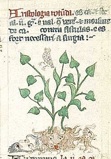
The image to the right also includes a bird at the top and a variety of faces at the bottom. Note that the demon-like face in the middle is somewhat rounded. This is to distinguish Aristolochia rotunda from A. longa, which has a slender root. In Sloane 4016, CLM 28531, and the Carrara herbal, dragons are drawn at the base of the plant, under the root. This is partly to indicate the name of the plant (serpentaria, snakeroot) and partly to indicate its purported use as an antidote to snake poison. It was also known to be toxic, which might explain the demon-like face in the 586 drawing. It is currently believed that aristolochic acid might contribute to kidney and bladder problems.

I don’t know whether they knew this by observation in the Middle Ages, but insects that eat the leaves of Aristolochia are injesting “chemical armor” that makes them toxic to birds.

The face on the bottom left presents a bit of a puzzle but maybe this is Aristotle providing a mnemonic for the name of the plant.

I can’t explain the catlike face on the right, with something like breath coming out of its nose, but perhaps it’s related to the smell of the plant. Aristolochia uses scent mimicry to lure pollinators, but it’s doubtful this was known in medieval times.

Page 22 Upper Right

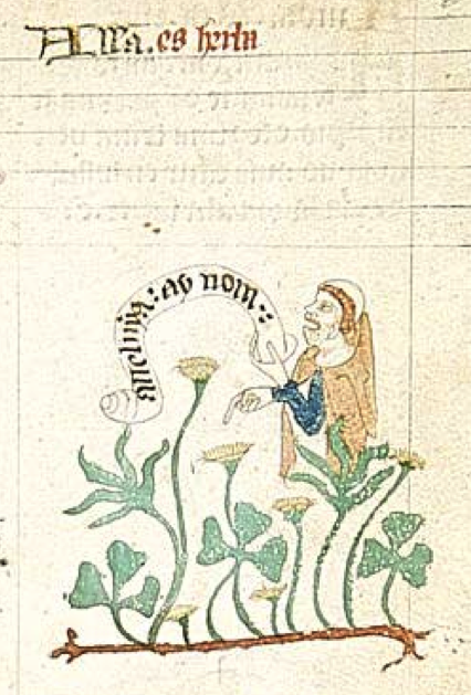
The text for the drawing on page 22 is incomplete, it says only Alla. es herba, but the drawing is accurate and one can immediately recognize the plant as Oxalis acetosella, plus, the figural drawing confirms this. We see a man dressed in monk’s robes holding a scroll on which is written “alleluya…” which is the common name for this plant and a word used in hymns. Note the rounded shape from which the scroll is emanating—it may represent the mouth of a singer or a horn, and the man’s head is thrown back with his mouth wide open.

Note how the rhizome (side-growing root) is drawn. I have Oxalis in my garden in a shady spot where almost nothing else will grow and it spreads quite rapidly through rhizomes, and yet the Manfredus and Carrara herbals, Sloane 4016, Morgan M.873, and Harley 3736 (to give a few examples), show only a basic root. Probably the best-known herbal that includes the rhizome is Egerton 747 (ca 1295).

Page 25 Upper-Right

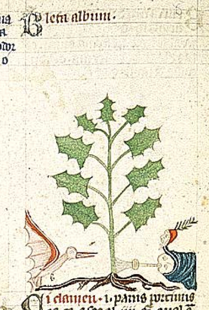
This is an interesting drawing with a bird on the left and a double-headed figure on the right with something horn-shaped by his mouth. It is labeled Bleta album.

Bleta refers to leaf and is usually associated with various forms of spinach and beet plants, valued for their edible leaves. However, this is obviously not chard, which has a mass of broad leaves growing low to the ground rather than jaggy leaves growing up the stalk. There are other forms, such as Bleta trigyna, that grow in this fashion.

Blitum bonus-henricus looks like this drawing when it is flattened and dried, the ruffled leaves taking on a more spiky appearance, and is commonly known as Good King Henry or Poor man’s asparagus. This is not based on an English king, however, it apparently comes from Heinrich which may, in turn stem from Old High German Heimrih (home ruler).

I’m not completely sure of the meaning of this drawing, but if the plant is Good King Henry, then perhaps the two-headed figure on the right is a troubadour with an extra head on his jester’s hat. Troubadours were performers skilled in puppeteering, acrobatics, juggling, clowning, and music—circus performers who were sometimes under the patronage of a ruler or noble house.

If the object in his mouth is a wind instrument, then it would fit with a king’s court filled with entertainers, and would evoke the name of the plant. It’s possible the bird is included because the seeds of the chenopods are very popular with birds. I’m not sure, however, since the seed tassels are not shown (perhaps because they are not the part of the plant that is used by humans).

On page 26 top-left, we see a woman wielding a broom, a common use for Bruscus ruscus. For page 28 lower-right, read the story about castoreum on a previous blog.

This is becoming long, so I’ll conclude with just one more…

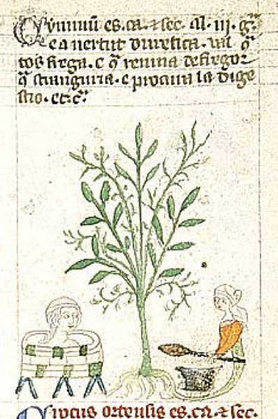
The drawing on page 30 (left) might interest Voynich researchers because there’s a bath, but to understand what’s going on, one has to identify the plant. I’m fairly certain this is Cuminum cyminum (caraway).

Cyminum was used as a relaxant and soother of swollen bronchial tubes, so imagine that you’re sick with a bad cold and you treat it with a nice hot bath and a steam-pot full of herbs to help clear your sinuses.

The picture on the right might not be a steam pot. It looks like she is holding a spoon, so perhaps the drawing on the left indicates the relaxant properties and the one on the right illustrates the plant’s use as a digestive aid.

Summary

This is just a small selection of examples, there are approximately 300 individual figures associated with plants on the first 60 pages so it’s not possible to cover more than a tiny percentage in one blog, but it should be enough to illustrate that the figures serve a variety of purposes—sometimes indicating the use of the plant, sometimes physical properties that set it apart from similar species, and sometimes the name.

J.K. Petersen

Copyright © 2018 All Rights Reserved, J.K. Petersen

Kantha – 4600 miles and 450 Years Later?

20 December 2017

Is the spirit of the VMS illustrations embodied in crafts from the 1860s? I wanted to include these images in previous blogs about rayed designs here and here, but a disparity of 450 years is significant. If you believe in the VMS-as-a-modern-forgery theory maybe you don’t find it strange that a medieval manuscript resembles 19th-century textiles, but if you’re confident it’s from c. 1420, it may leave you peering at details for hours.

Medieval cultural exchange between east and west typically occurred through men. Women stayed home to feed and raise the children while men took perilous journeys by land and sea that often lasted three to six years. For those less inclined to brave searing deserts or savage seas, Arabic-speaking traders in north Africa and the Middle East served as intermediaries. Thus, Europe acquired astrology from Egypt and the Levant, numerals and exotic spices from India, ivory and ceramics from north and west Africa, and many illustrative and medical traditions from the Greeks.

In contrast, textile embroidery was practiced mainly by women in rural communities who had less access to ready-made city wares (note, it was not uncommon for men to weave, but embroidery was usually left to the women). Living in isolation from men and often being barred from education, women developed distinctive vocabularies, and sometimes their own writing systems (e.g., the Nüshu phonetic script from China).

They also developed their own illustrative traditions, passing down skills and ideas from mother to daughter. Unfortunately, textiles embellished by women were of a practical nature, they were used for clothing, food covers, and bed linens, and would wear out in a generation or two, leaving few records, and the ideas behind them were orally transmitted, making it difficult to study their origins and evolution.

The Quilts of East India

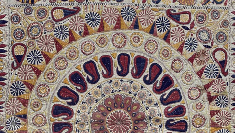
Kantha is an ancient Indic embroidery tradition, but it is difficult to find examples more than 200 years old. Most of those in museums are from the latter half of the 19th century, but the way the decorative, repetitive elements are combined is not dissimilar to the VMS.

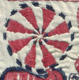
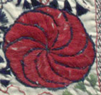
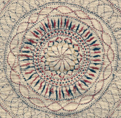
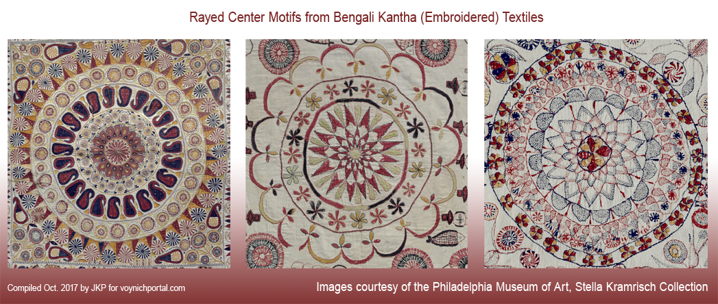
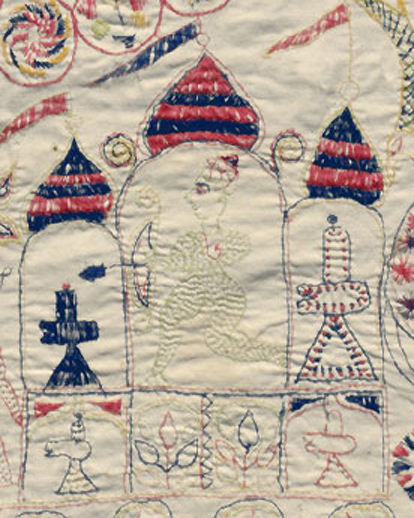
Common themes in kantha textiles include rayed designs, flowers, starbursts, family, flora, and fauna. You can even find cloudband shapes, circular diagrams similar to western depictions of the earth and stars, and circular rows of scales and points like those on the VMS “map” folio. Remember, these are 19th-century creations, so there was more exposure to outside influences, but they nevertheless retained many historic patterns.

These are some typical rayed designs:

And some stylized plants similar to menorah-tree-of-life images, from two different quilts:

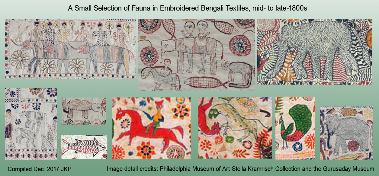
In the fauna category, elephants, snakes, birds, monkeys, and hoofed animals were popular and there are occasionally boars, sheep, and smaller cats. Being so close to China, one might expect dragons, but mythical animals were rare compared to those based on life:

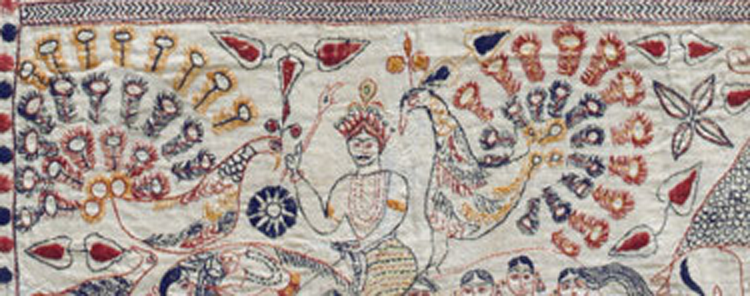
In the following detail, note how the peacock feathers were drawn, almost like tubes or spikes. Even though the subject matter is different, the way it was expressed reminded me of the VMS plant that has roots with “bolts” and the rayed design on folio 69v:

Here’s a shape (left) that might be hard to recognize, until you turn it in the other direction, and add the rest of the picture and then it is less similar to the odd shape in the top-left corner of f116v as it seems at first glance. Even so, it’s an unusual way to draw a tail:

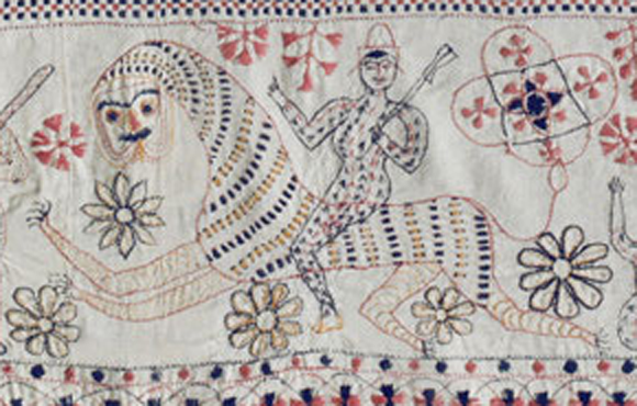
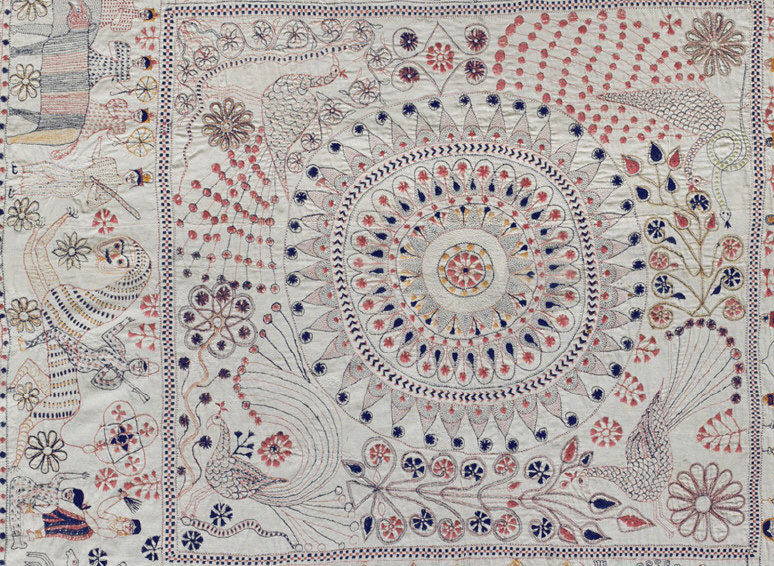
One critter that might be of interest to Voynich researchers is the long-necked maneless cat (possibly a tiger or leopard, although the tail is like that of a lion). Like many western medieval images of lions, it has a human-like face. Note that the rider is sexually ambiguous, dressed like a man but possibly having breasts.

Horses with riders are fairly common on kantha quilts, but a person riding a cat is infrequent, and similar to the astrological symbol for Leo in middle-eastern manuscripts. There is even a reference to God in Arabic on one of the quilts. In general, however, references to astrology (other than suns, moons, and stars) are not common in the kantha textiles of this era, so the image may only coincidentally resemble the middle-eastern Leo:

Storytelling in Kantha Textiles

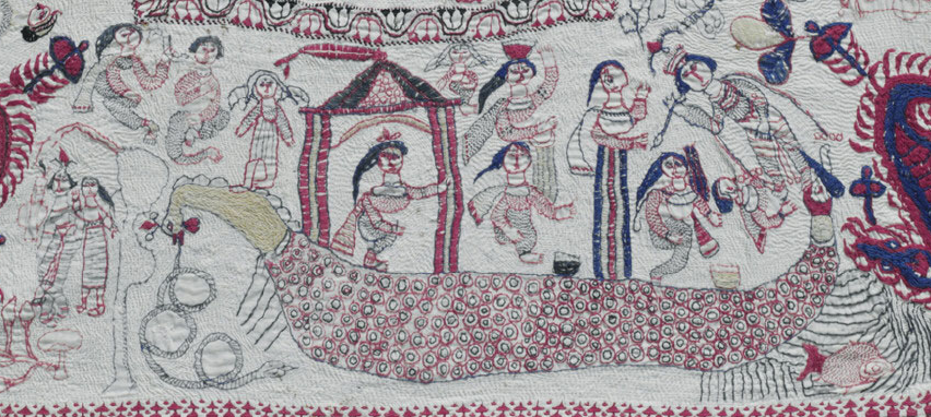
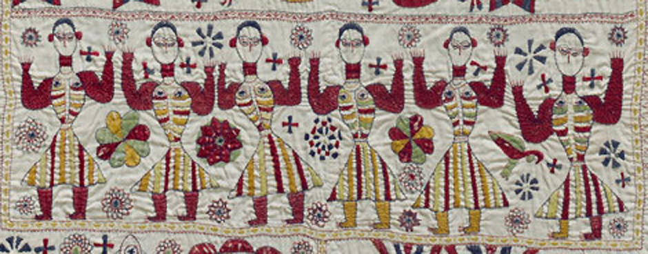
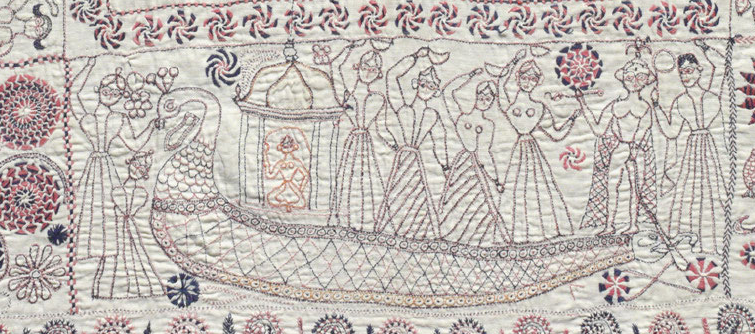
Some designs are narrative, commemorating special occasions, journeys, Hindu legends, and daily activities:

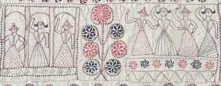
Imagine if these ladies were nude. It’s not exactly the Baths of Pozzuoli but it is an example of repetitive use of female figures:

In fact, some of them are nude from the waist up in a quilt of a similar style:

Could these ideas have reached the west in earlier times?

This kantha quilt (below) caught my eye because there was a certain aesthetic that emerged in southern France in the early medieval period that included “spinner” flowers (similar to those below right) and a stronger emphasis on deeper, brighter, warmer shades. I mentioned this in a previous blog about troubadors (some of which may have been Roma). There is a hint of this style in a few of the VMS flowers, as well:

More About the Circular Motifs

The following image, on the same kantha quilt as the long-necked cat, includes an infurled scalloped shape similar to a cloudband. Note also the dots inside the “scales” and the row of pickets around the outer edge, each with a spot attached to a string. The VMS “map” page has a number of similar patterns:

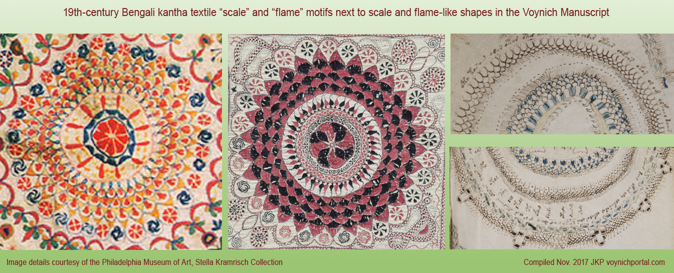
There are many instances of overlapping scale textures in the VMS. Scale patterns were common to many cultures, including Persian, Chinese, and many others, but it was interesting to see that scale and flame patterns are also found in the Bengali kantha:

It’s not surprising that kantha from southern Asia have a mandala-like quality, but there are also distinctive differences between the mandalas associated with monasteries and those created by Bengali quilters. Many of the monasteries are Buddhist. Today, the religions in Bengal are split east-west between Islam and Hinduism (with only about 8 to 27% overlap). Not long after these quilts were made, a sizable portion of the east Bengalis moved farther east to Assam.


Summary

It was not my intention to draw direct parallels between 19th-century Bengali textiles and 15th-century manuscript drawings, but I was struck by the similarities when you look at some of the repetitive decorative elements.

For years, I’ve searched the world for strong overlap, without much success. It’s easy to find a few examples here and there, but not all in the same place, and yet these interesting images occur within a dozen textiles.

Even when I scoured the cultural traditions of Afghanistan, Pakistan, Malaysia, and western India (many times since 2007), I didn’t locate as many similarities as I did in the Bengal/Bangladesh region, which surprised me because Bengal is near Nepal and SW China, and eastern India was never ruled by the Greeks and Romans in the same way as Pakistan and Afghanistan. Trade with this specific area was almost nonexistent in 15th-century Europe.

The odds of mostly rural Bengali textiles reaching the west are quite small (the Roma are said to be from the Sindhi area near the Pakistani border, not from eastern India, so it doesn’t seem likely they brought these). The designs are specific to the Bengal region (Pakistani, Afghani, and Persian textile designs have more in common with each other than with Bengal quilts), and whether it’s coincidence or not, they share  a certain design aesthetic with the VMS in the way that repetitive textures are drawn.

Even if there’s no connection to the VMS, I thought you might enjoy them… you almost expect a string to connect the hands of these figures to the star-like medallions nearby:

J.K. Petersen

Copyright  (c) 2017 J.K. Petersen, All Rights Reserved

A Rose or Not a Rose…

11 December 2017

On November 25th, 2017, D. O’Donovan posted an image of a decorated plate next to the center motif of Voynich Manuscript folio 67r. There’s no commentary or date accompanying the plate, but I’m assuming it was intended as a comparison to the central motif in the VMS design, as the paired images are both rayed patterns and O’Donovan cropped the VMS image down to emphasize the central rays. A larger image of the dish was added later that day, and was posted again November 30th, 2017 on her continuation blog on cloudbands.

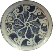
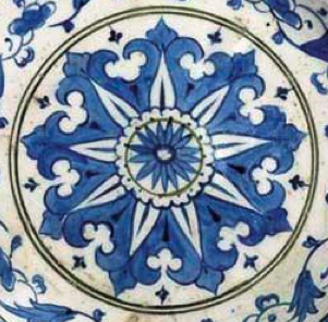
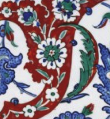
I’ve always been interested in antiques, so I recognized the plate pattern as one of the signature designs of Iznik ceramics, which reached its zenith in the late 16th century. The distinctive designs and quartz-enhanced materials are believed to be from a number of kilns in the Tabriz region. İznik (Nicaea) was a primary center for their production and distribution. Earlier designs (c. 1400s) include Iznik Miletus-ware (center detail shown left).

Is it possible that ceramic designs from the Iznik area are related to the central motif in VMS 67r?

There’s no question that they are visually similar, but the Iznik designs that are closest to the dish posted by O’Donovan were crafted about 100 to 170 years after the radio-carbon dating of the Voynich Manuscript. The 14th-century ceramic glazes and designs from this area are less similar to the VMS image than the later wares, but I thought Voynich researchers might appreciate some background information on Iznik designs so they can decide for themselves.

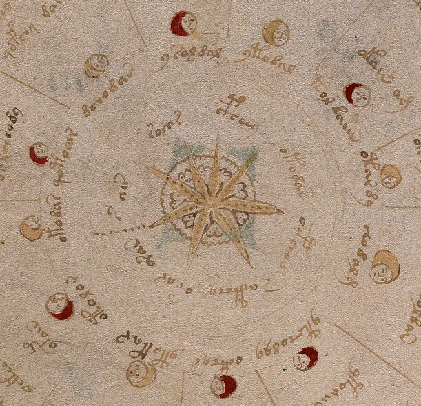
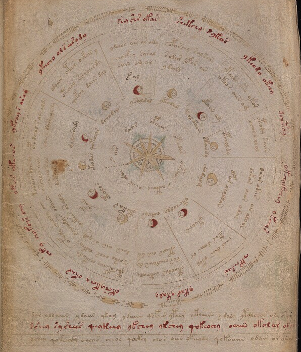
First, here is a wider shot of the VMS image. I’ve included the twelve moon-like circles because they may be contextually important to understanding the center (full Beinecke scan is here). The rayed motif in the center is the focus of the paired images on O’Donovan’s blog:

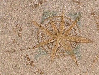
The VMS image consists of eight pointed rays painted brownish-amber, with a line of dots down the center of each ray. The four upper-left rays have six dots each, the others, seven dots each. Whether the numbers are significant is hard to tell. The lower rays are a bit bigger, so perhaps the extra dot is to fill the space.
To the left of the rays is a line of dots, possibly to demarcate the beginning and end of the accompanying letter-tokens. Behind the star- or starfish-like pattern is an unpainted almost circular band of scalloped bumps within which is a series of somewhat heart-shaped larger bumps. There are irregular clusters of dots in the inner bumps that make them stand out from the undotted texture behind them. The layering doesn’t make it clear whether the heart-shaped bumps are part of a larger design hidden by the rays or whether there are eight individual shapes between each ray.

The important details to note are the fairly straight VMS rays, joined in the center (with dots running through the middle), that sit on top of the unpainted scallops.

Iznik-ware is similar,  with rays and scallops, but the rays are behind the central “daisy” petals, and the difference might be important.

Iznik designs are mostly floral. The “rays” poking out from behind the petals are often painted green and sometimes more explicitly curved. They are often drawn from the top, sometimes from the side.

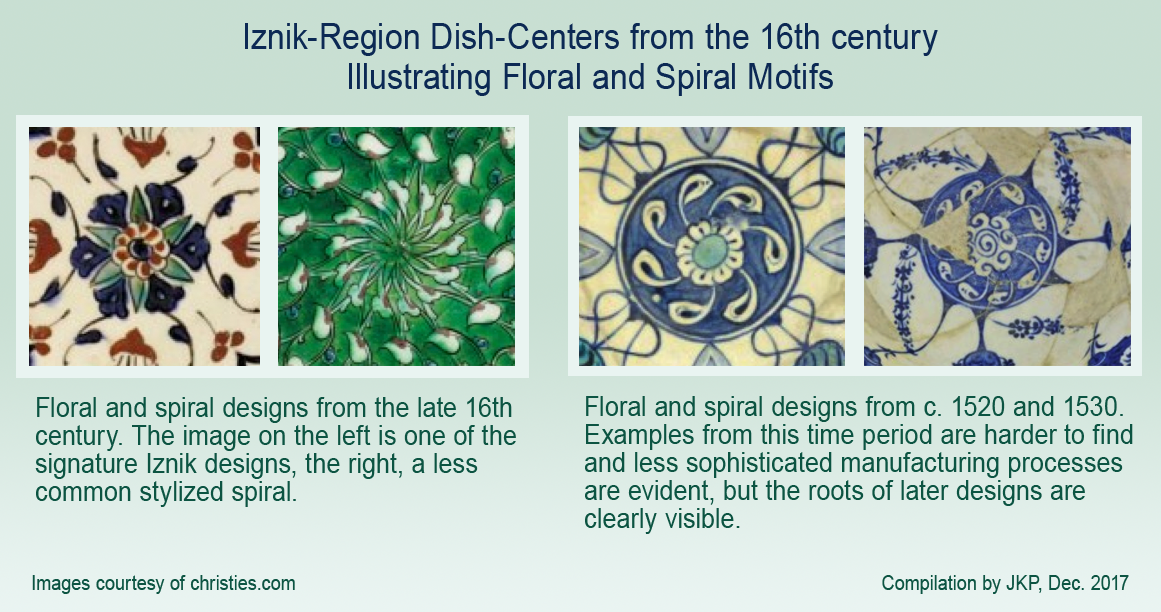
The image details on the right are both traditional Iznik from the late 16th century (courtesy of christies.com).

Iznik floral centers (below left) are typically divided into six or eight rays, but there are exceptions. Asters and Dianthus are especially popular, as their petal arrangements adapt naturally to rayed designs.

The red and blue pattern (below left) is similar to the VMS center motif. The green pattern second-left is less common and more stylized than most. It includes a slight twist suggestive of a spiral. Note that there are 13 rays, an uncommon number.

The two dishes below-right are from an earlier time period and very rare, c. 1530 with a daisy and spiral design, and c. 1520 (far right), with the same spiral but a more stylized center (7.5 sun-like curls and 10 rays). There are also sprays of flower spikes that extend the spiral motion. Note the flatter, more monochromatic glazing on the earlier examples:

The Whole Enchilada

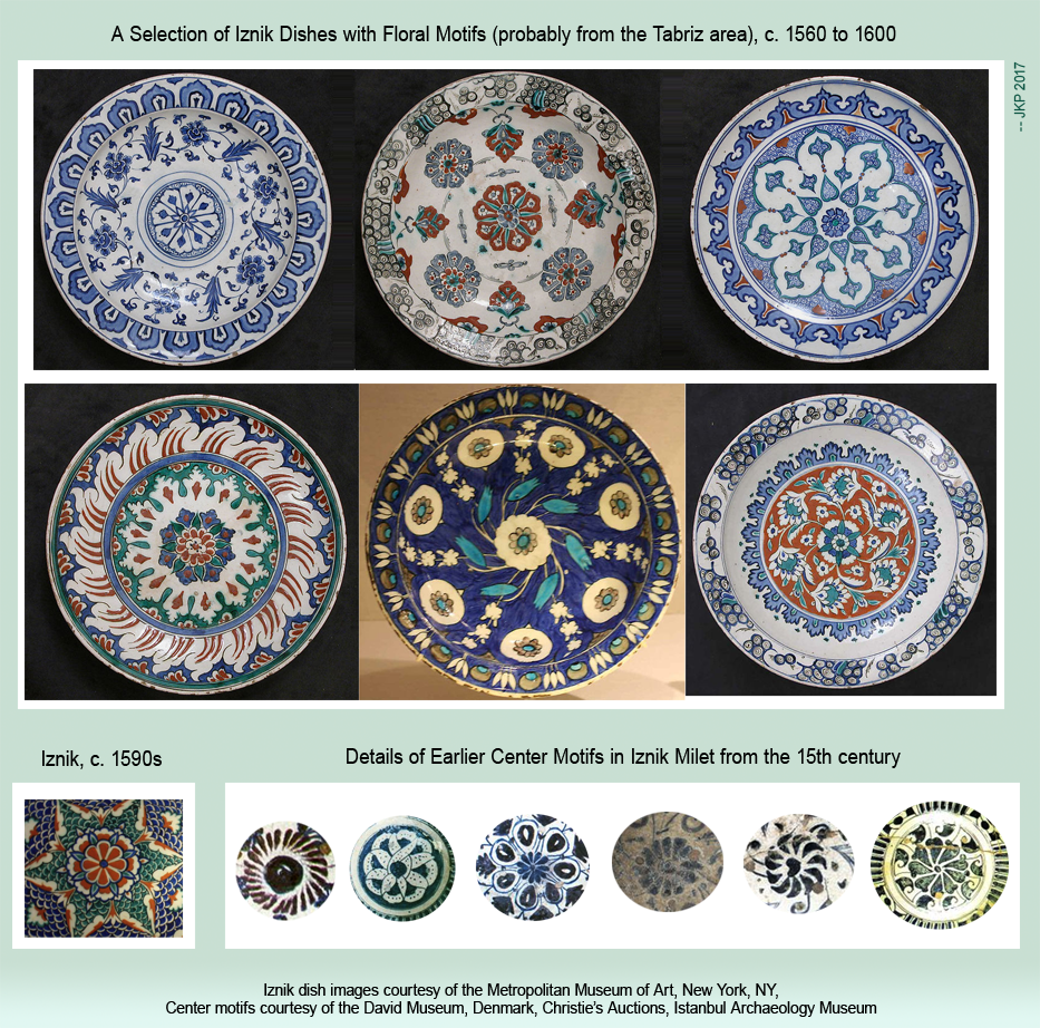
The following compilation shows the center motif in relation to the surrounding design. All are from the late 16th century (courtesy of the Metropolitan Museum of Art). One shows Asian influence in the outer ring in the flame- or cloud-like “petals”. Dragon-scale patterns were sometimes added for color and texture (bottom-left).

The details below the dishes (to the right) are very rare 15th-century examples. In the oldest ones, the flowers are often suggested rather than literal, with just a few petal-like brush strokes:

Could Iznik Traditions have Influenced the VMS?

Iznik and the VMS both include rays, but Iznik plates are historically based on floral patterns and the VMS design has pointed rays and lacks the daisy center (and is surrounded by moonlike shapes), so it’s hard to know whether it’s a similarity or a coincidence.

The Iznik center motifs that most closely resemble the VMS are too late to have influenced a 15th-century illustrator, and those that came earlier are a couple of evolutionary steps away from the later designs.

Are there centers that resemble the VMS more closely than designs on dishes? What do the moon shapes represent? Phases of the moon drawings are common in medieval manuscripts, but the VMS “moons” do not vary from full to crescent, and they alternate irregularly with single and double jumps and thus might not be moons at all.

The number of segments doesn’t necessarily reveal the meaning of associated symbols, but assuming the twelve-part division is meaningful, one possibility is that the VMS segments represent the relationship between the months of the year and the hours, as in the calendar-related computational manuscript attributed to Helperic, which is based in part on Bede’s De temporum ratione (St. John’s College MS. 17).

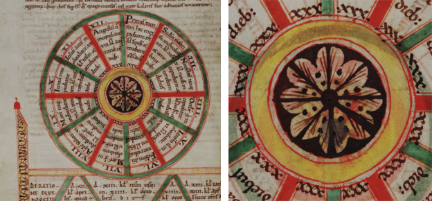
This manuscript includes a wheel divided into 12 spokes with an eight-pointed flower-like figure in the center (note the dots radiating between the spokes):

Reading the Latin, one can see that each segment, beginning at the top, is labeled in reference to a month: Primum mensem (1st month), Secondon mensem (2nd month), and then it switches to Roman numerals for the rest of the sequence.

Unfortunately, this wheel, while including an interesting center design, doesn’t shed much light on the rayed center in the VMS, or the moonlike shapes that surround it.

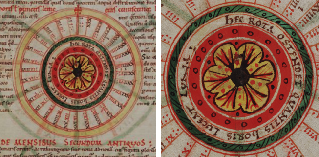
There is another wheel on the previous page that has a decorative center very similar to the one above except that the dark bands are replaced by triple branches and the surrounding red band is decorated with dots (the same design is used in the perpetual calendar on f34r):

In this diagram, the Roman numerals in the 31 spokes are meant to represent the hours of moonlight.

Could inspiration have come from time-related or cosmology-related diagrams in manuscripts?

Another Possibility

Volvelles are another source of very interesting center designs, and some of the more ornate ones from the 16th century are based on flower patterns. Volvelles also fit thematically with the VMS astrology/cosmology section. I can’t possibly fit all the wonderful examples of volvelles with decorative centers into this blog, but a quick search of Google images will give you an idea. You might especially enjoy the 13th-century volvelle by Benedictine monk Matthew Paris.

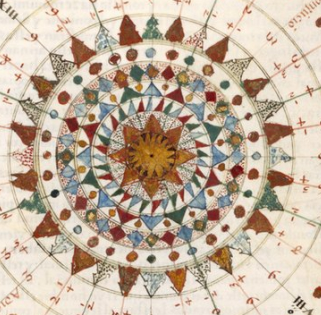
A related source of imagery is compass roses (right), but they tend to have single or layered star shapes and the cloud-like or petal-like background on the VMS star is not usually seen on compass roses and wind roses.

Maybe there’s another possibility…

This is just an idea, not necessarily the best one, but it might account for the moon-like shapes, the pattern, and the presence of the f67r text. Let’s take another look at the VMS drawing:

Dome in Hagia Sophia [Photo courtesy of Jorge Lascar, CC license].

Imagine for a moment that the rota in f67r is  domed, like a ceiling in a palace, church, or temple. Domes have been proposed for some of the other VMS drawings, but picture the spokes on 67r as architectural supports, or divisions created by paint or tiles. The outer edge of the VMS drawing is patterned. Maybe this pattern represents carved plaster or stone.

Rayed patterns are found in domes all over the world and often there are additional petals or rays between the main ones. Here is a very small selection of dome designs:

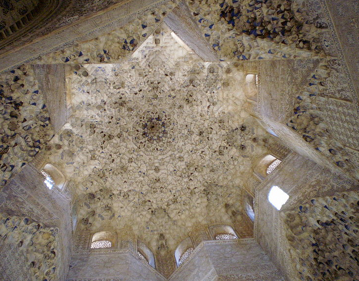
The deeply textured Alhambra star dome is reminiscent of the grotto-like textures throughout the VMS and the center could be interpreted as a drawing in a number of ways. [Photo courtesy of AnnekeBart, Wikimedia Commons.]

What about the moon shapes?

Domes are frequently decorated with important figures (religious, secular, mythical, magical)—the moons might be people, or perhaps coyly disguised drawings of arched windows that let in light irregularly, depending on the time of day and buildings nearby (or the presence or absence of doorways). When you stare at a dome from the ground, the upper semicircles are sometimes irregularly dark and light, and somewhat moon-shaped.

Since 2008, I’ve collected hundreds of pictures of domes to see if any of them match the VMS wheels or star patterns in the “cosmo” or general features in the “map” section. Despite a concerted effort, I didn’t find a match, but there are some interesting themes and commonalities (if you click on the links you will get targeted search results):

  • Many church domes have arched windows, central rosettes, and panels of allegorical figures or celestial themes.
  • Islamic mosques also have arched windows, delicate rosettes, and intricate compositions of text-as-image.
  • There are Indian temples with breathtaking and very symbolic domes that are 3D layered and mathematical in their embodiment (something that might appeal to the creator of the VMS), and which sometimes have protrusions like the “container” shapes in the VMS central rosette. I recommend clicking this link to see the stunning carvings.
  • Like the Indian temples, some of the Spanish domes have 3D grotto-like layers reminiscent of the multi-layered scale-textures in the VMS.

A Prevalent Theme in VMS Research

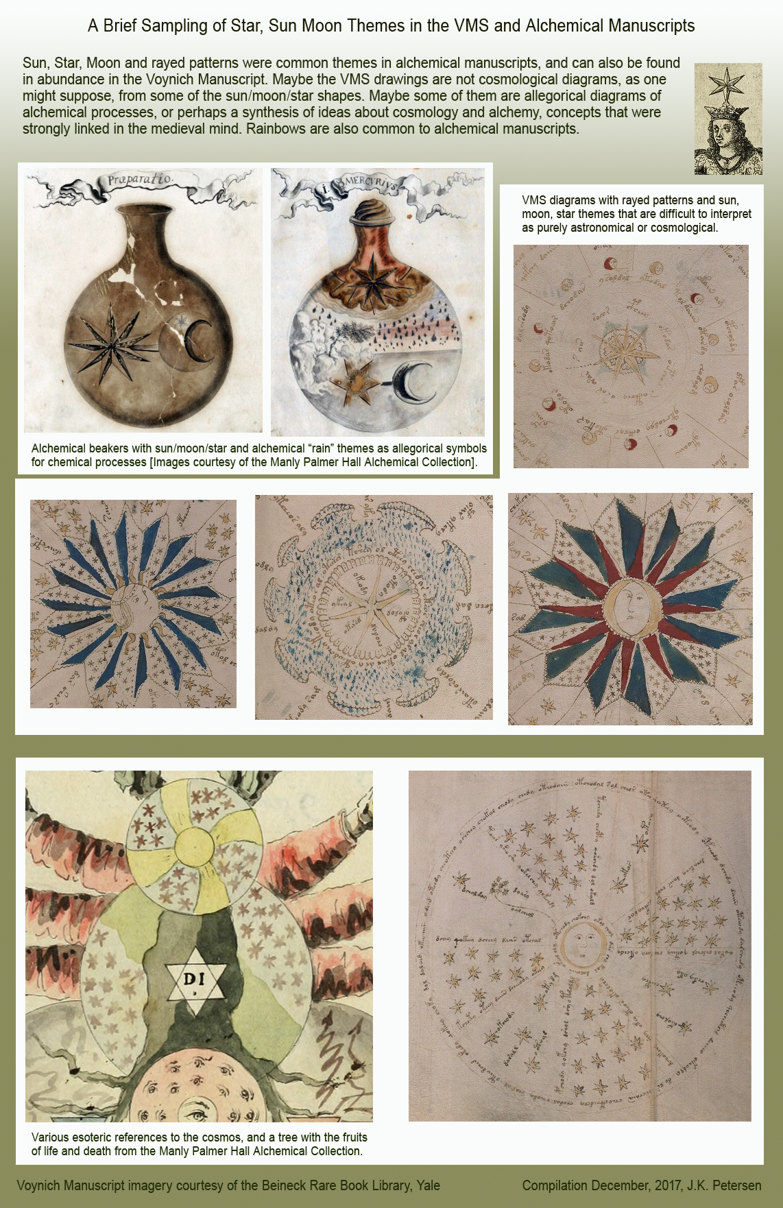
Even though medieval domes are full of rayed patterns, I didn’t feel satisfied that I had uncovered all the possibilities, so I turned to alchemical manuscripts and immediately found something more consistent with the shapes and themes on folio 67r, in combination with other drawings in the same section.

As a quick example (you can find many more on the Web), below is a pair of beakers with sun, moon, and star motifs, with the sun drawn in a dark/light fashion. Look at these together with the 67r two-image foldout and 68v (note also the tree on the craggy hilltop on the VMS 85–86 foldout):

Stars feature prominently, as well. Another of the ideas put forward in alchemical manuscripts is the transformation of lunar nature into solar nature (representative of chemical changes). I haven’t posted all the relevant VMS illustrations here, it’s far too much for one blog, but these should be enough to highlight the commonalities.

Summing Up

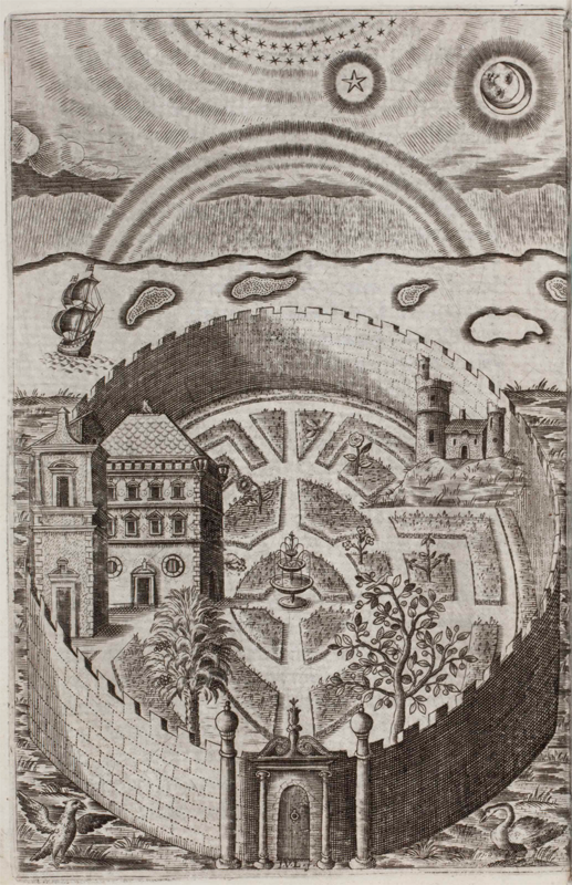
Henry Hawkins was a Renaissance-era Jesuit, as were Jacobi Synapius, Kircher, and many of Kircher’s circle of friends. Hawkins post-dates the VMS by two centuries, but there is an illustration in his book Partheneia Sacra: Or the Mysterious and Delicious Garden of the Sacred Parthenes (1633) that sums up many of the themes that are common to both alchemical manuscripts and the VMS. It includes a garden, birds, castles, cosmological symbols, rainbows, bodies of water, almost everything except naked nymphs:

Alchemy has been mentioned hundreds of times in connection with the VMS. I’ve frequently looked at alchemical texts myself, but what brought me back to it in this specific instance was the way the rayed design in f67r was drawn and integrated with other moon/star themes.

Even if there are alchemical references in the VMS, it doesn’t necessarily follow that the entire manuscript is focused on alchemical themes (some may be medical), but if I were to choose whether the center of folio 67r were inspired by the floral designs of the 16th century, or medieval alchemical drawings, I would choose the latter because the broader context of stars, moons, clouds, and other themes of an apparent celestial nature seems more in keeping with this quire as a whole, and because the pointed rays on 67r are more star-like than flower-like.

In fact, the dots coming out of the left-hand ray could represent a comet or a stream of light. Comets were included in most astronomical texts and many of the astrological and alchemical texts of the Middle Ages, and were drawn in dozens of different ways, sometimes even as spirals (see left)… or perhaps the line of dots doubles as a marker (for the start of the text) and part of the illustration at the same time.

J.K. Petersen

© copyright 2017 J.K. Petersen, All Rights Reserved

And the Clouds Parted

I’ve been collecting images of cloudbands for a number of years, but not as a concerted effort. If I come across something that looks interesting, I add it to the collection, but I don’t have many, less than 50, and I’ve scarcely looked at them, as most of my time is spent researching plants and text. A few days ago, I glanced through them and noticed one wasn’t a cloudband at all, but could easily be mistaken for one.

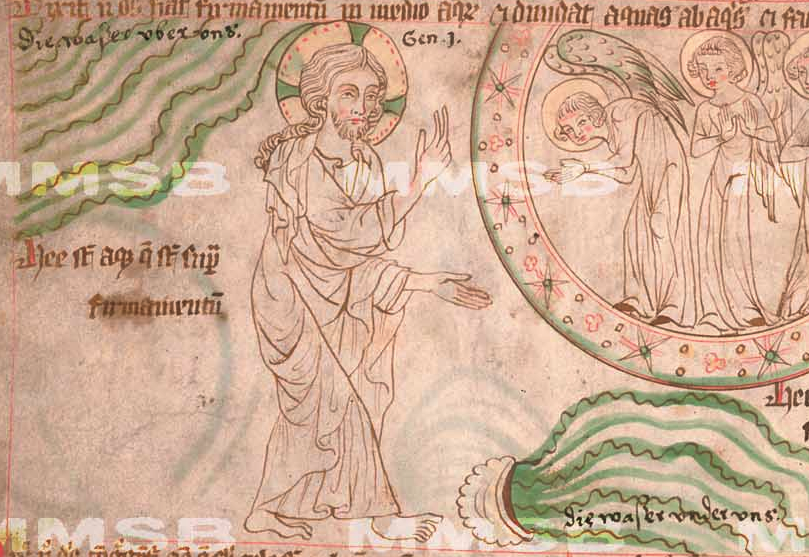
At first glance, this drawing from České republiky XXIII.C.124 (left) looks like there is some kind of liquid flowing from a bowl on the ground, and the undulating lines on the top left resemble a rudimentary cloudband of the kind more common to older manuscripts, before they took on their characteristic infurled shape:

Many medieval manuscripts are fragments, some are unfinished, and some include very terse and difficult-to-understand labels that don’t reveal much about the illustrations, so it can be easy to misinterpret them—one often has to find several versions from the same tradition to understand the imagery.

But this one is a little more clear, and upon reading the text, it turns out that God is parting the waters and that cloud-like shape in the sky isn’t a cloud at all. As the Bible says, “God made the expanse, and separated the waters which were below the expanse from the waters which were above the expanse…”

So both streams of undulating green are waters “below the expanse” and “above the expanse” and there are no clouds in this panel. If there were no text, how might a copyist with a wider palette of colors interpret the shape? There are many thousands of examples of imagery and text going through mutations as they pass from one hand to the next, and many examples of imagery being misinterpreted because modern viewers are unaware of old traditions.

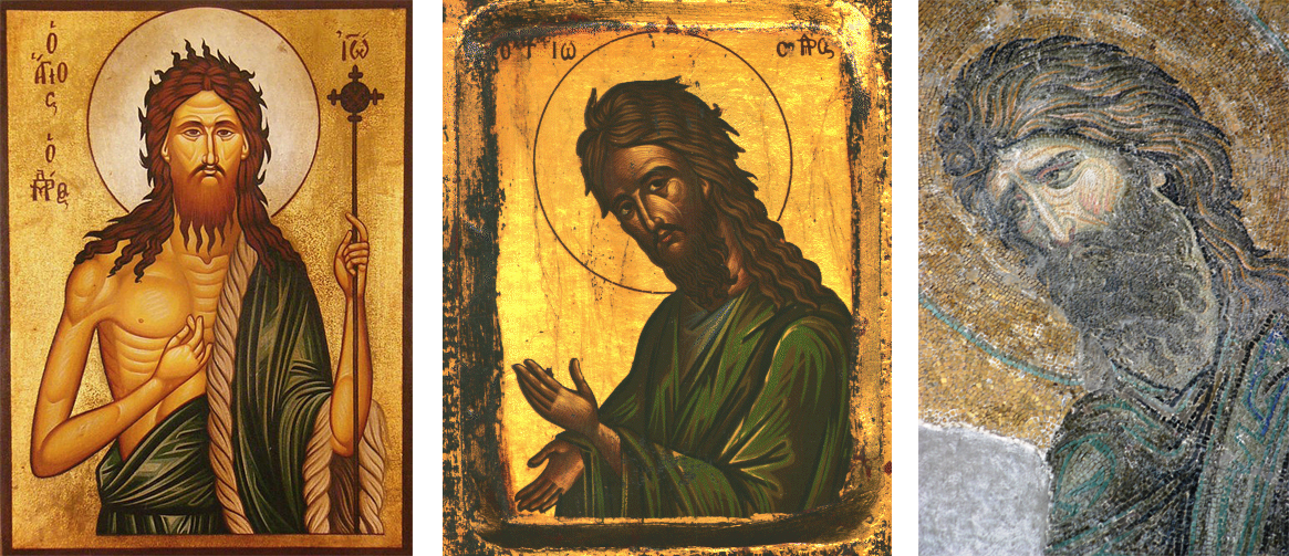
Take the example of early Christian imagery. If you showed these pictures to a modern viewer, many would identify the figure as Jesus when, in fact, it is John the Baptist:

I have also seen images that have been mistaken for Jesus and Mary which are ancient personifications of the sun and moon, with the circle around the figure’s head being assumed to be a halo rather than the sun symbol.

More Undulating Shapes

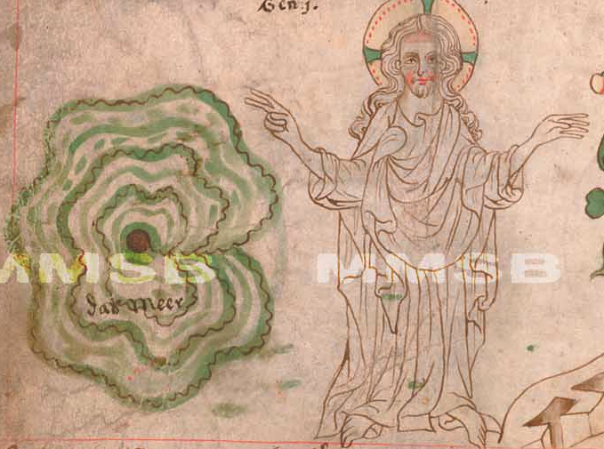
Coming back to the original manuscript, there are some other interesting illustrations. Often there are odd, round formless wiggly shapes in medieval manuscripts that are hard to interpret. For example, if this were drawn without an image of God next to it, it might be hard to recognize it as a picture of “the waters” being gathered into one place:

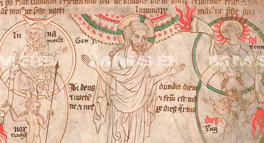
In the following panel, there is something vaguely cloud-bandish lined with stars. To the sides, are personifications of the dark and the light (the moon and the sun). In this case, the scalloped lines and stars represent “the expanse of the heavens” to separate the night from the day:

You’ll notice there are flame-like lines emanating from a number of horns. I believe these are meant to represent light (which in medieval times was usually provided by torches and oil lamps).

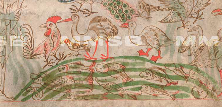
The next panel has undulating green lines to separate land from water. It depicts birds above and “swarms”of living creatures and great sea monsters below, with the lines painted right over the aquatic creatures (this was a very common way to draw water in the Middle Ages):

The palette in these illustrations caught my attention because it is very similar to the VMS. The brown is probably gall ink, and most of the water is a common shade of green. Blue is used more sparingly for highlights. The main difference is the shade of red, which is quite unusual, almost a fluorescent color. Older manuscripts with this palette tended to use orange rather than red, especially those copied in the Roman style. Later ones tended toward a true red, so perhaps this is a blend of orange and red pigments with egg binder that brightens up the color (I don’t know if this manuscript has been chemically analyzed, so this is pure guesswork).

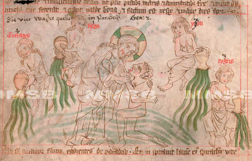
Next, after the terrestrial creatures are created, we see an interesting scene with a water theme common to older biblical illustrations, but less common in later centuries. Around a drawing of newly created man are four women, naked from the waist up, holding jugs of flowing liquid. If you follow the biblical narrative, you might expect mists steaming up from the earth rather than water flowing downward, but this is inspired by a later passage in which a river flows out of Eden to water the garden, from which it divides to become four rivers.

The composition borrows from traditional pagan styles, with nymphs dispensing the water, as was widely believed before Christianity, and are echoed in Homer’s Odyssey, in which the four fountains on the island of Ogygia, home of the nymph Calypso (daughter of Atlas) were described as, “…fountains four in a row… flowing with bright water hard by one another, turned one this way, one that.”

We know these represent the sources of four rivers because they are explicitly labeled Eufrates (Euphrates), fizon (Pishon), ygon (Gyon/Gihon), and tygris (Tigris) after the four rivers mentioned in Genesis. The Tigris and Euphrates flow through the Fertile Crescent, also known as “the cradle of civilization”, an apt reference to the Garden of Eden. Historians are not certain which rivers represent the Pishon or Gihon (there are many theories) or whether they still exist.

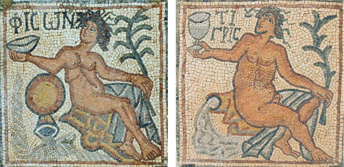
This 6th-century Libyan mosaic of the Pishon river is thematically similar to the illustration above, with a nymph at the head of the stream and an inverted jug dispensing the water. The same mosaic depicts other rivers of paradise, including the Tigris (shown right). For Voynich researchers following the “crown grotto” thread on voynich.ninja, note that the course of the Pishon (perhaps coincidentally) is drawn in spirals like a curl of hair:

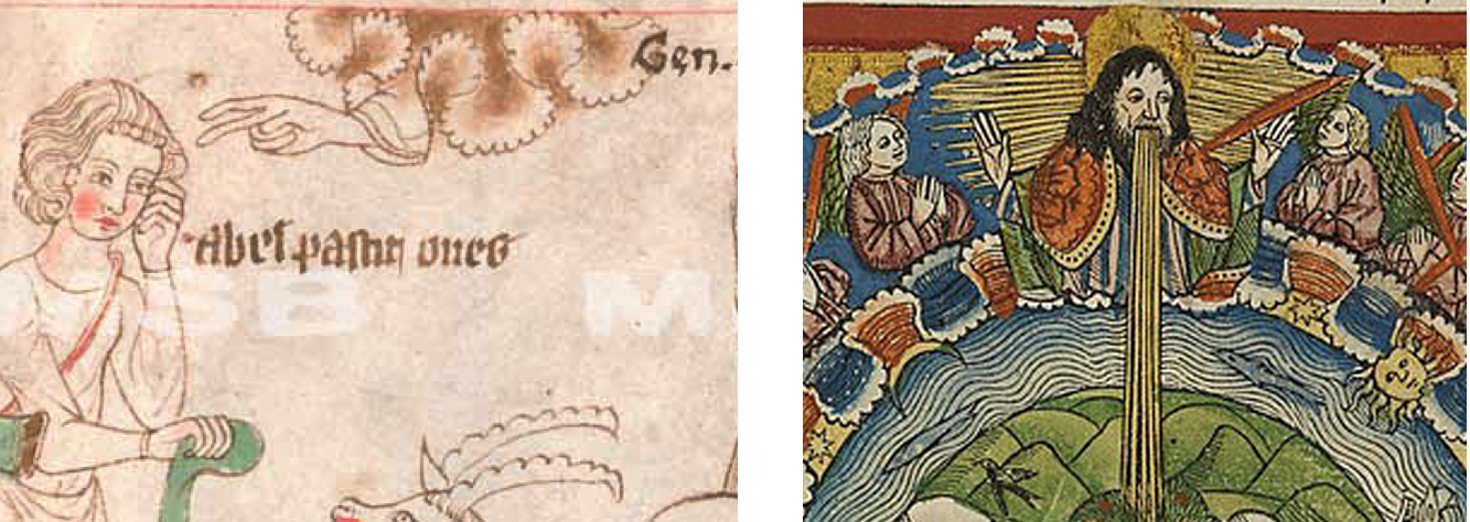
A few panels later, after Adam and Eve bear sons, we see a more classic depiction of a deeply infurled cloudband. On the left, the hand of God is reaching out to Abel. This style was still in vogue when the printing press was invented two centuries later and was used in woodblock prints (right).

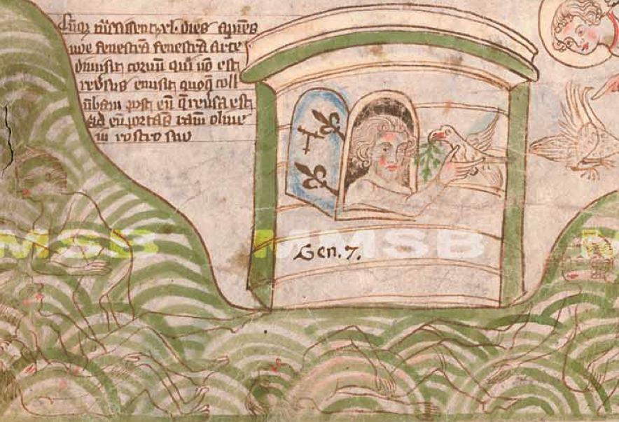
In the story of Noah’s ark, we see water depicted in a different way, as overlapping concentric curves, probably to emphasize the waves and vastness of The Flood. Under the waves are the outlines of the drowned:

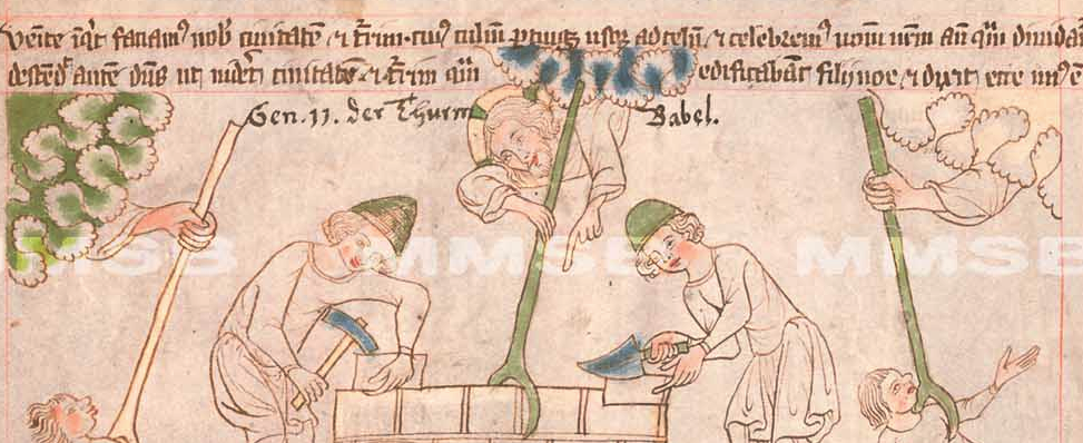
In a subsequent panel illustrating the construction of the tower of Babel, which was ambitiously designed to reach into heaven, God comes down and and thwarts the effort by dividing the languages of the workers so they can no longer easily cooperate. There are three cloudbands, one unpainted, one blue, the other a double band painted green, each with a hand and a staff to harass the workers. The differences between them appear quite deliberate so it might be intended to illustrate different points in time or the activities of God’s helpers:

Thus, humanity is scattered across the earth and many panels of war and mayhem follow.

As far as celestial imagery goes, the illustrator hasn’t run out of ideas yet.

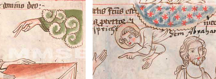
Further on, we see new forms of heavenly bands in the panels where God promises to shield and reward Abraham and Abraham, in turn, beseeches God for a son. In the first, a figure is poking out from a cloud-shape created with spiral forms reminiscent of the curlicues the Persians inherited from Chinese art. In the second, a finely scalloped edge encloses red stars against a blue background. This is not just a decorative element, but part of the story—Abraham is tasked with counting the stars and if he can, his descendants will number the same:

Most of the subsequent drawings of water and cloudbands follow the same basic styles as illustrated above, but there are other illustrative conventions of interest in this manuscript…

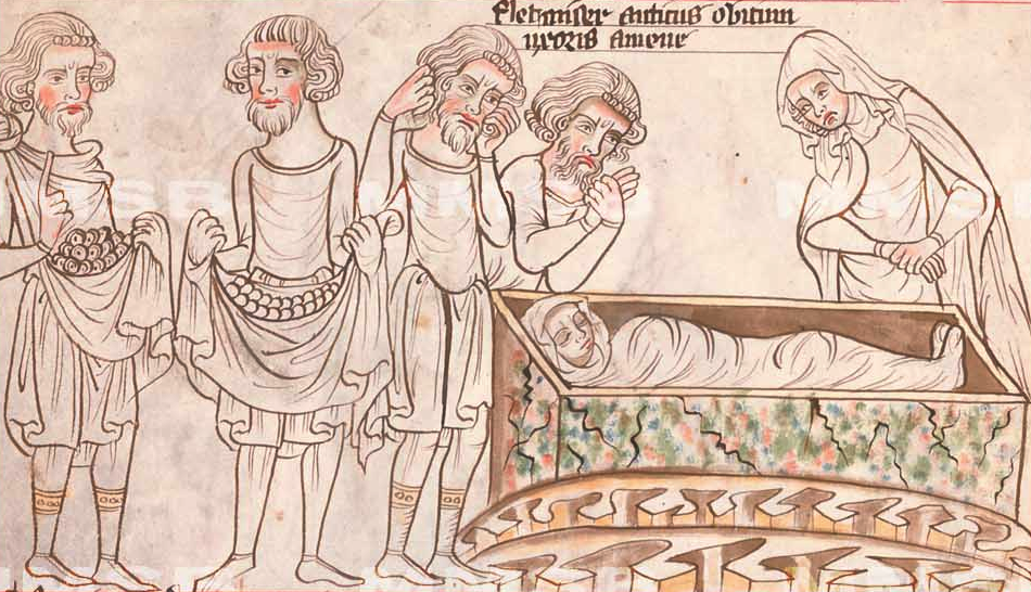
In the following panel, there are overlapping round shapes in the folds of the men’s tunics. This is a common way to depict coins in various forms of manuscripts, including chronicles, Bibles, and books of law. Abraham has asked Ephron to sell him a piece of a field and caves to bury his dead, so the coins represent shekels, and Sarah is shrouded in a box to the right, awaiting completion of the transaction so she can be buried. Note the jagged scallops under the box. When drawn and colored this way, they usually represent chasms, ditches, and holes in the ground.

Sorting Myth from Reality

Sometimes there’s no way to know if an image is literal or allegorical unless you know the story behind it.

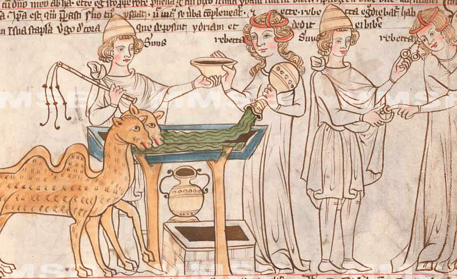
In the following drawing, a woman with face and hair similar to the river-nymphs holds a jug upside down, with liquid streaming from it. In the previous pictures, the stream represented a river and the women were mythical nymphs that protected and dispensed the water. In this drawing, however, the interpretation is more literal. The camels were led to a well in the city of Nahor where women drew water in the evenings. The damsel is not a nymph, but a woman named Rebekah. The main difference between her and the drawings of the nymphs is that she is fully clothed:

Rebekah shows a kindness by offering water to the traveler and his camels. The two figures to the right are the same people after the camels have been watered, which might be confusing because it’s in the same panel and could be mistaken for two other people at the well.

The “panel” to the right illustrates the emissary giving Rebekah a ring—it could be a nose ring, finger ring, or earring (historians and theologicans aren’t sure which kind of ring is meant), along with two bracelets of gold—a rather excessive payment for a few gallons of water, but it was more of a bribe and expression of intent, since he was tasked with finding and bringing back a bride. [As an aside, it’s hard to believe Rebekah, who was from a well-to-do family, would be drawing water (normally a servant would do it), but since divine intervention is at work here, we’ll let it pass.]

Summary

Many of the shapes in this manuscript would be difficult to interpret if it didn’t have a well-known backstory, so it’s refreshing to find such a variety of water and cloud/celestial imagery in a text that’s easy to read. Earlier medieval texts were sometimes abbreviated almost as much as the later ones, but the handwriting in the earlier periods was generally more clear than Gothic styles that came later.

Note that many themes of water, rivers, ponds, drowning animals, and rings are also found in the VMS. These are elements common to many legends, both biblical and otherwise.

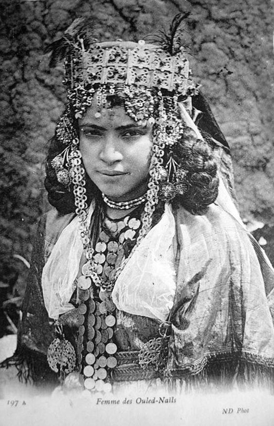
One of the things the drawing of Rebekah brought to mind that I find interesting about ancient cultures, is that women paraded the family’s wealth. They walked around wearing a significant portion of family gold and jewels, dangling from their waists, ears, foreheads, arms, and ankles. If you tried to do that in New York or London or any major city today, you’re asking to be dismembered.

This custom, in turn, reminded me of the mysterious ring-like shapes in the VMS. Usually rings in manuscripts represent marriage or sometimes mirrors. In some cases they represent coronation. But perhaps there’s a further possibility, that of representing a transaction, or intent to bargain, with the ring as a down payment until the final terms are settled.

J.K. Petersen

© 2017 J.K. Petersen, All Rights Reserved

The Catch to the Crossbow

7 November 2017

I’ve written several posts on the VMS bowman and didn’t think there was more to say about his bow, but after looking at hundreds of crossbows, I feel more strongly than ever that the origin of the Sagittarius bow might remain a mystery until the text is deciphered.

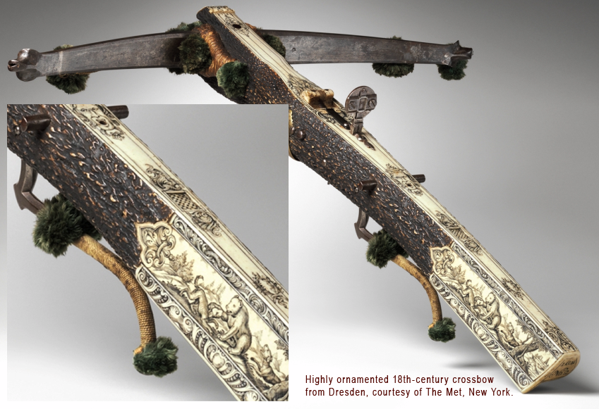
It’s difficult to find crossbows that originated before 1500. They’re made of natural materials that wear out or easily perish in fires. There are a few rare examples that are claimed to be from the late 15th century, but even those dates are speculative—a home-crafted bow from the 16th century can look very much like a typical 14th-century bow.

Crossbow artisans kept their trade secrets close to the vest, so most of what we know about crossbows was passed down by scribes and illustrators. Fortunately, a few descriptions are relatively detailed. Most of them, however, are not, including the drawing of a crossbow in the Voynich Manuscript.

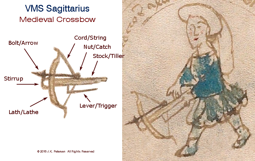
To recap, here is a picture the VMS crossbow that was previously posted to point out its main features. The shape of the stock-end is speculative, since it’s hidden by his hand.

pic of details of Voynich Manuscript Sagittarius crossbow

In terms of locating the origin or time-period of the bow, there are four features of particular interest:

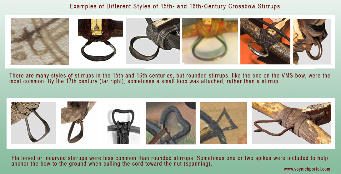
  • the rounded stirrup,
  • the long trigger,
  • the extra curve at the tips of the lath (also called a prod), and
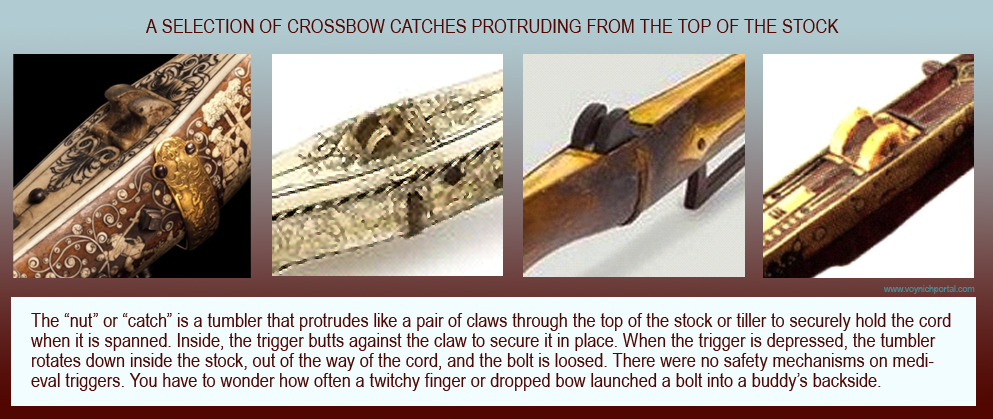
  • the position of the nut or tumbler, also known as the catch (in a small, rough drawing it’s impossible to determine the style of catch).

Details of Interest

Lugs and Lath Tips

Most stocks in the Middle Ages were straight or narrowed. After the Renaissance, some evolved into gun-stocks like those on a rifle. Later bows were fitted with lugs for attaching a crank (these are usually positioned a couple of inches behind the nut), a feature that was less common in the 15th century, but quite prevalent by the 17th century.

pic explaining lugs on old crossbows

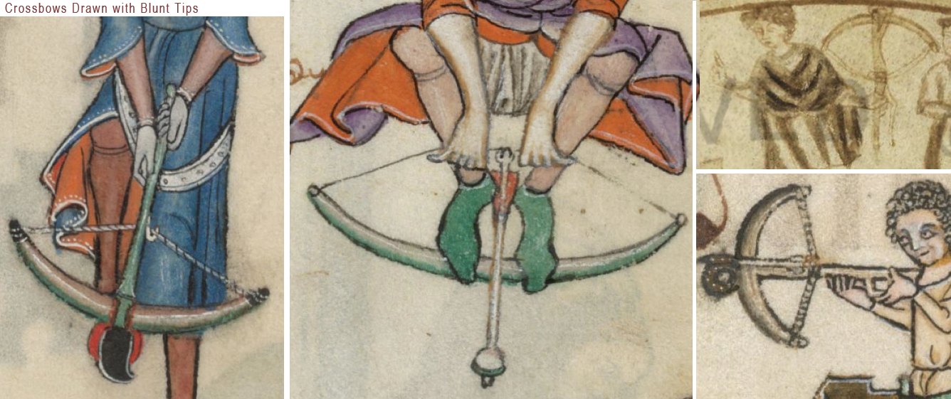
The VMS drawing is not detailed enough to show the style of cord, whether there were lugs, or how the stirrup was bound to the lath. It is interesting, however, that so much care and attention was given to the graceful curving tips at the end of the lath, a feature that was not common to crossbows (longbows didn’t always have long tips either). Medieval laths were usually wood, or composite materials such as wood and bone, with blunt tips, as in these examples:

pic of medieval crossbows with blunt tips

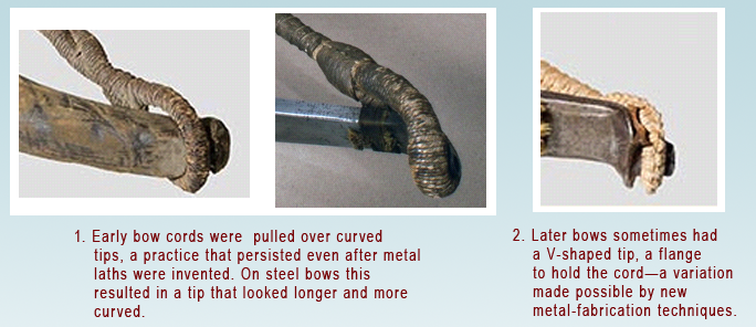
Sometimes when the cord is quite thick it gives the appearance of longer tips (as in the center image that follows), but the VMS drawing doesn’t look like an extended cord—it looks like the tips of the lath extend beyond the wound cord.

examples of wound crossbow cords

So what could account for the relatively sharp lath-tips in the VMS crossbow?

Could the illustrator have combined features of the longbow and crossbow? Or might the lath have been made of steel (as in the two images to the right above), a material that was gradually introduced in the 12th century, but did not become widespread until the late 15th or early 16th century? Steel prods were narrower than composite, sometimes with longer tips.

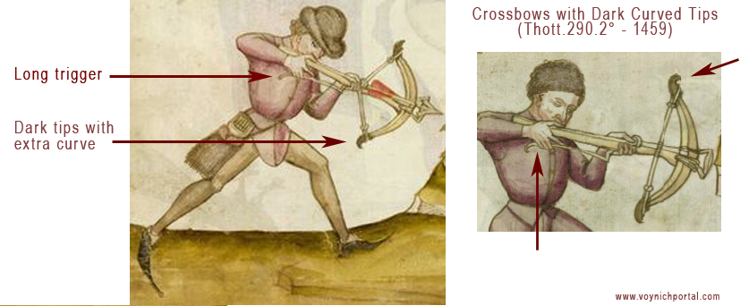
Or maybe the answer is more complicated… the lath in the following picture looks like it could be composite materials (it is moderately thick), but the tips are quite narrow and very hooked, as though they were reinforced and extended by metal caps. I’m not aware of any historic prods with caps, and the glue would have to be very strong to hold against the pull of a loaded cord, so I looked for another explanation. Perhaps the bow in the picture was wrapped in a material like snakeskin, with the tips left unwrapped… but that still doesn’t account for the extra curve in the tips—these kinds of curves are not easily incorporated into wood or composite bows, and the tips become fragile if sharply tapered—a broken tip could lead to death on the battlefield or the loss of a week’s food on a hunting trip.

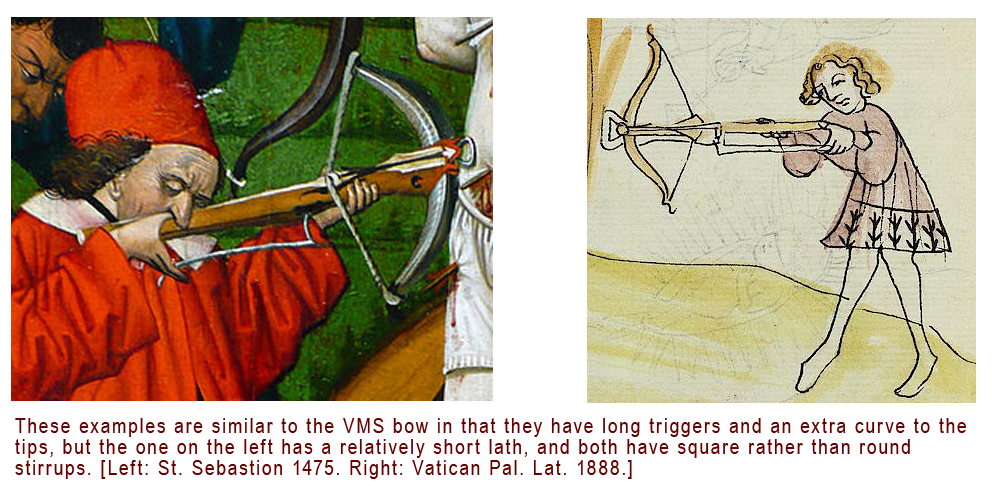
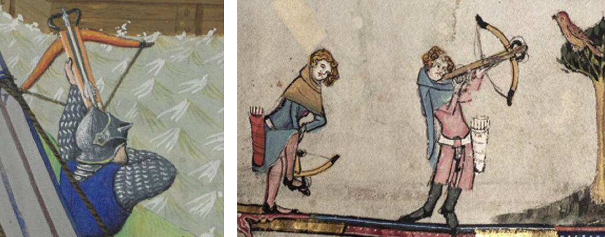
If the tips were “caps” rather than a protruding unwrapped part, these drawings from 1459 (Thott.290.2º) might illustrate a part of crossbow history that isn’t well documented. Either way, even if the curve is not literal, but simply an artistic embellishment, drawings like the VMS, with an extra curl in the tips, are definitely in the minority. I found very few compared to bows with blunt tips or only a slight curve. Here are some drawn with an extra curve:

pics of medieval crossbows with long curved tipsexamples of medieval crossbows with long triggers

Note how the laths in the Thott illustration above have darkened tips.

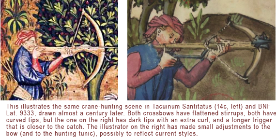
The following examples are the same crane-hunting scene from the Tacuinum Santitatus tradition, drawn by different illustrators almost a century apart. Except for drawing style, the later version is a fairly faithful reproduction of the storyline, but notice how the illustrator took time to change some of the details, like the sleeves of the tunic, and the color and shape of the crossbow tips:

crossbows in Tacuinum Sanitatus

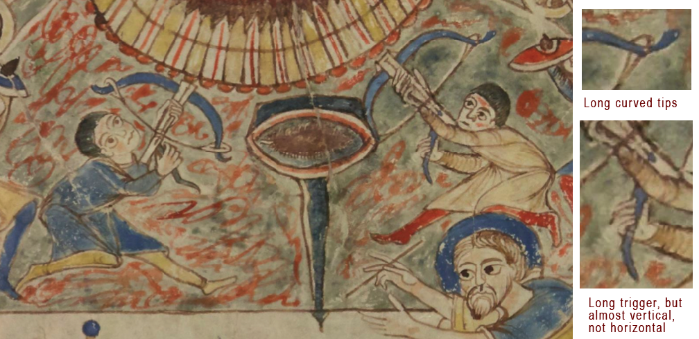
The earliest example I could find of a relatively clear crossbow with slender long tips was in an ecclesiastical manuscript from the 11th century (BNF Latin 12302), probably from France. It doesn’t have a stirrup, however, and the trigger is almost vertical, in contrast to the mostly horizontal triggers of later crossbows:

crossbows in early medieval manuscript

I did locate a photo of a long-triggered steel bow from Portugal with slender tips curved a little more than average, from the late 1500s, but the stock extends a couple of inches beyond the lath, and there was no stirrup attached.

Coloration in Drawings of Medieval Crossbows

By the 15th century crossbow laths with dark tips are not uncommon. Here are examples of a battle bow from BNF Français 9342 and a hunting bow from Bodley 264, with darker tips. In these drawings, it looks like the bow might be wrapped (possibly with snakeskin) and the tips left unwrapped, as opposed to the tips being capped:

medieval crossbow laths in manuscript art

The VMS drawing doesn’t have dark tips but it does have a rounded stirrup, like the bow on the right.

Stirrups

The rounded stirrup, the style in the VMS drawing, appears to be more common than squared-off stirrups:

examples of different styles of crossbow stirrups

When comparing the VMS bow to historic crossbows, keep in mind that they were functional items, subject to wear-and-tear, and the stirrup bindings and cords were replaced as they wore out. Thus, the stirrup itself may also have been replaced, especially if the original was lost due to disintegrated bindings, which were usually leather or cord. The nut would sometimes also break and be replaced with a slightly different style.

By the late 16th and 17th centuries, many crossbows, especially those for the nobility, showed significant artistry, with ivory, bone, laminate, and incised decorations along the full length of the stock. In the 17th century, pompoms (rounded tassels) were added to some of the laths. This remarkable bow from Dresden, Germany, has elaborately carved bear-hunting scenes, a tooled lath tip, and pom-poms. It dates to about the late 17th century or early 18th century (it has similar characteristics to a 1663 bow in The Met collection).

The VMS drawing shows no signs of decoration (possibly because it is so small), but judging by other medieval drawings, embellishments were less common in the 15th century than later.

And now to the important part… a little detail that is scarcely a blot on the drawing of the VMS stock.

Nuts

The catch to this whole VMS crossbow identification effort, is, well… the catch, the nut, the little protruding knob that secures the power of the spanned cord, like a capacitor, until the bowman releases its energy.

The catch is approximately a third of the way down the stock from the stirrup, depending on the length and style of bow. The trigger “catches” on the underside of the nut so that pulling the trigger moves it just enough for the catch to rotate freely and ZING! the cord is freed and ejects the bolt. Here are some examples of the nut/catch. Notice it is clawlike, to grip the cord securely:

examples of crossbow nut mechanisms

Catches are pretty much alike… or so it seems if you look only at the shape and ignore the mechanics. There’s quite a bit of variation in the distance of the catch from the trigger, and how they connect inside the stock, but there are some things that are necessary for the trigger to work… And this is the important detail that throws all VMS identification efforts out the window… the VMS catch is like the legs on the lobster’s tail in the zodiac roundels, or like the joints in the back legs of the ruminants—it’s in the wrong place.

I looked at the catches of almost 200 historic crossbows, and all of them were located above or slightly ahead of where the trigger attaches to the stock (usually about 1/2″ to 2″, up to a maximum of about 3″). If you look at the VMS drawing again, you’ll see that the catch is about 2″ behind the trigger. This never happens, as far as I can determine. The portion of the trigger inside the stock rotates in a specific way when you squeeze it and the nut has to sit at the right junction to efficiently respond to this movement.

Summary

hunting scene with crossbow and VMS Sagittarius style of tunicI would love to say I found bows that closely resemble the VMS bow, and I did have some success, but if this important detail of the crossbow-catch is wrong, maybe others are too.

Maybe the tips are artistic, maybe the trigger is lengthened to make it look like it’s touching his hand, not because it’s long, maybe the attachment point of the trigger was moved up to show that it is long… It’s possible the position of the catch is the only thing that’s off, but there’s no way to be sure. We have to look to other factors, like the style of the bowman’s tunic (which is echoed quite well in the hunting scenes of Gaston Phoebus, right) and aspects of the manuscript that seem mostly but not-quite-right.

So, I’ve put crossbow identification on the table for now, but I’ll keep my eyes open for other imagery that might help us understand this roundel, and if I find some, I’ll post it.

J.K. Petersen

© 2017 J.K. Petersen, All Rights Reserved

Latin’s “Om-age” to Indic Numerals

5 November 2017

Most people don’t think of Indic and Latin scripts as similar, but the links between east and west are old and deep and medieval Latin script is not the same as modern Latin.

When I first discovered VMS glyphs, I scoured foreign alphabets for the origins of some of the less familiar characters. I already knew the Latin alphabet, some of the runic scripts, the Cyrillic and Hebrew alphabets, the rudiments of Korean, a little bit of Russian and Japanese (and a tiny bit of Chinese), some Coptic Greek, a few Greek numeral systems, and a smattering of Malaysian alphabets, but no matter how hard I searched, none of them, except Latin (combined with a small percentage of Greek), seemed to match a high proportion of the VMS glyphs.

I also searched plant-related words in Baltic and Turkic languages. Unfortunately, I haven’t had time to study Finnish, Czech, or Silesian, but they’re on my list.

Just to be sure I hadn’t missed anything, I explored several other alphabets from languages I thought had potential, including Georgian, Armenian, Amharic/Ge’ez, Syrian, and Sanskrit/Gujarati/Nagari (the word Devanagari did not exist in the middle ages) and… once again was led back to Latin, but with a better understanding of how Latin, Greek, and Indic script were more similar in the Middle Ages than they are now.

Western Presence in Eastern Lands

In ancient times, the Greeks and Romans occupied Pakistan and made forays into northern India. Alexander the Great, the Kushana peoples, and the Persians all left their mark, and absorbed certain aspects of Indic culture. There were numerous Indic coins that included Greek letters and numbers long after Greek occupation had subsided.

I couldn’t help noticing that “Arabic” numerals, as they were used by Latin scribes in the 14th and 15th centuries, resemble Indic numerals more than Arabic, and I subsequently saw the credit line in Latin, in the Codex Vigilanus (Spain, 976), attributing the number system to the Indians.

The earliest-known Indian numerals in a European manuscript are in the Codex Vigilanus (976 CE). It’s possible the manuscript reached the Spaniards through Arabic traders, thus leading to the “Arabic” moniker.

Leonardo of Pisa, now known as Fibonacci, appears to have independently discovered the Indic number system that was documented in Spain two centuries earlier. While traveling in Bugia, North Africa, with his father, he observed the notation system and calculations used by Muslim traders. When he returned to Pisa, he wrote Liber abbaci “Book of Calculation”, which included the Indic numerals. There are no copies of the original, completed in 1202, but a number of copies of Fibonacci’s enlarged 1228 edition survive.

The following is from a copy of Fibonacci’s book, believed to be from the late 13th century (BAV Pal. Lat. 1343). Like the Spanish manuscript, it introduced the numeral system that became popular until the 15th century, when slightly rotated glyphs for 4 and 7 and a more curled 5 evolved into our modern system:

Despite widespread acclaim for Fibonacci’s 13th-century manuscript on computation, change occurred slowly, and Roman numerals did not significantly give way until the 15th century when more flexible calculations were needed for scientific studies.


Latin Conventions in Medieval Scripts

Researchers often miss similarities between VMS glyphs and Latin because medieval scribes used many ligatures and abbreviations that are not taught in modern Latin. These were as integral as the letters themselves, and it’s hard to find late-medieval manuscripts without them.

Before describing similarities between Latin and Indic scripts, it’s important to understand how Latin is more than just an alphabet. You’ll note in the examples that follow that several of these scribal conventions are apparent in Voynichese.

Example #1

The first sample (BNF Lat 731) is lightly abbreviated. It uses some of the more common Latin conventions, including quibus, per, et, tails on the ends of words that loop back over the previous letters to indicate missing letters (it’s like an attached apostrophe), and caps over other letters to serve much the same purpose when the missing letters are closer to the middle of the word than the end.

Notice that loop-back tails and caps are common in the VMS, and that the abbreviation symbol that resembles a “2” or back-leaning “r” is, as well.

Example #2

The second example (BSB CLM 29505) also uses very common conventions, but not identical to the previous example. Scribes were free to pick and choose what was convenient because they were interpreted by context.

In this example, we see the common symbol for “Item” (at the beginnings of lines)—it resembles EVA-k; the macron or “cap” that indicates missing letters; the swooped-back tail at the ends of words (also missing letters); g° to stand for degree (grado/grade); a squiggly line over the “e”, which usually indicates a missing “r” or “er” “ir” or “re” (again, depending on context). Note that this is similar to the squiggle on the red weirdo on VMS 1r.

The loop on “item” is also used at the ends of words to represent “is” with the Latin suffixes -ris/-cis/-tis being drawn like EVA-m.

Notice also the tail on the “r” on the last line. This tail wasn’t always added to “r”, sometimes it was added to “i”, so one has to read for context to know which letter was intended. Take note that the shape of the tail sometimes indicates specifically which letters are missing (I’ll come back to that later), but not all scribes distinguished the missing letters by shape.

Thus, there are four scribal conventions in this small sample that are found as VMS glyphs:

Example #3

The third example (Ms San 827) makes slightly more frequent use of abbreviations, but they are still very common ones and easily readable.

In sample #3, note the lines and caps over the letters to indicate missing letters, the curled tail on the “p” to stand for “pro”, the symbol that resembles a “2” which sometimes means “et” (and) but often means -ur or tur.

On the fourth and fifth lines, you will see the “9” symbol at the beginning of one word and the end of another. At the beginning, in this example, it stands for “con-“. At the end it is usually “-us” or “-um”. This is one of the most common glyph-shapes in the VMS and, as in Latin, it is usually at the end, but sometimes at the beginning:

Example #4

The above examples are all from the 15th century, but conventions were similar in the 11th to 14th centuries, leading up to the creation of the VMS. The following earlier text (OBV SG 21), uses all of the same concepts and most of the same conventions:

Thus, with four brief samples, and the numerals that evolved from Greek that were mentioned in a previous blog, we can account for the majority of glyphs in the VMS.

The problem is not in relating the VMS glyph-shapes to Latin letters, ligatures, and abbreviations—the similarities are numerous and obvious—the difficulty is in determining their meaning because VMS tokens do not, in general, behave like Latin or the majority of natural languages in terms of the variability of the words or the characters within the words. Here are some important differences:

  • In Latin scripts used for a variety of languages, abbreviation symbols can be associated with many different letters. In the VMS we see caps only on EVA-sh and occasionally EVA-q.
  • In Latin, the swept-back tail is found on almost any character where letters have been omitted near the end of a word. In the VMS, it is specific to EVA-e, EVA-r, and the last glyph in “daiin”.
  • The “9” symbol is shaped and positioned the same in both Latin and Voynichese, but in Voynichese it’s much too frequent to mean the same thing as it means in Latin (or other common languages).

So the shapes are similar to Latin, but the extreme repetition and positional rigidity are not.

After the 15th century, abbreviations and ligatures fell out of use, as Latin scholarship was replaced by local languages, and the newly invented printing press and typewriter introduced mechanical limitations that made it difficult to mimic these scribal traditions.

Ties with the Eastern World

So what does all this have to do with the Indian scripts mentioned at the beginning?

Dozens of languages have been mentioned in connection with the VMS, but claiming it’s a specific language is easy. I saw one person claim five different languages in the same week, and another claimed three more in the course of three months. Proving that it’s a specific language is the real challenge, and so far no one has provided a convincing translation of even one paragraph.

I think I know why so many different languages have been proposed for the VMS. It’s partly because expanding or anagraming text expressly turns it into readable text or, if Voynichese is based on natural language, it may be partly because words related to disciplines like science are often loanwords and thus similar in many languages. But this bewildering array of suggested languages might not be entirely imaginary… certain languages did, in fact, have more in common with one another in the Middle Ages than they do now.

As an example, Indo-Iranian writing styles are more similar to medieval Latin than east-Asian character-based scripts like Chinese—both come from proto-Indo-European roots.

The Indo-Greeks and others who subsequently ruled Pakistan kept some of their native customs and adapted others from local culture. They blended pagan gods with Buddhist beliefs and minted bilingual Indo-Greek coins, as in the following example from c. 100 BCE:

[Image courtesy of the Classical Numismatic Group, Inc.]

The Kushana, nomadic peoples from central Asia, at one time ruled a large region that included Afghanistan, parts of Pakistan, and northern India, and almost shared a border with the Romans during Trajan’s and Hadrian’s rules (a coin mould featuring Emperor Hadrian was found in excavations of c. 2 CE artifacts in Rairh, near New Delhi). The Kushana were Indo-Europeans who actively traded with both Rome and China.

This gold coin, probably of Kushan origin, is a testament to multicultural interaction. It was minted in India, inscribed with Greek letters with the ruler on one side and “Boddo” (Buddha) on the other, and was unearthed in Afghanistan. Sometimes Zeus was substituted for Buddha on this style of coin.

[Image courtesy of the British Museum.]

Commonalities with Indo-Iranian Scripts

Please note that I have used Gujarati as an example of glyph similarities, even though it is more recent than Nagari, because it does not have the line across the top (thus making it easier for westerners to read). It is very similar to other Indic scripts if you ignore the top-line and look specifically at the shapes underneath. The following observations apply to a group of related Indic scripts descended from Sanskrit, not specifically to Gujarati.

I’ll start with some of the simpler and more familiar shapes, followed by glyphs with ascenders (gallows characters), because the majority of VMS glyphs are Latin. Only a few that are rarely used (or which show up only once) are distinctly eastern and will be described later.


Glyphs with Tails

Voynichese has a number of glyphs with tails, a ubiquitous convention in medieval Latin. Adding a tail to a glyph wasn’t just an embellishment, it was a way to indicate missing letters. In the VMS, the r, c, and minim shapes at the end of the word “daiin” all have distinctive tails. Certain Indic glyphs also have tails, and the shape or length of the tail can change the sound or meaning of a letter.

Here are some interesting patterns in Latin and certain Indic scripts, that may have some relevance to the VMS:

  • EVA-r. In Latin, when a tail is added to “r”, it can mean “rus, but it often means “re”, “er”, “ra”, “ar”, “ir”, or “ri”. In other words, a vowel is inherently indicated by a tail added to a consonant, as in some of the abugida languages. Similarly, in the later 13th- and 14th-century Nagari scripts, and in Gujarati, you will see an “r” shape with a curved tail to represent “r” or “ar” or “ra”. There are several places in the VMS where two forms of tails are apparent in the same block of text. In Voynichese, Latin, and Gujarati, the curved tail is more frequent than the extended-loop tail. If Voynichese is anything like Latin, Gujarati, or some of the Malaysian scripts, and not just a smokescreen to make the text look like Latin, then extending the tail and changing its shape changes the meaning of the glyph:
  • EVA-s. In many older Latin scripts, the “t” was written like a “c”, rather than with a straight stem. It can be a struggle to tell them apart. Adding a tail to this c-like tee stood for “te” or “ta” or most combinations of “t” plus a vowel (it can also mean “ter” or “tus”). In Gujarati, the symbol for “ta” is a c with a tail (note that both “r” and “c” shapes with tails are found in the VMS) and some are ambiguous, with a slight hook on the foot, perhaps denoting a third character. In Greek, a c-shape was used as an abbreviation for “kai” (and). Once again, if you look at it from a Latin point of view, the c-shape can also be “e” (many early medieval e-shapes didn’t have a crossbar or hook), and adding the tail turns it into “eius” or “et” for “and” (in fact, if you extend the tail a little more, it becomes an ampersand). Thus, we have a glyph with many meanings. C-tail can be the abbreviation for te, ta, or ter, or for et, eius, or er. In the VMS, as in Latin, this tailed shape, which sometimes resembles c-tail, sometimes e-tail, and sometimes t-tail, is found both individually and within other words.
  • EVA-d. If you look at variations of the thorn character, which is usually associated with northern European scripts, you’ll see some of them are written like a curvy “d” or a Greek sigma with a small bar through the ascender. It may be coincidental, but the Gujarati shape for “tha” is a curvy “d” shape. There’s no line through the stem, but many Latin scribes wrote it that way, and there is a strong association between “d” and “th” sounds in various Indo-European languages. If you round the top loop a little farther, as some scribes did with Latin “d”, thorn, and Greek sigma, it resembles a figure-8. This is why many researchers read the figure-8 on folio 116v as an “s” or “d”, but perhaps “th” should also be considered.

There are analogs to VMS shapes in both medieval Latin and some of the Indic scripts. The “a” and “o” shapes need no explanation—they are distinctly Latin, and “o” is common to many languages.

The simple “c” shape doesn’t tell us much either, because it is found in most alphabets, but two c-shapes tightly joined were used in early-medieval Latin to express “a”, “t”, and sometimes “u”. The double-c is also found in the VMS (right)—a distinction that might be meaningful but is not recognized in most VMS transcripts. In fact, in the Takahashi transcript, which is probably the most widely used, the extra c-shapes are sometimes omitted.

But tails are meaningful in both Latin and Indic languages, and ligatures common to both. Sometimes the tail changes the letter, sometimes it extends a sound, and sometimes it specifies which vowel is used. Note that Nagari and Gujarati are syllabic languages which might not seem to have much in common with Latin, but medieval Latin script has its share of implied vowels.

A sidenote on abugida scripts… Gujarati is a syllabic language, but not entirely an abugida script (neither is Hebrew). Both Hebrew and Gujarati include a shape for alpha, so it is explicit rather than implied (it’s possible that in ancient languages alpha was more of a glottal stop than a vowel), but most of the time the most common vowel (alpha) is rolled in with the consonant, as it is in a number of Asian and African languages.

In Gujarati, several of the syllables are written as though they were ligatures, with a vertical stem on the right  (as in sa, pa, na, and numerous other glyphs). This is technically part of the syllable but can also be thought of as the implied vowel. This vertical line has an additional function—it can be added to the preceding vowel or syllable to lengthen it into a long vowel, as in the following example:

Note how the vertical bar changes a short-a to long-a, a symbolic concept that was mentioned in the previous relative notation blog. A similar convention exists in Modi, another Indic script that is first recorded in the late 14th century.

Some of the commonalities between Latin and Indic scripts disappeared when Latin abbreviations were dropped and Latin was reduced to a simple alphabet.

Summary

I have much more information on this subject and was going to try to cover the Voynchese ascenders and some of the rare characters in the same blog  because they also have their roots in scribal conventions, but this is becoming too long, so I will continue with the less common characters in a future installment.

… to be continued…

J.K. Petersen


© Copyright 2017 J.K. Petersen, All Rights Reserved