Category Archives: Paleography

Matching the Marginalia

It’s a challenge to find paleographic matches to the VMS. I’ve been hunting for almost eleven years, sampled more than 50,000 characters from scripts that were similar to the marginalia or to the main text, and developed tools to more objectively compare scripts based on slant, heaviness, spacing (between letters and lines), and the individual shapes of each letter.

Evaluating the VMS main text is particularly difficult because some of the glyphs may not be letters, they may be symbols, numbers, or abbreviations, so I will describe the marginalia first, and then explain my strategy for locating scripts similar to Voynichese in a separate blog.

As a sideline, I also looked for matches to the column text on folio 1r, but it is not my primary interest, so I have presented it more simply as a chart, which you can see here.

Selecting the Marginalia

For sampling individual letters in the marginalia, I used these sections:

  • The more consistent letter-forms on folio 116v (some shapes look like they might be in another hand, although it’s hard to tell, so I gave precedence to those that matched several times on the page rather than those that were questionable), and
  • The strip of text at the top of folio 17r (which I believe is the same handwriting as most of the text on folio 116v):

[pic of VMS 116v and 17r marginalia]

Note that I have doubts that the first letter of “valden” is a “v”. For one thing, no one wrote v like this in the Middle Ages (in more than 1,000 samples of text in a similar style, only one v comes close to the shape in “valsen”—this is an unusually low hit rate), but more importantly, if you look closely at the scans, you might notice traces of tails and letters under the last line (to see it you have to ignore the bleed-through from the other side).

Also, the part of the first letter that is visible is a close match to the top of other “p” shapes on this page, which makes me even more suspicious about this letter being “v”. Judge for yourself, here are some examples of common “v” shapes from the Middle Ages (keep in mind that “v” and “u” were used interchangeably in the Middle Ages):

[pic of medieval letter u/v]

The “v” in “vix” is not common either, usually “v” was written with a curve, but this form is not rare, it is simply uncommon, so I have provisionally used this for “v”, but gave it lower priority than other letters that are written several times (and more clearly).

[pic of V similar to VMS marginalia]

First Impressions

When I first saw the marginalia, it looked to me like hybrid text, Gothic with hints of both cursive and book hands (I’ll post details later). There are also hints of Italic/humanist hand (e.g., note the small, rounded, spaced-out m).

But… scribes and scholars moved around, so it’s hard to generalize, and there were blended scripts similar to the VMS marginalia in several multicultural areas, including 1) Lombardy, 2) the area encircling the Veneto, 3) some parts of Bavaria/Tyrol, and parts of 4) Alsace/Schwabia.

There’s no sign that the marginalia was influenced by Anglicana, but not all English scribes wrote Anglicana, some adopted the styles of St. Gall. It doesn’t seem as elegant as many of the Parisian scripts, but not all were elegant, and scholars brought many different writing styles to Paris, so… I tried to put my initial impressions out of mind as I searched for similar texts, because I didn’t want to narrow my search based on preconceptions. Thus, I searched digitized manuscripts from as many regions as possible.

Matching the Marginalia

My only requirement for collecting a sample was overall similarity to the basic forms in the marginalia. These scripts tend to score 50 or higher. A really good score is 73 or higher.

Language didn’t matter and, for the most part, dates were ignored (I was hoping dates would fall naturally into place). In general, scripts scored as follows:

[samples of Gothic text similar to the VMS marginalia]

I sampled the following characters:

  • letters of the alphabet,
  • common abbreviations, and
  • words like leben/leber/lebe, maria, and vix, when I could find them, or similar words if I couldn’t.

A full sample was typically about 40 characters but not all source texts are long, some are marginalia or short dedications and thus were sampled for as many characters as were available. If the text was heavily abbreviated, I sampled most of the common abbreviations.

Scribes often used more than one shape for certain letters, depending on their position in the word, so I included terminal forms and forms with tails, but “character ratings” were only given to letters that specifically matched marginalia. The rest were evaluated separately.

Here are some general observations from approximately 1,000 reasonably close samples…

  • Gothic cursive, book, and hybrid hands were common throughout Europe from the late 14th century until the early 16th century, so common that paleographers often have difficulty identifying place of origin.
  • I was hoping for scores of 95 or better (out of a possible 120 for individual character shapes), but found it extremely difficult to find hands with totals higher than 75. I only have a few. There were a number of interesting finds in the 60 to 75-point range, however. Even if they didn’t match overall, there is some useful information that can be gleaned from individual characters that scored high.
  • I was hoping high scores might help me geolocate the marginalia-writer’s origins, but many of the manuscripts that scored high are of uncertain origin.
  • Certain letter-forms are very common, while others are specific to the scribe. For example, thousands of scribes wrote p, r, s, and o like the marginalia, while other letters are unusual or more commonly found in 14th-century scripts or in book hands. I will describe these characteristics in separate blogs.

The marginalia is not abbreviated in obvious or traditional ways, but one gets the feeling that some of the words might be missing letters because the words don’t quite make sense. There are, however, languages that have implied vowels, like some of the Bohemian languages, so perhaps this mindset was familiar to the writer and influenced the way words were written.

Scoring Individual Letters

Each letter is scored differently based on how widely the letter varied in medieval scripts. The letter “o”, for example, is not going to vary as significantly as an ornate letter like “g” or “h-with-a-tail”.

A perfect match scores 6. Out of tens of thousands of individual-letter clips, only one 6 has been given so far. Very close matches generally score 5 because even close matches don’t quite look like the same handwriting. The overall shape might be the same, but there are usually subtle differences in pressure, stroke order, or the way the parts connect.

[pic of similar and dissimilar letterforms]

How objective and consistent are these scores?

The first (and more important) answer is that I have a list of criteria for rating each letter—these could be taught to another person as long as that person has experience in reading old scripts.

The second answer is anecdotal…

One day I noticed two sets of samples lined up next to each other with identical scores. I thought I had discovered two different manuscripts written by the same scribe. As it turned out, I had inadvertently sampled the same manuscript (different folios) almost four years apart. The results were exactly the same.

Why does it matter?

The marginalia may have been added long after the VMS was created, so why would I devote so many years to studying it?

It’s possible it was added later, but research into the letterforms has convinced me that the marginalia may have been written close to the time of the VMS, perhaps even at the same time. If so, then the marginalia writer was potentially a designer, advisor, or even illustrator.

Even if the marginalia was added later, anything that can be learned about the Voynich Manuscript brings us a little closer to understanding it, and if the source of the script style can be located (or connected with other documents in the same handwriting), it might help unravel the missing provenance.

J.K. Petersen

© Copyright 2018 J.K. Petersen, All Rights Reserved

Small Clues in the Marginalia

I’ve mentioned that the person who wrote the VMS marginalia may have learned to write in the late 14th century or early 15th century. If so, he or she could have lived at the same time as those who illustrated and wrote the VMS, and might even have been involved in the creation of the manuscript in some way.

I’ve already posted some of the statistical properties of the marginalia “g” on the voynich.ninja forum. Here is a reprise of the comparison chart:

Paleography samples similar to VMS marginalia "g"

Samples of the letters “g” and “a” suggest the marginalia writer was familiar with older handwriting (e.g., 14th century), or with more formal book hands, and it appears that the writer may have learned to write in the late 14th or early 15th century. This suspicion is not based on just one set of statistics, however.

The Sample Set

[Pic VMS abc]To sample the marginalia, I used the text on 116v and 17r because I’m fairly confident it is the same handwriting. I did not use “ven mus mel” because there are too few words to be certain if it’s the same. Many scribes had similar handwriting. In fact, they were encouraged to copy each other so several scribes could work on the same manuscript without awkward transitions.

Samples of Voynich Manuscript marginalia

Below is the sample set I use for full comparisons. Note that the “z” is actually an abbreviation symbol, but most scribes wrote it like the letter “z” and sometimes also the number “3”, so I provisionally stored it in the “z” slot.

It’s not clear whether the last letter of “gaf” on the last line is “f” or “s” but since most scribes wrote them the same (except for the crossbar), it probably doesn’t make a big difference. When assigning values to similarity, I gave higher priority to letters that are repeated and clearly written. I consider the “u” and “v” shapes to be lower priority since “u” is not clear and the “v” appears to be in a different style.

Note that “n” has both a descending “tail” and a non-tail form. This is very common. Many scribes wrote n, m, and h both with and without a tail:

Paleography sample of VMS marginaliaNow here’s an interesting puzzle…

Is the first “a” on f17r a double-chamber “a”, the style that was popular in the 14th century, but less so in the 15th century?

It’s hard to tell, but it looks like it might be, if the top is slightly fuzzed. It was very common for the two-chamber “a” to be taller than other characters nearby:

Voynich marginalia - mallier allor

It’s impractical to post exhaustive statistics or lists of manuscripts that have different styles of the letter “a” in a blog, but to give the flavor of it, here are examples from the 14th century with only the double-chambered “a” (from scripts with some similarity to the marginalia):

In paleography, there are many hybrid scripts (scripts that blend different styles). Paleographers frequently argue about names and classifications (some have devoted whole books to this), but diversity isn’t a bad thing—it can help identify an individual’s writing.

The Significance of the Double-Story “a”

As the single-story “a” became more popular in the 15th century, some scribes mixed both singles and doubles, sometimes even in the same sentence. Here you can see both kinds of “a” in marginalia that was added c. 14th century to an early medieval calendar:

Sometimes the mixing was random, other times, the double-story “a” was used as an uppercase “a” or at the beginnings of words.

The double-story “a” was retained for a longer time in more formal book hands, but casual hands gradually abandoned it for the single-story “a”. By the late 14th century and early 15th century, many manuscripts included only the single-story “a”:

Paleography sample of single-story "a"

Some Statistical Properties of the Marginalia “a”

As mentioned previously, I set up a mathematical system to compare letters more objectively. A perfect match on higher-priority letters would be 120 (with slant, weight, connectivity, spacing, etc., assessed separately). After 10 years, 5 months, and 5 days of searching for a close match, I still find it quite difficult to locate scripts higher than 75, so a bit of luck will probably be necessary to do better.

It surprised me that a medieval “a” could be so varied. Out of a sample of more than 1,000 manuscripts specifically chosen for their similarity to the VMS marginalia, only 20% scored 4 or higher (out of 6) for letter-forms.

Note that the stem is fairly vertical, and the loop doesn’t quite close on the bottom. There is a small point at the top of the stem and the serif turns up at a fairly sharp angle.

Finding all these characteristics together is a challenge, but here are some of the better matches. Note that the overall score (listed under the letter) isn’t always high. In other words, even if the “a” was fairly close to the VMS script, sometimes other letters were not:

Paleography samples of the letter "a"

If the letter on 17r is a double-story “a”, then it has some physical and statistical commonalities with the single-story “a”. The stem is fairly upright and the bottom loop is not quite closed. Note that the bottom loop is larger than the top one (some scribes did it the other way around).

Here are some examples from handwriting that is fairly similar to the VMS (note that only one “a” is significantly similar to the VMS “a” in shape, proportions, and slant, and it lacks the sharp serif):

Paleography double-story "a"

When the double-story “a” is substituted, the statistics for overall similarity come out very much like the previous search, as did the date range of most of the samples. In other words, scribes with handwriting similar to the VMS writer used either or both forms of “a” around the same time period as they wrote letter-forms similar to the VMS.

Summary

The greater popularity of the double-story “a” in the 14th century might suggest a date earlier  rather than later in the 15th century, although there are a few areas where the double-story “a” was still common until the end of the 15th century. Some parts of eastern Europe, and many of the smaller more remote towns, lagged behind large urban areas in terms of the evolution of script. It does seem very likely, however, based on the paleographic evidence, that the marginalia was added after 1330 and before 1490. It’s not as precise as radio-carbon dating, but it does help when research from various disciplines tends to confirm rather than deny the existing data.

I have much more information on this topic, but will cover it in separate blogs, and I will leave it up to the reader to decide whether the letter on folio 17r is a double-story “a”.

J.K. Petersen

© Copyright 2018 J.K. Petersen, All Rights Reserved

The Chameleon Quality of Scribal Conventions

Medieval alphabets, numbers, and abbreviations are often the same shape. For example, the glyph identified in the VMS as EVA-l (ell) was used as both a number and as a scribal abbreviation. In the previous blog, I described the “is” glyph, which is used to create syllables such as ris, tis, or cis. This time I’ll illustrate the flexibility of the EVA-l shape.

Something I noticed, when reading early medieval texts, is that many basic abbreviation symbols were based on Indic-Arabic numbers, long before these shapes came into general use. I’m assuming this was to help distinguish abbreviations from regular letters.

Numerals used as scribal abbreviations

Thus, the number 1 (the old style with a slight wiggle), and the lightning-bolt style of 5 were used for er/ir/re/ri and other sound-alikes that usually include “r”. Number 2 represented ur/tur, number 3 (often written like a zee) was at the ends of words to stand for rem or us/um. Number 4 (as shown above) was a general-purpose abbreviation, 7 became et, and the number 9 was commonly used at the beginnings of words for con/cum, and at the ends for us/um. These conventions continued from the early medieval period until the 16th century. The only significant change was that the number 4 gradually fell out of use  by the 15th century.

The 4 had lapsed as an abbreviation by the time the Voynich Manuscript was created, but it had become common to use it as a numeral.

This clip from a legal charter illustrates the flexible nature of 4. It represents whatever letters are missing, similar to a short macron or curved macron in late medieval texts. It usually stood for one- or two-letter omissions (a bar was more commonly used if several letters were missing). Here it variously stands for m, n, and er:

Scribal abbreviation 4 symbol representing a number of different letters

Examples of the flexible nature of the “4” abbreviation standing in for several different letters or more than one letter.  [Image credit: Stiftsarchiv Reichersberg German legal document from 1231]

You might wonder why a single glyph would be substituted for another single glyph rather than writing the missing letter. Part of the reason is space. There is plenty of space between lines that goes unused, so substituting a superscripted letter shortens the overall length of the document (and the amount of parchment needed). Vanity may also play a part—those who could write and read abbreviated text probably moved up in the social hierarchy.

Paper began to replace parchment in the 14th century, and was less expensive, so some of the superscripted abbreviations, like 9, were lowered to the main text (some scribes wrote it both ways). The 4 continued to be superscripted until it became more strongly associated with numbers rather than with abbreviations:

Illustration of flexibility of scribal abbrevation symbols

I think it’s important to understand how scribes made the distinction between letters, abbreviations, and embellishments if one is to analyze anything written in the medieval period.

I still encounter considerable skepticism about the VMS glyph-shapes being inspired by Latin. They are not as unusual as many people have suggested.

You can search all over the world for that elusive “alphabet” without finding it. In fact, I did exactly that. Even though I recognized these shapes as Latin, I wanted to be sure I had not overlooked anything and spent two years learning dozens of foreign alphabets (Armenian, Syriac, Gujarati, Georgian, Sanskrit, Hebrew, Greek, etc., in addition to the ones I already knew… Korean, Japanese, Russian and a tiny bit of Chinese), well enough to read simple words… and then came back to where I started—almost all the VMS glyphs are normal Latin scribal repertoire, and the few that are questionable are similar to Greek conventions or could reasonably be constructed from Latin scribal building blocks put together in a slightly unconventional and yet acceptable way.

Understanding scribal conventions might help sort out which variations in VMS shapes are meaningful and which are not. For example, in Latin, you can draw the tail on EVA-m in any direction without changing the meaning, but if you change the left-hand side, it becomes another syllable. In Latin, the 9 shape can be drawn any way you want, as long as it is vaguely 9-shaped, but if you move it from the end of the word to the beginning, you change the meaning. VMS glyphs might follow similar concepts even if different meanings have been assigned.

Summary

If some of the VMS glyphs are abbreviations, it creates one-to many relationships of varying lengths. If this were a substitution code, this, in itself, would not be unduly difficult for cryptanalysts to unravel, but in medieval times there was another twist—scribal abbreviations commonly represented not only several letters, but often different letters in each word. In this way, scribal abbreviations diverge from typical one-to-many/many-to-one diplomatic ciphers, in that the interpretation of a specific shape can change from one word to the next.

In Latin, and possibly also in the VMS, two words can look the same, but mean something different.

J.K. Petersen

Copyright © 2018 J.K. Petersen, All Rights Reserved

Le’go my Lego

I’ve frequently posted that Latin scribal conventions are flexible. They are like Lego® blocks that can be taken apart and recombined in many ways. This is essential to understanding Voynich text. Looking for similar shapes is not enough, one has to consider the combinatorial and positional dynamics of medieval text in relation to the VMS.

Basic Building Blocks

I’ve already discussed these shapes in previous blogs, but I’m going to post again with additional examples. This is one of the most common Latin scribal conventions, frequently used to represent the syllables “ris”, “tis”, and “cis”.

The glyphs below are from two scribes with different handwriting styles so you can see how the abbreviations vary from hand to hand, but can still be understood by the reader:

Some parts of the ris/tis/cis abbreviation are meaningful and some can be changed to suit the person’s handwriting or aesthetic sensibilities. This is one of the reasons why it’s important for the dynamics of scribal abbreviations to be understood—meaningful and non-meaningful variations in glyph-shapes need to be differentiated to create accurate VMS transcripts.

For ris/tis/cis, the left side of the glyph defines the meaning (although ris and tis can sometimes be hard to tell apart in 15th-century documents and tis and cis can be hard to tell apart in 13th-century documents). In the example below, it’s quite clear that the left side is “r” for ris, but the shape of the right side can be varied, as long as there is a small loop with some kind of tail. In this 15th-century addition to an early medieval calendar, the tail is long and swings left:


A further example (c. 16th century), shows that the ris/tis/cis abbreviations were still used during the Renaissance and early modern period, and could vary in shape, as long as the meaning was clear from the context. Note here that “tis” looks like a small EVA-k at the end of the word hereditatis. It has a straight stem (no foot as in earlier script styles) and a short tail, and yet is perfectly understandable:

Here’s an example in a different 15th-century hand in which ris has a foot and so, to distinguish it from tis, the scribe has given tis a bigger foot and a subtly more rounded back. Also notice how cis is rounded to the point that it looks like EVA-d with a tail. This cis-variation is also found in the VMS and might be a hand-variant of the cis-shaped glyph or might be a separate glyph:

This example, from yet another 15th-century scribe, shows tis and cis in context. Even if you don’t know medieval Latin, you can probably figure out that the word on the right is “dulcis”. Note how the tis and cis are at the ends of the words. This is how they are usually positioned in languages that use Latin conventions and in the VMS, but they can be placed elsewhere if desired:

Similar Shapes in the VMS

Now I’d like to point out a snippet from the VMS that suggests the Latin “is” convention was probably known to the scribe or designer, because it is not always written like EVA-k and EVA-m in the VMS. A right-facing  loop with a stem is sometimes attached to other letters.

On the left, an “is” shape has been attached to EVA-a or, alternately, it might be a straight-leg EVA-d attached to the right side of a bench. Either way, EVA-d has a variant form with a straight leg that is similar to Latin short-leg cis. I don’t have a clip handy, but  “is” also appears next to other glyphs such as EVA-y.

In the example below-right, both ris and cis shapes are visible, but what you might overlook if you are not familiar with Latin scribal variations, is that the character in the middle of the second line is drawn a little differently. This might be a differently-written ris (different from others in the VMS), OR if one were reading this as a Latin scribal glyph, it could also be interpreted as EVA-i with the looped shape added:

Summary

After I wrote a series of blogs on Latin scribal conventions there was a mini-flood of Voynich “solutions” that made the headlines, all claiming that the VMS was abbreviated Latin. They looked suspicious to me because the researchers clearly didn’t understand how to use these conventions correctly and thus could not have come up with the idea independently.

Here are some of the major problems with these “solutions”:

  • Latin scribal abbreviations don’t automatically mean Latin language. Latin conventions were used in all major European languages. Even some of the west Asian languages apply some of the same concepts. The VMS might turn out to be Latin, but not in the simplistic way these researchers translated the VMS text. And it might not be Latin—the same scribal conventions are used in Spanish, French, English, German, Czech, Italian, and other languages. Sometimes the same shape means the same thing in different languages, and sometimes it is adjusted to fit the spelling or grammar of the host language (for example, a squiggle-apostrophe might mean -er in English and -re in French).
  • Most of the proposed “solutions” are nonsense words, not Latin. They might include one correct Latin word out of every 20 or 30 words (more by accident than by design) and they might look a bit like Latin, but it’s not Latin vocabulary, it is certainly not Latin word-order or word-frequency, and it definitely isn’t Latin grammar (not even note-form grammar).
  • Those offering the solutions expanded the abbreviations incorrectly—that was the give-away that they hadn’t really done their homework and probably got the idea from somewhere else. Saying that it’s Latin is easy, anyone can do it—demonstrating that it’s Latin when you don’t know scribal conventions makes it really obvious to those who can read medieval script that the person offering the solution is not even superficially familiar with the basics. One of the solutions, published in a prominent newspaper, expanded one of the most simple and common Latin abbreviations the wrong way (he forgot to take into consideration the position of the abbreviation in the word). Another solution didn’t recognize the fact that Latin scribal glyphs have many different meanings, not just one, and that the meaning is inferred from context. The solver expanded them all the same way which, once again, generates nonsense rather than natural language.

The VMS might be natural language and it might not.  If it is natural language, it’s possible scribal shapes are different from alphabetical shapes. The majority of computational attacks do not take this into consideration, or the fact that if there are scribal shapes, they might need to be expanded.

So, I will continue to post examples, as I have time. Perhaps a better familiarity with medieval conventions will help researchers understand which glyphs might be combination glyphs, which parts might need to be expanded (if the glyphs do, in fact, represent abbreviations and ligatures), and how VMS transcripts could best  be adjusted to provide a more accurate rendering of the text.

J.K. Petersen

© Copyright 2018 J.K. Petersen, All Rights Reserved

Running the Numbers

Lambert St. Omer’s Liber Floridus is a delightful volume that I saw years ago, but which always draws me back because of a number of haunting resonances with the VMS.

Liber Floridus rotum with text and face

Guelf 1 Gud Lat [Wolfenbüttel Digital Library]

 Note, for example, the simple palette, rotum-with-face, and text written in circles. It’s a book of knowledge that covers many subjects, including Creation, sun and moon charts, ancient myths, former rulers, a wonderfully decorative (but very short) section on plants, real and mythical beasts (including a road-kill lion intended to represent a crocodile), Jerusalem, a lapidary, a history of nations,  genealogies, alphabets, and number systems.

If you glance through it, you will see that the calendars and timelines are laboriously indexed with Roman numerals:

index written in Roman numerals

In previous blogs, I’ve written about ancient languages that used letters for numbers instead of separate glyphs for numbers. Similarly, the Romans used the letters M, D, C, X, V, I as both letters and numbers. Sometimes dots or a line were drawn above the characters so they would not be mistaken for letters. In some languages, the placement of the dots (or the number of dots) indicated the place-value of the character (e.g., hundreds or thousands).

Most people probably zoom past the Liber Floridus chart on folio 55v, but it’s worth a second look because it describes the correspondence between Greek and Roman numerals.

Glance through it and you can see that the Greek system is more compact. For example, the single character tau (“t”) represents three hundred, which would be written as three characters (CCC) in Roman. It’s a trade-off… Greek takes less space to write (and probably saves wear and tear on the scribal hand), but requires more memorization.

Note that early Roman Numerals were “additive” in the sense that the number 9 was sometimes written as VIIII (rather than as IX):

additive, positional character of Roman numerals

As a small detail of interest to VMS researchers, the “a” in the left column is written 1) with a crossbar on the top rather than in the middle, and 2) without a crossbar. These forms are quite common in Coptic Greek and also in a number of early Latin texts. This shape was sometimes used for the letter “a” and was almost indistinguishable from the Indo-Arabic number 7 or Greek lappa/lambda. This shape is found in the VMS, as well, as one of the uncommon characters.

I’ve already pointed out similarities between the VMS and Roman Numerals in a previous blog, and how benched characters represented numbers in Greek and early medieval Latin, so I won’t repeat them here, but I would like to reiterate that patterns c, cc, ccc, and even cccc all occur in the VMS. Here are a few examples:

c-shapes in the Voynich manuscript Voynichese glyphsLinguistically, one doesn’t usually expect to see the same letter three- or four times in a row, but there could be a number of explanations for the uncommon “ccc” and “cccc” patterns. They might represent

  • the end of one token concatenated to the beginning of another, or
  • symbols, modifiers, or numbers (similar to Roman numerals), or
  • minims disguised as curves, or
  • biglyphs. I have mentioned in previous blogs that “cc” represented the letter “a” in early medieval texts and, if superscripted, sometimes referred to the “u” sound (especially when combined with “q”), so biglyphs that stood for a single letter did exist in early Latin. Thus, “ccc” could represent “ac” or “ca” in early medieval Latin, and “cccc” could represent “cac” or “aa”. Note how some of the VMS “cc” combinations are more tightly coupled than others.

A Century of Transition

By the late 14th century, Roman Numerals were giving way to Indic-Arabic numerals, the system that was used to write the VMS quire numbers. Several of the VMS glyphs in the main text are the same shapes as Latin numerals, including 4, 7, 8, and 9:

Voynich Manuscript similarity to Indic-Arabic numeralsIn Latin, all of the VMS “numeral” shapes can double as letters:

  • The “7” that looks like a caret sometimes stood for “a”.
  • The “8” often stood for “s” or “d”.
  • The “9” symbol could be a number or a very common Latin abbreviation used at the beginnings and ends of words.
  • In early medieval Latin texts, EVA-l (numeral “4”) was used as an abbreviation symbol, a convention that had mostly disappeared by the 15th century.

Thus, three of these four glyphs were in common use as both letters and as numbers in the 15th century, which makes it more difficult to guess how to interpret them in the VMS. When you factor in the position-dependency of Roman numerals the similarity to the construction of VMS tokens cannot be easily dismissed.

Transitional Greco-Latin Forms

For centuries, Latin manuscripts made use of Greek scribal conventions.

Here is an example of a notation that might help relate some of the examples I have shown in previous articles to those I have posted above. Other writers almost never comment on these marks, partly because they are concentrating on pictures and the primary text, and partly because most people can’t read them. I am, however, fascinated by snippets in the margins because many of them shed light on medieval conventions.

From a 14th-century book of statutes (Berkeley HM 923), note the marginal notation on the left:If you are unsure of what this represents, I’ll break it down for you…

That’s not a “y” at the end, the resemblance is superficial—these marks stand for a Greco-Latin numeral (I say Greco-Latin because the Roman numerals are organized in the Greek style). The strokes at the end represent four “i” characters (the number 4)—it was tradition to lengthen the tail of the last “i”.

Now look at the left side. Notice how there are three characters that resemble “r”? Each one stands for Greek rho, the symbol for 100, Romanized to look like a Latin “r”. Note the line through the characters similar to the crossbar on benched gallows in the VMS.

benched rho character on Greek coin

Benched rho char on a Greek coin.

I have shown examples of this form of benching in earlier blogs and I include an additional example of a benched-rho on a Greek coin (right). Note also the slash on the right.

Adaptation of Greek forms wasn’t always perfect. In a few Latin manuscripts of the 13th century, a benched-P-shape sometimes diverged from its Greek roots to represent the number 4 instead of 100. This may have been a corruption of Greek delta (4) which was sometimes written with extra descending hooks that resembled a bench. Thus benched-rho and delta with hooks might have looked confusingly similar to a Latin scribe.  Greek theta (number 9) was also sometimes written with hooks to resemble a benched character. In other words, when manuscripts were translated from Greek to Latin, sometimes the original meaning was retained, and sometimes only the shape remained. In either case, the result was a traditional bench shape associated with a number.

Latin manuscripts of the 13th and 14th centuries sometimes had a single “c” on the left (rather than on both sides) for the number 4 (Ref. Gerlandus De Abaco and BNF Ms Lat Fds St Victor 522). In fact, it’s hard to tell if they are meant to be benched rho, or a Latinized rho with only the left part of the bench. Note these examples in the VMS that show a similar dynamic in terms of the half-bench:

half-bench glyphs or long-cee in Voynichese

In languages that use Latin characters, crossbars and benching were applied to both numbers and words.

The Mysterious Foot on Some of the VMS Ascenders

Here comes the important part… As far as I know, there is no previous explanation of this glyph-shape by any VMS researcher…

Look at those tiny tails on the bottom of the “r” chars in the Huntington marginal example. The manuscript was written in early Anglicana script, which has many right-swooping flourishes on descenders, so this would be easy to overlook as an embellishment, but if you are familiar with the Greco-Latin evolution of numerals, you know that these are not flourishes, but “c” characters, the Roman glyph for 100.

The two most commonly benched chars in Latin manuscripts using Greek conventions were rho (which resembles EVA-p when written in the Greek style) and tau (which could possibly be the inspiration for EVA-T). Here are examples of the same “c” shape in the same position in the VMS.

Voynich Manuscript gallows characters with unusual stems

As has been mentioned, Latin scribes did not always retain the full meaning of the text they were copying. In Greek, when numbers were combined, they usually had additive or multiplicative effects. In Latin, the combination of characters didn’t always add up mathematically in the same way as they might in Greek. You have to look at context to figure out whether the combination of rho and “c” is simply a way of relating the Greek and Latin numerals as the same thing, or whether they must be multiplied to represent a larger number.

Greek method of benching and stacking characters ProdromosThe Greek convention of combining shapes wasn’t limited to numbers. The system was used for letters as well, especially when a name or word had to fit in a constrained space. As an example, look at the characters on the left.

The first letter is “o” and you might think the second one that looks like a “p” is rho, but in fact the next letter down (the one that looks like a bench but which represents pi when read as a letter) goes first, and the letter it crosses comes next, so that we have “o pr odro” finished off with an angular slash across the base of the bottom rho, which represents a common ending (in this case “mos”). Together it reads “o Prodromos” which refers to John, Baptist. When writing Greek acrophonic numbers, certain rules of precedent were followed, so the reader would know which parts stood for tens, hundreds, or thousands. The rules for text were looser, however, since a name or word could usually be puzzled out by context, and aesthetics sometimes came into play, as well.

Summary

I have much more information on this topic but unfortunately, I’ve run out of time and this is already long, so I will continue later.

J.K. Petersen

© 2018 J.K. Petersen, All Rights Reserved

The Pitfalls of Unhinging Pairs

An article posted today by Marco Ponzi alerted me to some VMS text analyses I have never seen before. A Google search revealed that several researchers have studied vowel placement in natural languages and some of those concepts were used to analyze VMS text (e.g., W.F. Bennett and linguist Jacques Guy).

So I looked up Guy’s papers, read through the first one, and am stating right up front that no matter how often one runs the numbers, vowel-identification analyses on individual glyphs in the VMS is not going to work as it does for natural languages. In this blog, I’ll explain why.

Background

For those interested in computational attacks and historical precedents, here is a summary of my Google search for the VMS-related work of Jacques Guy:

  • Cryptologia 1991 (Issue 3), “Statistical Properties of Two Folios of the Voynich Manuscript” by Jacques B. M. Guy, in which he analyzes folios 79v and 80r as to letter frequency in terms of both word and line placement, and co-occurrence, with a “tentative phonetic categorization of letters into vowels and consonants using Sukhotin’s algorithm”. This was republished online in June 2010.
  • Cryptologia 1992 (Issue 2), “The Application of Sukhotin’s Algorithm to Certain Non-English Languages” by George T. Sassoon, in which he applies Sukhotin’s vowel-finding algorithm to a number of languages, including Goergian, Croatian, and Hebrew, et al. This was republished online in June 2010.
  • Cryptologia 1992 (Issue 3), “A Comparison of Vowel Identification Methods” by Caxton C. Foster, in which he compares four methods of vowel identification. This was republished online in June 2010.
  • Cryptologia 1997 (Issue 1), “The Distribution of Signs c and o in the Voynich manuscript: Evidence for a Real Language?” by Jacques B. M. Guy, in which he references Currier A and B and builds on the Sukhotin identification of c and o as vowels and speculates as to whether they might represent o and e, “which they resemble in shape”, “a phenomenon similar to that shown by Standard English and Scots English…”. This was republished online in June 2010.

There isn’t room to analyze all these papers in a single blog, so I will confine this article to vowel identification. Sukhotin’s algorithm is given by Guy in the first paper as follows:

“Given a text in a supposed unknown language written in some alphabetical system, Sukhotin’s algorithm identifies which symbols of the alphabet are likely to denote consonants and which vowels.”

Guy then illustrates glyph-assignments in W. F. Bennett’s transcription system from the 1970s from which his own glyph-assignments are derived:

As you can see, it’s very similar to the current EVA system.

Guy then illustrates his transcription system, which is very similar to Bennett’s, except the VMS double-cee shape is acknowledged, and some ligature-like VMS glyphs are transcribed as single characters (a decision that can be debated but may not have a significant impact on vowel-analysis statistics):

Is the Above Research Based on a Flawed Premise?

Guy’s research into VMS vowels, and that of many others, neglects important co-relationships in VMS glyphs. It’s not enough to come up with a transcription alphabet and then run frequency analysis software on individual glyphs (whether it is specific to vowels or not) if there is evidence of biglyphs or positional dependence.

Many researchers accept the spaces in the VMS as word boundaries and, for the most part, assume 1-to-1 correspondences between alphabetical letters and glyphs perceived to be vowels (either by humans or by the software). Guy does not acknowledge biglyphs in any significant way other than VMS “cc”, which has a historical precedent in early Medieval Latin texts of representing the vowel “a”.

Side note: In early medieval text, “cc” usually stood for “a”, but if “cc” was superscripted, the vowel “u”  was usually intended. The “cc”=”u” is not mentioned in Guy’s paper, he only references “a” and may not have known medieval Latin well enough to know that “cc” could also stand for “u” or the consonant “t”. He does note, on page 210, that what we call EVA-e “is always followed by {t}” but he’s referring to EVA=ch, not the “c” shape in general, which is followed by a number of glyphs.

Guy must have been working from a flawed transcript because he acknowledges “cc” and “ccc” but completely neglects “cccc”, a pattern that unambiguously occurs a number of times in the VMS, but which is almost entirely ignored in most transcripts (including the popular Takahashi transcript). But even this may not be a significant hindrance to analyzing text patterns.

A perplexing statement in Guy’s paper is that he acknowledges the ligature-like nature of some of the VMS glyphs but then partially negates this by stating: “It is certain, then, that {ct} and {et} represent single letters.” By “ct” and “et”, he is referring to EVA-ch and EVA-sh and I think there are many who would debate the certainty of this assertion.

Pairing-Patterns in VMS Text

I have described glyph co-relationships in previous blogs, including biglyphs, Janus pairs, positional constraints, and the “rules” for reproducing samples of VMS text from a conceptual basis and with examples, but this time I have decided to keep it simple and use just one glyph to get the message across in a more explicit way.

As an example of co-relationships that could significantly alter the results of computational attacks, I will refer to the backleaning glyph expressed in most transcripts as the Latin letter “i” (this glyph also appears on the third line of folio 116v in the middle of a word that resembles Latin “vix”, but this appears to be an exception).

Guy analyzed two different transcripts and, in his results charts, identifies the “i” glyph as vowel #6.

Here is a detail-clip of Guy’s results from one of the transcripts he used for analysis. The chart was published in Cryptologia, 1991, Issue 3, p. 211. Glyphs that have been statistically analyzed as candidates for vowels are listed in the left-hand column. You can see quite clearly that EVA-i appears only in the medial position:

The Crux of the Matter

The problem with analyzing (or perceiving) the “i”-glyph as a vowel (or any individual letter) is that it is only positioned in one way in the VMS.

This is in stark contrast to natural languages, where vowels are found in many positions, both 1) in relation to other letters and 2) within a word.

I call EVA-i the “pivot” glyph due to its position in tokens and the way specific glyphs precede or follow it and I have not been able to find any natural language in which any vowel is always preceded by the same letter, and is always in the medial position, as in the VMS. This is why I constantly refer to the “rule-based” and “positionally constrained” nature of VMS text.

Looking More Closely at the Rules for EVA-i

With the exception of folio 116v (which may be marginalia in another hand), the backleaning-i cannot stand alone and must be preceded by “a”. It can only be followed by certain specific glyphs or glyph-groups.

VMS “i” differs from “o” and “a” (identified as vowels #1 and 3 in Guy’s chart) in that “o” and “a” can be paired with other glyphs and can move around somewhat (and can appear at the beginnings of tokens), whereas the “i” glyph cannot.

Before one argues that “i” can be preceded by another “i”, consider this…

The minims that appear after “ai” in “dain” are commonly transcribed as “n”, “m”, “v”, and there are many places in the VMS where the scribes have written them with a curved connector similar to the shape “u” (in contrast to most glyphs in the VMS, which are not connected), so the general feeling is that the minims that follow “ai” are not necessarily additional “i” shapes. Guy also acknowledges this ambiguity on page 210, and Bennett  transcribes the minims as “m”, “n” or “u”.

After going through every glyph in the VMS numerous times when I was creating my transcripts, I record them as follows:

The glyph-pair “ai” occurs almost 6,000 times in the VMS. If you run the numbers on popular transcripts, you may get different results, because the distinction between minims is not recognized in many of them (as discussed in the above chart).

But even if the minims are interpreted in a completely different way from the way I have drawn them above, even if one supposes all the minims are the same glyphs, the essential problem remains… the minims, as a group, must be preceded with “a” and do not occur at the beginnings of tokens, only together, and only at the end. The argument for “i” being a vowel becomes even weaker!

Guy acknowledges the possibility that the “i” strokes might be minims (or something else), but nowhere does he address the important fact that however one transcribes them, individually or as a group, “a” must precede them and they are never at the beginnings of words. These characteristics, taken together, are why we must question their interpretation as vowels.

Summary

Early researchers like Bennet and Guy were working with low-resolution B&W photostats, so some of their misconceptions can be forgiven, but ignoring glyph-placement is hard to excuse. Even if you can’t see fine details of individual letters, there’s no mistaking the following properties of EVA-i:

  • EVA-i is virtually always preceded by “a” (there are 7 rare instances (only 1/10th of 1%) of an “r”being inserted between two minims and one is especially strange as it is in different handwriting, is out of line, and is proportioned differently),
  • EVA-i never appears at the beginnings of words,
  • EVA-i rarely appears at the ends of words unless all the minims are assumed to be the same, and then they are always at the end, and
  • only certain specific glyphs follow “i” (I’ll include further details in a future blog).

The only way to resolve “i” into a natural-language vowel is to consider additional ways in which the text might be manipulated (as examples one would have to manipulate spaces, letter-order, or assign the same letter to multiple glyphs, or perhaps assume there are “hidden” minims, which is starting to stretch things a bit far, etc.). As it stands, if the spaces and letter-arrangement are taken as literal, and the glyph-assignments are considered consistent throughout the document, there’s not much evidence to support EVA-i as a vowel using the form of analysis proposed by Guy.

One might try to relate ai to “qu” in the sense that they are often found together and “q” rarely exists without “u”, but “qu” occurs in many different locations in a word, as can most common pairs of letters in most languages. The analogy doesn’t hold.

The Consequences

The behavior of EVA-i also affects the interpretation of EVA-a. If “ai” turns out to be a biglyph, then other instances of “a” have to be evaluated separately from “a” + “i” and the statistics will change, as will the number of glyphs that form the Voynichese “alphabet”. If there are other biglyphs (which I believe there are, as described in my blog about Janus pairs), then all the single-character computational attacks and early “vowel-assignment” research needs to be re-visited.

If, on the other hand, “ai” is not a biglyph, EVA-i is still problematic because one has to ask, “What is the purpose of the preceding “a”? or of “i” itself?” It’s possible that neither EVA-i, nor some instances of EVA-a, are vowels. They might not even be letters, but even if they are, they can not be statistically evaluated without taking into consideration the relationship of “i” to its companion.

J.K. Petersen

Copyright © 2018 J.K. Petersen, All Rights Reserved

Jan Jakub de Tepence

I thought readers might enjoy some more background information on Jacobius Sinapius, the Latin name of Jan Jakub Horčický, a Jesuit of uncommon intelligence who rose from poverty to become Emperor Rudolf II’s physician and herbalist. Sinapius (also sometimes written Synapy), came to the attention of Wilfrid Voynich when a faint ghost of an expunged name was seen at the bottom of the first page of the Voynich Manuscript. René Zandbergen has collected samples of books with similar signatures located by various researchers.

The following biographical information is from a variety of sources, but the most important points are from an 1896 book of history in the Stanford library that was microfilmed in 1994 and scanned more recently by Google. Unfortunately, it is in Czech, and I have not studied Slavic languages. I  know some German (which is a second language to many Slavs) and a little bit of Russian, but it was a struggle to piece together information that was mostly in Czech.

In Czech history, Sinapius is presented as a promoter and defender of the Catholic faith, which is not central to solving the VMS, so I have selected events of particular interest to Voynich researchers.

Here is a detail of a scan of folio 1r from the Beinecke Library that shows the badly defaced vellum and faint marks of a name or signature Jacobi [á? de?] Tepenecz on the first line. There is possibly some obliterated text on the second line (or bad scratches in the vellum), and some faint marks to the right that may be a catalog number, as suggested by other researchers:

What made me particularly interested in re-visiting Sinapius’s history (which I looked at a few years ago) is the fact that the Ex Libris marks located by other researchers on books apparently from Sinapius’s library have some odd properties. I will describe those in a separate blog after summarizing some of his background.

In the Beginning…

Jan Jakub Horčický was born approx. 1575 to a poor family, in or near the village of Krumlově. Krumlově, now known as Český Krumlov, is a town in southern Bohemia that was ruled by the Rosenbergs in the early 14th century, the time leading up to the creation of the Voynich manuscript. The primary language of Krumlov was German and German became even more dominant when miners and tradesmen moved in to take advantage of local resources. If Jakub’s first language was Czech, then he was part of a minority population.

In the early 1600s, when Sinapius was in his mid-20s, the town was purchased by Emperor Rudolf II, who presented it to his son Julius. German was the primary language of the Holy Roman Empire. Why would this be relevant to Voynich research? Because the German language was expressed with certain scribal conventions that differed from those of Slavic languages.

When he was about 13, Jakub was accepted as a cleaning boy in the kitchen of the local Jesuit institution, which included a school. Someone apparently noticed the boy’s keen intelligence, as he was admitted to classes in 1590 and became associated with the local pharmacy, possibly as an apprentice, under the tutelage of Martin Schaffner, who was a Moravian-born apothecary in his mid-20s who was knowledgeable about herbs and distillation.

In autumn 1598, Jakub traveled to Prague to continue his studies in logic and natural sciences and honed his business skills by collecting, processing, and selling herbal remedies. Some of these herbs were collected in the Jesuit gardens on the slopes of Petřín Hill and at Vltava (below Letenská hill).

Detail of Prague in 1572, illustrating the vast lands and gardens. Georg Braun.

In 1600, he moved to Jindřichův castle, in SW Bohemia, to assume responsibilities for the grounds at a sprawling estate that shows many signs of having been remodeled and rebuilt over the centuries. It’s difficult to imagine what it looked like in the 1600s.

Shortly before 1606, he moved again, traveling north to Hradčany, an independent borough of central Prague. The map above illustrates Prague’s topography and vast gardens in the days before the farmland was covered over by buildings and streets. Sinapius apparently had enough idle time during his tenure to experiment with herbal remedies and to become acquainted with the alchemists in Rudolf II’s court.

Prague Castle in 1595, a few years before Sinapius moved there. [Wikipedia image contributed by Joris Hoefnagel]

Hearing of Sinapius’s skills, Emperor Rudolf called him, became acquainted with him, and was impressed. Sinapius joined those under the emperor’s patronage, and also spent time governing the monastery of St. Vitus and what is now St. George’s Basilica in Prague Castle.

When the Emperor fell ill in the winter of 1608, and the apothecary cured him of an ailment that other doctors had apparently failed to remedy, the emperor awarded him a coat of arms and the title of Jacob of Tepence (in Czech: Jakubu Horčickému z Tepence). This suggests that the name was added to the Voynich Manuscript sometime after 1608 or 1609.

Change in the Winds…

In 1612 , Emperor Rudolf II died and his younger brother Matthias (1557–1619) took over his title and estates and ejected many of the scientists who filled Rudolf’s court.

After the new régime was established, Sinapius was appointed governor of the royal estate of Mělník, just north of Prague. This appointment was rockier than the previous ones as the people of the region challenged his authority and his religious beliefs. Rudolf II had been religiously tolerant, but it was feared that Matthias would be less so.

For Sinapius, it was a time of general unrest and things became deadly when the Bohemians rose up against Matthias’s Habsburg dynasty. A provisional government was established, Sinapius refused to accept their authority, and was briefly imprisoned. The 30 Years War—a violent confrontation resulting in physical destruction, and millions of lost lives, created a major disruption that the kitchen boy from Krumlov probably never expected to experience in his lifetime. When released from prison, his future was uncertain and he faced possible expulsion.

In 1619, Emperor Matthias died, and two years later SInapius apparently fell from a horse and was injured such that his health failed and he died a year later, in 1622.

Unanswered Questions

Did the VMS belong to Emperor Rudolph, or to Jacob Sinapius? When the emperor died, was the manuscript in Sinapius’s possession?

Emperor Matthias didn’t share his older brother’s passion for alchemy, so he may not have cared about an unreadable book with strange pictures of plants. Would it have mattered to him if Sinapius kept it? Might he have given it to Sinapius? Or might Sinapius have quietly taken it with him when moving from Prague to Mělník and then, realizing his days were numbered, passed it on to his Jesuit brothers before he died?

The correspondence that went back and forth between the Jesuits about the VMS is never very explicit, which makes one wonder if the VMS was contraband. The other reason for the secrecy might have been social taboos against the “black arts”. Anything of an occult nature might be perceived as consorting with the devil. Whatever the reason, I noticed something about the Ex Libris markings that I will discuss in a future blog.


J.K. Petersen

© Copyright 2018, All Rights Reserved

Roundup of Past Blogs

23 January 2018

I realized today it might be a good idea to post an occasional roundup of blogs to make it easier for readers to find related information. Most of the topics discussed on this site are too long to present in one post, so they are split up over a series of blogs. When read individually without the previous background information, they don’t make much sense, so hopefully this will make it easier to find related topics.

Voynich Text

Could some of the glyphs with ascenders be pilcrows?

Some observations on transcriptual interpretations of “dain” (this is very introductory, I have much more information on this, including statistical charts)

Observations on individual characters with parallels in Latin and Greek scripts:

A sample of Voynichese that illustrates how the text is heavily rule-based

General observations on paleography – some notes on two very similar scribal hands

Introduction to entropy for those who are unfamiliar with the term and want some clarification so they can explore some of the VMS computational attacks


Voynich Marginalia

Trying to discern the column text on f1r (Colorizing the text so it’s easier to see the letter forms)

Marginalia and possible color annotations on f1v

The marginalia on 66r (the prone figure with the pot)

Marginal Notes on f17r (I’ve written about this several times and have posted additional information on the voynich.ninja forum and I keep coming back to it, hoping to improve the interpretation, so this is a work-in-progress)

Folio 116v (the last page):

  • The “plummeting rock” (Some observations on the strange rounded shape on the last page)
  • The text on the last page (I’ve blogged about this several times. I keep coming back to it, hoping I can see it with fresh eyes and a different point of view.)
  • Introduction to healing charm (Abracula) and the last page marginalia (July 2013)
  • Introduction to the last page script and the handwriting on the last page (These blogs are from 2013 and are a bit dated—I have a huge amount of new information on this topic that I will post when I can find time.)
  • Is the last page a healing charm? (A 2016 continuation of the July 2013 post on the text and healing charm)
  • more on Pox Leber/Leben
  • what if it were French instead of German?
  • A paleographic investigation of the last-page marginalia text, Sept. 2017 (I have more information on this now that I will post when I can find time)

Parallels in scribal conventions between medieval Latin and Indic scripts

The conceptual basis of relative music systems and how they might be applied to ciphertext


Voynich Imagery

The Nymph on 77v (some possible interpretations of the arms-spread nymph… note that Cassiopeia has also been suggested by other researchers, and explored in some detail by K. Gheuens)

The Baths of Puteolanis (interesting parallels between the ancient baths near Naples and the VMS drawings)

Do the nymphs around the zodiac symbols represent a series of cycles?

Some of my earliest ideas about the top-left circle on the “map” foldout (note that these were some of my initial ideas from 2008, since then I have had several more and have also seen some fascinating visual parallels posted by other researchers such as a scallop shell recently posted by K. Gheuens)

Interesting parallels between water gardens and the VMS “map” page. I was hoping to find the water garden that inspired the Villa d’Este which might, in turn, have inspired the “map” page.

Interesting Visual and Cultural Traditions:

Examples of mnemonics in an herbal manuscript (Palatino 786)


Voynich Zodiac-Symbol Shapes

One of my earliest posts on the zodiac symbols and their marginalia labels from 2013 (subsequent blogs include much more information on the imagery)

Brief introduction to astrology and the history of zodiac imagery, including a map.

Trying to make sense of the VMS “zodiac” section – one possibility


Commentary on Various “Solutions”

General statements on code-breaking (not a solution) by Cicco Simonetta


Physical Characteristics

Brief list of manuscripts similar in size and dimensions to the VMS


History & Provenance

The item put into auction was a Kraus catalog mentioning the VMS, not the VMS itself

Guglielmo Libri catalog


General Cryptology

Glyphs from the mysterious note in the dictionary (not directly VMS-related)


This is a not a full set of links. I haven’t included most of the early blogs from 2013 (they’re mostly about plants and it would take too much space), but if I have missed some of the more recent ones (which is quite likely), I’ll update this page as I come across them.

J.K. Petersen

Final Page, But Probably Not the Finale

9 January 2018

Like an ancient whale surfacing for air, discussions of the marginalia on folio 166v re-emerge from time-to-time. The subject this time was a possible French/Catalan interpretation, something Nick Pelling has apparently written about in the past and commented on in his Cipher Mysteries blogs.

I haven’t seen Pelling’s earlier writings about this folio, but I’m fairly certain the marginalia at the top of f17r is the same hand as the final page. Also, the f17r marginalia includes a word that looks to me like mallier (an ending often found in French), so I’m perfectly willing to consider a French interpretation, especially since porta?/portas/portad on the last page is a construction common to Romance languages.

If we evaluate the top line as French/Provençal, there are a number of possibilities. But first, I should mentioned that I thought for a long time that the last letter in this line was “r”. Now I am not so sure. The more I look at it, the more it resembles some kind of i-like blip followed by a worm-hole. If that’s a wormhole, then it’s probably not an “r”. I wish it were, so this line might be interpreted as a piece of verse. Then one might get something like this:

por le ber [o]u mon votr[e] fer   or   por le ber [o]u mon votr[e] fe

Yes, I know, this isn’t good French or Provençal, it’s as much of a potpourri as any German interpretation, but it shows that the top line is not necessarily germanic in the same sense as “so nim[m] gaf/gas mich” on the last line.

The words in the middle are by no means clear. It could be “um en” or “urien” or “uri on” or “[o]u mon” any number of odd interpretations. The second letter looks like an r that was turned into an m and the third letter is nothing I recognize except perhaps ç (which would not normally be followed by “n”).

The last word isn’t much better. The first letter looks like v, or p with the stem partly erased. The next letter is bizarre, neither “u” nor “o” but a somewhat Voynichese-backwards-leaning “u”. The next letter is unclear, but perhaps a p or a badly formed “r”. The f has part of the top erased, the “e” is clear and then the last letter is ambiguous, somewhat like “r” and yet not.

What could it mean? In Provençal, “le ber” refers to a noble and eventually became a surname, and “fe” is faith. If it’s “fer” then it’s something that is done. If one then looks at the second line through the same lens, we might end up with something like this:

au chi/qui ton o la dabas + imil tos + te/re +  c?e + cere/céré + portas + m

In some Provençal dialects, “qui” (who) was written as “chi”. Unfortunately, even though there are some Romance-language words here and “au qui ton” isn’t completely weird, the sum total of the line doesn’t make any grammatical sense.

If it were Spanish, one might be able to wrestle something out of “oladabas” if one assumes the first “d” is an “s” with a pen skip. Then it could be interpreted as “o las [h]abas” (or the beans).

So, it still comes out as a gobbledy-gook of French, Spanish, Latin, Voynichese, and German, with no cohesive meaning.

The only place I can think of where they might have spoken like this would be the borderlands between Switzerland (French and German), Provençal (Spanish/French/Italian), and Italy, where blended versions of French, German, and Romance languages were spoken and were mixed with Latin in scholarly circles. Either that or the writer used a set of tables in a variety of languages, with words selected and combined according to some system that’s not easy to discern.

Two or More Hands on the Last Page?

It’s important to note that the ink on the top line is slightly browner than the three lines lower, and if you look at the way the letter ell is drawn on the top line, with an added straight bar across the top loop, rather than a connected, angled bar as on the second line, there’s no guarantee these were written by the same person. Note also the smaller, more angular “e” on the top line, compared to the larger, rounder ones on the other lines. It’s the same style of handwriting, one that was extremely common (Gothic), but was it the same person?

It’s really hard to tell, especially when the marginalia on f17r illustrates both styles of ell (angled tops and straight tops):

A straight, disconnected loop on the top line is rare enough in Gothic hands that I hoped it might provide clues to the cultural identity of the scribe. For years I’ve searched for straight Gothic-style loops, and only found four that were were similar enough that I thought them worthy of note. One is in a manuscript of unknown European origin, one is thought to be from Germany, the third is attributed to Nuremberg, the fourth is possibly Venetian.

There are two that are not quite as distinctly similar, one from Clairvaux, France, and one from Germany. Perhaps one day I’ll hit a bingo and find a perfect match. In the meantime, I’m not any wiser as to the meaning of the text, but it’s always interesting to look at it from another point of view.

J.K. Petersen

Copyright © 2018 Jan, J.K. Petersen

Latin’s “Om-age” to Indic Numerals

5 November 2017

Most people don’t think of Indic and Latin scripts as similar, but the links between east and west are old and deep and medieval Latin script is not the same as modern Latin.

When I first discovered VMS glyphs, I scoured foreign alphabets for the origins of some of the less familiar characters. I already knew the Latin alphabet, some of the runic scripts, the Cyrillic and Hebrew alphabets, the rudiments of Korean, a little bit of Russian and Japanese (and a tiny bit of Chinese), some Coptic Greek, a few Greek numeral systems, and a smattering of Malaysian alphabets, but no matter how hard I searched, none of them, except Latin (combined with a small percentage of Greek), seemed to match a high proportion of the VMS glyphs.

I also searched plant-related words in Baltic and Turkic languages. Unfortunately, I haven’t had time to study Finnish, Czech, or Silesian, but they’re on my list.

Just to be sure I hadn’t missed anything, I explored several other alphabets from languages I thought had potential, including Georgian, Armenian, Amharic/Ge’ez, Syrian, and Sanskrit/Gujarati/Nagari (the word Devanagari did not exist in the middle ages) and… once again was led back to Latin, but with a better understanding of how Latin, Greek, and Indic script were more similar in the Middle Ages than they are now.

Western Presence in Eastern Lands

In ancient times, the Greeks and Romans occupied Pakistan and made forays into northern India. Alexander the Great, the Kushana peoples, and the Persians all left their mark, and absorbed certain aspects of Indic culture. There were numerous Indic coins that included Greek letters and numbers long after Greek occupation had subsided.

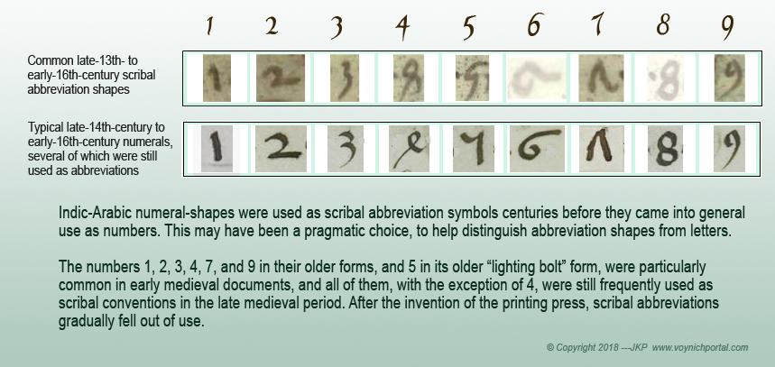
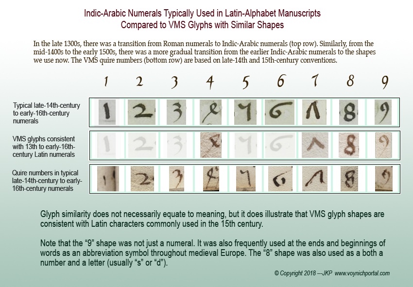
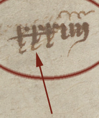
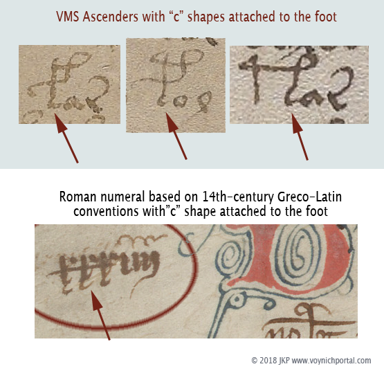
I couldn’t help noticing that “Arabic” numerals, as they were used by Latin scribes in the 14th and 15th centuries, resemble Indic numerals more than Arabic, and I subsequently saw the credit line in Latin, in the Codex Vigilanus (Spain, 976), attributing the number system to the Indians.

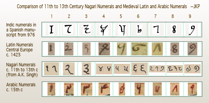
The earliest-known Indian numerals in a European manuscript are in the Codex Vigilanus (976 CE). It’s possible the manuscript reached the Spaniards through Arabic traders, thus leading to the “Arabic” moniker.

Leonardo of Pisa, now known as Fibonacci, appears to have independently discovered the Indic number system that was documented in Spain two centuries earlier. While traveling in Bugia, North Africa, with his father, he observed the notation system and calculations used by Muslim traders. When he returned to Pisa, he wrote Liber abbaci “Book of Calculation”, which included the Indic numerals. There are no copies of the original, completed in 1202, but a number of copies of Fibonacci’s enlarged 1228 edition survive.

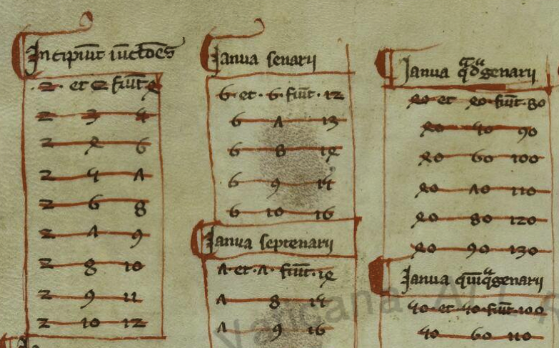
The following is from a copy of Fibonacci’s book, believed to be from the late 13th century (BAV Pal. Lat. 1343). Like the Spanish manuscript, it introduced the numeral system that became popular until the 15th century, when slightly rotated glyphs for 4 and 7 and a more curled 5 evolved into our modern system:

Despite widespread acclaim for Fibonacci’s 13th-century manuscript on computation, change occurred slowly, and Roman numerals did not significantly give way until the 15th century when more flexible calculations were needed for scientific studies.


Latin Conventions in Medieval Scripts

Researchers often miss similarities between VMS glyphs and Latin because medieval scribes used many ligatures and abbreviations that are not taught in modern Latin. These were as integral as the letters themselves, and it’s hard to find late-medieval manuscripts without them.

Before describing similarities between Latin and Indic scripts, it’s important to understand how Latin is more than just an alphabet. You’ll note in the examples that follow that several of these scribal conventions are apparent in Voynichese.
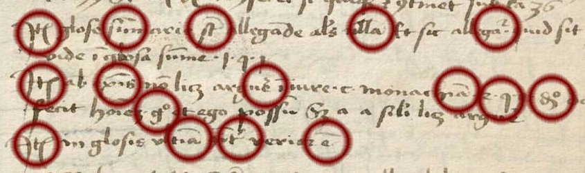
Example #1

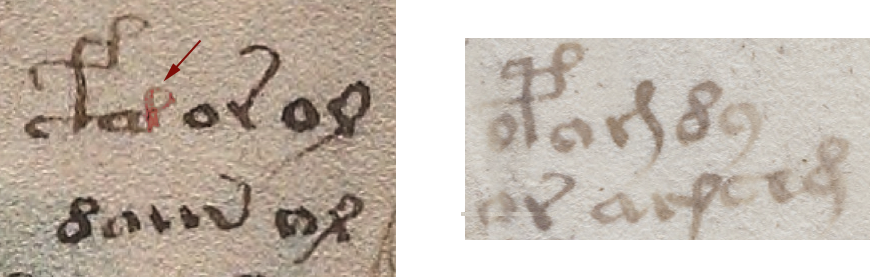
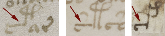
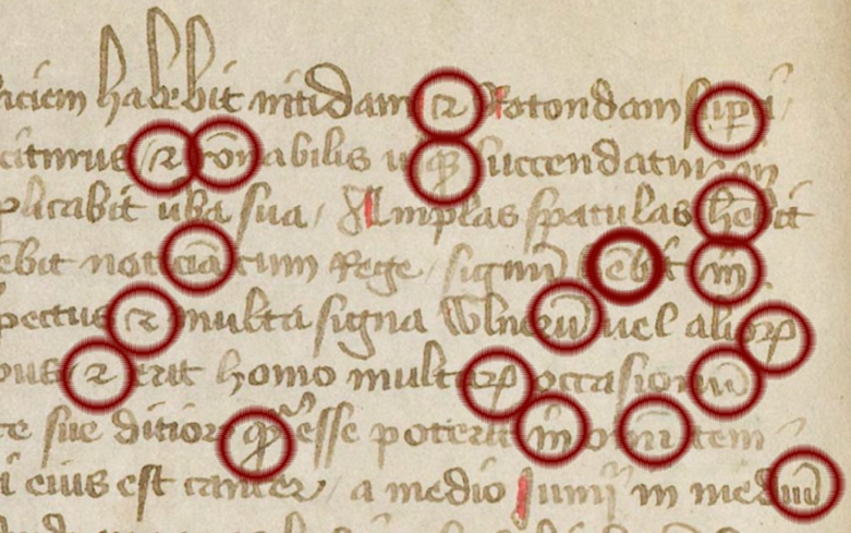
The first sample (BNF Lat 731) is lightly abbreviated. It uses some of the more common Latin conventions, including quibus, per, et, tails on the ends of words that loop back over the previous letters to indicate missing letters (it’s like an attached apostrophe), and caps over other letters to serve much the same purpose when the missing letters are closer to the middle of the word than the end.

Notice that loop-back tails and caps are common in the VMS, and that the abbreviation symbol that resembles a “2” or back-leaning “r” is, as well.
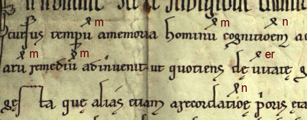
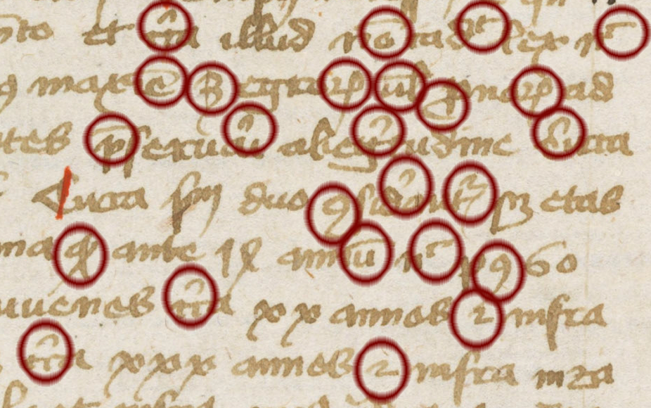
Example #2

The second example (BSB CLM 29505) also uses very common conventions, but not identical to the previous example. Scribes were free to pick and choose what was convenient because they were interpreted by context.

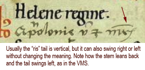
In this example, we see the common symbol for “Item” (at the beginnings of lines)—it resembles EVA-k; the macron or “cap” that indicates missing letters; the swooped-back tail at the ends of words (also missing letters); g° to stand for degree (grado/grade); a squiggly line over the “e”, which usually indicates a missing “r” or “er” “ir” or “re” (again, depending on context). Note that this is similar to the squiggle on the red weirdo on VMS 1r.

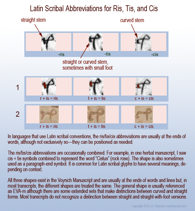
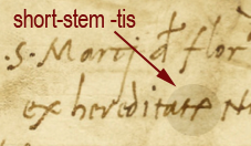
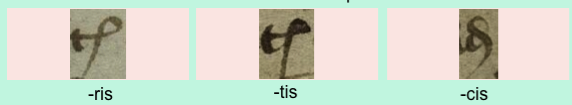
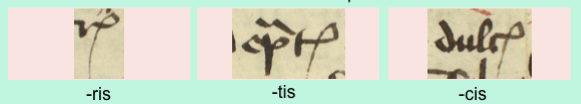
The loop on “item” is also used at the ends of words to represent “is” with the Latin suffixes -ris/-cis/-tis being drawn like EVA-m.

Notice also the tail on the “r” on the last line. This tail wasn’t always added to “r”, sometimes it was added to “i”, so one has to read for context to know which letter was intended. Take note that the shape of the tail sometimes indicates specifically which letters are missing (I’ll come back to that later), but not all scribes distinguished the missing letters by shape.

Thus, there are four scribal conventions in this small sample that are found as VMS glyphs:

Example #3

The third example (Ms San 827) makes slightly more frequent use of abbreviations, but they are still very common ones and easily readable.

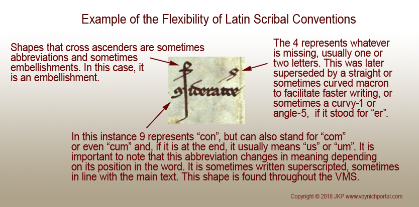
In sample #3, note the lines and caps over the letters to indicate missing letters, the curled tail on the “p” to stand for “pro”, the symbol that resembles a “2” which sometimes means “et” (and) but often means -ur or tur.

On the fourth and fifth lines, you will see the “9” symbol at the beginning of one word and the end of another. At the beginning, in this example, it stands for “con-“. At the end it is usually “-us” or “-um”. This is one of the most common glyph-shapes in the VMS and, as in Latin, it is usually at the end, but sometimes at the beginning:

Example #4

The above examples are all from the 15th century, but conventions were similar in the 11th to 14th centuries, leading up to the creation of the VMS. The following earlier text (OBV SG 21), uses all of the same concepts and most of the same conventions:

Thus, with four brief samples, and the numerals that evolved from Greek that were mentioned in a previous blog, we can account for the majority of glyphs in the VMS.

The problem is not in relating the VMS glyph-shapes to Latin letters, ligatures, and abbreviations—the similarities are numerous and obvious—the difficulty is in determining their meaning because VMS tokens do not, in general, behave like Latin or the majority of natural languages in terms of the variability of the words or the characters within the words. Here are some important differences:

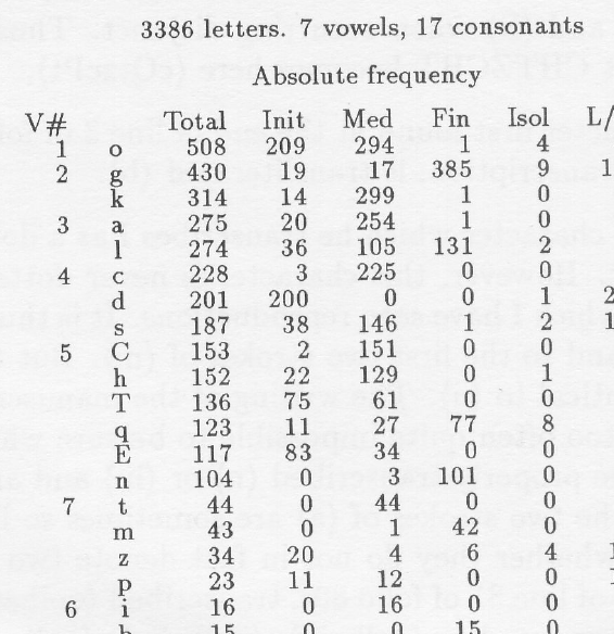
  • In Latin scripts used for a variety of languages, abbreviation symbols can be associated with many different letters. In the VMS we see caps only on EVA-sh and occasionally EVA-q.
  • In Latin, the swept-back tail is found on almost any character where letters have been omitted near the end of a word. In the VMS, it is specific to EVA-e, EVA-r, and the last glyph in “daiin”.
  • The “9” symbol is shaped and positioned the same in both Latin and Voynichese, but in Voynichese it’s much too frequent to mean the same thing as it means in Latin (or other common languages).

So the shapes are similar to Latin, but the extreme repetition and positional rigidity are not.

After the 15th century, abbreviations and ligatures fell out of use, as Latin scholarship was replaced by local languages, and the newly invented printing press and typewriter introduced mechanical limitations that made it difficult to mimic these scribal traditions.

Ties with the Eastern World

So what does all this have to do with the Indian scripts mentioned at the beginning?

Dozens of languages have been mentioned in connection with the VMS, but claiming it’s a specific language is easy. I saw one person claim five different languages in the same week, and another claimed three more in the course of three months. Proving that it’s a specific language is the real challenge, and so far no one has provided a convincing translation of even one paragraph.

I think I know why so many different languages have been proposed for the VMS. It’s partly because expanding or anagraming text expressly turns it into readable text or, if Voynichese is based on natural language, it may be partly because words related to disciplines like science are often loanwords and thus similar in many languages. But this bewildering array of suggested languages might not be entirely imaginary… certain languages did, in fact, have more in common with one another in the Middle Ages than they do now.

As an example, Indo-Iranian writing styles are more similar to medieval Latin than east-Asian character-based scripts like Chinese—both come from proto-Indo-European roots.

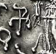
The Indo-Greeks and others who subsequently ruled Pakistan kept some of their native customs and adapted others from local culture. They blended pagan gods with Buddhist beliefs and minted bilingual Indo-Greek coins, as in the following example from c. 100 BCE:

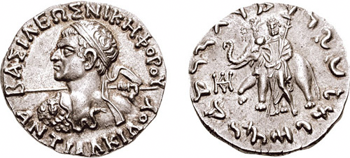
[Image courtesy of the Classical Numismatic Group, Inc.]

The Kushana, nomadic peoples from central Asia, at one time ruled a large region that included Afghanistan, parts of Pakistan, and northern India, and almost shared a border with the Romans during Trajan’s and Hadrian’s rules (a coin mould featuring Emperor Hadrian was found in excavations of c. 2 CE artifacts in Rairh, near New Delhi). The Kushana were Indo-Europeans who actively traded with both Rome and China.

This gold coin, probably of Kushan origin, is a testament to multicultural interaction. It was minted in India, inscribed with Greek letters with the ruler on one side and “Boddo” (Buddha) on the other, and was unearthed in Afghanistan. Sometimes Zeus was substituted for Buddha on this style of coin.

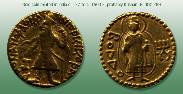
[Image courtesy of the British Museum.]

Commonalities with Indo-Iranian Scripts

Please note that I have used Gujarati as an example of glyph similarities, even though it is more recent than Nagari, because it does not have the line across the top (thus making it easier for westerners to read). It is very similar to other Indic scripts if you ignore the top-line and look specifically at the shapes underneath. The following observations apply to a group of related Indic scripts descended from Sanskrit, not specifically to Gujarati.

I’ll start with some of the simpler and more familiar shapes, followed by glyphs with ascenders (gallows characters), because the majority of VMS glyphs are Latin. Only a few that are rarely used (or which show up only once) are distinctly eastern and will be described later.


Glyphs with Tails

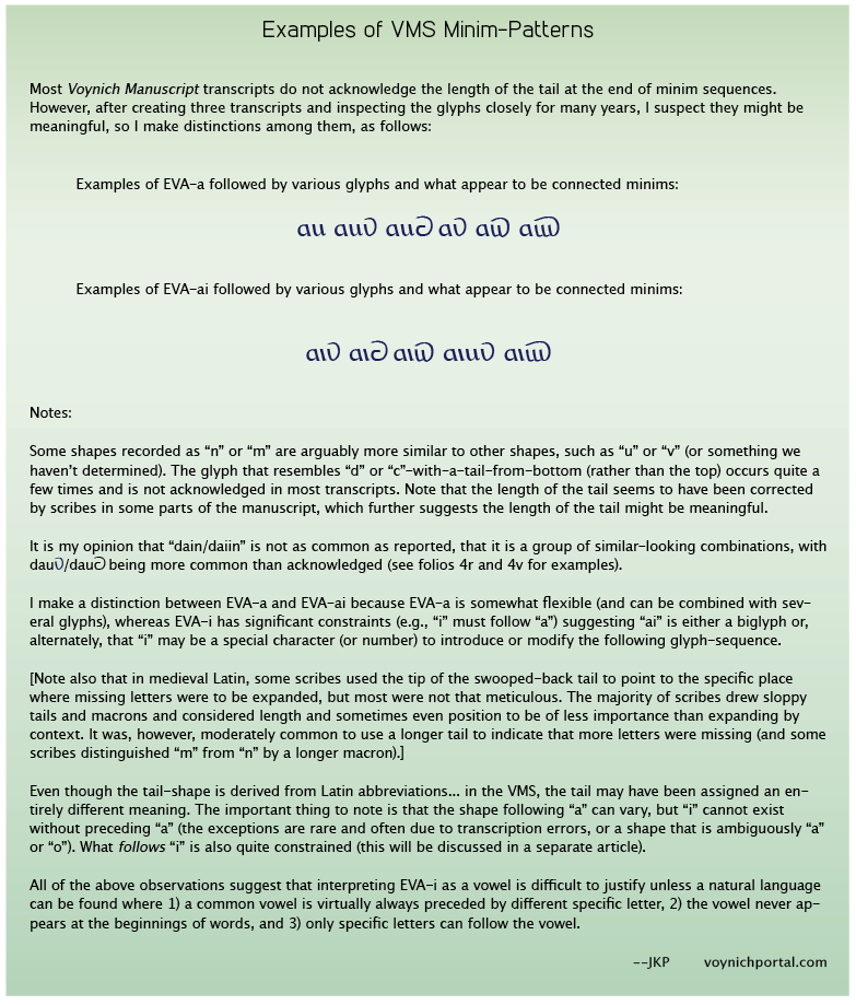
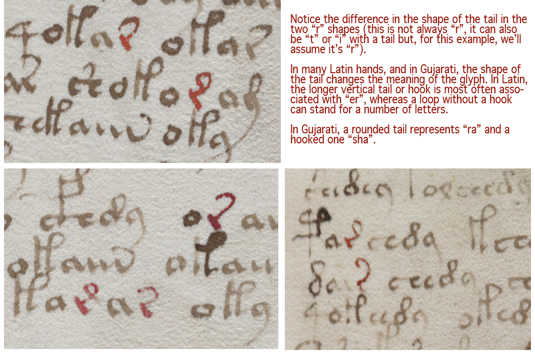
Voynichese has a number of glyphs with tails, a ubiquitous convention in medieval Latin. Adding a tail to a glyph wasn’t just an embellishment, it was a way to indicate missing letters. In the VMS, the r, c, and minim shapes at the end of the word “daiin” all have distinctive tails. Certain Indic glyphs also have tails, and the shape or length of the tail can change the sound or meaning of a letter.

Here are some interesting patterns in Latin and certain Indic scripts, that may have some relevance to the VMS:

  • EVA-r. In Latin, when a tail is added to “r”, it can mean “rus, but it often means “re”, “er”, “ra”, “ar”, “ir”, or “ri”. In other words, a vowel is inherently indicated by a tail added to a consonant, as in some of the abugida languages. Similarly, in the later 13th- and 14th-century Nagari scripts, and in Gujarati, you will see an “r” shape with a curved tail to represent “r” or “ar” or “ra”. There are several places in the VMS where two forms of tails are apparent in the same block of text. In Voynichese, Latin, and Gujarati, the curved tail is more frequent than the extended-loop tail. If Voynichese is anything like Latin, Gujarati, or some of the Malaysian scripts, and not just a smokescreen to make the text look like Latin, then extending the tail and changing its shape changes the meaning of the glyph:
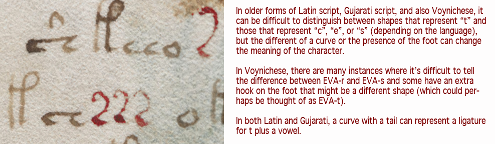
  • EVA-s. In many older Latin scripts, the “t” was written like a “c”, rather than with a straight stem. It can be a struggle to tell them apart. Adding a tail to this c-like tee stood for “te” or “ta” or most combinations of “t” plus a vowel (it can also mean “ter” or “tus”). In Gujarati, the symbol for “ta” is a c with a tail (note that both “r” and “c” shapes with tails are found in the VMS) and some are ambiguous, with a slight hook on the foot, perhaps denoting a third character. In Greek, a c-shape was used as an abbreviation for “kai” (and). Once again, if you look at it from a Latin point of view, the c-shape can also be “e” (many early medieval e-shapes didn’t have a crossbar or hook), and adding the tail turns it into “eius” or “et” for “and” (in fact, if you extend the tail a little more, it becomes an ampersand). Thus, we have a glyph with many meanings. C-tail can be the abbreviation for te, ta, or ter, or for et, eius, or er. In the VMS, as in Latin, this tailed shape, which sometimes resembles c-tail, sometimes e-tail, and sometimes t-tail, is found both individually and within other words.
  • EVA-d. If you look at variations of the thorn character, which is usually associated with northern European scripts, you’ll see some of them are written like a curvy “d” or a Greek sigma with a small bar through the ascender. It may be coincidental, but the Gujarati shape for “tha” is a curvy “d” shape. There’s no line through the stem, but many Latin scribes wrote it that way, and there is a strong association between “d” and “th” sounds in various Indo-European languages. If you round the top loop a little farther, as some scribes did with Latin “d”, thorn, and Greek sigma, it resembles a figure-8. This is why many researchers read the figure-8 on folio 116v as an “s” or “d”, but perhaps “th” should also be considered.

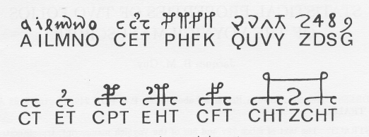
There are analogs to VMS shapes in both medieval Latin and some of the Indic scripts. The “a” and “o” shapes need no explanation—they are distinctly Latin, and “o” is common to many languages.

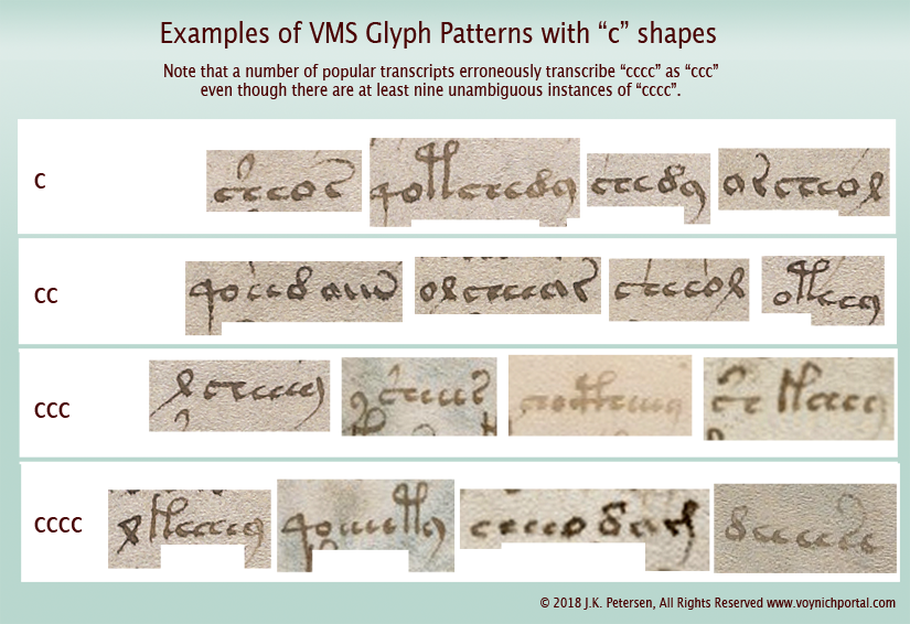
The simple “c” shape doesn’t tell us much either, because it is found in most alphabets, but two c-shapes tightly joined were used in early-medieval Latin to express “a”, “t”, and sometimes “u”. The double-c is also found in the VMS (right)—a distinction that might be meaningful but is not recognized in most VMS transcripts. In fact, in the Takahashi transcript, which is probably the most widely used, the extra c-shapes are sometimes omitted.

But tails are meaningful in both Latin and Indic languages, and ligatures common to both. Sometimes the tail changes the letter, sometimes it extends a sound, and sometimes it specifies which vowel is used. Note that Nagari and Gujarati are syllabic languages which might not seem to have much in common with Latin, but medieval Latin script has its share of implied vowels.

A sidenote on abugida scripts… Gujarati is a syllabic language, but not entirely an abugida script (neither is Hebrew). Both Hebrew and Gujarati include a shape for alpha, so it is explicit rather than implied (it’s possible that in ancient languages alpha was more of a glottal stop than a vowel), but most of the time the most common vowel (alpha) is rolled in with the consonant, as it is in a number of Asian and African languages.

In Gujarati, several of the syllables are written as though they were ligatures, with a vertical stem on the right  (as in sa, pa, na, and numerous other glyphs). This is technically part of the syllable but can also be thought of as the implied vowel. This vertical line has an additional function—it can be added to the preceding vowel or syllable to lengthen it into a long vowel, as in the following example:

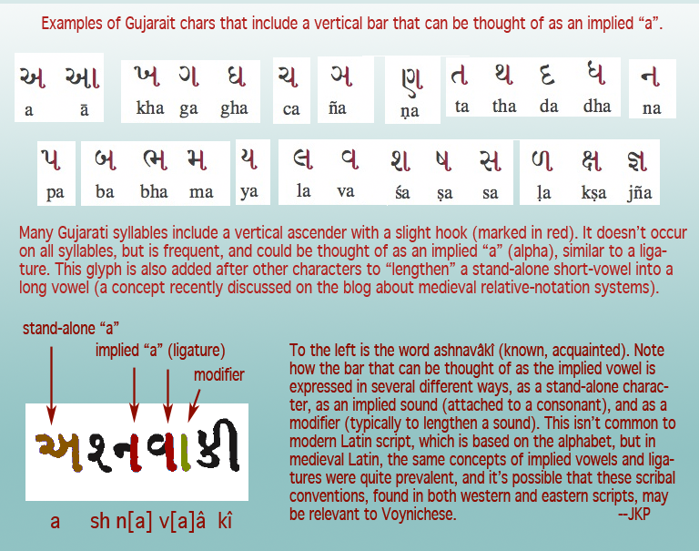
Note how the vertical bar changes a short-a to long-a, a symbolic concept that was mentioned in the previous relative notation blog. A similar convention exists in Modi, another Indic script that is first recorded in the late 14th century.

Some of the commonalities between Latin and Indic scripts disappeared when Latin abbreviations were dropped and Latin was reduced to a simple alphabet.

Summary

I have much more information on this subject and was going to try to cover the Voynchese ascenders and some of the rare characters in the same blog  because they also have their roots in scribal conventions, but this is becoming too long, so I will continue with the less common characters in a future installment.

… to be continued…

J.K. Petersen


© Copyright 2017 J.K. Petersen, All Rights Reserved
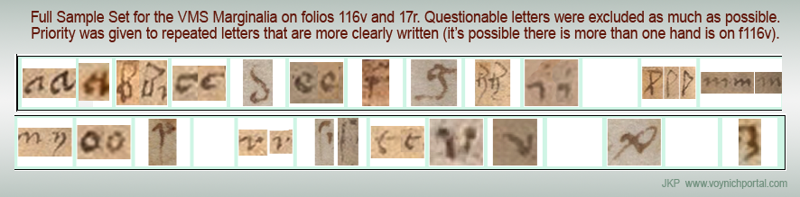