Notice: Function _load_textdomain_just_in_time was called incorrectly. Translation loading for the advanced-gutenberg-blocks domain was triggered too early. This is usually an indicator for some code in the plugin or theme running too early. Translations should be loaded at the init action or later. Please see Debugging in WordPress for more information. (This message was added in version 6.7.0.) in /home4/jensonje/public_html/voynichportal/wp-includes/functions.php on line 6131
Notice: Function _load_textdomain_just_in_time was called incorrectly. Translation loading for the wp-external-links domain was triggered too early. This is usually an indicator for some code in the plugin or theme running too early. Translations should be loaded at the init action or later. Please see Debugging in WordPress for more information. (This message was added in version 6.7.0.) in /home4/jensonje/public_html/voynichportal/wp-includes/functions.php on line 6131 J.K. Petersen | Voynich Portal | Page voynichportal.com|author|voynich-mage|page|4| Deprecated: Function WP_Dependencies->add_data() was called with an argument that is http://marionjensen.com/2006/03 deprecated since version 6.9.0! IE conditional comments are ignored by all supported browsers. in /home4/jensonje/public_html/voynichportal/wp-includes/functions.php on line 6131
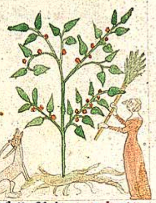
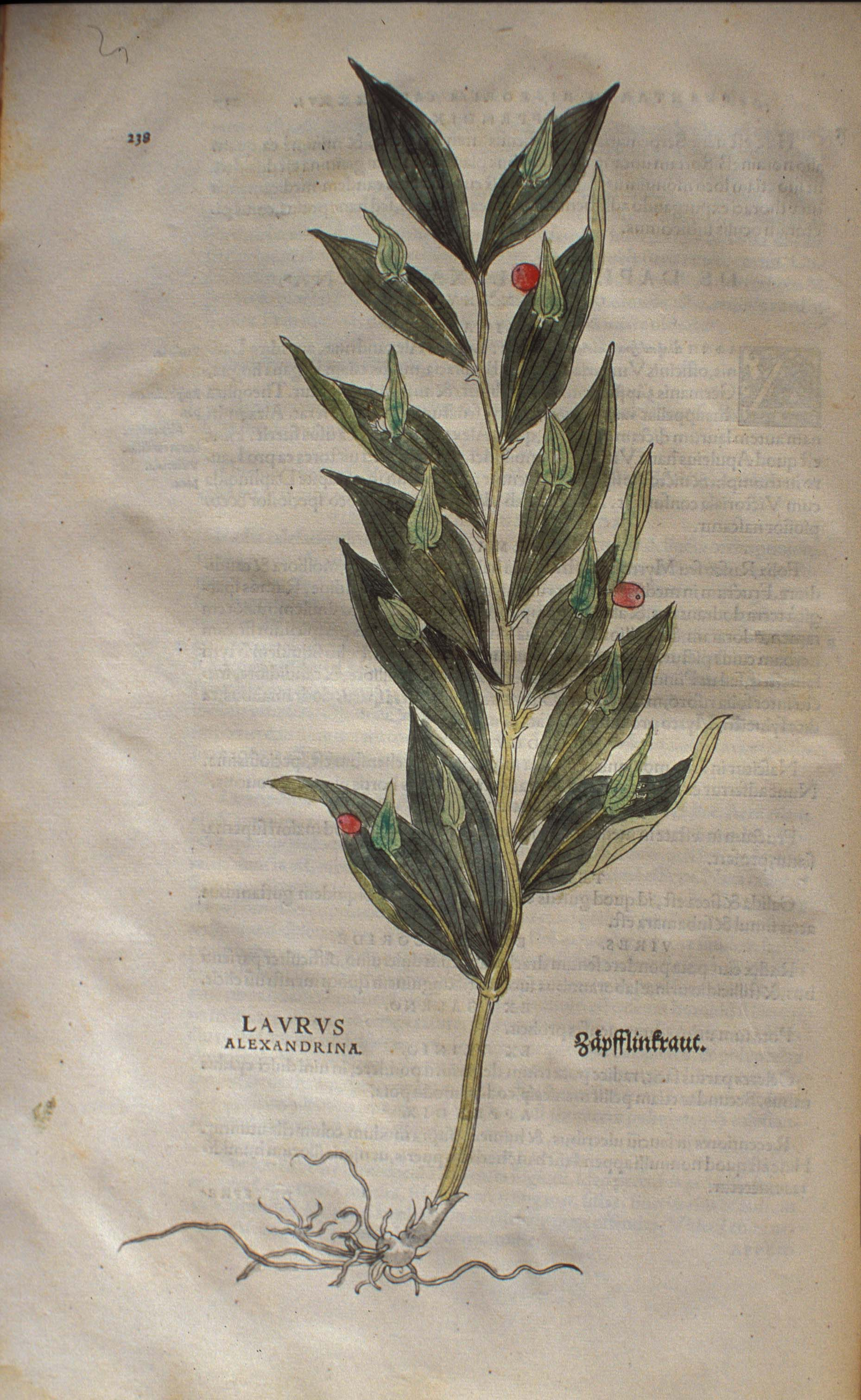
Butcher’s broom is a fascinating plant. It is native to Eurasia and is found in many medieval herbals. It has distinctive flowers and colorful fruits that are aligned with the inner part of the leaf when they first emerge. The branches and leaves are stiff, yet resilient enough to be used for broom-making.
Plant with Polka Dots
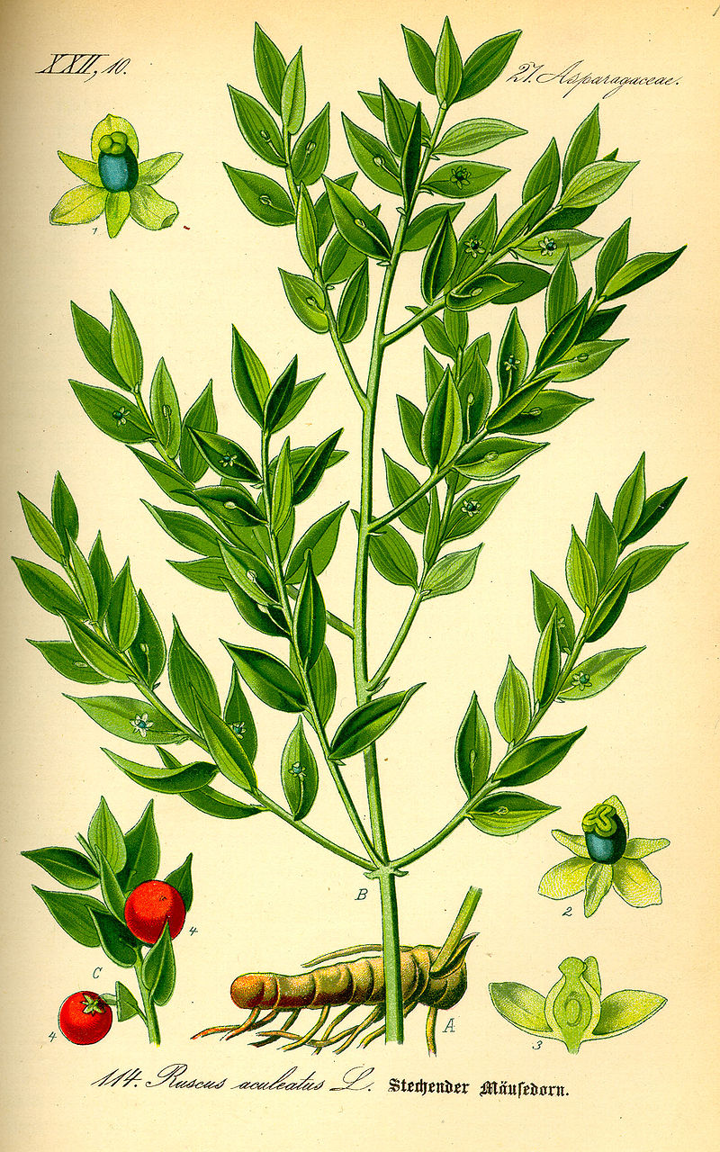
Here is a large-sized image of butcher’s broom, Ruscus aculeatus. Note the position of the flowers within the leaf:
But if you look closely, you will notice there is a stalk. It’s very slender so the flowers almost appear to be growing out of the leaf, an illusion that was emphasized by many medieval illustrators.
Even Elizabeth Blackwell drew it this way (which is not 100% accurate, since the fruits tend to hang down when they get ripe, but it gets across the impression that most people have of the plant).
But it isn’t just an illusion…
Some species of Ruscus have a flower that actually grows out of the leaf.
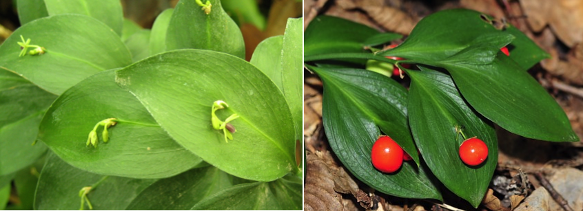
For example, Ruscus hypoglossum, also called Alexandrina’s laurel, and Ruscus hypophyllum have this charming adaptation:
Ruscus hypophyllum flowers and Ruscus hypoglossum berries growing from the inner part of the leaf [Images: Laurha of España and A. Karpov, Wikipedia]
Many species of this plant are shrubby and have a fairly extensive rhizome (side-growing root from which new shoots may emerge). R. hypoglossum has an additional peculiarity, a little leaflet that covers the flower and sometimes looks like it’s pinching the berry, a quirk that inspired the name Double Tongue:
Medieval Ruscus
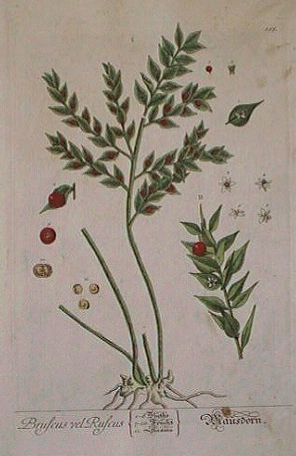
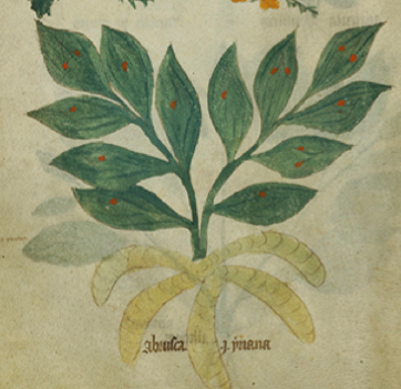
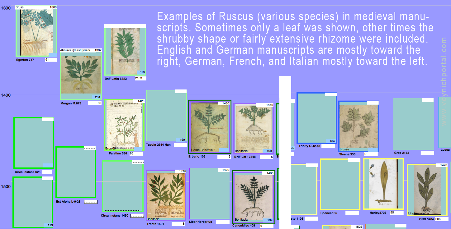
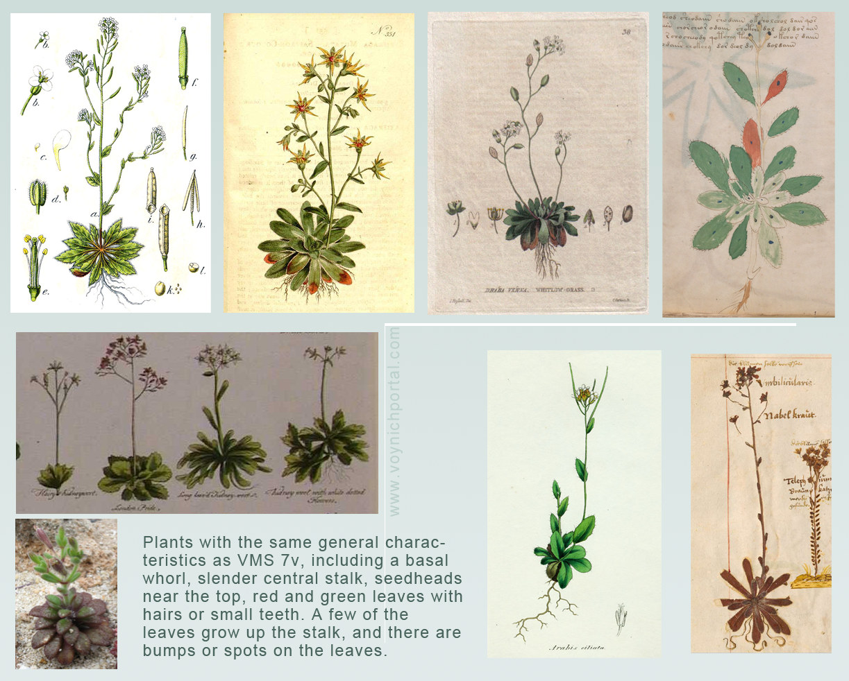
Both the unusual form of Ruscus and the fine-stemmed form of Ruscus are found in medieval herbals and many of them are drawn with dots on the leaves or red spots to represent the berries. Depending on the region and the species, they have names like Abrusca, Brusci, Brusse, and Bonifacia.
Some manuscripts included both kinds of Ruscus, but most of them chose one. Here are some examples from my files, from 14th- and 15th-century manuscripts:
Dots on Leaves
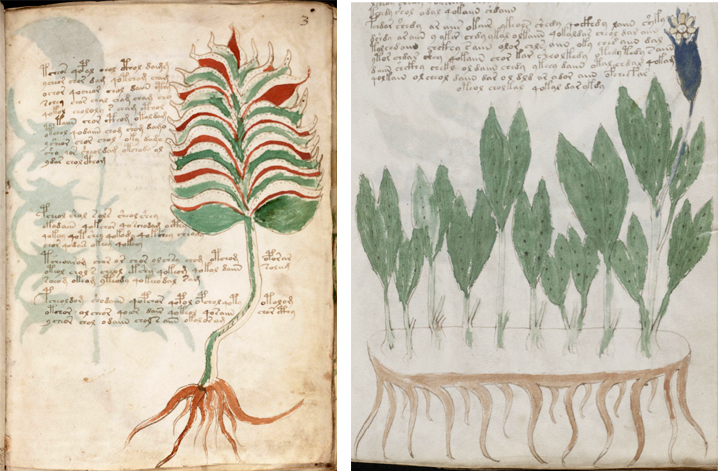
Is there a VMS plant with dots on the leaves? Yes. Plants 3r and 39r have dots, but there are many dots, drawn in lines, and the plants don’t look like Ruscus:
There is also a three-leaved plant in the small-plants section with dots on the leaves, but there isn’t enough detail to identify the plant. The label oraro isn’t much help either. It’s possible it is something like clover or medicago, which have spots or chevrons and which have leaves in groups of three, but it’s difficult to know for sure.
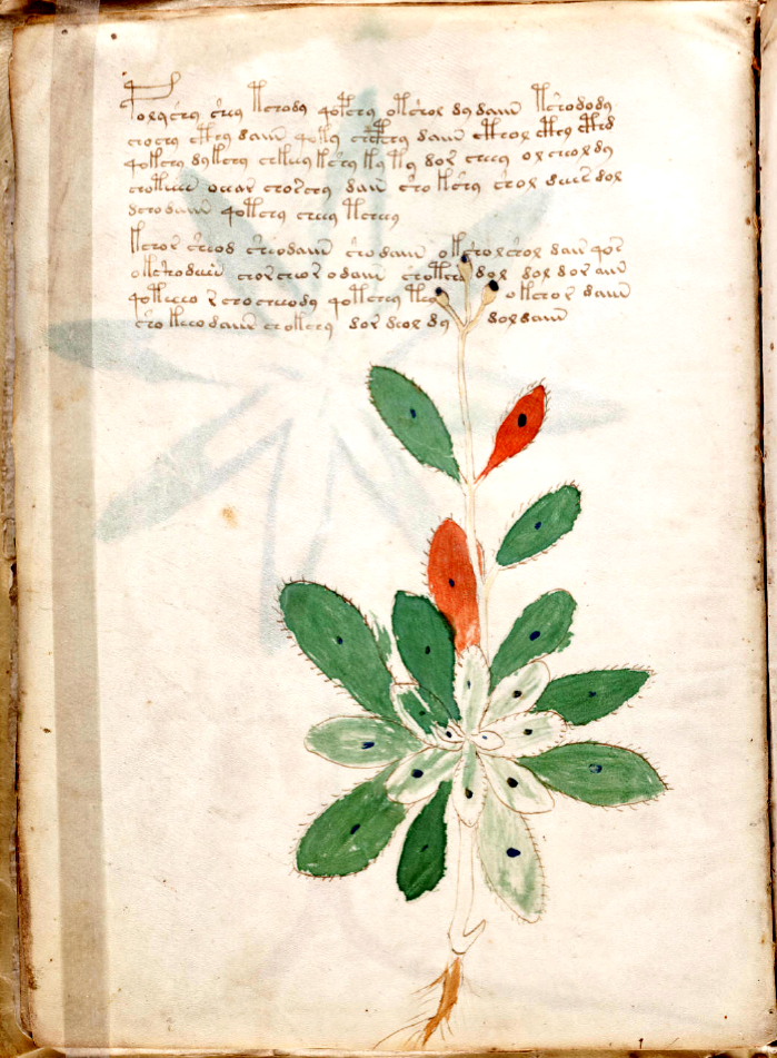
Plant 7v
What about Plant 7v? It has a prominent spot in the middle of each leaf. Could it be Ruscus?
No, I don’t think so. Obviously the dots are not flowers or seeds because the seedhead is at the top of the stalk. It’s a different kind of plant from Ruscus, one with a nicely drawn basal rosette, red and green leaves (this is a common trait in plants of this shape). It appears to have hairy or spiny leaves (I’m leaning toward hairy since there are other VMS plants that have more pointy margins that might be spiny). In contrast to the VMS plant, Ruscus leaves are smooth and very distinctly green.
Plant 7v has a tap root, Ruscus has a lumpy rhizome.
So if it’s not Ruscus, what is it?
Some plants have spots that are part of the plant. For example, some species of Orchis and Arum have brown speckles. Pulmonaria has numerous whitish spots (in fact, I think Plant 39r might represent Pulmonaria).
Some plants have specific parasites or diseases that consistently create spots. Some have spots that look like rust (e.g., Saxifraga mutata).
Overall Shape & Characteristics
There is a group of smallish herbs that look like VMS 7v. Most of them are small-to-medium-sized in height. They all have a tall slender central stalk and several of them have rounded seedheads. A few of the leaves grow up the stalk, but most are concentrated at the base in a whorl. Many of them are hairy.
This group of plants often has a mixture of red and green leaves later in the year when the plant goes to seed, and many of them have tap roots or a few fine tendrils similar in shape to buttercup roots.
Some of them have spots, some of them have little bumps on the leaves that look like spots because they are sufficiently raised to create shadows (e.g., Arabis, Erophila, Limonium, Silene sedoides, some species of Androsace, and Draba).
Here are some examples showing the overall form. Note the basal rosettes on the herbarium specimen bottom right is most similar in orientation to the VMS drawing. Basal rosettes were often drawn as though flattened in medieval manuscripts:
There are also plants that look like 7v that catch dew on their leaves, which make round sparkly dots, and have little teeth on the edges of the leaves, like Lewisia cotyledon. Some plants are incurved and collect a single drop of dew, but not all of them have hairy leaves.
It’s hard to choose among these plants. They are all very similar and all have distinctive bumps or spots, and many have red leaves mixed with the green, or are distinctly red and green later in the year, but the VMS seedheads appear to be somewhat rounded, and Arabis tends to produce long narrow pods, so perhaps Arabis is less likely than some of the others. Draba has rounded seedpods but it’s still difficult to eliminate the others.
Summary
I hope it is clear from these examples that Plant 7v is not likely to be Butcher’s broom. It has the wrong overall shape and a completely different seed stalk. Which of the rosette herbs it might be is difficult to say, but the seedheads are more similar to Draba and Silene than most of the others.
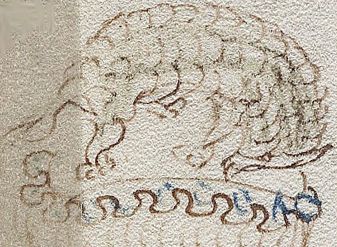
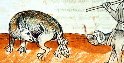
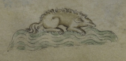
There’s been a fervor of renewed interest in the VMS mystery animal on folio 80v (including a post about the catoblepas on Nick Pelling’s blog), so I looked at the folio again (and glanced back through my blogs) to see if there was anything that could be said about the critter that hasn’t already been thoroughly investigated.
Looking at the Details
The mystery animal usually goes by the working name of “pangolin” or “armadillo” since it appears to have scales and to be in a curled-up position.
The scales are not certain, however, since the bumps are pointing in the wrong direction, and they don’t really look like the plates of an armadillo. They might be scales (they do appear to overlap), or maybe it’s a VMS version of bumpy fur or wool.
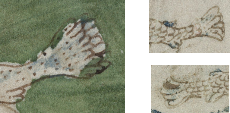
The Wispy Tail
The tail is quite ambiguous. Are those untidy hair strands or is it a forked tail? In other VMS drawings, fish tails are quite detailed:
If the “pangolin” has a fish tail, why is it so tentative—why is it strandy instead of loopy? Is it intentionally vague? Or did the different context inspire the illustrator in another direction? Or is it a different kind of tail altogether, like a hairy tail? Maybe it’s vague because it’s an animal the illustrator has never seen.
The Feet
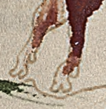
The mystery animal’s feet look like cat’s paws without the claws showing. They look nothing like the feet of a pangolin or armadillo. But the VMS illustrator wasn’t exactly a rock star in the matter of drawing feet, as can be seen by the drawing on the right. These are the hooves of Taurus in the zodiac-figures section. Unlike most medieval drawings of hooves, they have soft edges.
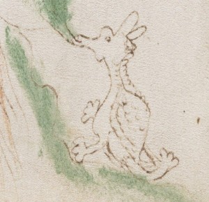
This peculiarity is even more apparent in the feet of the dragon-like critter on the right. Instead of the fearsome eagle-like claws often seen on mythical animals, they are distinctly round, like those of the the mystery animal on f80v. Also, like the 80v animal, this critter has a long nose, long ears, a somewhat ambiguous tail (is it a medieval flower-tail? if so, why does it look like an extra paw?). It has some scaly stuff on its back (are they wings or a turtle shell?). Even though it somewhat resembles medieval dragon drawings, it’s hard to pin down the details.
The Head
The head of 80v, depending on how you interpret it, has a pointy upturned snout, possibly a round eye, and possibly a pointy horn or ear.
If it’s a horn, then it might be a reference to Jason and the golden fleece, something I’ve blogged about previously. Or maybe it refers to Aries.
If it’s an ear, then it seems to be one that’s long and pointy.
Other Possibilities
I try to look at the animal in as many different ways as possible (fur? hair? scales? leaves?).
Here is Pliny’s description of the catoblepas from Pelling’s site:
“…the source of the Nile… In its neighbourhood there is an animal called the Catoblepas, in other respects of moderate size and inactive with the rest of its limbs, only with a very heavy head which it carries with difficulty — it is always hanging down to the ground; otherwise it is deadly to the human race, as all who see its eyes expire immediately.”
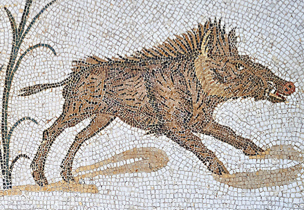
When I read it, I thought to myself, that sounds like a warthog. The warthog roots along the ground with its head down, is somewhat hairy with a long mane that blows up when it runs. It has a very heavy head and is a very aggressive animal, dangerous to humans. In other descriptions, a mane like a horse is mentioned:
The well-armored warthog has a very heavy head and a boar-like tail with a hairy tuft [Photo: Bernard Dupont, Wikimedia Commons].
Could Catoblepas Alches from Der Naturen Bloeme (KB KA 16 c. 1350) be a hoofed and heavy-headed warthog?
The rhinocerous also has a very large head and forages with its head down, but it doesn’t have a mane, and most of the descriptions of catoblepas fit better with warthogs.
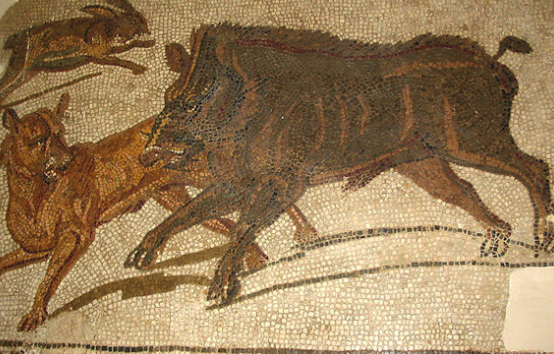
The range of many African animals has greatly diminished. There used to be lions as far north as the Caucasus and giraffes in northern Africa, so it’s possible the warthog ranged farther north in medieval times than it does now. It is closely related to the wild boar and it’s possible their range originally overlapped. They are very similar in form, but the wild boar does not have the long distinctive mane of the warthog. This Roman mosaic shows a mane and also buffalo-like shoulders:
Roman mosaic preserved in Bardo Museum, Tunisia
Here is another from the Bardo Museum with the mane and forelock standing up:
Warthogs are not especially known for smelly breath (it’s dangerous to get close to a warthog so it’s hard to get a whiff), but they do root around in poo, which might give them a reputation for smelly breath.
So I think there’s a fair possibility that catoblepas was inspired by the warthog. I noticed that Pliny does not mention scales, a feature that appears to have been added in later descriptions.
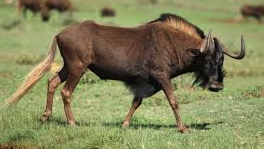
Wildebeest (gnu) [Photo: Derek Keats, Wikipedia]
Other animals, like the wildebeest are also possible. In basic form it is similar to the warthog, with heavy shoulders and a mane, but it is much larger and has the snout of an ox. In proportion to its body, however, the head is not as big as a warthog’s.
Both warthogs and wildebeests are very aggressive animals…
I wonder if an animal as aggressive and smelly as the catoblepas would be portrayed as the mellow-looking creature in the VMS. Are there other possibilities a little more in keeping with nymphs and cloudbands and more pleasant topics?
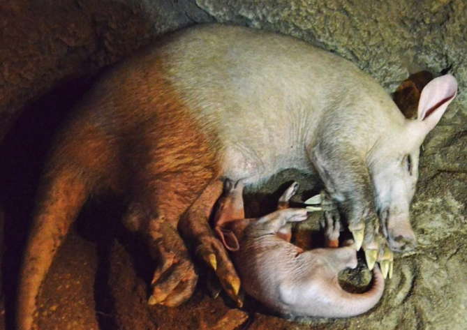
The Amiable Aardvark
On the voynich.ninja forum, I’ve suggested the critter on 80v looks like an aardvark (they often curl up like a cat when they are sleeping). The problem is that aardvarks don’t have scales and the critter on 80v might. They do sometimes have fur up to about 4″ long, depending on the climate and variety (seven species of aardvark have been merged into one, so they no longer consider them separate species, but the length and color of their coats can vary widely):
Snout-nosed aardvark mom and baby curled up together [photo courtesy of zooborns.com]
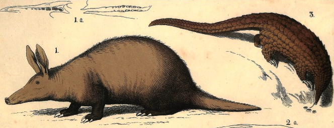
The nose of the ardvaark is a good match for the VMS critter. It turns up at the end, like a pig’s snout, and is used to hoover up ants and termites:
Screenshap from youtube video on aardvarks
When foraging, aardvarks always keep their noses to the ground and hunt by smell. For a long time it was thought that aardvarks and pangolins were related, perhaps because of their long tongues, and similar overall form and diet:
Could the VMS creature be a cross between an aardvark and a pangolin, cobbled together from a confused verbal report that describes ant-eating animals? There are many strange African animals in medieval bestiaries drawn from poorly understood verbal descriptions.
Part of the aardvark’s distribution is Ethiopia, a pilgrimage site sometimes included on medieval maps with a little line of European castle icons. The aardvark is a more amiable creature than the warthog—it is sometimes kept as a pet.
Back to the Beaver
In a 2016 blog, I suggested the critter might be a beaver, the animal most often depicted in herbal manuscripts and bestiaries as the unwilling donor of castorum, a substance in testicles that was thought to have medicinal value. Beavers were often drawn with scales, long ears, and long snouts, as in this example from the previous blog:
It was the curled-up position and scales that made me wonder if it might be the castorum beaver, since it is usually drawn with its nose in its groin, biting off its testicles. A cloudband might also be relevant since the beaver is making a choice between death or life without progeny.
Reptilian Possibilities
I wanted to include these enigmatic drawings because they show how far medieval drawings can diverge from nature. This furry doglike creature with chicken legs is from the Northumberland bestiary (c. mid-13th century):
And this c. 1315 creature has long ears, a wavy mane, fluffy tail and doesn’t look reptilian at all (BL Royal 2 B VII):
It may be hard to believe, but both of them are crocodiles. However, a crocodile is not really designed to tuck its head under its body.
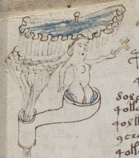
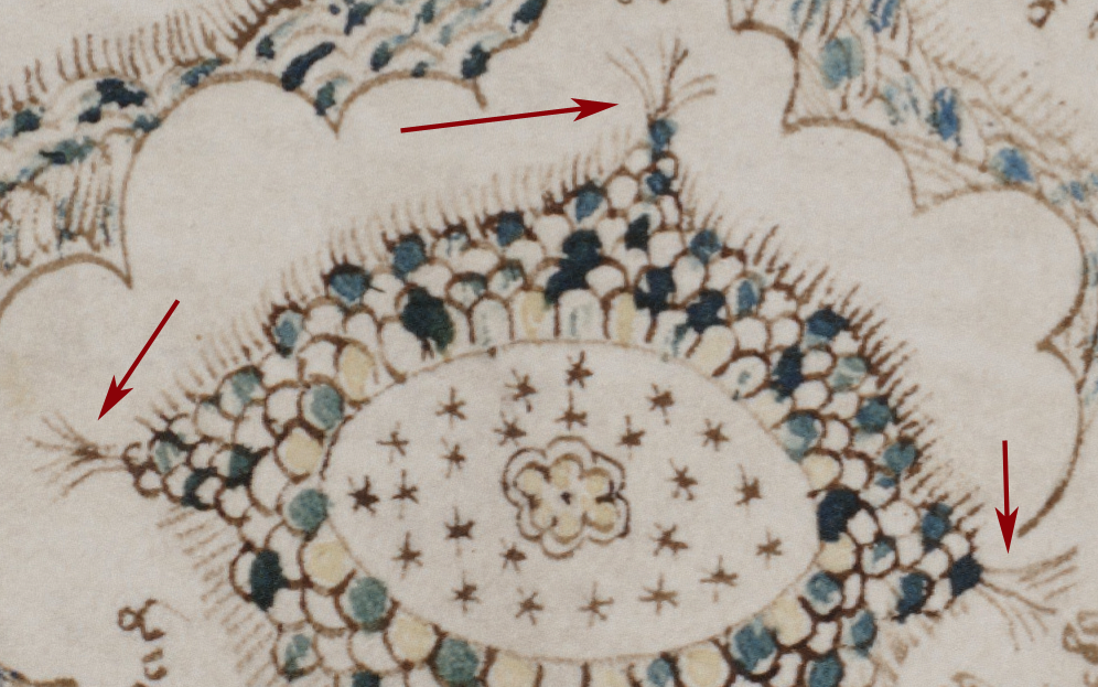
The Folio as a Whole
What else is going on on the folio? Critter 80v is sandwiched between hovering nymphs holding a spindle and a ring. And, oddly, the critter is lightly dabbed with streaks of green, a color associated more with reptiles than mammals.
In the green pool at the base of the folio is a nymph that started out with no breasts and has an unusually shaped pair of “eyeball” breasts quite different from the other nymphs (they look like they were added by a different hand).
There’s a lot going on on the right-hand side, too much to cover in this blog. K. Gheuens has suggested an interesting possibility—a connection with constellations. That’s a provocative idea and a topic in itself, so I’ll leave it to the reader to consider his interpretation while I get back to the critter…
What about the scalloped shape under the critter?
Is that a cloudband? Do the vertical lines represent rain?
Is it water, do the scallops represent waves?
There is certainly the hint of a cloudband in the middle-right rotum on the VMS “map” folio. But similar shapes also appear to resemble fabric.
On folio 79v, which is stylistically similar to 80v, the scalloped shape looks like an umbrella or tent-top with a finial. I don’t think we can assume every wavy shape is a cloudband.
If it’s fabric, maybe critter 80v is curled up on a cushion—a squarish cushion with a scalloped trim. Is this some nobleperson’s pet taking a nap?
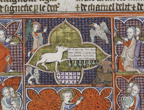
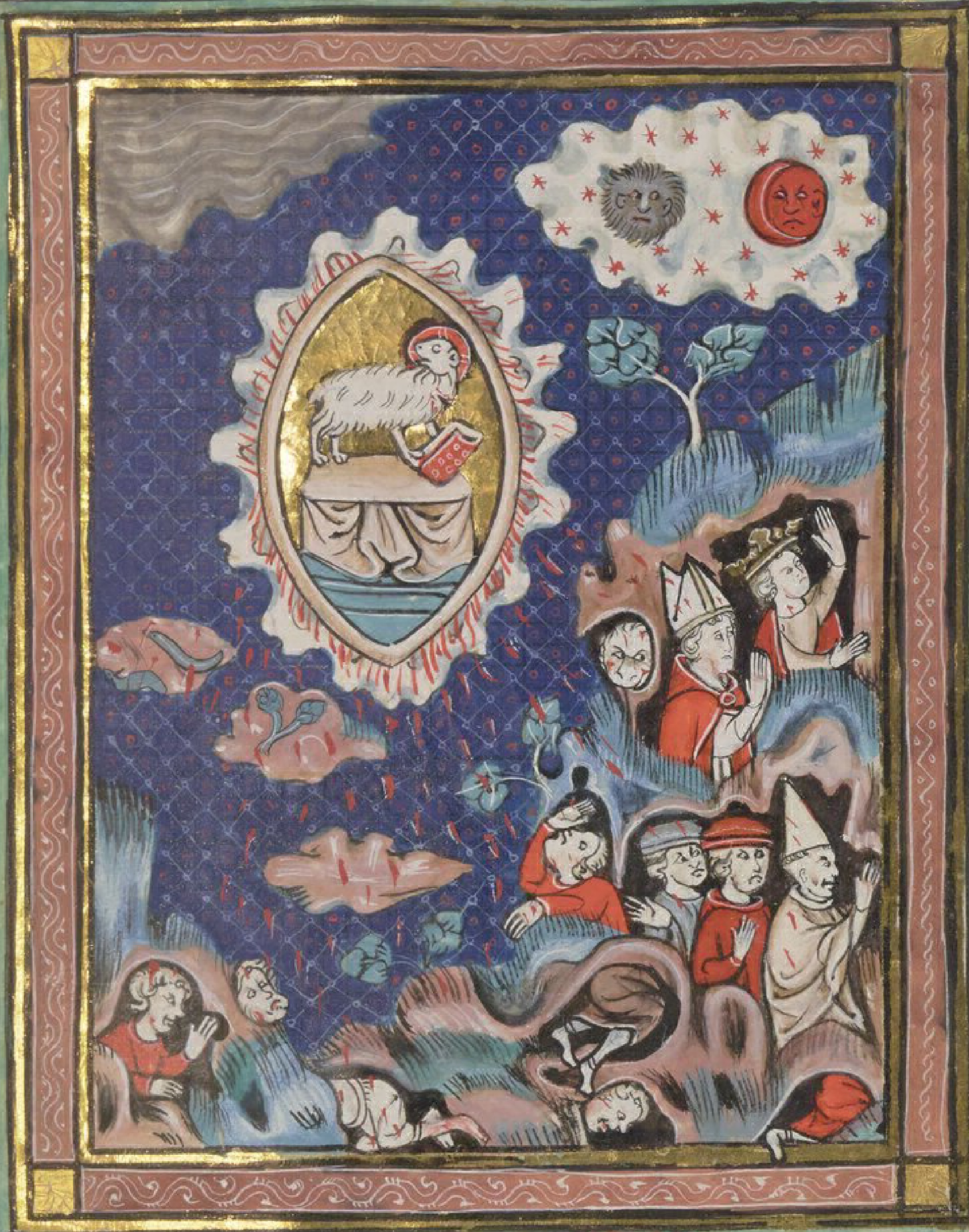
The idea of a pet aardvark or catoblepas doesn’t quite fit the context of hovering nymphs with attributes. The nymph above the critter sits in something resembling a double cloudband, at an elevated position on the folio, all of which makes her seem somewhat important. The one below holds out a ring… which brings me back to the idea of Agnus Dei (the lamb of God) that I suggested in a previous blog.
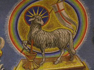
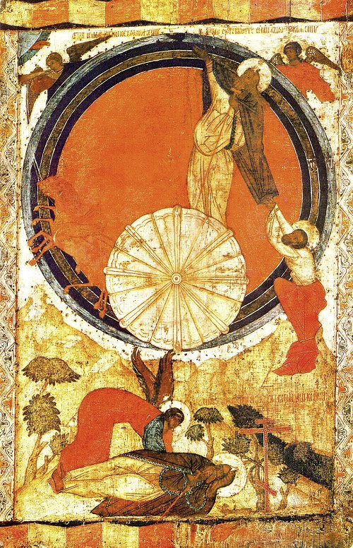
Agnus Dei
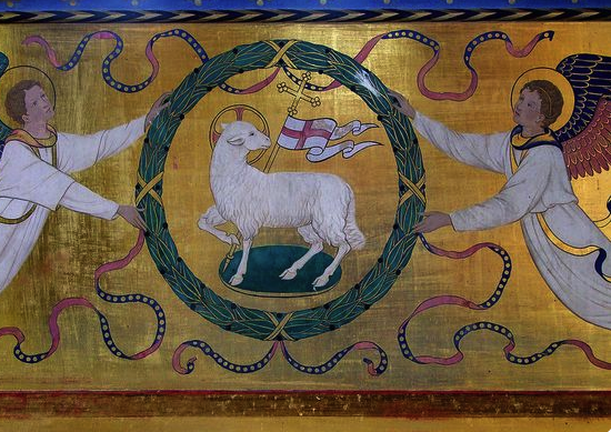
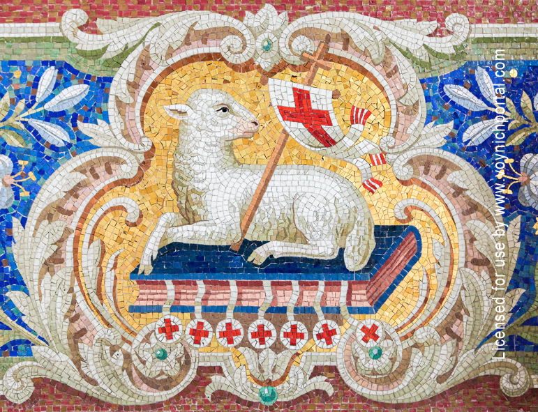
The lamb of God is associated with ascension and redemption, based on biblical passages. Much of the time, Agnus Dei is represented like this, standing in a prominent position, with a cross-staff and banner, often nimbed:
Here is another from British Library Additional 17333, with the lamb standing on an altar:
The lamb is often surrounded by a wreath or a rainbow, or decorative elements that one sees in church alcoves.
In almost all instances, the lamb is on some kind of pedestal or cloudband, or perched on the top of a crucifix. Frequently it is positioned midpoint on the page or fresco, between earthly matters and God:
In a 6th century mosaic in the Basilica of Santi Cosma e Damiano, the lamb is standing on a base with water flowing out below its feet. Pagan influences are still present in this very early depiction:
Lamb of God on a rock with flowing water in the Basilica of Cosmas and Damien, Rome [Photo credit: The library of Lee M. Jefferson, CC License 3.0]
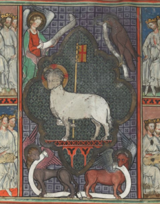
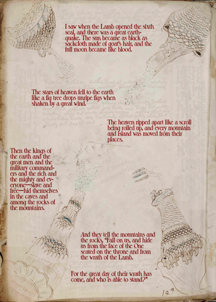
Toward the Middle Ages, it became popular to add a scroll or book with seven seals dangling from the base:
Agnus Dei and seven seals in an apocalypse manuscript from the early 14th century [Credit Cambridge, Corpus Christi College, CCCC MS 20]
Another popular medieval theme was setting the lamb on a cushion, cloudband, or book with seven seals dangling from the edge, as in this early 14th-century example in the Martini church in Braunschweig, Germany:
Agnus Dei on a book pedestal with seven dangling seals.
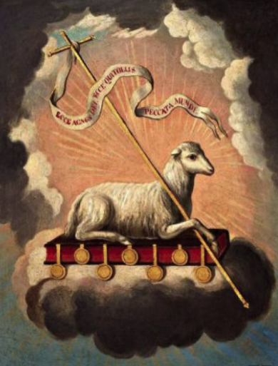
This 19th-century interpretation retains the traditional cross-staff, book, and seven seals, and places the book with the seals on a cloud-cushion:
Agnus Dei by José Campeche (early 19th century)
Could the lines under the VMS “cushion” be rain? Or does it represent movement (ascension?), or possibly an abstract reference to the seven seals?
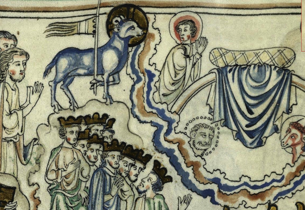
In this c. 1260 drawing, the lamb stands on a cloudlike line above the heads of watchers, facing an empty cushion, a place for it in heaven ringed by a double-layered cloudband:
Agnus Dei’s place in heaven, c. 1260 in an apocalyptic manuscript from the Flanders region [Bibliothèque minicipale Cambrai MS 0422]
The Sacrificial Lamb
Agnus Dei, St. Antonius, Potsdam-Babelsberg [Photo by Liebermary, Wikipedia]
This version has blood pouring from the chest of the lamb, a detail that might be relevant to the VMS…
The lamb was used for sacrifices and one of those sacrifices occurred after a woman had given birth. There are many hints at ob/gyn themes in the VMS and perhaps this is another one. Below the 80v animal we see a ring, often representing marriage, then we have the lamb, used as a sacrifice following childbirth, above it a woman with a spindle—spinning was an activity that many women took up when the children were grown and their nest was empty. Is there a life-story narrative here?
Notice also, in the St. Antonius example, that the texture of the fur has been drawn as scales.
Notice also that a turned head is very typical for lamb-of-God imagery.
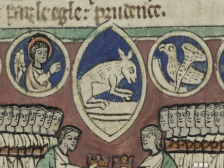
The lamb doesn’t always look like a lamb. Depending on the skill of the illustrator, sometimes it looks like a kangaroo with its head down:
The lamb of God in a 14th-century English manuscript, looking more like a kangaroo or rabbit than a lamb [Corpus Christi College MS 394]
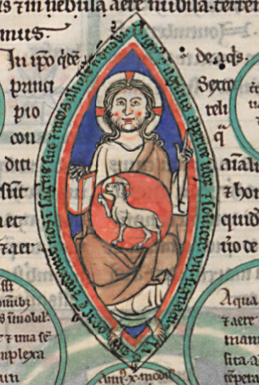
Sometimes the lamb looks vaguely like the VMS drawing of Aries, drawn within a circle, with a leg held high:
Agnus Dei in c. 1360 Liber Floridus, drawing within a circle, with the leg liftedd [BnF Latin 8865].
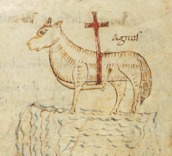
This example has a couple of things in common with the VMS: the drawing is not professional level and the “pedestal” is hard to identify. Is it water or a cloudband? Given its early date, it’s probably water:
An early 9th-century representation of Agnus Dei in a Grammaticalia manuscript. The lamb is standing on an ambiguous platform that is probably water, as in the Basilica of Cosmas and Damien example, or possibly clouds [BnF Latin 13025, c. 820].
This example is interesting because it combines Agnus Dei on a fabric platform with imagery that is similar to VMS 86v, and also represents an early example of a sun and moon with faces:
Apocalyptic vision that includes hiding figures, a high tor with a tree, wavy cloudlike shapes in each upper corner, stars, Agnus Dei on a cloth pedestal with head turned and held with a cloudband, and a sun and moon with faces [BnF Français 13096, c. 1313].
Here is one possible interpretation of 86v that I posted in a previous blog:
Could the 80v animal be somehow connected to the imagery on this folio, as well?
Is it possible that the object and wavy lines under the animal represent water, clouds, and cloth all at the same time, and thus encompass all the popular ways of representing it?
Could the nymph holding the ring under the animal represent a marriage scene, as in some of the English apocalypse manuscripts from the 13th century?
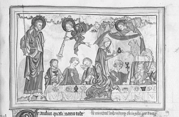
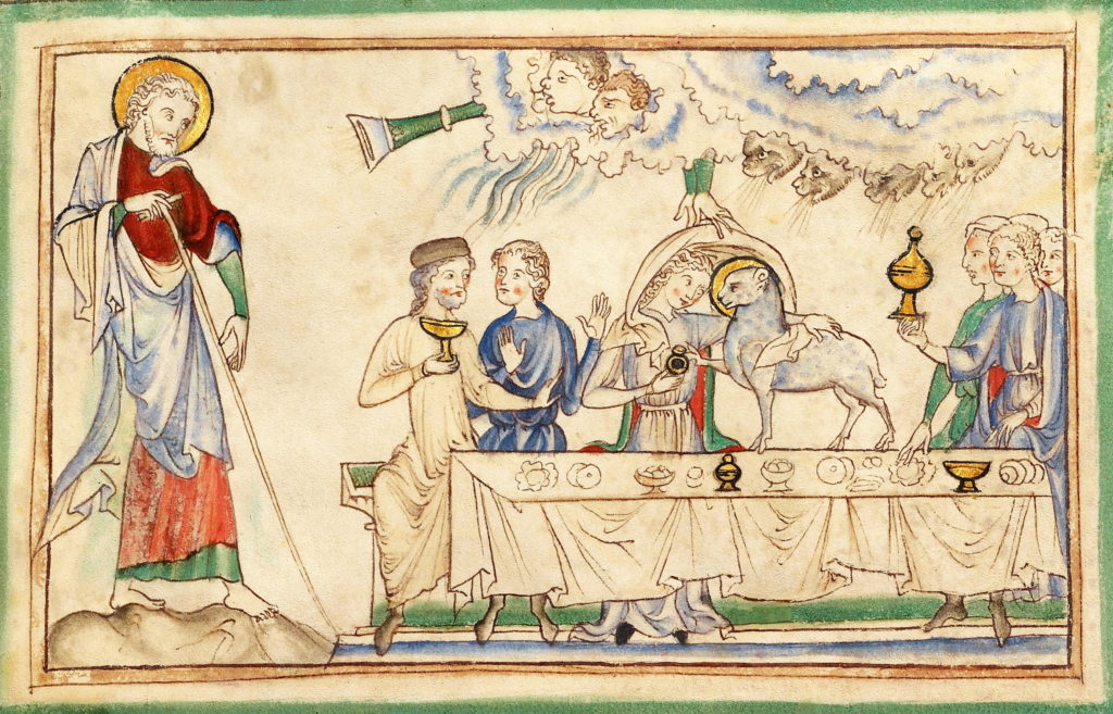
Wedding ceremony with lamb and ring [British Library Add 35166, c. 1280]
“Blessed are those who are invited to the marriage supper of the Lamb,” Revelation 19:9
As an aside, I thought I’d share this little gem I stumbled across in an early medieval manuscript. The scribe has turned a flaw in a piece of parchment into a “holy” lamb.
Summary
I have tried hard to find an explanation for the animal on 80v that fits as many aspects of the folio as possible. I suggested the idea of Agnus Dei in a previous blog, but the blog was already too long to add all the pictures, so consider this a continuation.
I rather like the idea of an aardvark on a nobleman’s pillow, or the infamous life-or-death castorum beaver, but the folio does not look like a bestiary—the relationship of the images to one another has a more narrative feel. I wanted to explain the relationship of the lamb to the other figures and to the various props in the margins and, hopefully, to some of the other VMS folios.
The idea of Agnus Dei seems more cohesive than the other possibilities and the fact that the animal appears to have scales is apparently not a problem, since the St. Antonious lamb does, as well.
Many medieval drawings are ambiguous, it may turn out to be something completely different, but at least this idea relates to some of the other elements in the VMS.
I am fond of pyrotechnics and once kayaked out to see a giant fireworks display raining flames on the water.
It was risky. Powerboats with drunk pilots whooshed around me in the dark. To add to the adrenaline, sparks were landing on my shoulders and pfushed and sizzled against the kayak. They could have ignited my clothing or hair… but I loved the front-row seat.
If you can’t resist fireworks, imagine squinting into the middle of a diamond-studded vortex, sparks exploding all around you, with 8-foot swells lifting the boat closer to the blast. It’s awesome.
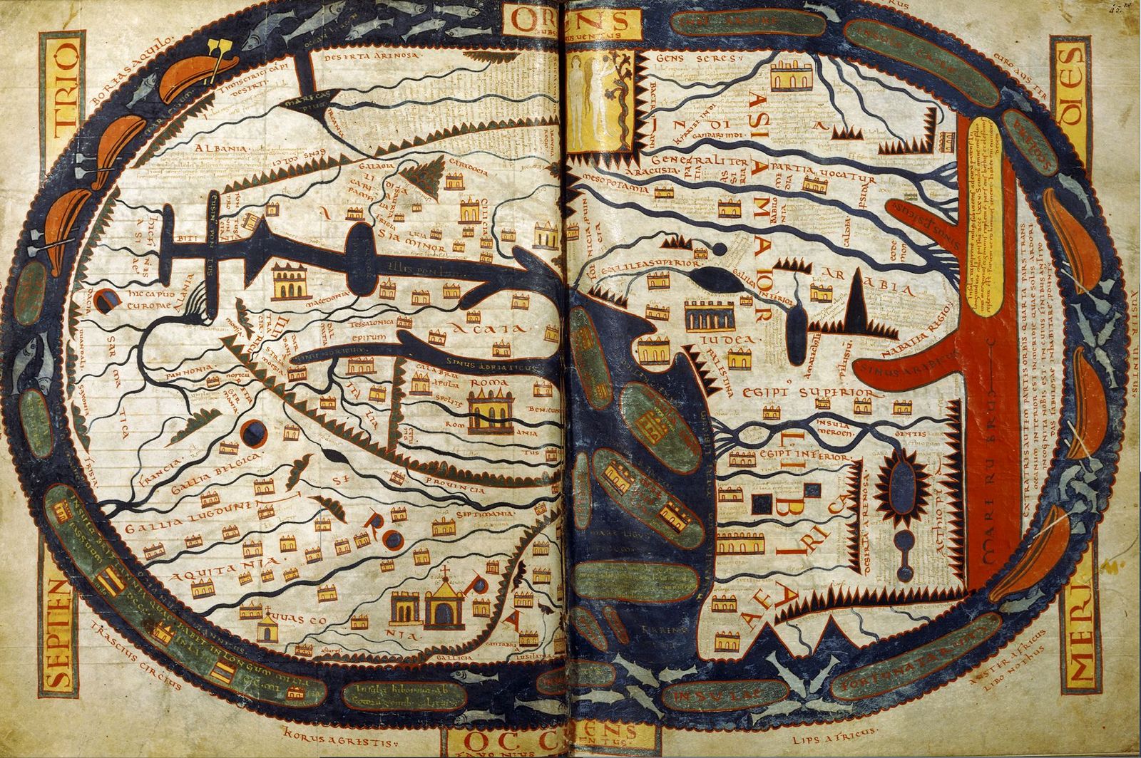
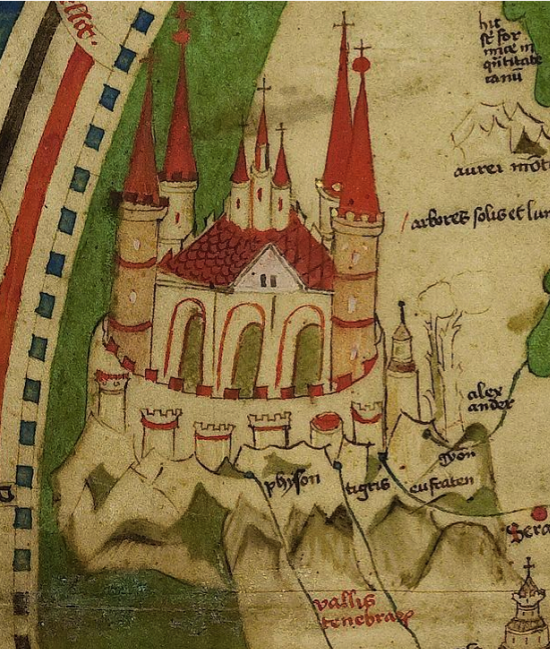
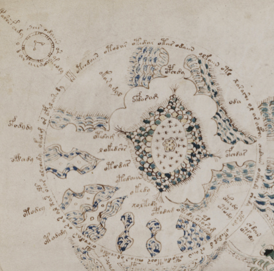
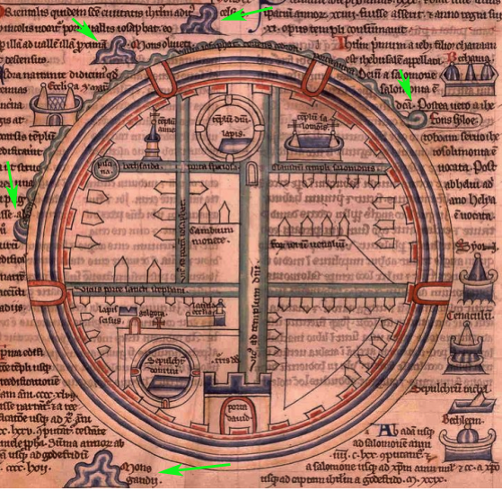
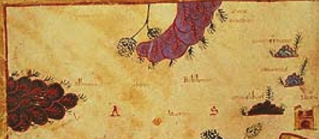
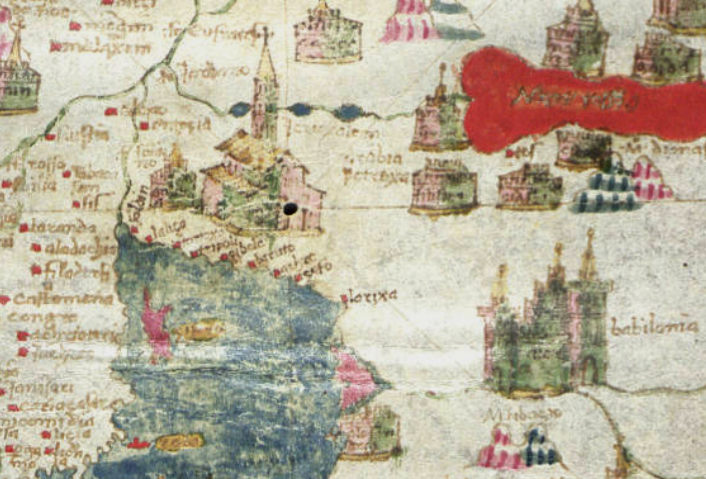
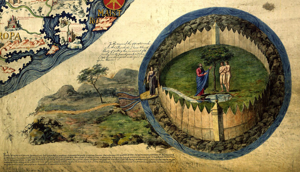
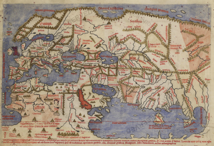
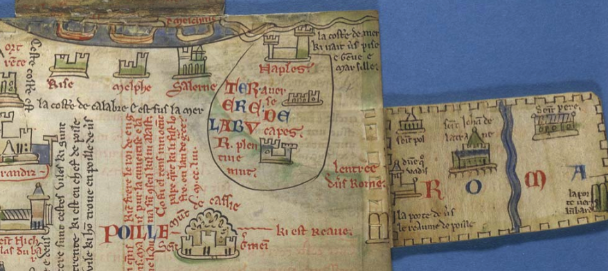
So it’s natural for me to want to find volcanoes in the VMS “map”. I’ve mentioned volcanoes numerous times on my blog and on the forum, have admitted that the Naples area is on my top-5 list of locations for the VMS “map” (it’s not my only idea, but it was the first region I studied in depth after a long investigation of the water-gardens at the villa d’Este). Recently, I wrote in more detail about volcanoes and mud vents.
Historical Precedent
The idea of volcanoes on the “map” foldout is not new. I took it for granted that many people probably saw them as volcanoes. A quick Google search as I was writing this blog brought up volcano references from 1996 and there are surely some older than that, considering there’s more than one rotum that could be interpreted as a volcano.
Rotum1 (top-left circle) looks like a mountain or gaping maw. Rotum7 (bottom-left), could be flows of water, but could also be flows of lava.
Similarly there are spewy mounds between the rota that might represent volcanoes or mud vents, but they might also be geysers or natural springs.
I’ve suggested Rotum3 might be the remains of a volcanic crater (e.g., the island of Nisida, which has a small crater-shaped harbor facing the sea, with remains of an ancient castle wall on the ridge).
I’ve also mentioned Vesuvius, the island of Sicily, and volcanic areas around Damascus, Azerbaijan, and the region around Ischia. Even though there are numerous possibilities, Naples is one of my favorites because it has ancient pools that potentially connect volcanic “hot spots” with thermal bathing.
Eruptions in the 14th and 15th Centuries
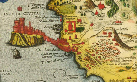
In 1302, there was a “spatter cone” eruption on Ischia (you can see a debris field to the lower right on this old map labeled “Locus terribilis…”):
In 1329, 1333, and 1381 Abraham Rees describes major eruptions of Mt. Etna. These kinds of events could have been handed down as oral or written history to the creator of the Voynich Manuscript. But are they reflected in the VMS “map”?
Cheshire One More Time (and Hopefully the Last)
Gerard Cheshire has based his entire “proto-Romance” linguistics solution around this very premise. In his recent paper he claims the VMS “map” documents a heroic rescue from a volcanic eruption.
In the previous two blogs, I commented on the linguistic flaws in his arguments. In this blog, I’ll quickly summarize his historical assertions.
Cheshire contends that nuns in the Castello Aragonese, off Ischia, wrote the VMS, and that the “map” documents the rescue from a 1444 eruption of Vulcano (in the Aeolian islands).
Other than the eruption, these ideas don’t seem to be supported by facts, …
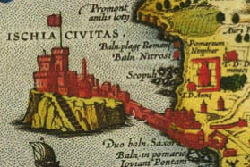
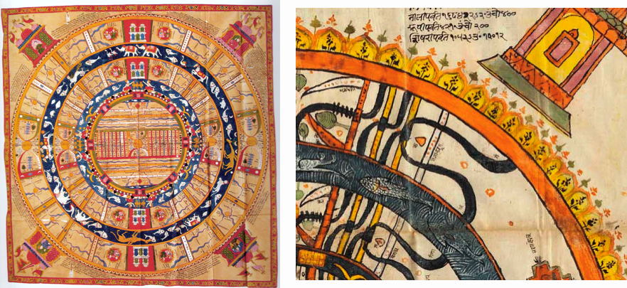
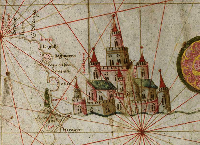
I’ll continue looking, but I haven’t found any evidence that nuns lived on Ischia prior to c. 1600 or that they lived in King Alfonso’s Castello in the 15th century as Cheshire claims. The castle was built in 1441 just off Ischia, as shown in the diagram on the right. Cheshire writes that this is where the VMS originated.
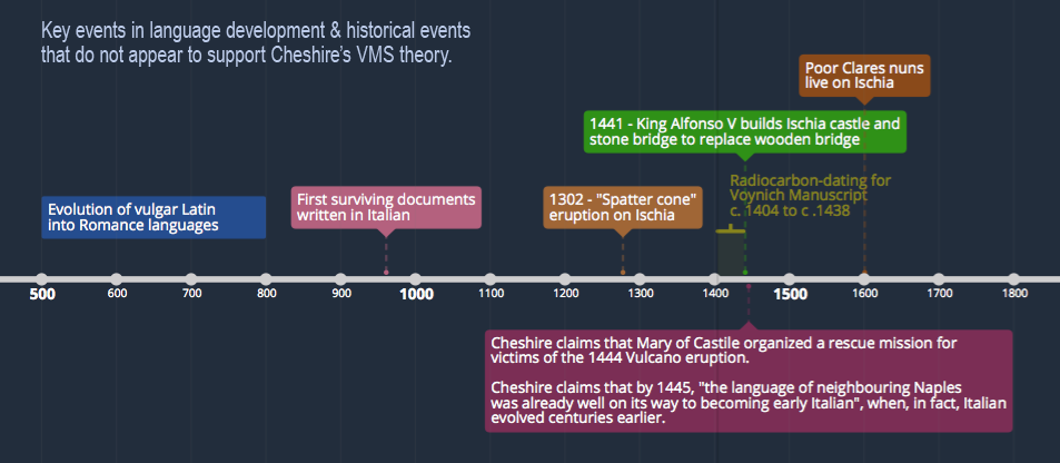
The following timeline shows some key events related to Cheshire’s theory that appear to be at odds with his claims:
Cheshire says that Maria of Castile organized a rescue from an eruption of Vulcano. The only rescue mission I came across was the liberation of Alfonso and his brother when they were captured in Naples. If any historian has evidence that Maria of Castile ferried victims away from a volcanic eruption in 1444, feel free to comment below.
As much as I like the idea, the interpretation of the VMS map as one or more volcanoes is problematic when applied to the Naples area. There are two sets of Ghibelline merlons on the VMS “map” that don’t mesh well with Naples. In the mid-15th century, this style of battlement was mostly confined to parts of what we now call northern Italy. For this reason, I have never committed fully to Naples and have continued researching the other possibilities on my list…
Lava and Lavage
Let’s assume for a moment that the various vents and flows on the VMS “map” are streams and sources of water, which may or may not have a volcanic source…
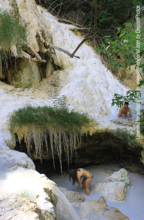
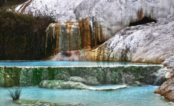
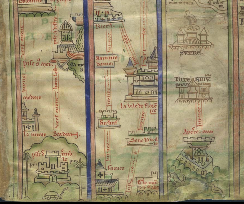
One of my other favored locations is an area with numerous hot springs, including Bagni San Filippo, Bagnore, and Saturnia.
Of particular interest are the natural spring areas of Tuscany, such as San Filippo, where thermal pools, dripping foliage, and calciferous stalactite formations are nestled in a picturesque setting of rivers and woods—just the thing to inspire drawings of nymphly bathing and grotto-like archways and caves.
Some of the pools have calciferous walls that hold the water in step-like terraces. Others are ringed with stone walls that have been built and rebuilt for thousands of years.
Some pools appear bright blue, others green.
Sparkling calciferous pools in Bagni San Filippo [Detail courtesy of Il Vechhio]
Numerous waterfalls carve pathways through the rocks to feed the step formations:
This by itself is not enough to connect San Filippo, Saturnia, or Monticiano hot springs with the VMS. There are thousands of hot springs throughout Europe, in Turkey, Germany, eastern Europe, several regions of Italy, and Sicily.
What interests me about the hot springs in Tuscany is that they are near a stronghold for Ghibelline sympathizers, which might explain the swallowtail merlons:
Some people have suggested that the VMS pools might be color-coded for fresh or salt water. I think this is possible, especially if the pools represent something less literal than bathing pools. But, if they are bathing pools, maybe the colors represent hot or cold water. It was believed (and still is) that alternating between different temperatures can be therapeutic.
It was also believed that pools with certain temperatures and mineral balances were good for particular parts of the body, which might explain some of the drawings in the “bio” section. There’s no guarantee the different sections of the VMS relate to each other, but I’m hoping they do, because a holistic approach, on the part of the designer, appeals to me.
Moon-Shaped Medieval Castles
If the “stars” on Rotum3 (upper-right) are meant to represent water, then it’s possible it is a moon-shaped island with a castle at the top. It’s one of the reasons I think it could be an island in the Naples area. There are several crater-shaped islands, including Nisida.
In Greece, Santorini is similar (I’ve been there and if you scramble up Mesa Vuono mountain, you get a real sense of the vastness of the crater).
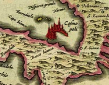
But if the “map” represents Tuscany, where would you find a moon-shaped island? This might be a bit of a stretch, but this 1664 map of Elba, an island off the coast of Tuscany, has a very interesting drawing of a moon-shaped castle-complex labeled Cosmopoli, with a man-made bridge connecting it to Elba. It’s not on a steep hill, like Nisida, but at least it has some of the characteristics of Rotum3:
Rotum3 isn’t necessarily an island, it might just be a stopping point on a strip map, but if it is an island, there are a few locations that could account for its distinctive shape.
Along the Pathway
There’s another detail on the VMS map that can relate to Tuscany… on the pathway between Rotum2 and Rotum3 are some undulating ledges that look somewhat like dunes, possibly sand dunes.
If you turn them, however, so that the tower and wall are facing up, then they look more like solid escarpments.
They’re too steep and narrow to be vineyards, but they reminded me of something, something I couldn’t put my finger on at first…
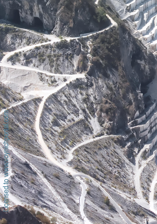
Then one morning I woke up and remembered—marble quarries, the mountains of Carrara, pathways and ledges.
Here’s a photo…
Note the textural differences between the paths winding up into the mountains and the escarpments where the marble has been quarried in stepwise fashion.
We don’t know exactly how the quarry looked in the middle ages, but the mountains have been mined for hundreds of years, supplying marble for pillars, walls, mosaics, and classical statues that grace ancient buildings. Now marble is used largely for floor tiles and countertops.
It’s not a perfect match for the VMS drawing, but it does have a similar feeling, so maybe the “dunes” represent some pathway through mountains.
Summary
I can’t possibly cover every detail of the map in one blog, this is enough for now. Much of this I’ve mentioned before, but it illustrates that there are many ways to interpret the “map”, more of which I’ll cover in future blogs.
A week ago I posted commentary on Gerard Cheshire’s “proto-Italic ” and “proto-Romance” solution for the VMS. At the time, his most recent paper was pay-to-view, so I had to restrict my comments to the previous open-access paper. Now the most recent version is open-access. Unfortunately, not much has changed from the previous version. You can see his April 2019 proto-Romance theory here.
What exactly do the terms “proto-Romance” and “proto-Italic” mean?
Proto-Romance
If you search for “proto-Romance”, you will find many references to
“vulgar Latin” (also called colloquial Latin)—variations of Latin spoken
by the common people (most of whom were illiterate) during the
classical period of the Roman Empire.
The “classical period” of the Greeks and Romans spanned approximately
14 centuries up to about 6th century C.E. when the Roman Empire was no
longer dominant. As Rome lost its grip, vernacular languages and local
versions of Latin had the opportunity to evolve into modern languages
such as Italian/Sardinian, Spanish, Portuguese, French (with Gaulish
influence), and Romanian.
Extinct Languages and Undocumented Scripts
The prefix “proto-” comes from Greek πρωτο-. This refers to the first, or to something that comes before. So proto-Romance means before the Romance languages had fully emerged (from vulgar Latin), and proto-Italian script means an alphabet that was used before the script that became standard for writing medieval Italian. Medieval Italian script is essentially the same alphabet we use now except that the letterforms are more calligraphic than modern computer users are accustomed to seeing.
This brings us back to Cheshire, who is claiming that Voynichese is an extinct proto-Romance language in an undocumented proto-Italian script… something that existed about 1,000 years before the creation of the VMS.
How is that possible when the radiocarbon-dating and many of the iconographical and palaeological features of the VMS point to the early 15th century?
Cheshire’s Interpretation of Medieval Characters
Cheshire’s descriptions of individual glyphs, and his interpretations of the annotations on folio 116v, suggest that he is not familiar with medieval scripts.
It also seems that he hasn’t studied the frequency or distribution of the Voynich glyphs in the larger body of the main text, because he associates common letters and letter combinations with glyphs that are rare, or that have unusual positional characteristics. This point is so important, it bears repeating… Cheshire assigned substitution values for common letters to rare VMS glyphs, or glyphs that have positional characteristics that are not consistent with Romance languages.
Is it possible he never tested his system to see if it would generalize to larger chunks of text? Did he prematurely assume he had solved it?
Let’s look at some examples…
Cheshire’s Analysis and Transliteration of Voynich Glyphs
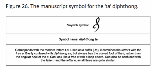
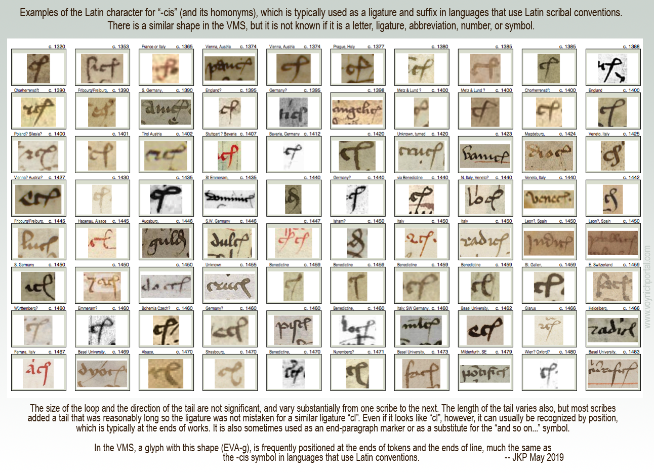
In his first example, Cheshire takes a glyph-shape that is known to palaeographers as the Latin “-cis” abbreviation (the letter c plus a loop that usually represents “is” and its homonyms). This shape is both a ligature and an abbreviation in languages that use Latin scribal conventions. It has not yet been determined what it means in the VMS, but its positional characteristics are similar to texts that use the Latin alphabet.
VMS researchers know this shape as EVA-g.
Cheshire transliterates it as a “ta” diphthong. It’s not a diphthong. A diphthong is a combination of two vowel sounds and “t” is clearly not a vowel. The terminology is wrong.
He then gives an explanation of the shape that doesn’t mesh with medieval interpretations of letter shapes. This is figure 26 from his paper (Source: tandfonline):
To say that this can be confused with the letter r and the letter n makes no sense to anyone accustomed to reading medieval manuscripts. It looks nothing like r or n. If Cheshire means it can be confused with his transliterated r or n, he should clarify and provide examples.
To get a sense of how this character was used in the medieval period, I have created a chart with examples of the “-cis” ligature/abbreviation that was common to languages that used Latin scribal conventions. I have sorted them by date.
This is not to imply that the Latin meaning and the VMS meaning are the same. The VMS designer may only have borrowed the shape, but it is important to note that the position of this glyph in the VMS is very similar to how it is positioned in Latin languages:
More important than the mistakes in reading medieval characters and linguistic terminology is that Cheshire did not address the basic statistics of VMS text and the fact that this glyph occurs primarily at the ends of words and sometimes the ends of lines. Thus, transliterating EVA-g as “ta” is highly questionable.
Perhaps Cheshire can justify this mismatch between letter frequency and position by saying that separate glyphs also exist for “t” and “a”, but when you put the various transliterations together, one finds that the character distribution of Romance-language glyphs and Cheshire transliterations are significantly out-of-synch.
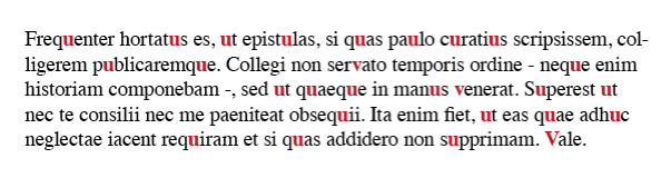
For example, as in his previous paper, he chose one of the rarest glyphs in the VMS repertoire (EVA-x) to represent the letter “v”. In classical Latin and Romance languages, the letters “u” and “v” are essentially synonymous and very frequent. In this brief excerpt in modern characters, from Pliny the Younger, note how often u/v occurs:
If Voynichese were a proto-Romance language (some form of classical vulgar Latin), and EVA-x were transliterated to U/V and also F/PH, as per Cheshire’s system, one would expect to see this character more than 40,000 times in 200+ pages. Instead, this character occurs less than 50 times. That alone should create doubt in people’s minds about Cheshire’s “solution”.
So what has Cheshire done? He has assigned a different letter to represent “u”, but we know that in classical Latin, Etruscan, and Old Italic, “v” and “u” did not represent different letters even if both shapes were used (which they usually weren’t).
Even in the Middle Ages, when there were different shapes for “u” and “v”, most scribes used them interchangeably. In other words, “verba” might be written with the “v” shape in one phrase and with a “u” shape (uerba) in the next, just as “s” was written with several different shapes (without indicating any difference in sound).
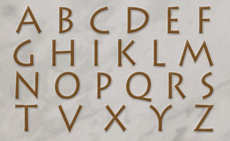
This is the 23-character Latin alphabet in use around the time vulgar Latin was evolving into Romance languages:
Perhaps Cheshire didn’t know that they were interchangeable shapes rather than two different letters when he created his transcription system. But if he did know, if he actually believes that “u” and “v” were distinct letters in proto-Romance languages, he will have to provide evidence, because historians, palaeographers, and linguists are going to be skeptical.
Beginning-Paragraph Glyphs
Voynich scholars have noticed there are disproportionate numbers of
EVA-p/r and EVA-t/k characters at the beginnings of paragraphs. There is
a possibility that some are pilcrows, or serve some other special function when found in this position.
Cheshire doesn’t appear to have noticed this unusual distribution (at least he doesn’t comment on this important dynamic in his paper) and translates the leading glyph in the same ways as the others. In his system, a very large number of paragraphs inexplicably begin with the letter “P”.
Some of his translations cannot be verified. For example, he used a drawing on f75r to demonstrate a single transliterated word “palina” on f79v. There’s no apparent relationship between them (other than what he contends), so how does an independent party determine if the translation is correct?
Tenuous Assertions
On f70r, he uses a circular argument to explain the transliteration of “opat” (which he says is “abbot”). He says the use of “opat” indicates “that proto-Romance reached as far as eastern Europe” because “opát survives to mean abbot in Polish, Czech and Slovak”.
We don’t need a dubious transliteration to tell us that proto-Romance languages reached eastern Europe. The existence of Romania demonstrates this rather well—it borders the Ukraine, and used to encompass parts of Bohemia. Bohemia included Hungary, Czech, and parts of eastern Germany, so transmission of vulgar Latin to Polish through Czech was a natural process.
Palaeographical Interpretations
There are problems with the way Cheshire describes the text on folio 116v. He refers to the script as “conventional Italics”. It is, in fact, a fairly conventional Gothic script, not “conventional Italics”.
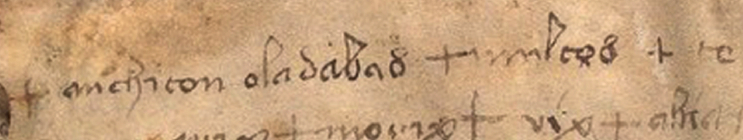
Then he makes a strange statement that the second line on 116v is hybrid writing, that it is Voynichese symbols mixed with “prototype Italic symbols, as if the calligrapher had been experimenting with a crossover writing system”. It’s hard to respond to that because his statement is based on misreading the letters. Here is the text he referenced in his paper:
Cheshire interprets this as “mériton o’pasaban + mapeós”
He misread a normal Gothic h as the letter “r” and a normal Gothic “l” as the letter “P”. In Gothic scripts, the figure-8 character is variously used to represent “s”, “d”, and the number 8, so it’s very familiar to medieval eyes, but he doesn’t seem to know that and interpreted it as a Voynich character that he transliterated to “n”.
If his reading of the letters is wrong, then his transliteration is going to be wrong, as well.
Zodiac Gemini Figures
Cheshire mentions the Gemini zodiac figures (the male/female pair), and states: “Both figures are wearing typical aristocratic attire from the mid 15th century Mediterranean.”
It takes research to determine the location and time period for specific clothing styles—it’s not something people just automatically know. Since Cheshire didn’t credit a source for this reference, I will. It’s possible he got the information from K. Gheuen’s blog.. Even if he didn’t, Gheuen’s blog is worth reading.
Flora and Fauna
I’m not going to deal with Cheshire’s fish identification. It’s just as dubious as the Janick and Tucker alligator gar. There are fish that are more similar to the VMS Pisces than Cheshire’s sea bass, and pointing out the fact that sea bass has “scales” is like pointing out that a bird has wings.
I was hopeful that Cheshire’s latest paper would be an improvement over his previous efforts, but I was disappointed.
Summary
It’s possible there is a Romance language buried somewhere in the cryptic VMS text (it was, after all, discovered in Italy, and the binding is probably Italian), but that is not what Cheshire is suggesting. He’s saying it’s an extinct proto-Romance language, without providing a credible explanation of how this information could have been transmitted a thousand years into the future.
There is a relentless publicity campaign going on right now to catapult Cheshire into the limelight. I’m not going to repeat the claims in the news release (they’re pretty outrageous), but even Superman would blush at the accolades being heaped on this unverified theory.
When I checked Cheshire’s doctoral research, I discovered it was in belief systems. Somehow that seems fitting.
Postscript 16 May 2019: The University of Bristol has retracted the Cheshire news release. You can see the retraction here for as long as they decide to make it available.
You may remember an announcement by Gerard Cheshire that he had found a proto-Italic solution for the VMS. There was no corroboration for his theory by any of the scholars who are well-acquainted with the text and, to date, I haven’t seen Cheshire provide an objective verifiable solution.
He has now completed his Ph.D. and is making a bold and possibly proposterous claim that he solved the Voynich Manuscript shortly after discovering it and that his so-called solution “was developed over a 2-week period in May 2017” [Tandfonline.com 2019 Apr 29].
Who would claim to solve the VMS and then post a series of papers (Jan. to Apr. 2018) based on a few isolated sections that do not provide a convincing solution? Proposing that it is an extinct language is no more valid than any other VMS theory.
Since I am not willing to pay $43 (or even $4) to download the current version of his paper, I will restrict my remarks to the last of the previous papers, dated April 2018, which I only just read for the first time today (the link to Cheshire’s paper redirects from The Bronx High School of Science student newspaper’s site to sites.google.com).
Cheshire’s “Linguistic Dating” Theory
In the introductory section Cheshire states, “…in this regard, manuscript MS408 is ‘manna from heaven’ to the linguistic community, as it offers the components necessary to compile a lexicon of proto-Romance words, thanks to the accompanying visual information.”
He then claims that his “proto-Italic alphabet is shown to be correct, so we know that the spelling of the words is also correct, even if unknown”, and then goes on to say that pages without illustrations “will, of course, be more of a challenge…”
Besides the dubious claim that the “proto-Italic alphabet is shown to be correct…”, I’d like to point out that most VMS folios include illustrations. If you can decipher 200 pages with help from illustrations, then the ones without shouldn’t be too difficult, considering that Voynichese is reasonably consistent from beginning to end.
Cheshire then claims labels are easier to interpret (personally I haven’t seen anyone translate the labels in any verifiable way, but let’s continue):
“The longer sentences are filled with conversational connectives, pronoun variants, singular-plural terms, gender specifics and so on, that make it necessary to identify the unambiguous marker words and then make sense of the equivocal words by a process of sequential logic.”
This stopped me in my tracks. One of the characteristics of the Voynichese that truly stands out is the similarity and repetitiveness of beginnings and endings. How can one identify singulars, plurals and gender specifics in text where the beginnings and ends appear to be stripped of their diversity? I guessed that Cheshire must be either shuffling spaces or breaking up tokens (or both).
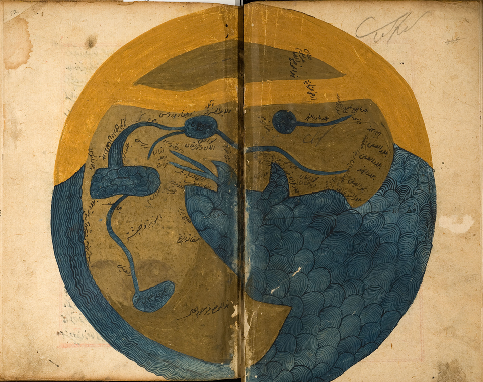
The 9-Rotum Foldout as Example
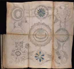
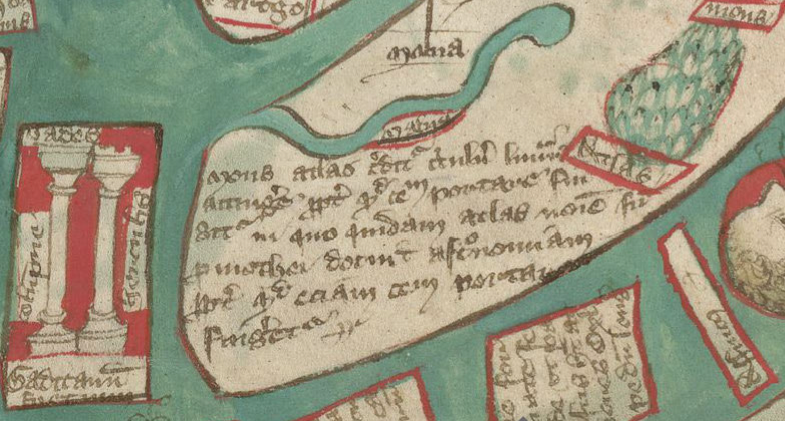
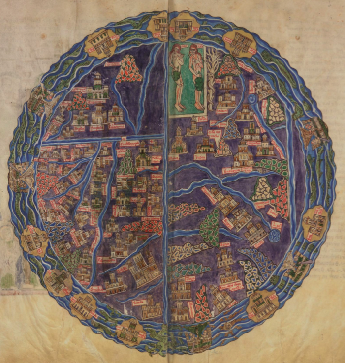
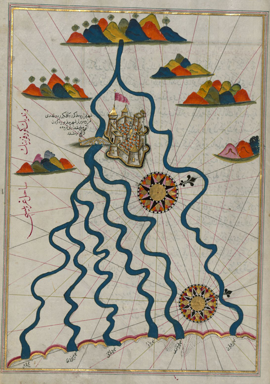
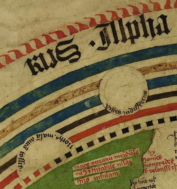
To demonstrate his claim that the VMS uses a proto-Romance language and proto-Italic alphabet, Cheshire presents a partial analysis of the 9-rotum foldout folio, which he refers to as the Tabula regio novem.
He claims the correlations, “…are beyond reasonable doubt in scientific terms. Most of the annotations are translated and transliterated with entire accuracy…”
Another bold claim that doesn’t live up, in my opinion. But let’s look at his analysis…
Cheshire identifies Rotum7 as a volcanic eruption. I think this is possible, based on visual similarity alone, and others have suggested this possibility. However, it could just as easily be an image of mountain springs (the source of water) or a river delta as it spreads out in an alluvial fan or… something else.
So how does Cheshire support his claim?
Rotum7 Translation
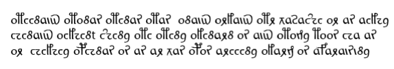
Cheshire transliterates the text around the circumference as follows [I’ve added a Voynichese transcript to make it easier for readers to compare them and to see how Cheshire has broken up VMS tokens to create “words”]:
om é naus o’monas o’menas omas o’naus orlaus omr vasaæe or as a ele/elle a inaus o ele e na æina olina omina olinar n os aus omo na moos é ep as or e ele a opénas os as ar vas opas a réina ol ar sa os aquar aisu na
Note that EVA-ot is alternately translated as part of a word or as a separate letter with apostrophe to separate it from the following chunk. The breaking of words in various ways is, of course, subjective interpretation, and would have to be verified by testing the more common divisions on larger chunks of text.
Cheshire translates the above passage as follows:
people and ship in unity take charge mothers/babies of ship to protect life-force pots [he says this is pregnant bellies] yet in he/she at inauspicious/unfavourable he/she is in a/one omen to look it is man not mouse epousee and embrace an opening thus you go but carefully to the queen to facilitate not getting wet with seawater
So before we look into the details of the translation, this supposed narrative seems to me to relate more to river basins and seaports than it does to volcanoes. Cheshire’s contention that this text helps pinpoint the location and time period of the VMS’s creation via a volcanic eruption can definitely be challenged.
But let’s look at the interpretation. Here are some observations:
Cheshire has chosen a rare character to represent f/ph, and u/v. Less than 50 instances of one of the most common letters in Latin and Italian in c. 38,000 words of text is hard to believe. In classical Latin versions of Ovid’s Metamorphoses, the u/v character would occur about 15,000 times in 38,000 words (that’s not even including the f).
There’s no word “inaus” in Latin, Italian, French, or Spanish (in fact, it’s more Germanic than Romance), so Cheshire has expanded it to mean inauspicious via Latin inauspicatus. Presumably he feels it’s acceptable to subjectively choose which tokens might be truncated.
Obviously Cheshire is using variations of “om” to mean homo/people, thus om (people) omas (mothers/babies), omo (man), but he chose to interpret “omenas” as o’menas (take charge) rather than as om enas (people swim). People swimming is arguably more consistent with the surrounding subject matter. This illustrates that his interpretation has a strong element of choice. I’m not even sure why o’menas would mean “take charge”.
Some of the translation seems rather nonsensical and hard to relate to volcanoes, such as “to look it is man not mouse and marry and embrace an opening thus you go carefully to the queen to avoid not getting wet with seawater”. Consider that “aisu” is neither Italian nor Latin and the grammar is seriously questionable.
I’m not sure why Cheshire seguéd to Persian for “moos” (mouse). Moos is an acceptable alternate spelling for “mus” in western languages. Perhaps it was to justify his choice of Persian to explain another word “omr” which has no equivalents in Romance languages. Going to non-Romance languages when a word doesn’t fit his theoretical framework introduces yet another level of subjective interpretation.
The choice of phrase-breaks is clearly also subjective. Cheshire separated “opénas” from “os” even though they go together better than combining “os” with the following phrase. The word “opénas” itself is questionable—it’s not likely to be expressed this way and it could be interpreted quite differently as a penalty, punishment, or even as sympathy.
Overall, there is only a vague coherence to it, one that does not evoke thoughts of volcanoes, and one that makes little grammatical sense.
In his summation of the text, Cheshire does not explain why text unrelated to volcanoes would confirm that the Rotum7 IS a volcano and avoids any explanation of why marriage and the queen would be included.
Confirmation Bias?
In the next section Cheshire identifies the symbol bottom-left as a compass (I personally think it looks more like a sextant, which was used for surveying as well as navigation, but I’m not sure what it represents). His transliteration is “op a æequ ena tas o’naus os o n as aus[pex]”, which he translates to “necessary to equal water balance of ship as it is propitious”.
A compass doesn’t really have anything to do with a ship’s water balance (and doesn’t relate to volcanoes either) and I would like to know why he says “op” means “necessary” when the root “neces-” is common to all major Romance languages. In Romance languages “op” is more likely to equate to “work/produce” than to “necessary”, and once again the grammar is abnormal.
From these two pieces of “translation”, Cheshire takes a logical leap that only two volcanoes might be plausible for Rotum7: Stromboli and Vulcano and states:
“…Vulcano is known to have erupted very violently in the year 1444, which corresponds with the carbon-dating of the manuscript velum: 1404-1438.”
He further translates the Rotum7 inner annotations as “of rock, both directions, not so hot, veers here, it twists, reducing, it slows, middling/forming, of rock it is”.
This could describe mountain springs (the source of water) just as easily as a volcanic eruption. I’m not denying that Rotum7 might be volcanic flow, it’s on my list of possibilities, only that Cheshire’s argument is not as definitive or scientific as he claims. Also, I would like an explanation of how he turned “oqunas asa” into “both directions”.
Origins of Glyph Shapes
Cheshire has this to say about VMS glyph shapes:
“…the symbol is an inverted v with a bar above. It seems to derive from the Greek letter Pi in lowercase (π),…”
I disagree. Pi was rarely written like EVA-x in medieval manuscripts. However, alpha and lambda are sometimes written this way, including Greek, Coptic, and old Russian scripts (I have collected many samples). I think it’s unlikely that EVA-x is based on the shape of Pi.
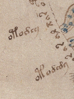
Rotum7 Side Labels
I can’t go through every translation point-by-point, but if you are reading along, on page 7 of his paper, you’ll notice Cheshire inserted the word “lava” many times when it wasn’t part of the translation. I don’t know if he was trying to convince us or himself.
Note that in two places, he translated “omon” (EVA-otod) as lava. Now take a look at this:
Cheshire translates EVA-otodey as omon ena and EVA-otody as omon ea. In his system, this translates to “lava largest” and “lava smaller”. If this system were applied consistently throughout the manuscript then we are looking at root-suffix constructions, with EVA-ey as largest and EVA-edy as smaller. This has significant implications for interpretation of the rest of the text but Cheshire didn’t address this.
If you’ve been paying attention to the translations, you might have noticed certain inconsistencies. Cheshire presents omo as people/humans and omon as lava, and now omona as “big man” (it’s not hard to follow the logic) but does not explain why these words would occur in other places in the manuscript where the context does not seem relevant. He also inserts increasing levels of subjective interpretation to explain the “story” behind the rosettes folio and asserts that Rotum8 depicts emergency refuge from the eruption and Rotum 9 is emergency relief in the form of free bread on tables.
Summary
As for the letters “o” that occur so frequently at the beginnings of words, Cheshire variously interprets them as conjunctions and articles. I’m not going to argue with this because I think it’s possible the over-abundant leading-“o” glyphs could have a special function as markers or grammatical entitites, but even with this flexibility, Cheshire’s grammar falls apart upon inspection. Even notes and labels usually exhibit certain patterns of consistency, that are not readily apparent in the translation.
I’m also not going to argue with the choice of location for these volcanoes (if they are volcanoes), because I’ve considered the Naples area many times, have blogged about it, and it’s still on my list of favored locations.
But I have trouble accepting the translation in its current form because
there are a lot of nonsensical word combinations,
there’s almost no grammar,
the letter distribution is quite different from Romance languages (it would take a whole blog to discuss this aspect of the text, but take 4 as an example, which almost exclusively is at the beginnings of tokens—Cheshire relates it to “d”, and “9” which is usually at the end and sometimes at the beginning, but almost never in the middle, which he designates as “a”),
the words still match the drawings if the drawings are interpreted differently (which means the relationship isn’t proven yet),
some of the transliterated “words” don’t show any relationship to Romance word-structures (and the author neglected to explain how specific non-Romance words were derived), and
the same words (e.g., “na”) are sometimes interpreted differently.
If Rotum7 turns out to be flows of water, rather than flows of lava, Cheshire’s arguments about time period and location are seriously weakened. Even if it turns out to be lava, the problems with the translation have to be addressed, because it seems more relevant to water than it does to lava.
Consider also that Cheshire’s word “naus” (EVA-daiin) is translated as nautical vessels, but the author doesn’t explain why this exceedingly common Voynich chunk, that is usually at the ends of tokens, would occur in almost every line, and sometimes more than once per line, throughout the manuscript.
Cheshire hasn’t given a satisfactory explanation of why a mid-15th-century scribe would use an undocumented proto-Italian script from c. 700 C.E. or earlier.
And let’s be honest, the translations are semantically peculiar. The human mind is designed to construct meaning from small clues, to fill in the gaps, so it’s easy to read meaning into almost any collection of semi-related words, but it’s very difficult to confirm anything that doesn’t quite hold together in normal ways.
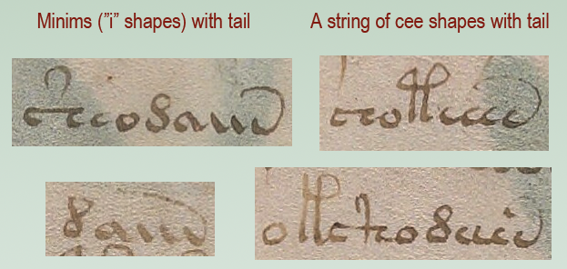
There are two pattern groups in the VMS that could be related, maybe. They have traits in common that might help us understand Voynichese.
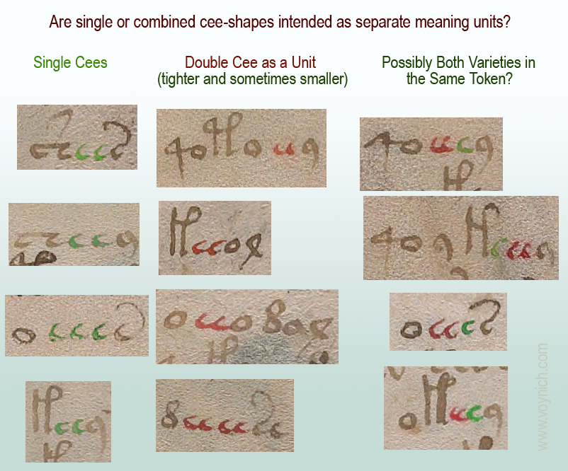
I’ve blogged about double-cee shapes (EVA-ee), but felt it would be too long if I included relationships between cee patterns and the more familiar aiin patterns, so I’ll continue the discussion here…
The Double-Cee Question
As I’ve posted before, there are many places in the VMS where cee shapes (EVA-e) look like they might be joined. There are even places where double-cee and single-cee are adjacent:
I strongly suspect that double-cee (the one that is tightly coupled) is intended as one meaning-block.
In Visigothic manuscripts, the letter “t” was often written as a double-cee shape.
In early and mid-medieval manuscripts, a double-cee stood for “a”
In early and mid-medieval manuscripts, a superscripted double-cee stood for what we would call “u” (it was often next to a “q” character).
Thus, many scribes perceived tightly coupled cees as a unit.
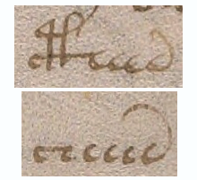
Of course, nothing is easy with the VMS. Here is an example of overlapping cee-shapes next to ones that are separate. Do we interpret them as different or the same?
Note also how the bench joins with the row of connected cees, which brings us to the next point…
Is The VMS Deliberately Deceptive?
It’s very difficult to tell if the VMS is designed to deceive. Patterns like the following are hard to interpret.
Are the tails on these glyphs added to hide the length of a sequence? Or are they genuinely different glyphs?
In the same vein, are EVA-ch and EVA-sh cee-shapes in disguise? Could the cap on EVA-sh be yet another cee?
Here’s an example where two cee-shapes are topped with a macron-like cap (a shape that is usually associated with the benched char):
For that matter, is the 9-shape a hidden cee?
I don’t know for sure, but based on the behavior of the glyphs (in terms of position and proximity), I get the feeling (so far) that EVA-ch and EVA-sh might be related to cee-shapes, even if they mean something different (they frequently occur together), while EVA-y dances to a different drummer.
Positionality
Cee shapes frequently cluster in the middles of tokens, just as minim patterns are frequently at the ends, but are they somehow related? They are the only two groups of glyphs that repeat many times in a row.
These examples from f4v and f7v are provocative because they suggest that cee shapes and minims might be related. Rather than being word-medial, the cees on the right are word-final and have long tails from the bottom rather than the top:
Now, let’s examine the -aiin patterns…
Aiin not Daiin, and maybe not even Aiin
I think it was a big mistake for early researchers to cinch the idea of “daiin” in people’s minds. The aiin sequences are frequently (yes, frequently) preceded by glyphs other than EVA-d.
Stephen Bax wrote a paper in 2012 (revised Nov. 2013), in which he summarized one of the most common ideas for interpreting the glyph sequence called “daiin” (e.g., that it might mean “and”). Here is a quote and a link to the PDF file:
It is argued from this analysis that the element transcribed as ‘daiin’, the most frequently occurring item in the manuscript as a whole, is in fact a discourse marker separating out sense units, functioning like a comma or the word ‘and’, and analogous to the use of crosses in folio 116v.
First, let’s start with the crosses on folio 116v. There is a strong precedence in medieval manuscripts for including the plus sign in charms and medical remedies in places where the reader or speaker (or healer) genuflects. The plus sign is sometimes also used like “and”, just as we use it now (nothing new about that). However, I doubt that the plus- or cross-symbol on 116v is related to “daiin”.
Now back to the paper…
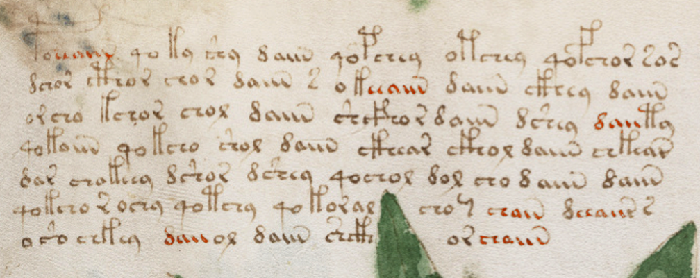
On page 3, Bax noted instances of word-final daiin, but he examined them out of context. He recorded instances of aiin that are preceded by EVA-d and basically ignored the other glyphs that precede -aiin in the same sample (as well as daii- that occurs at the beginning). I have marked the patterns that were not mentioned in red:
Studying the “daiin” pattern this way is like examining -tally patterns in English while ignoring related patterns like -ly, -lly, -ally, -aly, and -dly. He also failed to account for the fact that aiin is not a homogenous glyph pattern. It includes an/ain/aiin/aiiin and even sometimes iiin.
He further makes no mention of the tail patterns. If the length of the tail is meaningful then, like so many before him, Bax might have overestimated the frequency of daiin.
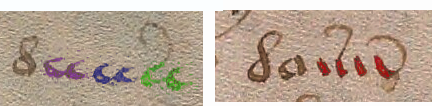
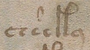
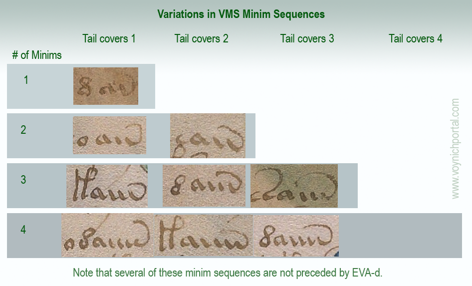
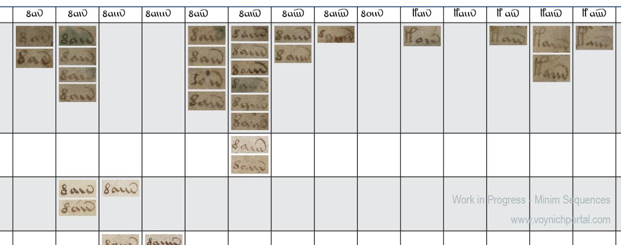
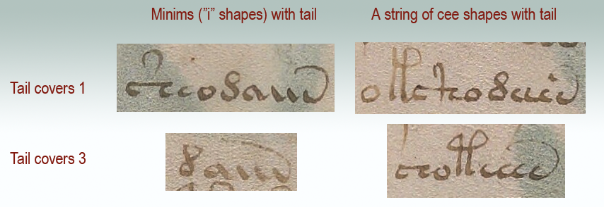
Tail Coverage
Most transcripts treat the many versions of daiin as if they are the same. They count only the number of minims (and they don’t always get that right). But there is another dynamic that gets little attention, and that is the length of the tails.
Tail coverage varies. Thus, a glyph with three minims might have three different versions of tail coverage and perhaps three different meanings:
Here is the text sample color-coded for different tail patterns, with green for one and red for two:
About half the instances of “daiin” look like dauv and the others look like daiw, if you pay attention to the length of the tail. They are not necessarily the same. If you include aiin sequences not preceded by EVA-d, it varies even more. Normally I wouldn’t consider tail length to be important. In Latin, the length of tails (a form of apostrophe or ligature) is pretty arbitrary. Some scribes lengthened the tail if more letters were left out, but this was not the norm. In the VMS, when you create a transcript and examine every token, tail-length feels deliberate.
Nick Pelling pointed out to me in a blog comment that there are dots at the ends of tails. I’m not sure I had noticed that (he’s right, there are). I had noticed the varying tail lengths. After Pelling called my attention to the dots it occurred to me that maybe the dots were to help the scribe accurately craft the length of the tail.
Tail lengths might turn out to be trivial rather than meaningful, but it’s still important to document their patterns as part of the research process. If they are significant, then vanilla-flavored “daiin” is not nearly as frequent as claimed.
Forget about the “d”…
Minim sequences don’t require EVA-d and don’t always need EVA-a. Here’s a minim sequence that stands alone (four minims with one covered, or perhaps three minims and another glyph entirely):
I think future research would be more fruitful if transcripts and descriptions of the text were more aligned with reality. Calling them minim sequences carries fewer assumptions than “daiin”.
Interpreting Minims
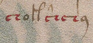
I’m not sure minim sequences are intended as separate characters. Just as some of the cee shapes look like they belong together as a block, the iii sequences do so as well. There are numerous instances where they resemble uiv rather than iiv.
In this example from folio 8r, a curved macron has been placed over two minims in aiiin (I prefer to call the shapes aiiiv rather than aiiin, but I’ll respect the existing EVA system for now). It is almost as though the scribe were explicitly associating two minims:
Maybe the cap is a macron in the Latin sense (apostrophe for missing glyphs), or maybe it’s a way to say, this is a “u” shape, don’t confuse it with “ii”. Note that there is a slight gap between the first “u” shape and the second (or between the “u” shape and the “iv” shape):
In this example from f8v, the first two minims resemble a “u” shape and are distinctly separated from the final glyph (which resembles “v” or “i-tail”, and yet there is a 3-coverage tail):
As for the length of the tail, in Latin it usually doesn’t matter, but there were a few scribes who pointed the tail at the particular spot where letters were missing (the tail is an apostrophe attached to the end so the scribe doesn’t have to lift the quill). What it means in the VMS is still a mystery.
Maybe progress in understanding the VMS is slow because many transcripts don’t include these details.
I have an enormous chart that documents these patterns, but it’s not yet finished and ready to interpret. This is only the merest snippet—part of the top-left corner:
Minims and Cee Shapes
This is getting long, so I’ll end with one last question (possibly an important one). Is there some connection between minims and cee shapes?
Minims are more frequently at the ends of tokens (but not always). Cee shapes more often in the middle. Both tend to cluster. Both have tails of varying lengths.
It’s fairly obvious that they both repeat, but I don’t know if anyone has offered a practical explanation (other than the possibility of Roman numerals). Here are examples that illustrate the similarities:
And here is an example that is particularly enigmatic. Is it EVA-ochaien or EVA-ocheiien or ochaiin or something else? Did the scribe slip and draw one of the minims as a cee-shape, or is this a uniquely structured token?
I just got a heads-up that D.N. O’Donovan is talking about me on her blog again. Once again, the information is misleading. I don’t see that I have much choice but respond to the two points she brings up over and over…
Point 1) The VMS Column Text Timeline
First, O’Donovan wrote this:
“My point was merely that the ‘gap’ is shorter than JKP thought: not 1400s to 1665/6, but only 1400s to the time Jakub owned it. It passed about 60 years later to Jesuit ownership, by Marcus Marci’s letter of gift (1665/6) to Athanasius Kircher, S.J., who was then a professor at the ‘Roman College’ – from whose collection it is known to have come when Wilfrid Voynich bought it.”
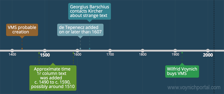
If O’Donovan had actually read my column-text blog all the way to the bottom, she would have seen that I included a timeline with the approximate date on or after which Jacobi de Tepenecz’s name was added to folio 1r of the VMS. It makes no sense to keep saying that I neglected to consider de Tepenecz in the VMS provenance. Even though the blog was about the Column Text and not about Jacobi, I included him on the timeline:
Plus, I don’t think it’s wrong to consider this a shadowy area of the Voynich Manuscript’s provenance.
We do not know if Jacobi added the name to the manuscript. It is not the same handwriting as his apparent legal signature (the difference is quite striking). Some of his other books have been annotated by another hand.
Jacobi was a wealthy man. Perhaps he asked an aide to catalog his books. Maybe someone cataloged them after his death. We don’t even know if Rudolph II actually owned the book.
I think these are intriguing questions, but they are in no way settled yet, so I don’t think I was out of line in saying there is “a substantial gap in our knowledge of the VMS” that encompasses the time it may have been in Jacobi’s hands.
Point 2) Did the Jesuits Steal the VMS?
The second point, that O’Donovan has brought up several times, is someone’s “theory” (as she calls it) about whether the Jesuits stole the Voynich manuscript.
I don’t know whose theory she’s talking about, but she likes to bring it up in the same breath she is talking about me.
For the record, I have never said the Jesuits stole the VMS. In fact, in the blog where O’Donovan accused me of “slandering” “poor” Jakub (she meant libeling, but we’ll let that slide), the majority of the blog was about legal ways the Jesuits might have acquired the VMS.
Nevertheless, we can’t ignore the fact that Rudolph II died owing money to Jakub (and a lot of other people) and the VMS might have been in Jacobi’s possession without necessarily belonging to him. Plus, there is evidence that some of the emperor’s assets were stolen after he died. If we are to be good historians, we must consider the POSSIBILITY that someone (including Jakub) might have stolen the VMS from the emperor (if it did, in fact, pass through Rudolph II’s court).
I never said this happened. I only said it’s possible, and it was only one of many possibilities I discussed, so there’s no need for O’Donovan to keep implying that I am promoting myths and theories.
It was just pointed out to me by a Voynich researcher that Diane O’Donovan is writing about me on her blog. I took a look and was actually quite surprised that the information I posted in my columns blog was so badly misconstrued.
But before we get to that, let’s put this rumor to rest. Maybe someone was joking (if so, no hard feelings), but this was posted as an aside on O’Donovan’s blog…
(Some have suggested tongue-in-cheek that JKP is a pseudonym adopted by Rene Zandbergen who holds very similar views and is one of the very few who really has been constantly involved for ‘many years’ – but it’s just jeu d’esprit. I’m sure JKP is quite real).
D.N. O’Donovan, 9 April 2019
Yes, I am. And to anyone who may think the rumor is true, I’m not using a pseudonym—I blog with my real name. I’m assuming René Zandbergen is European. I am North American. There’s a rather long swim between us and we don’t know each other personally.
Also, as far as I know, Zandbergen has been involved with the VMS quite a bit longer than I have. I first learned of the manuscript through Edith Sherwood’s site sometime in late 2006 or early 2007. A Google search for Da Vinci brought me to her blog and then, in 2007, I noticed she had a lot of plant IDs, as well.
I’m very interested in plants, I love puzzles, I’m fascinated by history.
That’s how I got hooked on the VMS. I wanted to solve it and it’s a perfect fit with my interests. I never planned to blog about it (my friends talked me into starting a blog, they kept insisting I had something to offer) and I’m still not sure a blog was a good idea (it takes time away from research) but in the process of blogging and joining the Voynich forum, I have met some beautiful minds, so it’s probably worth the sacrifice of time.
Now, to other matters…
You know what. I was going to quote some of the “twists” on O’Donovan’s site and respond to them point-by-point, but I have changed my mind. There are too many. It would take too long. Plus, she chose to nullify the fact that Jacobi de Tepenecz was educated in Jesuit schools, administrated a Jesuit college, died in the hands of Jesuits, and left his estate to the Jesuits by declaring that he, “does not seem to have been an ordained member of any Jesuit community”.
If it walks like a duck and talks like a duck, then I don’t think it needs to be ordained as a duck to be included in general statements about the Jesuit community. My blog was not about Jacobi, it was about the column text.
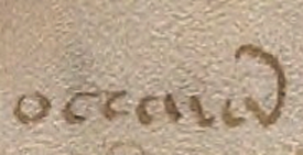
De Tepenecz Signature
I’m also not sure why she posted a recreation of Jacobi de Tepenecz’s signature in connection with her comments about my study of the column text. It’s different handwriting. It should be in a separate section, not conflated with my column-text blog.
I didn’t discuss the signature because there might be a time gap between the writing of the column text and the addition of the signature at the bottom of folio 1r. We don’t know yet. I don’t have enough information on the signature to blog about it, and I think it’s premature to imply an association between them.
In my opinion there’s not enough research yet to draw any conclusions about Jacobi’s signature. In the scant examples that people have kindly posted on the Web (and which were probably difficult to find), the legal signature doesn’t match the other signatures and the other signatures almost look like two different hands, as though they were greatly separated in time, or perhaps because his name was added by someone else’s hand?
If you are interested in VMS provenance related to Jacobi de Tepenecz, Anton has been posting some very good research on the Wroblicionim annotations on some of Jacobi’s books on the Voynich.ninja forum. This enlightening detective work is slowly but surely helping to round out the picture.
Suffice it to say that in my previous blog, I presented needle-in-a-haystack work-in-progress to help fill out some of the missing corners of Voynich history, and presented it as simply as possible, and was not trying to change or misrepresent the manuscript’s provenance, as O’Donovan has implied.
There’s a substantial gap in our knowledge of the VMS, from the time it was created (c. early 1400s) until the time it came into the hands of the Jesuits (c. mid-1600s), possibly through the court of Rudolph II. More than two centuries are shrouded in mystery.
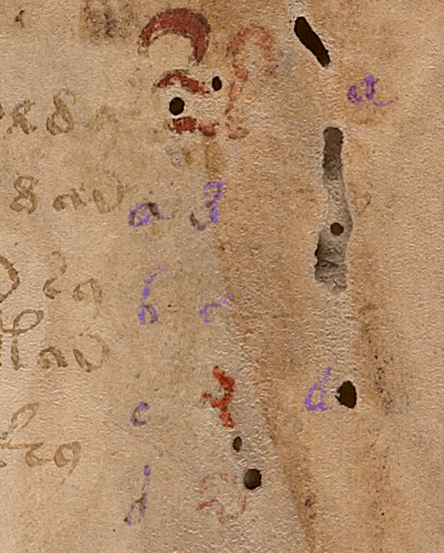
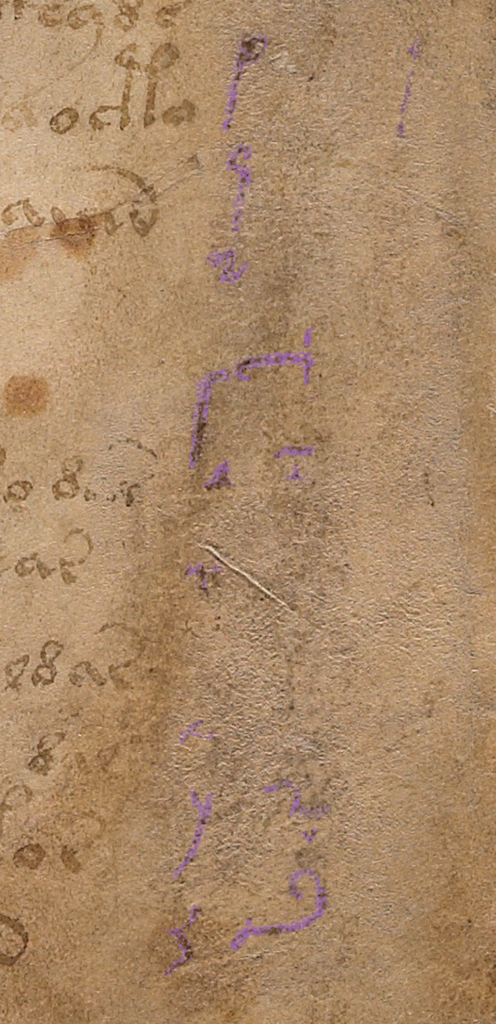
Part of my palaeographic research has included the faint text on the right-hand side of folio 1r because I was hoping it might reveal something about this hidden history, to fill in some of the missing provenance.
The column text on the right side of folio 1r has been partly obliterated and is very faint.
There appear to be four columns. The first two columns look like the same handwriting, with the alphabet shifted. The alphabet in the first column is complete, except that it’s impossible to make out the style of the r or the t. With very careful scrutiny, the other letters can be discerned.
The third column is slightly different. The loops are slightly rounder and it doesn’t appear to include as many letters as the first two columns. The fourth column is very faint and has fewer letters still. There also appears to be erased writing under the column letters (earlier attempts? or something else?). The spacing and style of the “red weirdos” doesn’t seem to have anything in common with the column text, so it’s probably written by another hand, perhaps earlier?
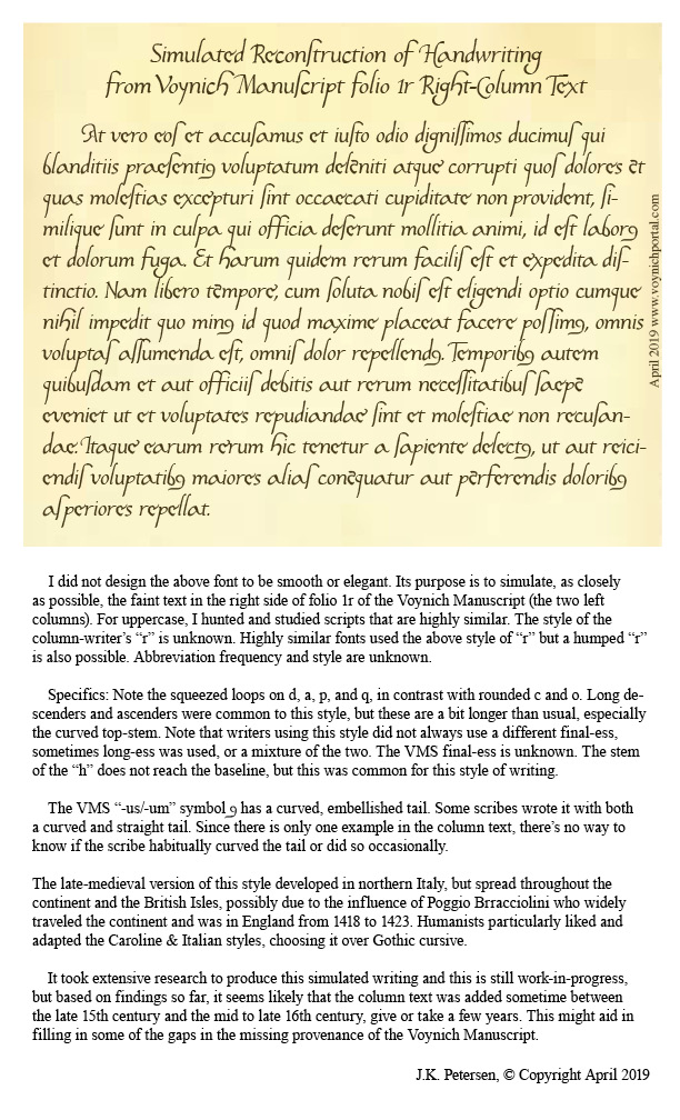
After extensive study of the letterforms, and intensive searches for similar handwriting, some of which I posted in previous blogs, I had enough information to try to reconstruct the handwriting of the person who wrote the column text. This research stretched over many years and included letterforms, spacing, final-ess styles, abbreviation styles, and time periods in which the text might have been added.
To make it easier to visualize how the scribe might have written whole sentences, I have created a font based on the style in the left-most column. It took a great deal of time and patience to try to achieve accurate reproduction of this script style. A couple of letters simply cannot be seen, but over time I became more familiar with this style of writing and how specific letters were usually written.
Scribal Specifics
Fortunately, there is a certain consistency to the way the shapes are written (not all writers do this).
The ascenders and especially the descenders are long, and some of the ascenders have an unusually long and rounded curve on the top (e.g., f, h, and s). This long curve is not common and appears to be specific to this scribe.
Letters with stems have a squeezed oval loop (b, d, p, and q); those without are more round (c and o).
An important clue to help identify the time period is the short left stem on the letter “h”—it doesn’t quite reach the baseline. The letter “h” was written this way during a fairly specific time period.
Another important clue is the style of the “g”. This was not an unusual style, but it was less common than the double-chambered “g” or one that is more angular.
Years ago, when I began this line of research, I was hoping to confirm John Dee as the foliator and/or writer of the column text. Unfortunately, after heroic efforts, I have some doubt that John Dee was the author of the column text or the folio numbers. His handwriting is close to both, but I have samples that are arguably closer. Examples of the column text can be seen in previously published charts and I have gathered more text and number samples since my early research was published that indicate a number of people had handwriting very similar to one another and to the VMS.
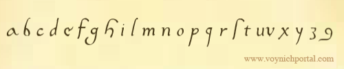
The Column Alphabet
Here is the basic alphabet (note that the column “e” is a variant that is less common and usually only shows up once in a while. I’ve seen it a few times but no scribe uses it habitually, so I have included the “base e” here and the variant column-“e” in the block of text below).
The shapes for u and v were used interchangeably by most scribes and the one in the VMS is hard to discern, but it looks like it might have a pointed bottom as we now associate with “v”.
I am not sure how long the descender is on the “x”, the x is barely discernible, but scribes who wrote in this style usually lengthened the stroke on the lower-left as follows. However, this specific scribe may NOT have added the small hook on the bottom left. It may have had a very severe tail, like the one on the y:
Constructing a Block of Text
To make it easier to imagine the handwriting of the column-text writer, I have created a block of text in Latin (I wasn’t worried about whether it was correct Latin or even medieval Latin, I just copied and pasted something more interesting than Ipsum Lorem).
Caveats
Be aware that reconstructing a block of text from an alphabet involves some educated guesses:
There are no upper-case letters, so the ones I included are based on writing samples that are very close to the column text, samples that took me years to locate.
The extent to which the writer used abbreviations is not known, so most of the following is not abbreviated except for the extremely common -us/-um abbreviation symbol that is included at the bottom of the alphabet on 1r.
The scale of the letter “o” is difficult to discern. I have made it a normal size in this sample BUT some scribes during this time period wrote the “o” smaller than other letters.
During the century or so that this style of writing was popular, some writers used long-ess as final-ess as well. Others used a snake-style final-ess, and some used both somewhat indiscriminantly. It’s impossible to know whether the column-text writer used a different shape for final-ess, so I have included both for purposes of illustration.
Whether the writer left out the serifs in the column alphabet because they were unnecessary, or because this is part of the writer’s style cannot be known from such a small sample, but the impression I get is that the scribe probably used serifs sparingly or not at all.
Here is the result of adapting the column text to a font that can be typed on a computer:
Keep in mind that real handwriting is typically more varied in slant, spacing, and letterforms than a computer font. I have varied the letters slightly, but I didn’t want to stray too far from the original letters or make too many guesses, so it will be up to the reader to imagine what this would look like as handwritten text. Hopefully the reconstruction will help in that regard.
Pinpointing the Date
Preliminary date ranges were suggested in the charts I posted in previous blogs, but I didn’t feel I had enough samples to narrow it down. I’ve collected about 100 more samples since then (ones that are specifically similar to the column text) and I still don’t feel I have enough but I’m more confident now than I was a couple of years ago. Here’s a rough timeline that might help illuminate some of the dark corners of the Voynich Manuscript’s early provenance:
Samples that are especially close to this script tend to be from the early 1500s, but this style was in use for about a century, so it might be premature to narrow it down any more than indicated by this date range. I will continue to seek out additional information and will post updates. I also have a great deal of information on other VMS text that I will post as I have time.
In a previous blog, I noted some of the ways that “mounds” on the VMS rosettes folio might be interpreted. It was barely an introduction, so this is a continuation, with “mounds” discussed in the context of medieval mappae mundi.
The blog format is too constrained to cover all the mappae mundi, so I’ve selected these as the main examples:
Sawley (England, c. 1110), Corpus Christi College
Ebstorf (Germany? 13th c), original destroyed, facsimile in Ebstorf cloister
Hereford (England, late 13th c), Hereford Cathedral
Paris, Bibliothèque Sainte-Geneviève 782 (late 13th c)
Walsperger (Constance, 1448)
Others are identified as they appear.
Basic Format
Western mappa mundae usually place Jerusalem at or near the center, emphasizing its historical and spiritual importance, as in this passage in Ezekial:
Thus saith the Lord God, This is Jerusalem, I have set it in the midst of the nations and countries, that are round about her.
Ezekial 5:5
In the example maps, each depiction of Jerusalem is different, as follows:
Ebstorf: Rectangular aerial view of walls, quite detailed, showing towers, bricks/stones, and battlements, with an image of Christ in the center. The palette is bright and varied.
Hereford: Circular aerial view, with crenelations and 4 plus 4 structures facing the center, in varying shades of brown ink.
S-G 782: A frontal image of a building with towers, crenelations, a saddleback portal, and two crosses, embellished with turquoise. The Sawley mappa is similar except that Jerusalem is slightly off-center from the Cyclades, and it has a dome instead of a saddleback portal entrance.
Walsperger: A more naturalistic view of a walled city with two tall round, layered towers. The palette is green, red, and a pale brownish amber—similar to the VMS except there’s no blue.
Each one is different because the architecture is stylized or entirely fictional. Jerusalem is identified chiefly by the label and its position on the map.
General Shape
Mappae perimeters are usually shaped like a race-track, almond, or circle, ringed by a body of water. This shape may reflect the idea of the map as a “mirror” of the world (the mirror thus reflecting an image given by God). Note that medieval lawbooks, and the scrying glass of John Dee, were also referenced as “mirrors”. They were seen as a vehicle to channel messages from a higher power.
The Sawley map (c. 1110) is oriented with east at the top and the Cyclades in the center (with Jerusalem nearby). Angels preside in each corner. Mountain ranges are lines of small bumps. Specific mountains, like Mount Atlas (bottom-right), are taller mounds:
On some maps, the surrounding waters are embellished with fish, boats, monsters, named or unnamed islands, or people.
Sometimes, God or Jesus is shown at the top or incorporated into the content as head, hands, and feet at the outer edges:
The organization of the towns and landmarks is based partly on biblical events after the flood:
These are the families of the sons of Noah, after their generations among their people: and out of these were the nations divided in the earth after the flood.
Genesis 10
All ethnic groups were said to be descended from Noah’s sons, Shem, Ham, and Japheth, and the earth was basically “assigned” to their descendants.
By the Middle Ages, mapmakers had a greater awareness of the extents of human populations, the arctic, antarctic, and the east, so they added them to the biblical interpretation while still retaining the basic ideas. Some of these maps were stylized into a T-in-O shape (or a four-part shape similar to a T-in-O).
Thus, we have Asia being roughly half the world, with the rest divided between Europe and Africa (and sometimes the Antipodes are shown as a small section by Africa).
East is Up
In the older mappae mundi, east is usually oriented toward the top. By the 15th century, some maps had south at the top. South was the direction taken by most Europeans for pilgrimmages to Jerusalem, Ethopia, and to reach many of the African and Indian trade routes, so it may have been natural to think of this direction as “up”.
By the end of the 15th century, magnetic compasses were more common and our concept of “up” changed from south to north.
We cannot be sure that the T-in-O on the VMS “map” folio is meant as an orientation symbol (or that the VMS rosettes are strictly geographical) but if it were, it would roughly correspond to compass points as follows:
This would put east at the top in relation to the binding, as would be common for the early 15th century.
More Examples
The 11th century Saint-Sever mappa mundi is race-track-shaped, with east at the top. The Mediterranean divides north and south, and the river systems and Black Sea generally separate Europe from Asia. It’s not quite a T-in-O, but it’s easy to see how the idea of T-in-O evolved.
Note how the Saint-Sever mountain ranges are drawn as lines of triangular bumps, and the tall mountain in the upper-left quadrant looks like a pile of scaly bumps, as in the Sawley map shown earlier. To the right is the Red Sea:
The Royal Higden map (Royal MS 14 C IX, c. 1350), is the same race-track shape, but the drawing surface is rotated 90°, so that Asia is a larger proportion of the total. Jerusalem is a little above center and Noah’s arc to the left:
Mountains are drawn as circles with a bit of green paint in the middle. This top-view theme of mountains as circles is also quite common. Sometimes the rivers flow from their centers, sometimes from the edges.
Often the tower of Babel is included as a tall, narrow, tiered structure, but it is not always large or prominent on the map. The Higden map has an especially fancy drawing of Babylon and Babel:
We often hear about “the seven hills of Rome” but this idea is not usually reflected in medieval mappae mundi. Rome is a fancy building, and the alps are nearby, but the seven hills are not explicitly drawn:
More literal expressions of the seven hills are sometimes found in illuminated manuscripts. These lofty tors reminded me of some of the escarpments in the VMS “map”, but they do not have pathways connecting them:
Mons atlas (a mountain created when Atlas was turned to stone by Perseus) is frequently included on mappae mundi. On the Higden map, it is prominently featured at the bottom with a textured mound rather than a simple circle. This region, next to Morocco, is now known as the Atlas range (note also the highly stylized islands off the coast of Africa):
Mappae mundi are often crowned with images of Paradise, or of Paradise lost (Adam and Eve after their expulsion from the Garden).
Adam and Eve and the serpent are featured prominently at the top of the map in the Beatus of Liébana map (right), and the NAL 2290 Beatus (early 13c).
The NAL 2290 map is round, with a lively procession of castles and critters in the outer ring of water:
Once again, the mountains are drawn as piles of textured bumps.
The Garden of Eden
In the Middle Ages, Eden or “Paradise” was not always represented by Adam and Eve. Sometimes it was a fancy dwelling with four rivers emanating from its edges, including the Tigris and the Euphrates. It was generally believed that Paradise, the cradle of humanity, was near Mesopotamia, in Armenia.
The Walsperger map illustrates Paradise as an elaborate walled castle with four rivers flowing from its perimeter, two which we recognize as the Tigris and Euphrates.
On the Sawley map (right), Paradise is sketched very simply at the top, somewhat organically enclosed by a “moat” connected to the great waters that ring the perimeter. There are two central circles with lines that probably represent the four rivers in a more abstract way than the Walsperger map.
Other frequent landmarks include Paris, Rome, Galicia, Bethlehem, the mouth of the Nile River (and other important rivers), the sea of Galilee, Black sea, Caspian sea, and the Red Sea (which is often painted red), along with various mountain ranges.
Thus, the maps were not strictly geographical, they combined history, landmarks, the origins and spread of humanity, and sometimes animals common to a particular region. Fictitious races of distorted humans are sometimes included, as well, with imagery that later showed up in manuscripts describing the travels of “John de Mandeville”.
Hints of Itinerary Maps
In Liber Floridus (c. 1113), the map is essentially a T-in-O configuration, but it is arranged a little differently from single-page mappae mundi, with water surrounding an entire quadrant. South is somewhat at the top, but only for parts of the map. Eastern Europe, Italy, Germany, France, and Galicia jostle each other around the edge, and Scandinavia is smaller than Saxony. Rome is emphasized in the upper-right. The orientations shifts slightly depending on where you are on the map:
The emphasis on Rome is two-fold. Not only was it the seat of power for much of Christendom, but it was the destination for many clerics to plead their requests or grievances directly to the pope—in other words, they needed to know how to get there.
River Systems
You’ve probably noticed that river deltas are prominently featured in most of these maps. Paradise, Egypt, Europe, the Black Sea, the Rhine, everywhere you look, there are fanlike fingers representing river systems. This is not surprising since water sustains us, feeds our crops, and provides important transportation routes. The way rivers are represented is much the same in maps from Europe and the Arabic world:
On the VMS foldout, Rotum7 has always struck me as similar to an alluvial fan, so much so I have difficulty thinking of alternative explanations. There are mounds in the center, possibly representing mountains as a source of the water. River basins throughout the world have the same basic fan shape.
But… the streaming shapes in Rotum7 are adjacent to the pathway with the Ghibelline merlons. How are we to interpret that?
If this rotum is a river delta, and the merlons represent northern Italy, it’s tempting to interpret it as the Po or Arno river basin. If east is up, then rivers that drain toward the west seem more likely, but I would still caution against taking the T-in-O too literally. If this were a strip map, the orientation could change en route:
I have rotated Rotum7 clockwise so the “labels” are easier to see. Most of the tokens start with o-Ascender, as do those in the “star charts” and “zodiac” sections. For comparison, here is a closeup of Arabic labels at each river mouth, sharing space with coastline symbols:
There might be other explanations for Rotum7. Maybe it’s not a drawing of river systems. It could be argued that the image is inverse, with the streams unpainted and the parts in between being something other than water. Perhaps this is smoke or vapor emanating from a thermal crater, rather than a river basin. Thermal baths or steam vents are found in thousands of locations throughout the world including places where there were swallowtail merlons.
Details, Details…
Petrus Vesconti of Genoa produced a number of maps in Venice in the 1320s. His circular mappa mundi has a more practical feel to it than many of the medieval mappa mundi. Vesconti included the rhumb lines common to seafaring charts and the mountains are more naturalistic:
The Paris and Upsala maps of Jerusalem include mounds with more stylized textures than those of Vesconti. Each of the three mounds in the Upsala map has a different pattern, but all mean the same thing… mountains.
The Matthew Paris map of Jerusalem clearly shows some of the common features: mountains, city walls, major landmarks, and the mouths of springs:
In Liber Floridus, the alps are drawn as a pile of scaly bumps with scepter-like embellishments:
Note how the labels for Burgundia and Aquitanoa have been split into syllables between the major river systems. Is it possible some of the VMS labels have been divided up in the same way so that several are needed to make up one word?
Clearly the use of small heaps of textured bumps to represent mountains is common to medieval maps in several styles. The main difference between the heaps in the VMS and those in other maps are the “spewy” things coming out of them. Are there any medieval maps that are similar?
Mountains with Extra Protruberances
The Beatus of Liebana map exists in a number of versions and was drawn with a variety of textured mounds, as in the Las Huelgas Apocalypse from Spain c. 1220 (Morgan Library):
But it doesn’t have any tufts or spewy things. Neither does this late-medieval copy of an early medieval Arabic map from the Book of Curiosities (Bodley Arab.c.90):
However, other copies of the Beatus map were drawn with feathery “tufts” along the edges, such as the 10th century Escalada Beatus of Valcavado, thought to be from Tábara, Spain:
Morgan Library & Museum, MS M.644, approximately 10th century
In the clearly derivative Beatus below, we see the same features: a mountain in Albania with tufts, (mons aquilo, possibly Mt. Korab?), smaller mountains to the right with feathery tree-like tufts on the earlier Beatus, and individual grainlike tufts on the later one.
To the right and down is a mountain that has both tufts and a poof at the summit. It is labelled mons libanus, the old name for a high peak northwest of Damascus, near the coast:
The area around Damascus was volcanically active until the Holocene period and there is an extensive lava field southeast of Damascus, so perhaps the poof refers to volcanic craters.
The VMS also has some tufty looking protrusions on Rotum7 along the edges of the scaly bumps and at the tops of the “mounds”? Might these represent trees in a very abstract way as in the Beatus maps? Might some of the longer ones represent vents as discussed in the previous blog?
Venetian Mappae Mundi
The Giovanni Leardo map of c. 1452/53 is oriented with east and the “earthly paradise” at the top. A calendar fills the outer edge.
The mountains are colored green and pink to help distinguish them from overlapping features, but don’t vary much in texture:
The buildings have a cookie-cutter quality, similar to the mountains, with the more important ones marked with taller or more numerous towers. Jerusalem and Babylon are given special prominence and the Red Sea is bright red:
The Carta Marina, published in Venice a century after the Leardo map (1539), is a very detailed map of Scandinavia and Iceland. Volcanoes are shown as mounds but it’s interesting that fires are raging at the base rather than spewing from the tops as is common on many maps. There is also an interesting twist on rivers, which emerge from pipe-like structures that resemble reservoirs rather than natural springs—a pipelike theme somewhat reminiscent of the VMS:
Two centuries after the VMS, not much had changed in terms of representing mountains. In this 1650 map of Ephraim’s inheritance by Thomas Fuller, we see textured bumps, with higher bumps for taller or more important peaks:
As in the VMS, sometimes the peaks are topped with fortresses:
Most buildings in medieval maps were fictional. They rarely resembled actual structures.
For a unique synthesis of map and myth, take an hour to peruse the drawings of Opicinus de Canistris, who created a series of maps around the 1340s (Vat.Lat.6435). A supporter of the Guelphs (who, in turn, supported the pope in Rome), the biblical elements are very apparent, but his integration of figure and form have a deft puzzle-like quality that is unlike other maps created in the middle ages and which vaguely reminds me of some of the pond-and-river images in the VMS:
Cultural Differences
Arabic maps often share similarities in the ways mountains or rivers are drawn, the 12th century world map by Al-Idrisi is essentially the same as western maps, but there are also some notable differences in maps created by specific map-makers. For example, this 13th-century Zakariya Ibn Muhammad world map, labeled in Arabic, uses scaly textures to represent lakes, rivers, and oceans, and mountains are not included:
Zakariya Ibn Muhammad al Qazwini world map from The Wonders of Creation (of which there are quite a few copies) [Source: U.S. National Library of Medicine]
Borders
I wanted to make a quick note about borders before summing up. The edges of most mappae mundi are unremarkable, sometimes ringed only by a roughly drawn circle or double line. But some have more elaborate borders.
Here is a circular world map (Kitāb al-masālik wa-al-mamālik), in which the outer ring of water is contained within a lace-like pattern of donuts and loops that resembles tatting:
The Walsperger map has a flame-like border of triangular ticks:
… somewhat similar to the ticks in the VMS:
It’s not exactly the same—the VMS triangles emerge from a scaly base and the flaglike ticks are disengaged from the triangles—but it caught my attention because the Walsperger map includes other relevant details, like placeholders for zodiac symbols and text written within the perimeters of circles.
Highly schematized mandala-like maps with elaborate edges are also found in Indian maps in the 18th and 19th-centuries:
The Emerging Renaissance
The c. 1450 “Fra Mauro” mappa mundi illustrates an increasing trend toward realism as the Renaissance took hold in Europe. Paradise has been conspicuously removed from the top, within the map, as was traditional, and placed outside the perimeter, in a corner. It is contained within a circular enclosure, has a daunting pointy fence, and craggy terrain outside the perimeter (does that sound like the VMS?).
As with its predecessors, there are four rivers running from the edge:
Here is another version with the same basic features:
If it is a Map, Where Does the VMS Fit?
If we assume for the moment that the rosettes foldout is a map, could it be interpreted as a mappa mundi? The perimeter is not round or oval and each rotum is quite large and distinct, larger than one would expect for a world map, but it might be a good exercise to see if it works.
Perhaps, like so many medieval maps, the central rosette is Jerusalem:
This is believable, as Jerusalem is frequently drawn as a circular enclosure with numerous towers. Sometimes stars are included. The enclosure is often a wall of stones or bricks.
Following this line of thought, and depending on the orientation, the bottom-left rosette with rivers or vapors running out of it, or the more symbolic one in the top-middle might be interpreted as Paradise.
Years ago, I thought the Tower in the Hole might be Pisa or, if the map represents Naples, one of the structures coming out of the ancient tunnels that still exist underneath the city. But another possibility is the tower of Babylon, which is almost always included in mappae mundi.
If east is at the top, as per the small T-in-O, then the rotum middle-right could be an aerial view of the lighthouse of Alexandria (see the previous blog for a detailed look at Rotum6):
What about the Swallowtails?
But then it gets complicated… if east is at the top, that would place the Ghibelline merlons in the west (at the bottom) relative to Jerusalem, suggesting that the map as a whole represents the Mediterranean region, rather than the whole world. This, in itself isn’t a problem, but then how does one account for all the other rota?
That Nagging Feeling That it Doesn’t Add Up
The problem is, it doesn’t feel right. On a subjective level, it’s like trying to push square pegs into round holes. Some parts of the VMS “map” can be compared to mappae mundi, such as the way the textured details are drawn. In other ways, it feels more like a strip map (from the beginning, I’ve felt it was more suggestive of a journey than of a world map).
It feels even less like a portolan. In general, portolans were more practical than mappae mundi, and more geographically literal than either mappae mundi or strip maps. They were more likely to include detailed coastlines, navigational lines (wind-rose or “rhumb” lines), and a variety of mariners’ symbols.
Here’s an early and fairly simple version of a portolan with reference lines and numerous harbor markings along the coast of Alexandria:
Portolan detail of the Mediterranean coast, c. 1325 to c. 1350 (prob. Italian origin). Library of Congress. Full version can be seen here: https://www.loc.gov/resource/g5672m.ct000821
The children of seafaring merchants were expected to learn math and to know it well, including fractions, distance computation, percentages, area computations, “meet-in-the-middle” problems, differences in speed related to the number of sails, and much more (for examples and a fun read, see Dotson’s Merchant Culture in Fourteenth Century Venice).
With this emphasis on analytical skills, one can expect portlans to be more detailed and accurate than charts based on biblical stories that are intended for general education.
Only a few of the elements of early portolan maps are found in the VMS and they are not synthesized in the same way but, before rejecting them entirely, I think it’s worth illustrating at least one of the later-medieval portolans because they started adapting ideas from mappae mundi.
Evolution of Portolans
By the 15th century, portolans were more detailed and colorful, and included some of the elements more common to mappae mundi: scales and textured mounds for mountains, river deltas colored blue, and more elaborate architectural drawings for cities (both real and mythical). But they continued to include practical elements such as rhumb lines and numerous port symbols, as in this chart by Spanish cartographer Gabriel de Vallsecha:
A walled city with numerous towers represents Babylonia in this detail of a Mediterranean portolan by Gabriel de Vallsecha, 1447 [BnF CPL GE C-4607]
Ironically, at the same time that portolans were becoming more expressive, mappa mundae were becoming more naturalistic and accurate than traditional T-in-O maps.
Evolution in World Maps
The 15th-century world map of Pirrus de Noha is clearly more geographical than Biblical. The coastlines, mountain ranges and river systems are recognizable without labels. North is at the top, and the eastern portion stretches past the Caucasus, a region only vaguely charted on earlier maps:
The date of the Pirrus de Noha map is unknown, but it is bound in a manuscript dated 1414. It is thought to be a synthesis of information from Ptolemaic and nautical sources.
In the Pirrus map, the focus is on land masses, so the harbor markers and rhumb lines common to portolans are not present, but the VMS “map” shows no signs of being geographical like the Pirrus map—I included it mainly for contrast to the VMS, and to show some details of mountains and river systems, which are similar to most maps of the time:
Thus, semi-geographical maps, and the 1439 portolan below, represent mountains as rows of triangles or scales, with taller heaps for individual peaks:
Portolan chart with navigation lines, land forms, sovereigns, major ports and cities, and scaly mountains and mounds, and a few animals, as well. [attributed to Gabriel de Vallsecha, 1439, Palma, image courtesy of Maritime Museum, Barcelona]
It should be clear by now that the VMS is arranged differently from most medieval maps. It’s not overtly similar to mappae mundi or portolans, but there are other kinds of maps that were used regularly in the Middle Ages that might qualify.
Is the VMS like itinerary maps?
Itinerary maps are lists of major landmarks and destinations along the way. Sometimes distance is noted in units of time rather than units of measure. Some itineraries are so detailed, they are like short books, with descriptions of places to sleep or to visit within a local community, others are brief lists of town names in the order in which they were to be visited.
Many are not illustrated, so I took a small section of the 16th-century itinerary of Bartolomeo Fontana (U Penn Codex 451) and mapped the destinations as an example:
This is a fairly short trip compared to some of them, and yet it is eight destinations. If the VMS is an itinerary map and IF it is drawn in two planes, then the number of destinations is very small.
Before we look at strip maps, I’d like to mention a map that doesn’t fit the common categories. It includes elements of both geography and itinerary maps, but leans toward geographical.
A Spartan Format
When I first found this c. 1425 map, the folio was zoomed out and I saw only a grid with some red dots. The preceding folios were star charts, so I assumed the red dots were stars, as well. When I zoomed in, I realized it was a semi-geographical map listing locations from Germany to the Levant and Greece in the southeast, and to Spain in the southwest.
I’ve transliterated and translated some of the better-known locations to make it easier to read. It’s interesting to note the changes in some of the names. For example, Herbipolis is today’s Würzburg. It also provides some insight into the towns that were significant to whoever created the map.
The top of the page is roughly west rather than north and it’s not strictly geographical, even though it’s placed on a grid. These “wandering” compass points are common to itinerary maps and strip maps since the orientation of the folio can be inferred from the names. To give a general idea of the orientation, I added a compass.
Oddly, Nuremberg is shown west of Cologne and, even more surprising, Rome is off the bottom of this clip, southeast of Florence. Most of the other towns are more-or-less in the right orientation to one another:
Detail of a map from a medieval astronomy manuscript. The points show towns in France, Germany, Bohemia, Italy (along with Sicily, Sardinia, and Mallorca), Tunisia and, at the bottom of the folio… the Levant, and Greece. [BAV Pal.lat.1368, c. 1425]
Below Sicily and Rome, there is a gap. At the bottom is a muddled collection of points vaguely describing Greece, Egypt, the Levant, and “Babilonia Nova” (New Babylon). If you’re wondering where New Babylon is, it’s near the mouth of the Nile (old Babylon was southwest of Baghdad; on medieval mappa mundi, it was usually close to Jerusalem at the center).
On the left are some faint marks that look like roads or coastlines, perhaps the first attempt to create a more conventional map. Whether the final map that we see was considered finished (or “good enough”) we’ll probably never know, but it demonstrates that not all maps followed traditional styles.
Itinerary Maps that Focus on Visuals
Illustrated maps are usually more interesting than written instructions, and there was a significant one passed down to us by Giraldus de Barri (Giraldus Cambrensis), a cleric of Welsh-Norman ancestry. He created or commissioned a map c. 1200 that is sandwiched between his two books on Ireland.
The map seems strange at first. The land masses are blobby, and the top is approximately southeast. Hibernia (Ireland) is at the bottom, but appears too far north of England. Germany and France have been collapsed to a fraction of their size, and the proximity of Iceland to Scandinavia is more sociopolitical than longitudinal.
Right away one can sense similarities to the itinerary map above in terms of geographical compromises. In fact, the orientation of the map shifts as one follows the various routes from Ireland to Rome:
Strip Maps
A strip map falls somewhere between a geographical map and a written itinerary, but is even more schematic than the example posted above. One could call it a Point-A-to-Point-B-to-Point-C map.
A journey from north to south might be expressed in the shape of a snake or a circle so that it fits conveniently on a page. Sometimes the routes are even drawn as strips, like this map describing the road from Hereford to Leicester:
The most charming and interesting strip maps are probably those of Matthew Paris (mid-13th c). They include some of the mythic and geographical quirks of mappa mundi, some of the instructional features of itinerary maps, with added storytelling elements about the journey and what might be seen along the way.
They are, in some ways, the medieval version of a pop-up book. Here, a little flap opens up to show Rome:
A building is topped by a stork, another visited by a turtle. Note how the page is organized into vertical panels like the Leicester map:
A 13th-century Matthew Paris road map arranged in strips, highlights major architectural landmarks and interesting animals and plants along the way. [Royal MS 14 C VII, British Library]
Assuming it’s a Map, Where Does the VMS Fit?
To me, the VMS feels much more like a strip map than a portolan or mappa mundi… but only part of it (the outer corners).
The possible nautical symbol in the upper-right corner isn’t enough to confirm it as a portolan. The stars in the upper-right, the T-in-O shape, and the symbol that resembles a sextant (bottom left), might exist for instructional purposes (imagine a father with child at his side pointing out the identity and purpose of individual features).
I’ve tried resolving the features to the bay of Baia and Nisida, the home of many craters, steam vents, and baths of the Pozzuoli complex, and it works quite well, but there’s still the question of the Ghibelline merlons.
A Less Literal Interpretation
In the previous blog, I suggested the map could be interpreted as a synthesis of two planes, an earthly plane and a spiritual/celestial plane, with medieval notions of the elements incorporated into the four corners of the earthly plane:
The pathways connecting the corner rota, and the geographical details along the paths, remind me of strip maps. The other portions remind me of medieval abstractions of the celestial sphere. If this is the correct interpretation, then the likelihood of a strip map diminishes, due to the paucity of “stops”
Patterns Among Rota
The central rotum has always looked to me like a spiritual center, which could be a temple or church (Jerusalem, Rome, a pagan temple, or basically any local spiritual hub), or a representation of “Sol”, Apollo or God. It could even represent heaven, or a return to Paradise, as the ultimate destination on the road of life.
If the “pipes” emanating from Rotum1 are like chimney pipes, channeling heat from a fire, and if Rotum1 represents an earthly location in tandem with the element fire, then maybe the “pipes” around the central rotum also represent heat/light/fire, as is common in medieval cosmological drawings.
The four middle rota, connected to the center, seem more abstract than the corner rota, with radiating lines that were often used to represent celestial objects or events in didactic medieval illustrations of the cosmos. This form of abstraction continued into the Renaissance, but was increasingly accompanied by naturalistic drawings:
A 16th-century interpretation of the fiery ascension of Elijah. Note the abstraction of the chariot wheels, rotum-like with radiating lines. [Image courtesy of The Tretiakov Gallery, Moscow]
Here’s an 18th-century interpretation of the idea of an earthly plane below and a celestial plane above:
Note how the heavens are drawn within the frame of a hanging tapestry, as though enclosed within walls, with stone-like cloud textures around the edge (not dissimilar to the more abstract rota in the VMS).
The earthly plane is drawn like a late-medieval-style map (modern maps are more symbolic)—quite literal and terrain-oriented. The center of the celestial realm above emanates rays.
Even though this engraving came later than the VMS and is a different drawing style, the basic themes are surprisingly similar. Heaven and earth, two different planes, and even though the earthly sphere shows naturalistic terrain and may represent a real location, the intent is not to illustrate a physical journey, but to provide a mental map of where the world fits.
Summary
I want to believe that the VMS “map” represents real places, that it is a strip map representing a journey. I invested years searching for matching locations (and found a few that might be relevant that I haven’t even had time to blog about yet), but the more I study medieval culture, the more I suspect I might be wrong… the corner rosettes map so easily to the four elements, it’s possible that is all they are intended to be, without any particular dependence on real locations.
Even if the drawings are real locations, they don’t necessarily have to be geographically related—the idea that they connect on the lower level (under the mid-folio rota) through pathways is speculation, in which case it isn’t really a map in the geographical sense, it might be more of a teaching map to explain medieval cosmology, with a few well-known or generic locations delightfully illustrated in the corners.
If I find out otherwise, I’ll post about it. I have mountains of information about possible geographical interpretations burning a hole in my hard drive and it would be a shame for them to go to waste. If the VMS turns out to be information deliberately obscured, maybe there’s still hope of decoding the text and understanding the “map” on its own terms.
Deprecated: ucfirst(): Passing null to parameter #1 ($string) of type string is deprecated in /home4/jensonje/public_html/voynichportal/VMSForum/.default on line 256