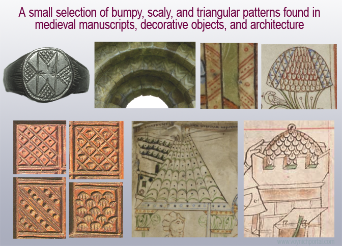
23 March 2019
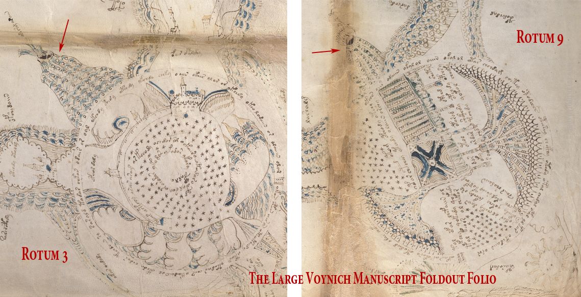
I have several ideas for how the middle-right rotum on the VMS “map” could be interpreted, so this is just one possibility. I’ve mentioned it a few times on blogs and on the Voynich.ninja forum, but I thought it might be better to post some visuals.
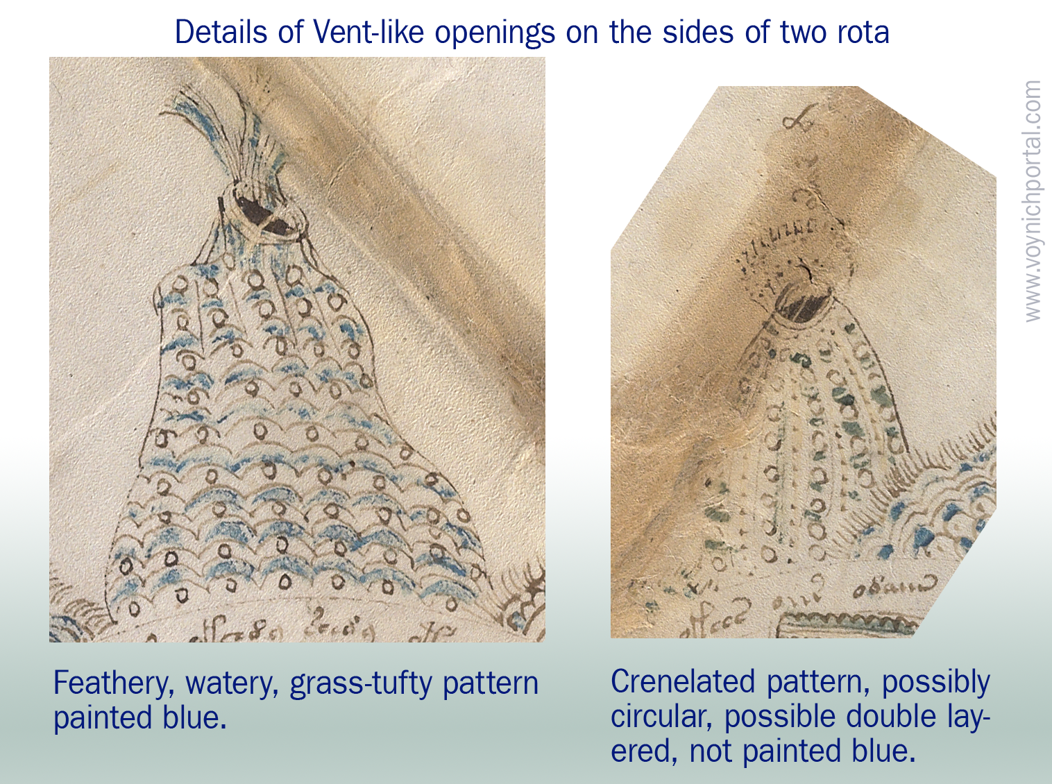
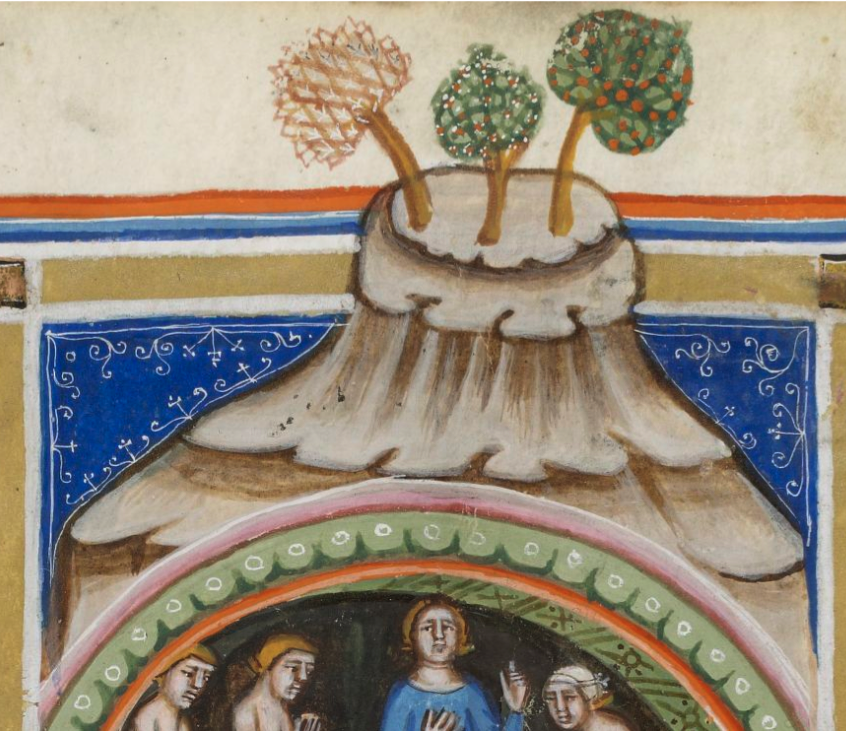
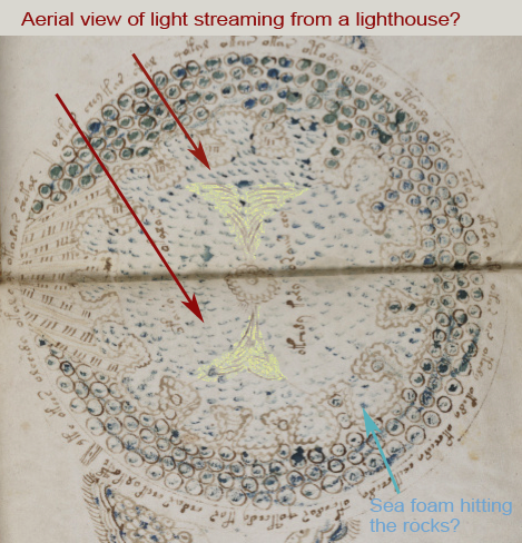
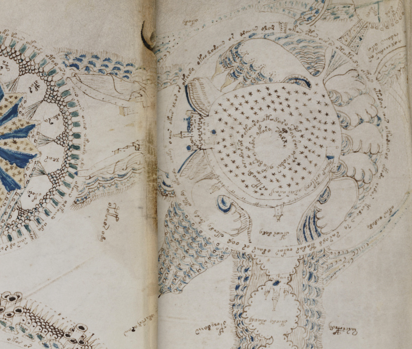
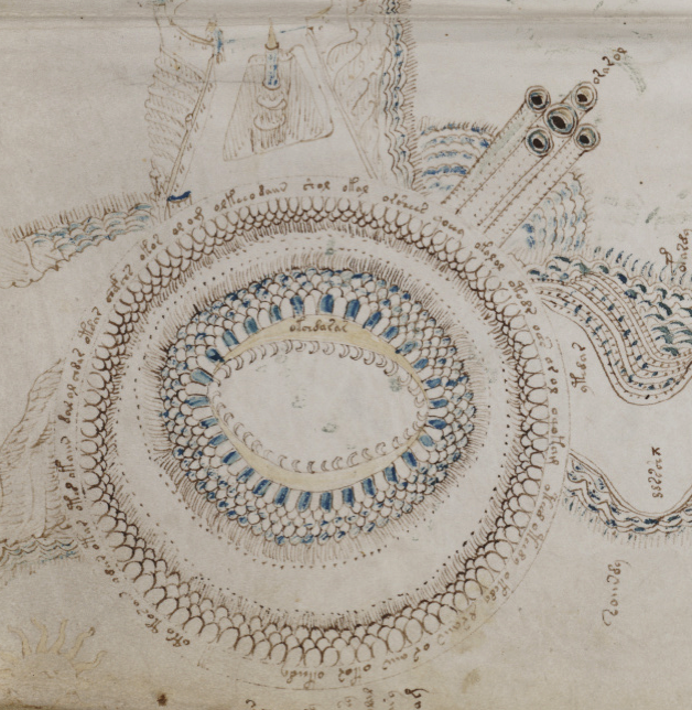
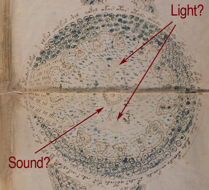
Rotum 6 is ringed by a textured pattern of small circles painted blue. On the left is a different pattern of lines connecting it to the center rotum.
Within the outer blue texture is a double-infurled scalloped pattern resembling a cloudband. In the center is a small circle with a dot (the dot is the compass point) surrounded by another circle of small scaly shapes. From the inner circle emanate two roughly triangular spreading shapes (or perhaps they are pointing to the inner circle). The open portion between the scalloped band and the inner section is dotted with blue paint:
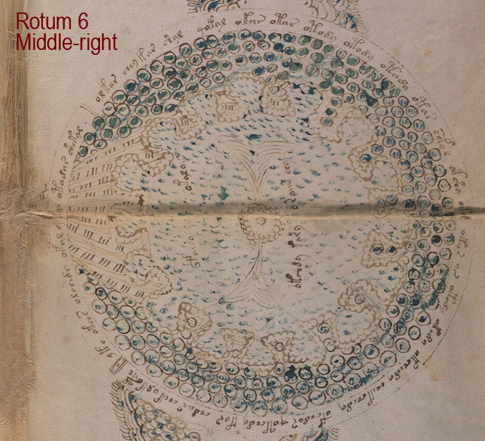
The first time I saw this, I thought it looked like water and rocks, similar to some of the other rota, but the infurled cloudband-shape makes me wonder whether the intention is mythical or real.
Does the double-infurled band indicate another realm or another time period? Could the band be “air”, as in some medieval depictions of the elements? Or could it be sea foam drawn with an infurled band simply because it was a popular theme at the time and they look somewhat the same?
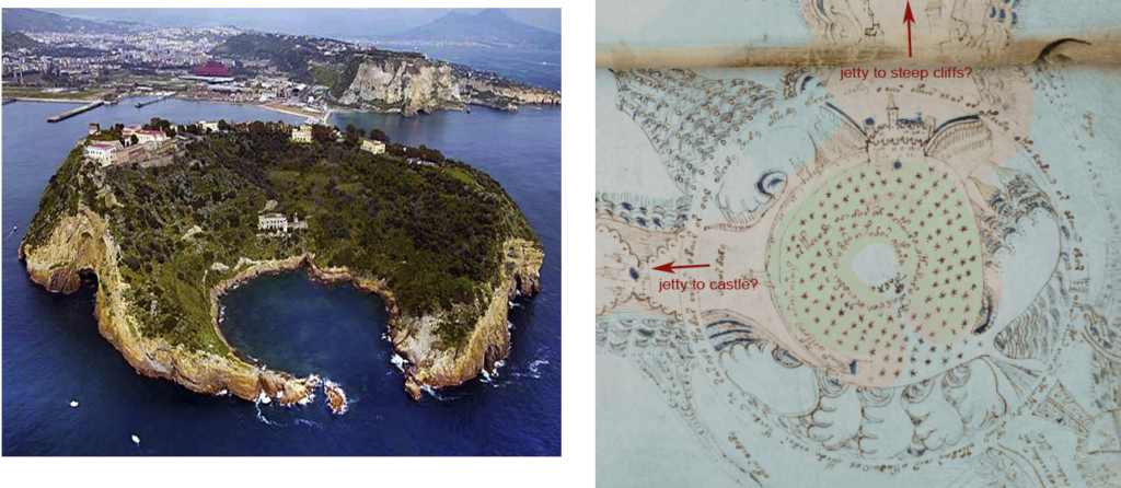
I can’t cover all the possibilities in one blog, so let’s start with one of the more literal interpretations. For the sake of exploration, let’s assume this is something real with water and rocks. One idea I had is an aerial view of a lighthouse.
Medieval Lighthouses
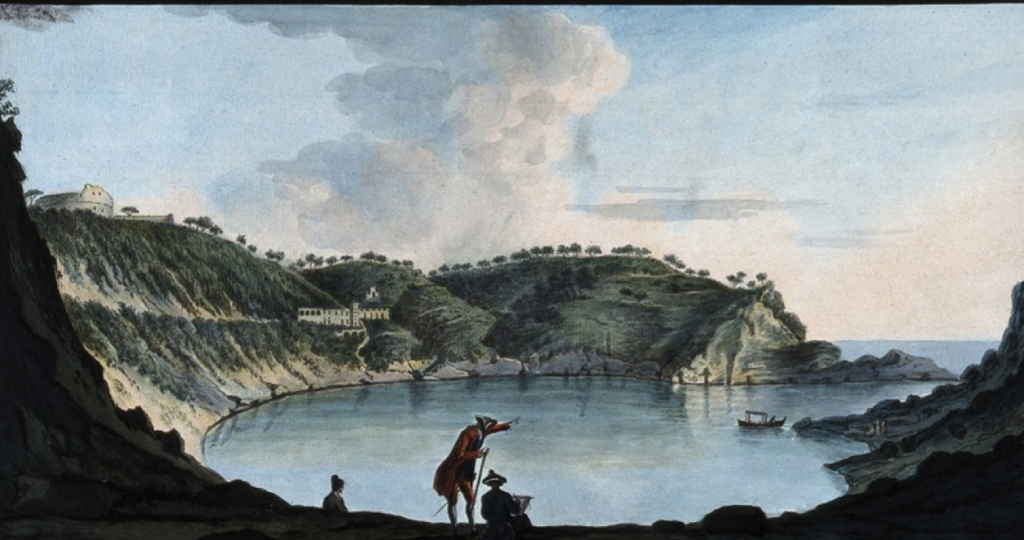
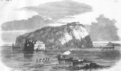
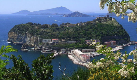
Most medieval lighthouses have been rebuilt. The few that remain in their original form have been fitted with modern beacons and sound systems to replace the fire beacons and manual horns that were used in the Middle Ages. Sometimes they have been made taller. Nevertheless, we can get a sense of how they might have looked from these images:
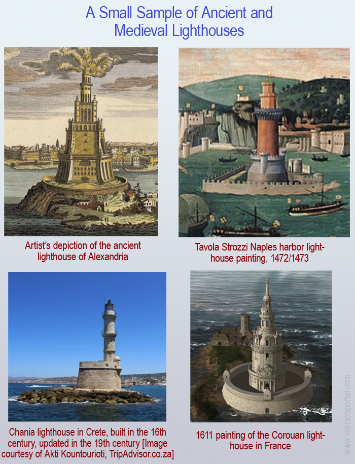
Ancient lighthouses may have been more squarish or perhaps a combination of squared and round shapes. Many of the medieval lighthouses were round or somewhat round (octagonal) and when they were built on artificial jetties, those were sometimes round, as well.
What about the “Beams”?
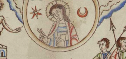
Looking at the central circle in Rotum6, it looks like something is streaming out of it or pointing toward it at the top and bottom. Also, if you look closely, you will see small tickmarks on the lower left. The infurled, scalloped shape that resembles a cloudband might indicate another realm, or it could be foam where waves lap up against rocks:
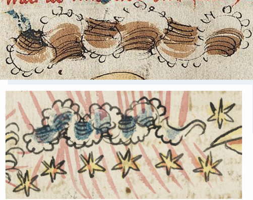
Were light and sound represented with streamers and little tickmarks in the Middle Ages? I wasn’t sure, so I checked, and found that they were:
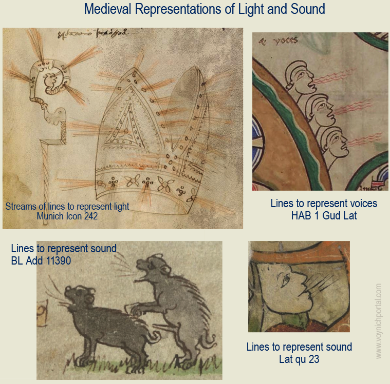
This doesn’t prove that the VMS lines mean light and sound, but it does show that it’s possible.
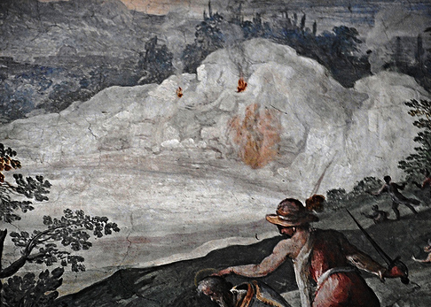
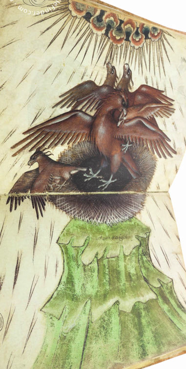
I wasn’t sure whether to include this image, as I’m not certain represents sound, but the way it’s coming out of textured bands at the top of the panel reminded me of the bird on VMS folio 86v that I blogged about here. The orientation is different, but the lofty position and the narrative impression are similar:
This image from Giovaninno Di Grassi, with rays coming out of the cloudband, also reminded me of the tor with the birds on VMS f86v:
So, let’s take a look at the evolution of this style of infurled band
The Infurled, Scalloped Band
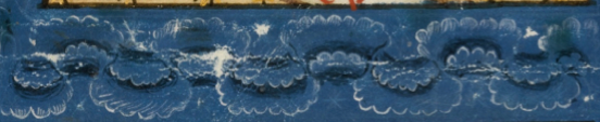
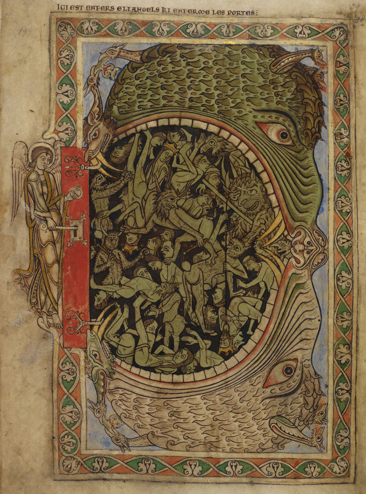
This infurled cloudlike shape was often used as a divider between the earthly and spiritual/heavenly realms. The scalloped edges were a later medieval style that evolved from simpler wavy shapes. Here is one of my favorite early-medieval cloudlike dividers with simpler bands (Tiberius C-VI):
These are some of the innovations that came later that are similar to the VMS band:
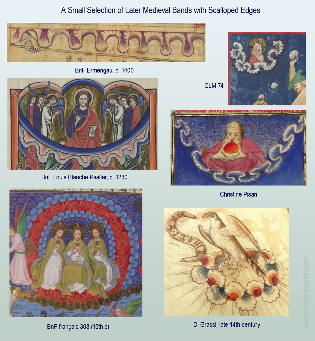
The earliest of these examples, the 13th-century Louis Blanche band, wasn’t infurled, but it did have scalloped edges.
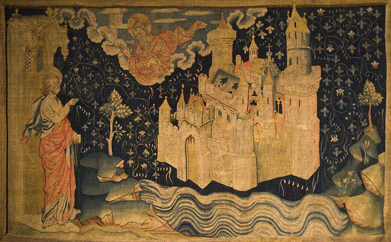
The scalloped infurled bands were quite common by the 15th century—I have far more examples than I can post. One influence may have been an Anglo-Norman tapestry of the New Jerusalem, woven in the late 14th century. Unlike the contents of books, tapestries were often on display, as signs of wealth, where more people could see them:
Another influence might be the design exemplar created by Giovannino di Grassi. You may have noticed that the illustration of the raptors on the tor above includes infurled shapes with scalloped edges. Di Grassi drew the image in his model book in the late 14th century, to provide examples for other illustrators.
Variations
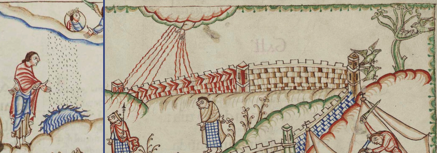
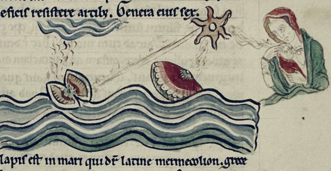
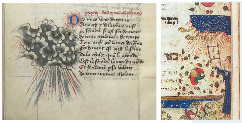
The Rotum6 band is a single row, but sometimes there are multiple rows of bands, with rays and sound-horns coming out of them. This occurs in both Latin and Hebrew texts:
In contrast to infurled bands, here is one comprised of spiral shapes from eastern Europe (probably Bohemia) that is more similar to Asian cloud clusters than the scalloped bands shown above (Velislavova Bible, c. mid-1400s):
The Lauber workshop, not surprisingly, created quickie versions of the western style of scallop:
This form of scallop was later repeated in a printed version of De Sphaera.
This super-quickie version, without the scalloped edges, appears in NYPL ma 104 (c. 1445). The drawing style of the figures is not too different from the VMS, but more care and attention was given to VMS decorative elements and textures:
The motif remained even after printed books displaced hand-drawn illuminations. A mappa mundi created by Hanns Rüst, published in Augsburg c. 1480, includes infurled bands, and a small inverted-T-O in the bottom-right corner:

On the same page, in the lower-left is a similar image, except it is arranged in bands rather than as a tripartate scheme, and thus the infurled shape is repeated as a representation of “air” within this schema, above horizontal bands of water, earth, and fire:

Thus, it can be seen that the infurled band was most popular in the late 14th century and the 15th century, consistent with the radiocarbon dating, and everything I’ve discovered so far about the paleographic characteristics of the manuscript.
But what does it mean in the VMS? Is it decorative or symbolic? If it’s symbolic, is it representative of another realm, or perhaps the element air? Or is it stylized sea foam around the base of a lighthouse?
Maybe the Answer is Simpler
Maybe Rotum6 is not a lighthouse, even though a lighthouse would fit well with the other water and rock/mountain imagery on the VMS “map”. Maybe it’s something more simple or more abstract.
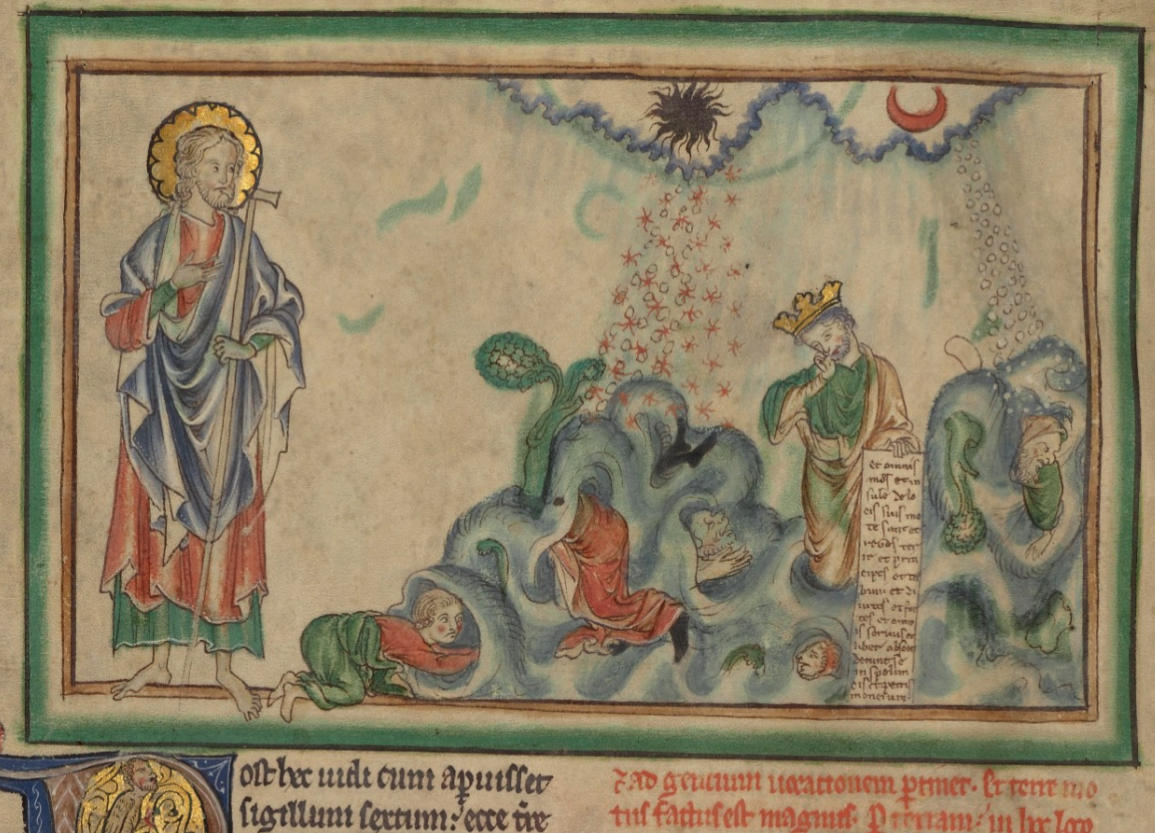
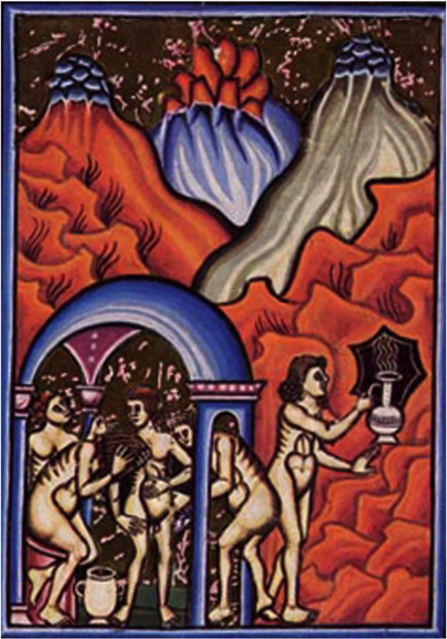
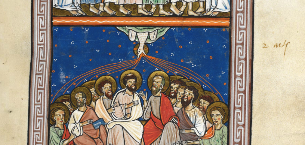
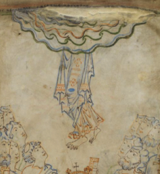
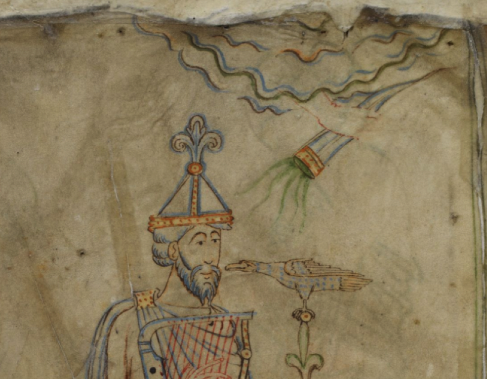
Coming back to examples from Cotton Tiberius C VI, it can be seen that biblical stores often include beams of light, horns, and other iconography that represent the light of God, the majesty or power of God, or the voice of God (or one of his emissaries), emanating from a heavenly-realm band:
Infurled bands can also be found in stories of creation, as in this Anglo-Normal Bible (BL Additional 47682, 1330s):
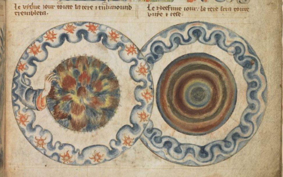
Notice that the centers are rather abstract. You wouldn’t know what they represent without context (which may also be true of the four mid-side rota in the VMS “map”).
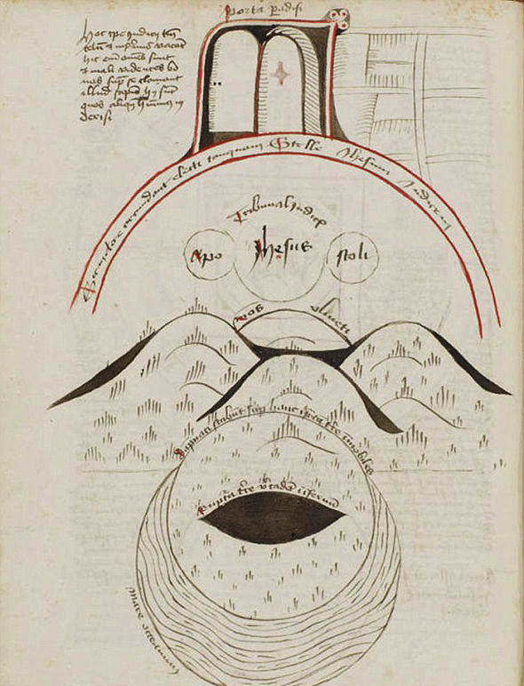
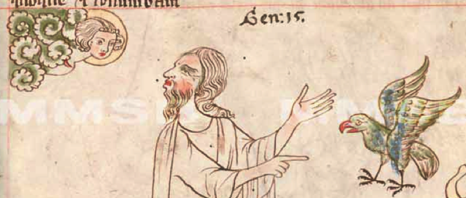
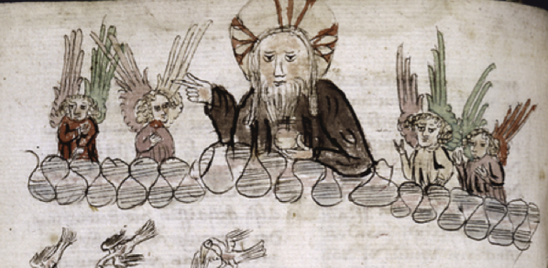
There is a more intricate version of the band in Egerton 1894 (c. 1360s), with God creating the animals (note also the rainbow):
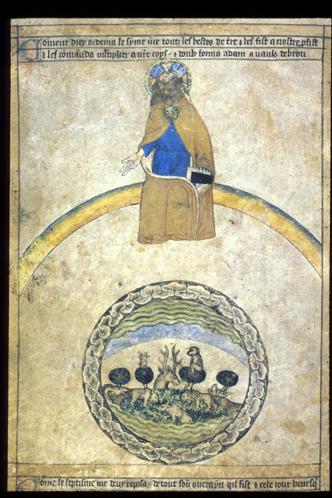
Sometimes the story of creation gets all bundled up with Eden, animals, elements, winds, angels, the sound/word of God, and an extra scalloped band for good measure:
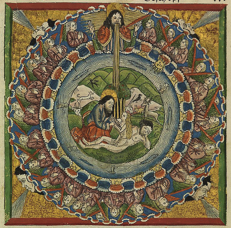
So this infurled style of band is frequently used to represent a division between realms (usually heaven and earth), but it can also represent “air”.
Could there be two different “planes” of meaning on the VMS “map” folio?
The VMS “Map” Seen as Layers
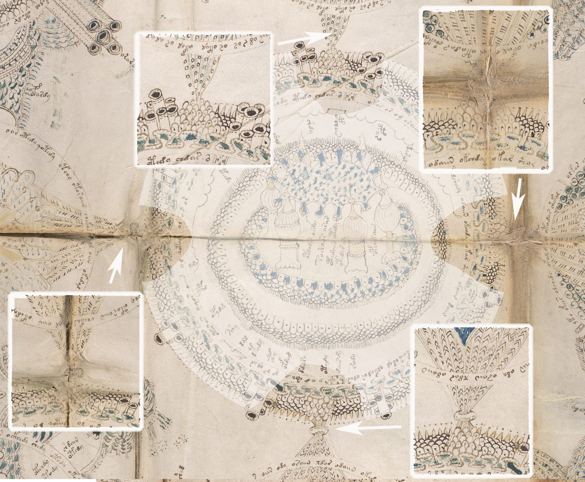
Perhaps the central rosette is a spiritual center (a church or temple, or Jerusalem, Eden, or Rome), and the four radiating “mouths” are the winds, connecting it to four rota on the middle-sides. There’s a certain consistency of theme among these. Each one has lines radiating from the center toward the edges (in Rotum6 there are only two rather than multiple spokes). Each one is explicitly connected to the central, larger rotum:
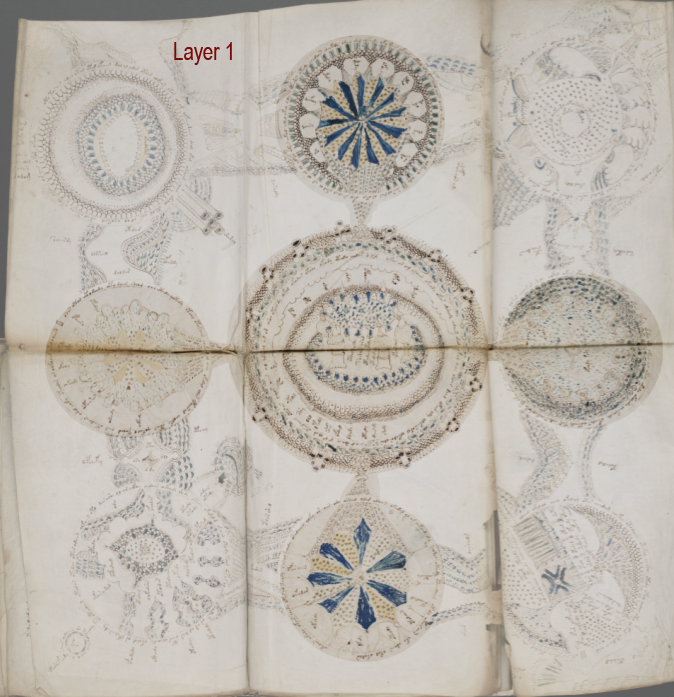
The four rota in the corners are drawn and connected in a different way from those on the sides—they are also more literal and detailed in a geographical sense. They are not directly connected to the center, like the side rota. Instead, they have “pathways” that connect around the edges of the folio.
Maybe these paths don’t go through the four side-middle groups as it appears at first glance… maybe they connect directly to the other corners on another plane. We might be looking at a spiritual plane and an earthly plane:
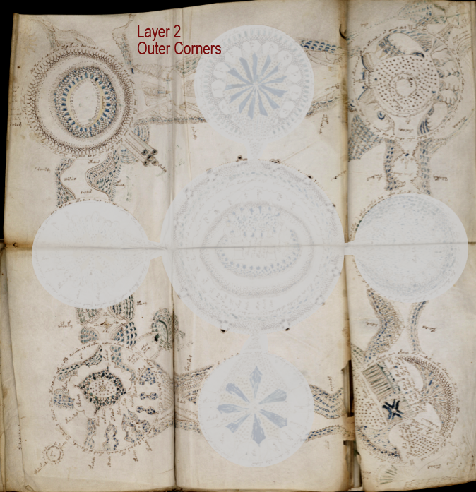
Even though the corners do not connect directly to the center (just as earth does not directly connect to heaven), they do in a sense “point” to the center using protruberances such as pipes and mounds. Each corner rotum has a certain amount of terrain or context extending into the space outside the edges (suns, symbols, textures).
There are two pathways extending from the sides of the corner rota, but each is a slightly different design. And each rotum has a different inner design (oval, spiral, terrain-like, garden-like).
One way to look at this is that the outer corners may represent the earthly plane, and thus embody (from the top-right going clockwise), the elements of water, air, earth, and fire, and still (at the same time) represent real locations, but before this idea is discussed in depth, I have some information on mapping traditions I’d like to post first.
Sorry for the abrupt interruption, but this was originally a small portion of a very long blog that goes into detail on whether the VMS “map” is traditional, metaphorical, or literal. It was much too long for one post, so I split it in two. I will post the rest of it as soon as I can figure out how to break up the remaining portion into two, as well, as it is also much too long.
To be continued…
J.K. Petersen
© Copyright 2019 J.K. Petersen, All Rights Reserved