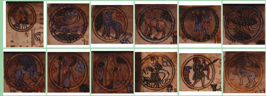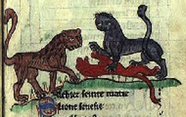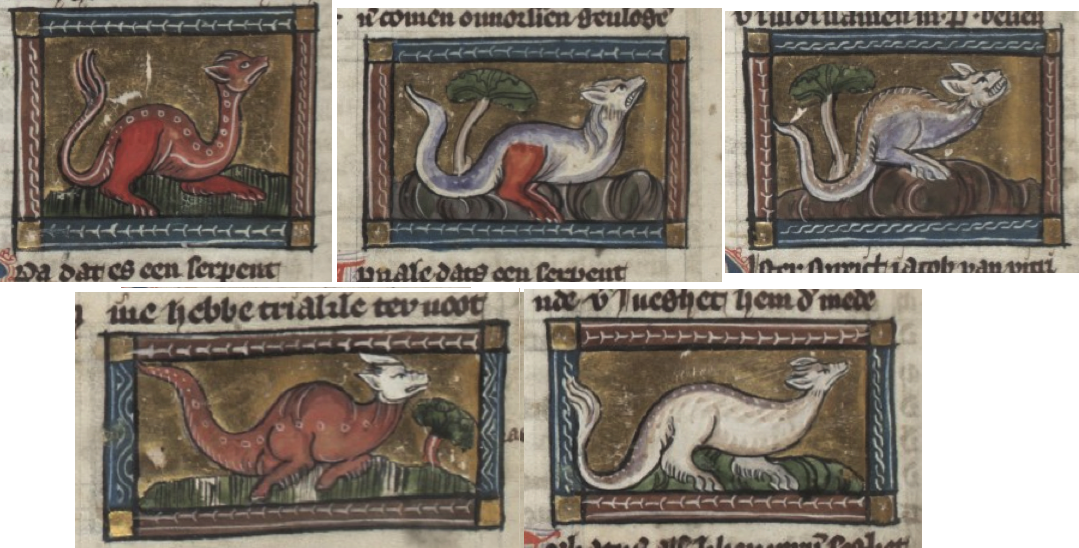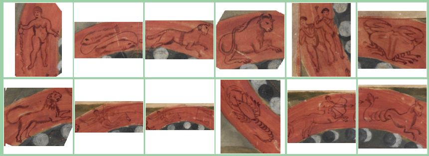
Tricky Text

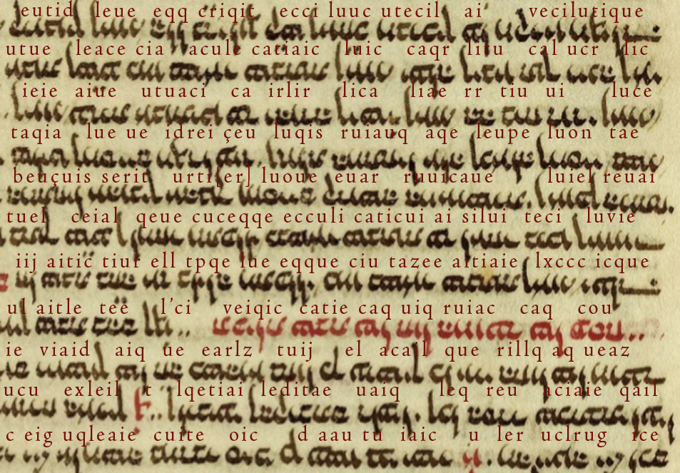
Here’s a chunk of cryptic text that looks like Latin at first glance, early Latin, in a 13th-century script. To read it, you need to remember a few things about old-style script…

In the early medieval period, they wrote letters differently…

  • “a” was written like two cees joined—”cc”,
  • “t” was small and round like a “c”,
  • “e” was sometimes written without a crossbar, and sometimes with a longer embellished crossbar,
  • the stem of the “i” sometimes had a slight curve, similar to the rounded “t”,
  • a common style of “r” had a long foot on the bottom (it almost looks like a square cee), and
  • roman numerals with several ones in a row or words with two “i” chars at the end, usually added a descending tail to the last one so it looks like a “j”.

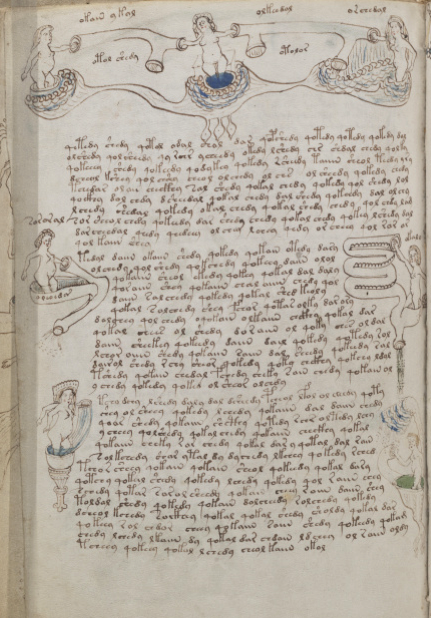
I won’t keep you in suspense any longer. Here’s the cryptic text with a rough transliteration:

The transliteration doesn’t have to be perfect to demonstrate that there’s something a bit weird about this text.

What language is it? It looks vaguely like early medieval Latin, but the common words aren’t there, and it’s somewhat more repetitive than one would expect.

Is it another language expressed with Latin characters?

I’ll let you think about it before I provide further information.

J.K. Petersen

© Copyright 2018 J.K. Petersen, All Rights Reserved

Four Play

I have written numerous times about Voynich “4o”, on my blog, on the forum, in comments on other blogs, but I have a feeling it needs to be done again because there may be misunderstandings about how the “4” glyph relates to others in Voynichese and to ciphers in general.

I’ve often seen Voynich researchers say that “o” usually follows “4” and, from a visual point of view that may be true but, in terms of understanding the VMS “4” character, it would be wiser to say that “o-tokens” are frequently prefaced by “4”. The idea that the “4” and the “o” are inextricably linked is not completely true and the idea that they are a unit, in essence one character, is not supported by evidence.

Does 4o Relate to Diplomatic Ciphers?

The diplomatic cryptography systems documented by Tranchedino are based on many-to-one and one-to-many substitution schemes, which means there are sometimes hundreds of characters per cipher system. The cipher on folio 1r of Diplomatsche Geheimschriften packs almost 340 glyphs into a single cipher system.

Think about that… 340 shape-combinations for a single cipher. This is in stark contrast to the VMS, which renders most of the text with 22 glyphs.

Diplomatic ciphers also coded names and common words into symbols and cipher pairs. For example, the cipher glyph for “Papa” is the Latin abbreviation symbol v + “-is”.

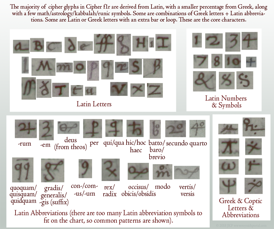
This creates a huge demand for shapes, but many were based on a core set. Here are the most familiar characters used to create the cipher system on f1r of Tranchedino’s collection:

medieval diplomatic cipher characters derived from Latin

It’s clear that Cipher 1r relies heavily on Latin letters, numbers, and abbreviations. Arabic and Hebrew letters (other than kabbalistic loops and lines) are conspicuously absent.

The straight and wiggly lines above some of the letters (not shown) are Latin macrons (the medieval version of the apostrophe). In fact, there are dozens of Latin abbreviations, too many to include on the chart. There is also a smaller percentage of Greek letters and abbreviations, and math/astrology/kabbalah/runic symbols. Sometimes Greek letters are combined with Latin endings (e.g., Greek letter theta + Latin “is” abbreviation), which is not uncommon in Latin texts.

The cryptographers created many new shapes by adding an extra line to a common shape. Or they would remove a stem or add a loop, as in these examples:

pic of letters modified to create new cipher shapesThere are very few shapes that are pure inventions. Most are common shapes, combinations of common shapes, or common shapes altered in regular ways, as in the above examples.

So what inspired “4o” in diplomatic ciphers?

In Latin, it is a common convention to add a small “o” to represent words that end in “o” like “modo”, “quomodo”, “quo”, “libro”, “ergo”, “tertio”, or “quarto”. Latin abbreviations are also applied to homonyms, so go can also represent “gradu”. Thus, we have mo or mo (modo), go or go (ergo/gradu), quo or qo (quo), and 4o or 4o (quarto), etc., several of which are included in Cipher 1r.

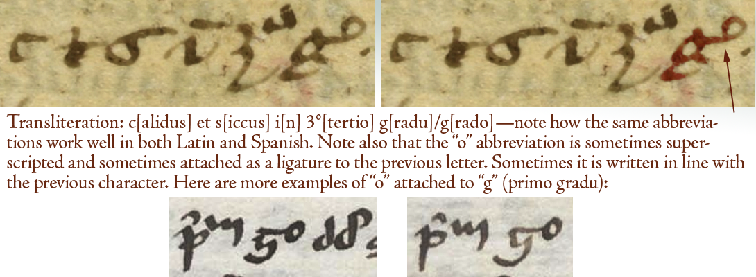
One of the more common of these abbreviations, often seen in herbal manuscripts, is “gradu” (grade/degree). It is typically written like the character highlighted below-right.

This is highly abbreviated Latin, so I have transliterated it to make the ordinal number (tertio) and the “o” abbreviation (gradu) easier to see. Both are abbreviated in the same way. Note that the “g” has the “o” attached:

Latin scribal abbreviations primo and gradu

The abbreviation “o” can be placed in almost any position and still mean the same thing. It can be directly above the letter, superscripted to the right of the letter, or attached directly to the letter.

Diplomatic Cipher 1r includes abbreviations for “modo”, “secundo”, and “quarto” (4o). The 4o is not an invented shape. It is used to represent ordinal numbers in several languages.

Related Abbreviations

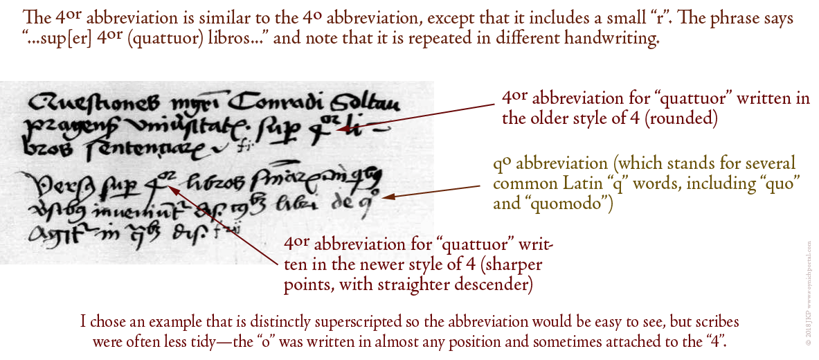
Here is an example of a related abbreviation (4or ) so you can see that this is a generalizable pattern. Even if you’ve never seen it before, you can figure out what it means because it is constructed in the same manner as mo, go, and 4o:

I chose this example for a second reason… it is written by two different scribes, one using the older form of “4”, the second using the newer. Note the “soft-4” (the older form) and the “sharp-4” (the one that became popular by the mid-15th century). In the VMS we see the “4” character written both these ways, and there is also an in-between shape that resembles “q” more than “4”:

pic - rounded and sharp 4 and Voynich Manuscript 4o pattern

Pic of VMS 4 that looks like q

This variability could have a number of explanations… different scribes, subtly different glyphs (possibly with different meanings), or scribes from the early 15th century who were transitioning to the newer form (I’ve seen foliation where the scribe changed the older rounded 4 to the newer one and then continued the rest of the numbers with the newer form, as though someone had told him to update the style).

Here is an example of how “quarto” was abbreviated in the 14th century, with the rounder form of “4” that was popular at the time:

medieval abbreviation for 4o

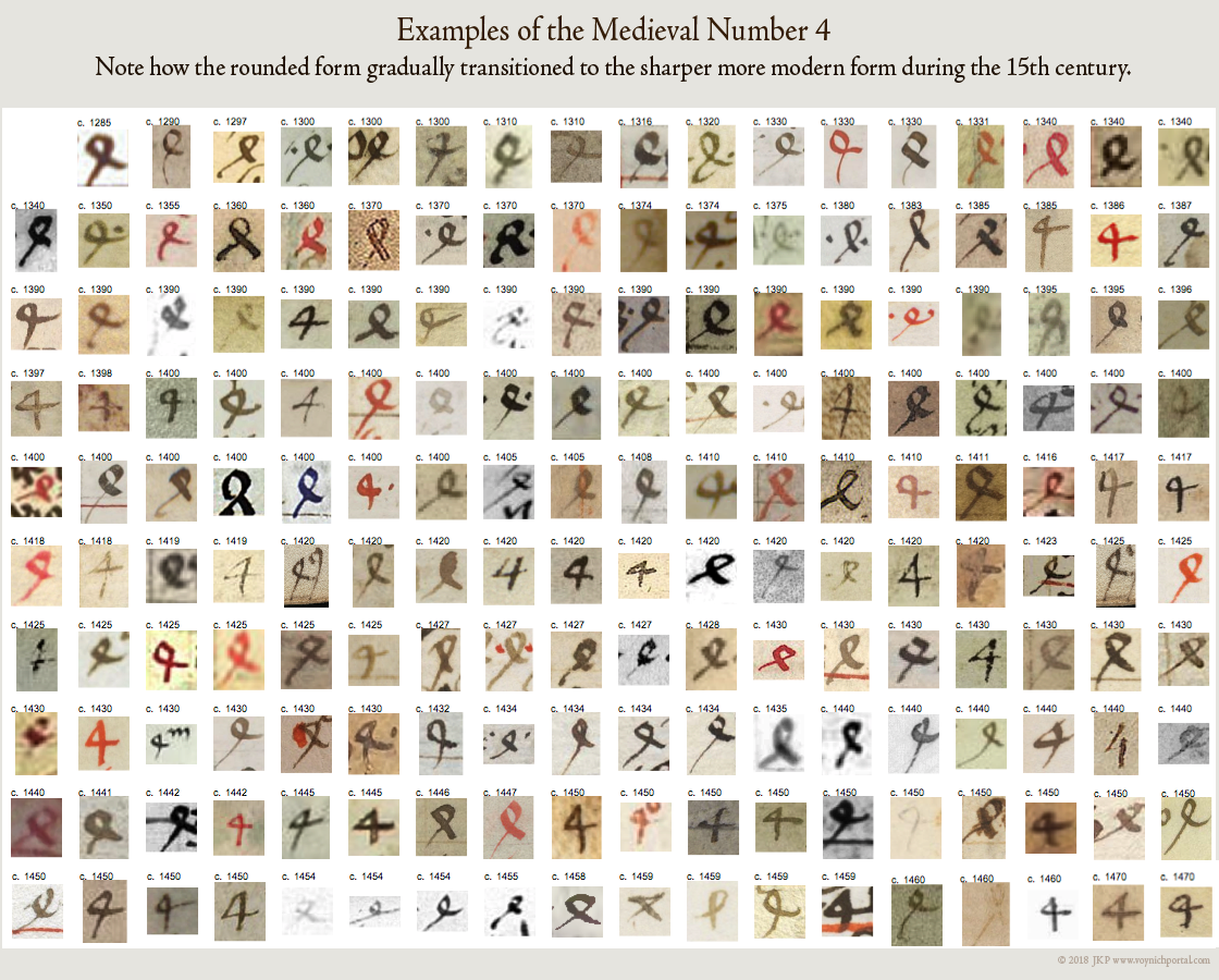
The following examples, dating from the 14th and 15th centuries, illustrate how the shape of the four gradually changed from the rounded form to the sharper, more modern form. Note how the sharper form starts to show up in the late 14th century and is more frequent by the mid-15th century:

Picture of medieval numeral 4 and how it changed during the 15th century.

Is 4o one character or two?

In the VMS, “4” and “o” are strongly associated, just as “th” or “ly” are strongly associated in English, but I don’t see anything that points to them being one character. If you write t + h to create a “th” ligature, they are still two different letters. The same applies to 4 + o in languages that use Latin conventions—they are written together but still represent separate characters.

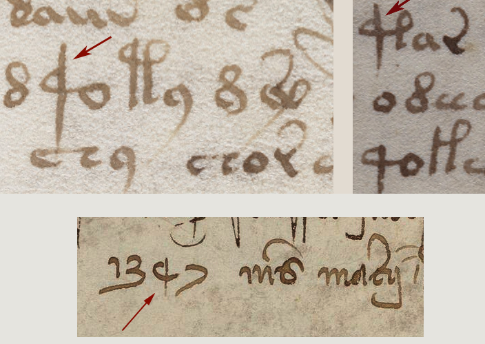
As I have illustrated in previous blogs, the VMS “4” glyph is not always followed by “o”. Sometimes it is followed 1) by other glyphs, 2) by a macron (which, if it were Latin, would indicate missing letters), or 3) by a shape that resembles a small Gothic “l” or the right leg of EVA-k or t:

variations on the 4o pattern in the Voynich manuscript

macrons on the 4o pattern in the Voynich manuscript
Another picture I’ve posted before is the long-stemmed glyph that is similar to the “4”. Is it the same glyph or something different?

I’ve updated the sample by adding a date from a 14th-century manuscript that doesn’t completely answer the question but shows how diverse numerals could be in the Middle Ages. It’s not even clear if the marked letter is a 4 or a 9. It’s an oddball numeral that I’ve only seen once, yet it struck me as similar to the oddball character in the VMS, with a shorter stem but a similar swooped curve. At least we know from the context that it’s a number:

unusual patterns similar to 4o in the Voynich manuscript

Is 4 a prefix that doesn’t require “o”?

There are many “o” words in the VMS and the “o” character sometimes stands alone. It’s possible “4” has an affinity for “o” words rather than “4o” being a character. Perhaps it’s a marker or modifier. Maybe it’s a number.

The 4 char has some interesting properties.  It appears only once on f1v, yet is numerous on f3r. Voynichese is highly repetitive, but it’s not like homogenized milk, there are peaks and valleys, and 4 is not always at the beginning of tokens.

To really understand it, it has to be determined if sharp-4, round-4, and long-stemmed “4” represent the same thing, and it should be remembered that the “o” that follows “4” might relate more strongly to what follows than what precedes it.

J.K. Petersen

© 2018 J.K. Petersen, All Rights Reserve

I C U

In his most recent CipherMysteries blog, Nick Pelling zeroed in on a shape on the top line of f116v in the Voynich Manuscript. The letter in question (there are plenty of questions) has been interpreted in more ways than I realized. Pelling has suggested that it might be, “…a rare way of writing a Gothic ‘s’ shape”. I have to admit, “s” never occurred to me when I examined the letter. Not even once.

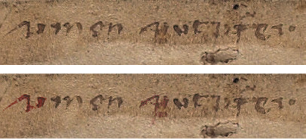
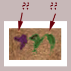
Here is a snippet that includes the mystery letter (focus on the first character). Underneath, I include a color-enhanced version to make it clear which shape(s) we are talking about and what I see when I look at it.

Pelling says he proposed in 2009 that it might be read as “simon sint (something)”. I found this  puzzling. No matter how I look at it, or split up the pen strokes, I don’t see a medieval “s” at the beginning (I’ll post examples of Gothic “s” further on):

To clarify my thoughts on this…

First, I do not see the first letter in the first word and the first letter in the second word as necessarily being the same. To me, the second one might have a faint descender and a horizontal line just to the right of the descender (under the smudgy part). It’s more squished than the first one (in the horizontal direction). It might be the same letter and it might not. The serifs at the beginnings of words often look similar on different letters.

I couldn’t see any descenders in the multispectral scans, but whether a descender shows depends partly on resolution and partly on which spectra are chosen. The first letter doesn’t appear to have a descender, however. The one on “put?fer” might. The letter on the right word looks vaguely like a “p” but I’m not sure, so most of my comments will be about the first word and the mystery letter on the left.

Sorting out the Letters in the First Word

I usually refer to the first word as “umen” or “umon”, but ONLY for communication, not because I’m committed to any particular interpretation. I have a list of possibilities and I don’t assume it’s a word—it could be a string of characters (e.g., vmçn), or an abbreviation.

The “e/o” letter is indistinct. It could be “o”, “c”, “ç”, or “e” (or something else). When I enlarge it, looks like there might be a couple of pen skips, so it’s possible it is an incomplete “o” (right). Letters 2 and 4 look like “m” and “n”, but I’m not sure about “m” because the humps are different from all the other “m” letters on the folio. Could it be “in”?

Scribal Habits

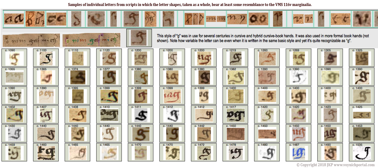
Before going into detail about the mystery letter, I’d like to point out that whoever wrote this (assuming a specific individual authored most of it) habitually used leading serifs, some of them quite long. It’s possible the writer learned both bookhand (the more formal handwriting) and cursive hand (for rapid writing). There are many hybrid hands with elements of both (see previous blog about the letter “g” which has a bookhand tail and low end-serif).

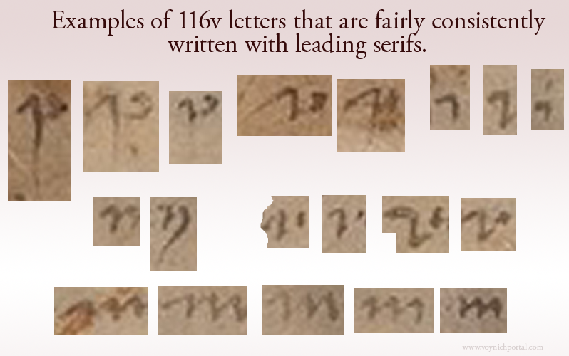
Here are examples of letters with leading serifs. The serif on the letter “i” is longer than average for scripts of this style:

Now here comes the surprise…

I couldn’t figure out why Pelling kept referring to the first letter as “^”. I assumed he was trying to be neutral about the letter’s identity by choosing a symbol instead of a letter, which is actually a good idea. It was several hours before it hit me that maybe he was interpreting only the serif as a letter. My reaction was, “Whoaaaaaaa!!”

It’s been a week of surprises palaeography-wise. I did not fully appreciate, until the last few days, how differently each researcher sees these characters.

Here are my feelings about it…

The serif at the beginning of the shape on the right is not a letter. If it were, the only typical letter it might be in Gothic script would be an undotted “i” with a very long serif.

An extra-long serif is not  unusual at the beginning of a word, but it still doesn’t look very much like “i”, in my opinion, it looks nothing like “s” either. Also, if the “^” shape were a letter, then what is the blob attached by a stroke on the bottom? The right stroke is not written like the other “i” shapes. NONE of the other “i” letters on the folio has a crooked stem or connects to the previous letter along the bottom. I think this is one letter, not two—one letter with a long serif.

So what letter is it?

You may have noticed that the longest serif of all is on our mystery letter, but is it unusually long? That depends on the identity of the letter. A long leading serif is unusual on the letter “i” but completely normal on “u” and “v” shapes.

Before I post the v/u examples, I’d like to clarify the medieval letter “s” to explain why I don’t think the beginning of the word is “s” (not even a rare one)…

Examples of Medieval “s”

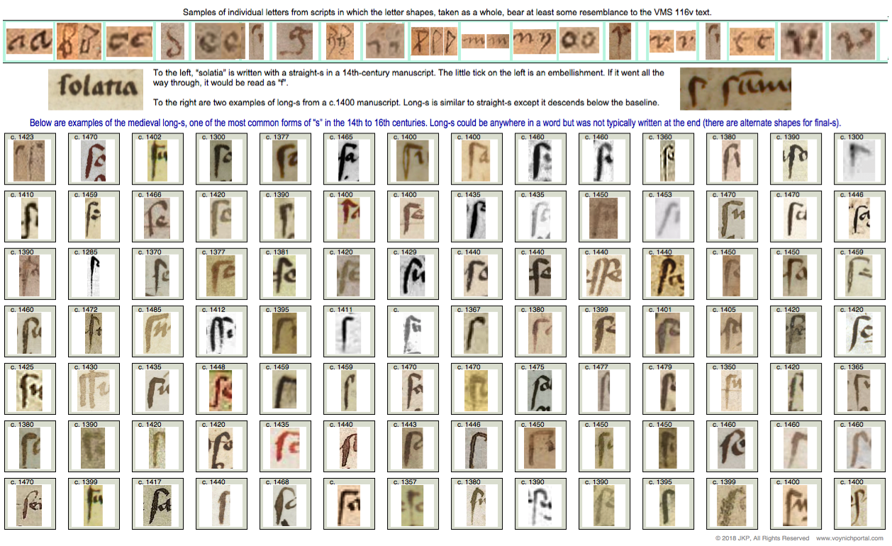
Based on direct observation and sampling thousands of medieval manuscripts, I have identified seven primary forms of “s” in scripts of the same basic style as 116v:

  • straight “s”
  • long “s” (essentially a straight “s” plus a descender)
  • final-“s” sigma (inherited from Greek)
  • final-“s” B shape (similar to modern ß but usually representing one “s”)
  • final-“s” snake shape (like our modern “s”—not common in most countries, although Spanish manuscripts often have this form of “s”)
  • figure-8 “s” (a true figure-8, not one that is deliberately skewed like a cursive “d” or accidentally similar to “8”—this was not common in cursive hands, but is sometimes found in book hands)
  • esszett (commonly expressed on computers as ß, this character had slightly different meanings in different languages but was frequent in central European manuscripts)

The straight-s (which modern eyes can easily mistake for “f”) was more popular in the early medieval period. The stem does not go below the baseline. The long-s has the same hook shape as straight-s plus a descender.

In the early medieval manuscripts, the straight-s was sometimes the only form of “s” used (which means it could be in any position in the word). In other manuscripts, a different “s” (final-s) was used at the ends of words. By the late medieval period, most scribes used a different “s” at the ends of words and some used multiple forms of “s”, as the example below-right:

The straight-s was gradually replaced by long-s. Straight-s is not very common in scripts that are similar to the 116v text, most of them use long-s.

Sometimes scribes added loops or flourishes, but the general form was the same. This chart illustrates that the VMS long-s is quite ordinary:

I’m not aware of any “s” shapes that resemble the first letter or even the first two penstrokes of “umen” but the above forms match well with the first letter of “six”, the last letter of “gas/gaf” and the last letters of “oladabas/oladabad”, “imiltos/multos/miltos” and portad/portas”, so the 116v script is reasonably conventional.

Summary

I don’t have a definitive ID for the mystery letter. It looks like the top of an open-p with a long leading serif, but I can’t see a descender (at least not on the first one) or any rubouts under the letter.

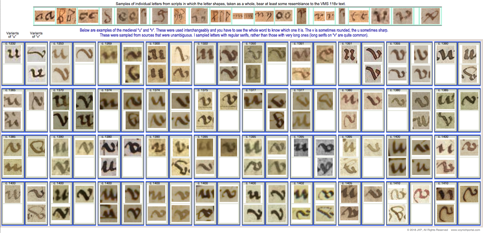
It comes closer to a flat-bottomed “v” than the remaining letters of the alphabet but I haven’t found a close match (the flat-bottomed variant is not as common as those with pointed bottoms). The vee on the right is a little too flat—it has lost the “v” shape.

Here is a chart of v/u letters common throughout the medieval period. There are a some flat-bottomed versions circa 1355, 1395, 1400, 1402, and 1410, so it’s possible this style was more prevalent after the mid-14th century, but I haven’t had time to confirm if this is true:

Coming back to the second letter… if this shape is “in” instead of “m”, it might be read as “vinen”, which has meanings in several languages (come, they come, the wine, the vines).

If the last word is “putrifer” then “vinen putrifer” (the grapes ferment/the wine ferments) would be hard to ignore as a possible interpretation. In certain germanic dialects, the “n” at the end of “vinen” is like adding the article “the”.

But what if it’s an “o”? Then it might be vinon or uinon which is harder to pin down than vinen. Vinon is a place in France, but a place name doesn’t seem like the best fit with the other words on the line.

Is anything gained by studying unknown letters?

Even if we can’t make out the letter, the serif on the mystery shape has a calligraphic “brush stroke” feel to it, as does the tail and dipped oval of the letter “g” on the last line. And yet, it’s not professional calligraphy. Maybe these clues hint at other skills…

Was it someone who could draw or who used a brush for some other craft? Medieval artists and illuminators were sometimes illiterate or semi-literate. Perhaps the writer contributed the nose on Aries, painted some of the plants, or inked the secondary breasts on the nymphs. The style of writing is 15th century and might even be earlier in the century if the “a” in 17r “mallier” is a double-story “a”.

I’ve never assumed the writer had any involvement in the creation of the VMS—notes on back pages were often added decades later—but the possibility is there… and that makes it more interesting.

J.K. Petersen

© Copyright 2018 J.K. Petersen, All Rights Reserved

Gee, I Never Would Have Guessed!

The VMS marginalia on folio 116v has a number of unclear letters and others that are reasonably clear. Fortunately, a few of them are repeated so we can see variations of the same letter, such as “h”, “i”, “m” and others. For the last decade I have been seeking matches to the marginalia in medieval manuscripts and incunabula, hoping to find the scribe (obviously not a professional scribe, but maybe there’s something out there). I don’t have a match yet, but I have some interesting paleographic data.

It surprised me to discover that one of the letters that I considered clear and readable has been challenged. It has been suggested that the letter following “nim” in “so nim — mich” is “ez” rather than “g”.

I take exception to this. I also do not consider the “plummeting rock” shape after the word “mich” to be the letter “o”, as discussed in my previous blogs.

Here is the phrase in question:

Note that the tall letter with a hook is a medieval “long s”. It’s only an “f” if there’s a crossbar. I read this as “so nim gas/gaf mich” followed by a small drawing.

I can’t tell if the third word is “gas” or “gaf” (both were used in the Middle Ages). There’s an abrasion on the parchment, so it’s hard to tell if it’s “s” or “f” but the letter in question is not the last one, it’s the first one. Another Voynich researcher stated on Nick Pelling’s CipherMysteries blog that the word that looks like “gas” or “gaf” is actually “ez as”. I don’t agree.

Here is a color-enhanced version of how I see it:

It’s a typical “g”, common for the time. The scribe does not write “e” like this and “z” is not typically written like the part on the right side of this letter in medieval scripts, not even as an “ez” ligature. I believe the first letter in the word is one letter and it is “g”. Especially note the serif (the tick on the right).

In medieval scripts that overall resemble the VMS marginalia, the letter “z” usually looks like the shapes in the chart below:

Are there other possibilities?

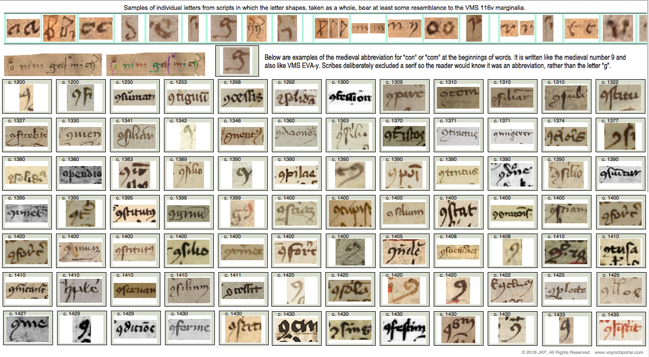
For the record, the “g” shape is not a medieval “9” abbreviation either. The medieval “9” abbreviation at the beginnings and ends of words was popular for centuries. The “9” abbreviation looks and is positioned pretty much as you see it in the VMS (so I included the VMS “9” glyph along with the other samples in the chart below with the date c.1425 for reference).

Here is how the “9” glyph looks in the VMS. Note that it is positioned the same way as in manuscripts that use Latin scribal conventions, mostly at the ends, but also commonly at the beginnings of words. I’ve written about this many times, but here is a visual refresher:

Sometimes the “9” char was drawn simply, sometimes ornate, but it always signified the same thing in medieval manuscripts… an abbreviation (usually con-/com- or -us/-um).

Here are examples of how the con-/com- abbreviation looks at the beginnings of words (it was essentially the same shape at the ends of words). Note that a serif is expressly not included to help differentiate it from the letter “g”:

So, the marginalia “g” does not resemble a “z” or an “ez” ligature and it does not resemble a “9” abbreviation. It does, however, fit comfortably with common forms of medieval “g”, as in these examples:

Summary

There are many shapes in the marginalia that I can’t make out. Some letters have abrasions, some are indistinctly written, some are partly filled in or rubbed out. But I don’t think there’s much ambiguity about the “g”. There’s nothing unusual about the shape or its position in the word.

If someone has a different interpretation for this letter, they can post their paleographic evidence. Personally, I think it’s one of the less controversial letters on the page.

J.K. Petersen

© Copyright 2018 J.K. Petersen, All Rights Reserved

Anchiton, Michiton, or An Chiton?

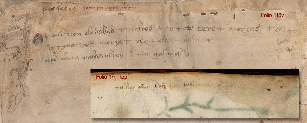
There’s a controversial word on the last page of the Voynich manuscript that is often read as “anchiton” or “michiton”. I’ve written about it before and so have many others, and yet the question hasn’t been settled despite decades of study. I’m hoping some paleographic insights might help.

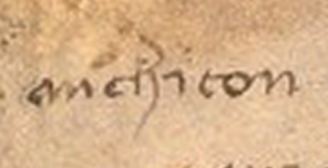
The troublesome word is on folio 116v (near the beginning of the second line). The individual letters that form “chiton” or “chi ton” are not controversial—they are pretty clear and fairly conventional. Most people agree on them. The only unusual thing I noticed is the extra-long leading serif on the letter “i”. This is a less common way to write “i”:

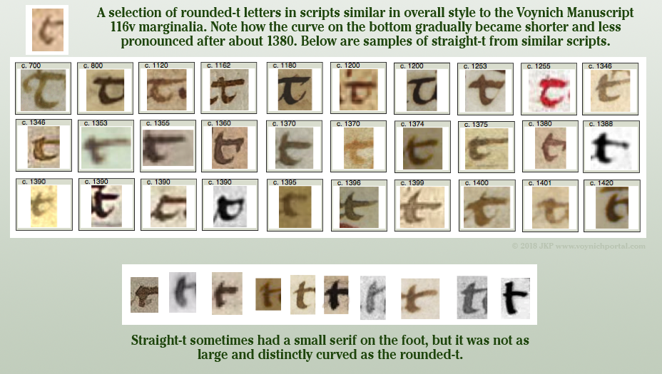
The extra curve on the “t” is not unusual if the writer learned to write the more traditional round-stemmed “t”. The rounded “t” (written like a “c”) was popular for many centuries, from the early medieval age into the 15th century. Here are some samples of rounded “t” and straight-stemmed “t”  in scripts with some overall similarity to the marginalia writing style:

In the 20 scripts with the greatest overall similarity to the marginalia, both rounded and straight t are represented, but most of them tend to be like the VMS t, in-between the two extremes:

So, putting aside “chiton” for the moment, let’s take a close look at the first letter, or two letters, since it’s not clear whether it’s one or two:

I can understand why anchiton/michiton is contentious. The first couple of letters can be read as ni, an, or mi, depending on the handwriting. Even “mehiton” (vaguely Semitic if it is a hard-h as in mechiton) might be reasonable if the other letters “e” were similar to the character preceding “h”, but they are not. It looks like “ch”.

The problem is further complicated by the less-than-professional-level script—the slants are all over the place, the loops are connected in different ways, and the letterforms are moderately inconsistent.

Nevertheless, I have some observations…

Note that the ending leg of “an” or “m” is not drawn like “i”. This writer has a tendency to draw “i” with a long leading serif, a straight stem, and no ending serif. The last minim on “an” is not drawn this way, so I am inclined to rule out “mi” or “ni” as a reading for this word. That leaves “m” or “an” (or perhaps a very unusual ligature “am”).

What about “an”? Here’s the full passage again, so you can look at all the instances of “a” and “n”:

Note the following characteristics of the handwriting…

  • The letter “a” is mostly tall, with a point at the top of a straight stem, but not always.
  • Ascending loops are usually sharp and at a certain angle, but not always.
  • The figure-8 letter (which is usually interpreted “d” or “s”) usually has a larger bottom loop, but not always.
  • The “n” is usually small and rounded, but not always.

So how do we know whether it’s “an” and both letters diverge slightly (the curve is squished on the “a” and the loops are sharper on “n”), or a loop-m that diverges even more?

Examples of Loop-M

Here are examples of “loop-m”, a particular style of medieval “m” that looks like a ligature-“an” to modern eyes. These are all chosen from unambiguous sources where it can be verified that the shape represents “m”. Loop-m was used more conservatively than regular–m. Some scribes only used it for names or for emphasis:

Did you notice that almost all the samples differ from the VMS in one important detail? Loop-m in medieval manuscripts always has a tail. Always… well, almost always. There are very few exceptions, and even the exceptions tend to have a short tail or a down-pointing end-stroke rather than a serif, in comparison to how the scribe wrote regular “m”.

Summary

I stated years ago that I was leaning toward “an” rather than “mi” and it has taken many years to find enough time to explain why. And yet, even though I lean toward “anchiton”, I’m not certain of either reading…

  • If this is “michiton” then the “i” is written differently from all the other “i” characters on the folio, and the “m” is an unconventional loop-m with no hint of a tail.
  • If this is “anchiton” then the “a” is a bit squished, and the “n” is more angular than other “n” characters on the folio.

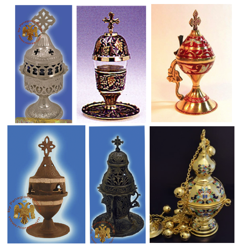
In fact, I’m not even sure this is one word. It could be “an chiton” or “an chi ton”, which looks suspiciously like an awkward Greek transliteration. It could be coincidence, but if you search the Greek words chυτά/Χυτά or chυτό/Χυτό, and filter for the metallic ones, you will see some very ornate Voynich-like Greek and Russian oil lamps and incense burners:

Images courtesy of Nioras.com and Holy Archangel Liturgical Supply

Medieval versions were probably less ornate than those pictured above (although some of the medieval Jewish spice jars were very ornate), but the tradition of metal censers for funerals, healing rites, and sometimes exorcisms, goes back a long way and the word chytoú for “cast” goes back to biblical times.

If the text on 116v is a healing charm or medicinal remedy (not saying it is, but it’s a reasonable possibility), then a cast/molded burner (chytó, chytón χυτό) for incense (or even as  source of flame for other purposes) would not be out of place.

J.K. Petersen

© Copyright 2018 J.K. Petersen, All Rights Reserved

A Stitch in Time

I’ve posted several blogs on hats and tunics and the VMS Gemini tunic is now being discussed in depth on the voynich.ninja forum, so it’s clearly a topic of interest. I’ve been researching the clothing of the zodiac figures for a number of years, so I have many examples from a large variety of sources (including mosaics and stained-glass windows), but I thought I would focus on fashion in two specific manuscripts.

I see the VMS zodiac tunics and robes as belonging together in terms of style.

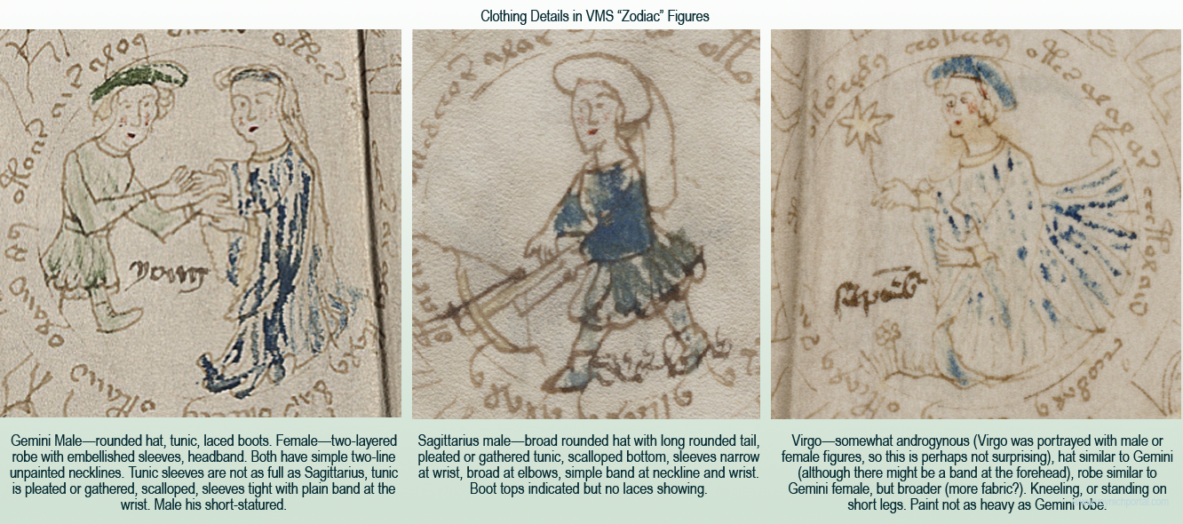
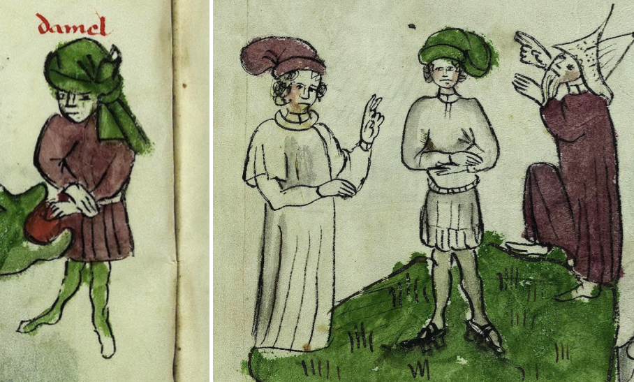
  • Both male-Gemini and Sagittarius wear basic tunics with simple double-line neckbands, both are wearing hats, Gemini a simple rounded hat, Sagittarius a hat with a very long rounded tail (similar to a foxtail hat, but with fabric rather than fur). Sagittarius has the hint of a goatee. Note that Gemini is conspicuously short-statured even though there’s room to make the leg longer.
  • Both females (assuming the slightly androgenous Virgo is female) are wearing long robes with embellished sleeves and the hint of an undergarment peaking out from under the outer sleeve:

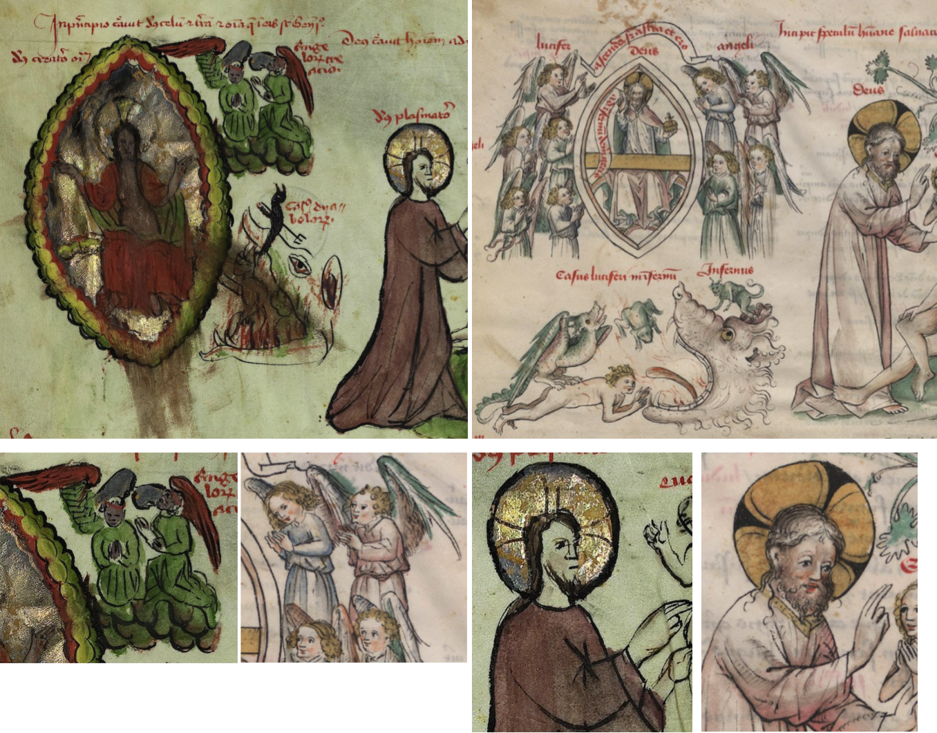
The clothing in Vatican Pal.lat.871 has been mentioned before, because it has many commonalities with the VMS figures.

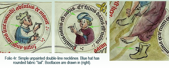
Here are examples from folio 4r. The subject matter is quite different from zodiacs, it’s a nativity scene, but the roundel-with-text presentation, drawing themes, and clothing have VMS parallels in necklines, gathers, and the hard-to-find bootlaces:

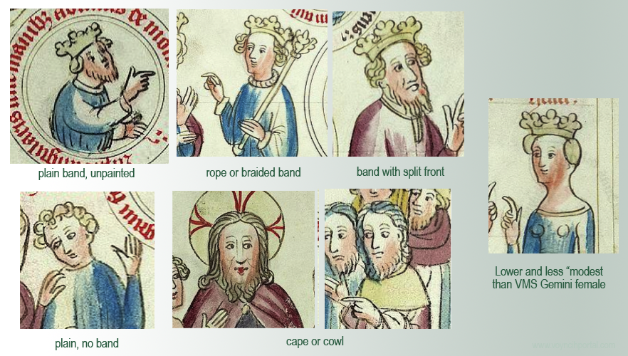
It’s possible that the round-tailed style of hat doubled as a carrying pouch since tunics generally did not have pockets. Small items were strapped to belts, carried on the back, or slipped into hat bands or pouches. The VMS hat does not look like an animal tail. Note that many of the neckbands are similar to the VMS (a plain double-line band), even though a variety of necklines are represented:

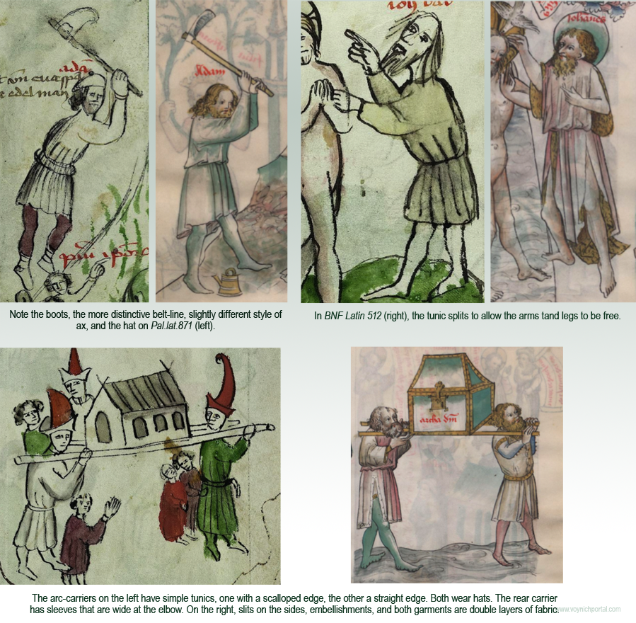
There are also tunics with bumpy or scalloped edges like those in the VMS:

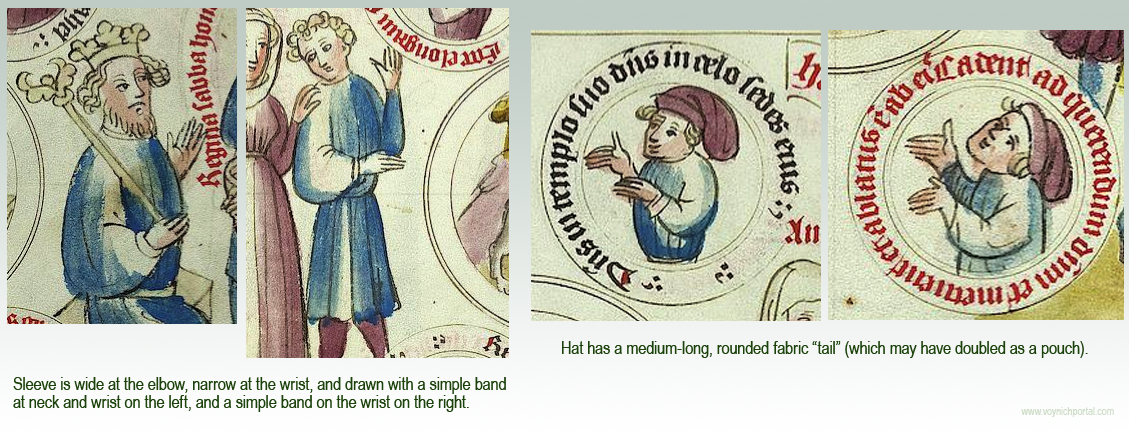
One can also find sleeves that are narrow at the wrist and wide at the elbow (left), which is less common than sleeves that are mostly even or much wider at the wrist:

The illustrator was definitely making distinctions in dress. Not all collars were a simple band, there were also high collar, capes, and cowls. Tunics were sometimes single-layer, sometimes double.

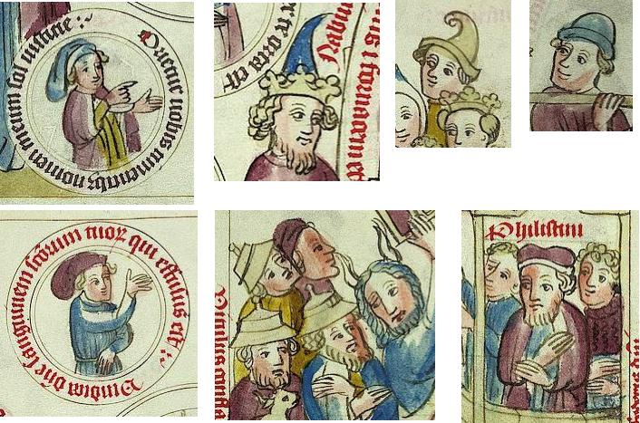
There are also many hat styles in addition to the “pouched” hat, including Phrygian hats, royal crowns, tonsured monks, berets, bowlers and, since this is a biblical text, pointed and flat hats to represent Jews and Philistines:

The drawings in Pal.lat.871 make it look like the “pouch” style of hat was common, but it is not easily found in medieval manuscripts. Usually, the tail was an animal tail or the ends were ragged, like a cock’s comb. Pouched hats with very long tails, like VMS Sagittarius, are especially hard to find, although I previously posted this one from Morgan M.453 (left) and one from a Swedish book of law that has a fairly long tail, with a conspicuous roll for the band:

Getting Back to Tunics

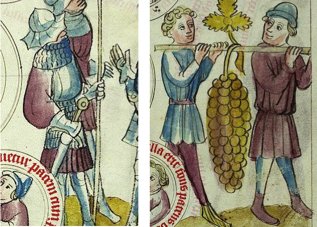
Many of the robes in Pal.lat.871 are long or have simple edges, but there are also tunics that are distinctly pleated (e.g., some of the warrior tunics, left) and some that are drawn with a bumpy, gathered, or scalloped edge, like the VMS:

So we can see numerous parallels to VMS clothing styles throughout the manuscript, not just in one or two places.

Finding the Origin of the Manuscript

I was curious about who drew the illustrations.

Pal.lat.871 is written in German, and I noticed it was a dialect. It is thought to be from central Germany, possibly north Hessen (near Frankfurt) or west Thuringia (about midway between Frankfurt and Prague). There is a woodcut version of the Pauper’s Bible created nearby in Bamberg, just north of Nuremberg (c. 1460s) with some of the same clothing styles.

I don’t know if it is specific to the illustrator, but there’s a political statement on folio 16r, a nimbed figure holding the battle banner of the Scandinavian tribes. This puzzling image is sandwiched between Sampson carrying tablets and Jonah in the mouth of the whale. It’s the only roundel on the folio without text.

In manuscript art, the white cross on a red field frequently represents the Lombards or Danes. The inverse of this flag, a red cross on a white field, often represented Helvetians, Templars, or participants in the Crusades. By the time this manuscript was created, Lombardian rule had long since diminished, and Lombardy itself had receded from Florence north to Pistoia, but it still dominated what is now northern Italy, and there were still pockets in Germany, Switzerland, and southern Italy.

But, I have also seen the white-on-red flag in drawings of 14th-century “Gaisler” (Geißler), Christian flagellants associated with the plague years.

Perhaps a sister manuscript can shed some additional light on origins.

A More Primitive Drawing Style

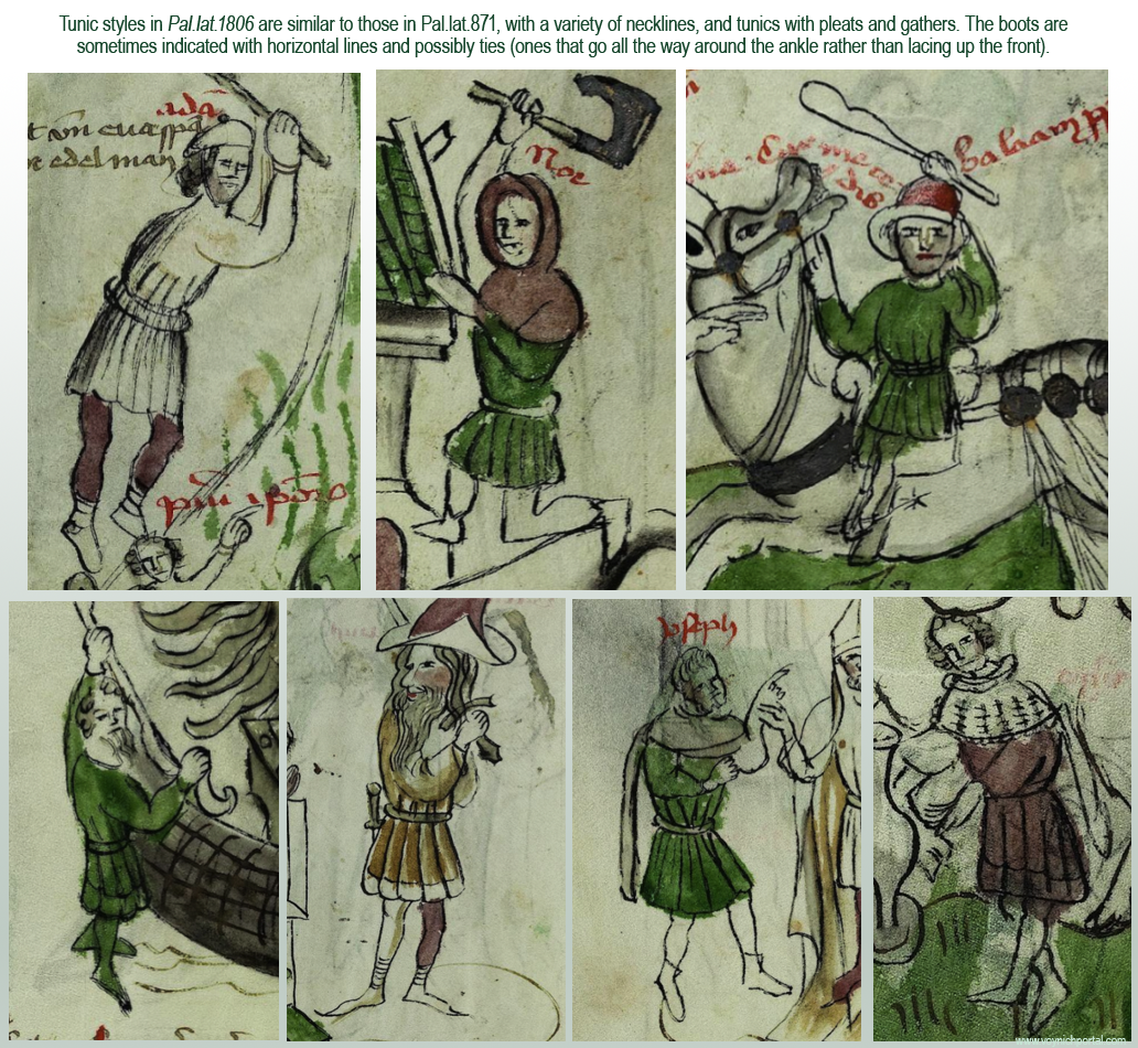
Vatican Pal.lat.1806 was created at approximately the same time as Pal.lat.871 and has very similar clothing themes. It is interesting because the illustrator’s skill level is a little less accomplished than Pal.lat.1806 and thus closer to that of the VMS. Here are some examples of tunics:

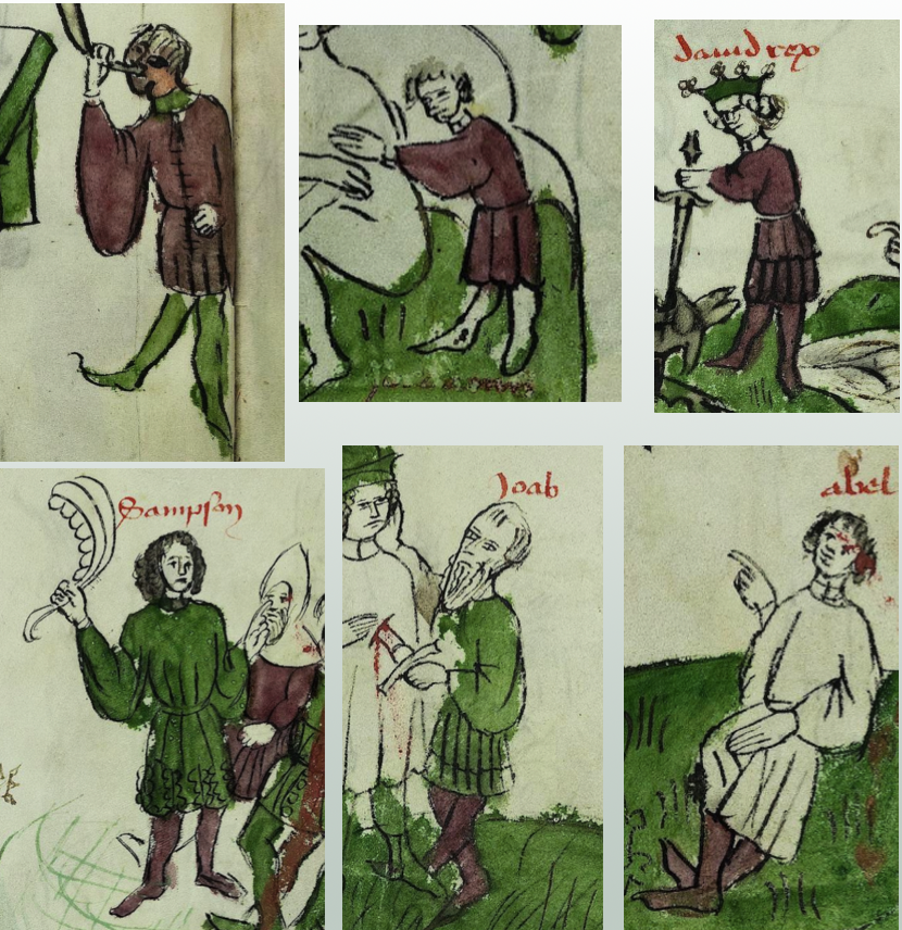
There are also sleeves that are narrow at the wrist and wide at the elbow, but they tend to be paired with fancier tunics. Here are some of the simpler ones

Also, if you keep looking, you can find the Sagittarius “pouched” hat. The hat (right) in Pal.lat.871 is not just a vague or generic drawing, it is drawn in a distinctively different way from the ragged-fabric chaperone on the left:

Pal.lat.871 and Pal.lat.1806 are thought to be from different towns, and are drawn by illustrators of different skill levels, yet the clothing themes are clearly related and, in turn, are similar to the VMS zodiac costumes.

Drawing Skill and Cultural Differences

What happens if the same subject matter is interpreted by someone from a different culture and significantly better artistic skills? Do the tunics change? That’s a subject for a separate blog, but I’ll include a few examples to introduce the topic. On the left, from Pal.lat.1806 and on the right, the same scene from BNF Latin 512:

Here some more specific tunic comparisons between Pal.Lat.871 and BNF Latin 512, both of which are from approximately the middle or third quarter of the 15th century:

As might be expected, there are more details in the drawing by the better artist, but paging through the manuscripts side-by-side, there also appear to be small cultural differences that are probably related to the difference in German and French origins. In terms of clothing style and drawing skill, the VMS is obviously more similar to Pal.lat.1806 than BNF Latin 512.

Summary

I have much more on this subject, and don’t have enough space to post about the female dress in the same blog. For the moment, there are enough examples to illustrate that the two German manuscripts Pal.lat.871 and Pal.lat.1806 (in addition to those mentioned in previous blogs), bear notable similarities to the costumes of the VMS zodiac characters.

J.K. Petersen

© Copyright 2018 All Rights Reserved


The Rise of Venus

Folio 77v of the Voynich Manuscript always struck me as anatomical. Mammaries and a uterus in the middle, tubes that might be blood vessels or the path between the ovaries and the uterus, something on the middle-right that resembles tubules or a curled intestine and, on the left, a penis with a nymph standing in the testicles, her hand by a “pipe” leading to the penis.

It seems strange, a nymph standing in testicles, but that’s what it looked like to me.

Then, while searching for something unrelated, I came across a detail in a manuscript from the 15th century that I never expected to see.

Illustrated Myths in MS Rawl. B. 214

Rawlinson B. 214 is less than 20 pages, and consists of two-tone compass-drawn charts sandwiched around colored illustrations.

The illustrations are painted in generous shades of brown blue, red, and green. There are Sibyls and gods, including Saturn, Jupiter, and other characters from Ovid’s Metamorphoses, such as Iuno (queen of the gods), Neptunus, and Pluto:
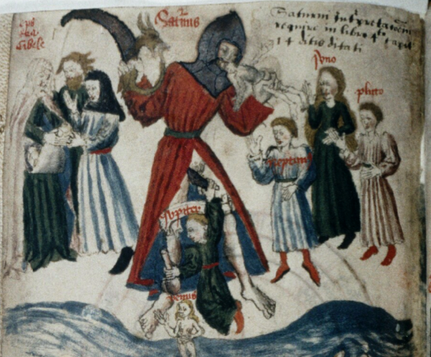
At Saturn’s feet, there is a character that may have particular significance to the VMS. But first, a quick summary of the other pages…

On the following leaf, we see Apollo with a harp and Corvus flying over a laurel tree:
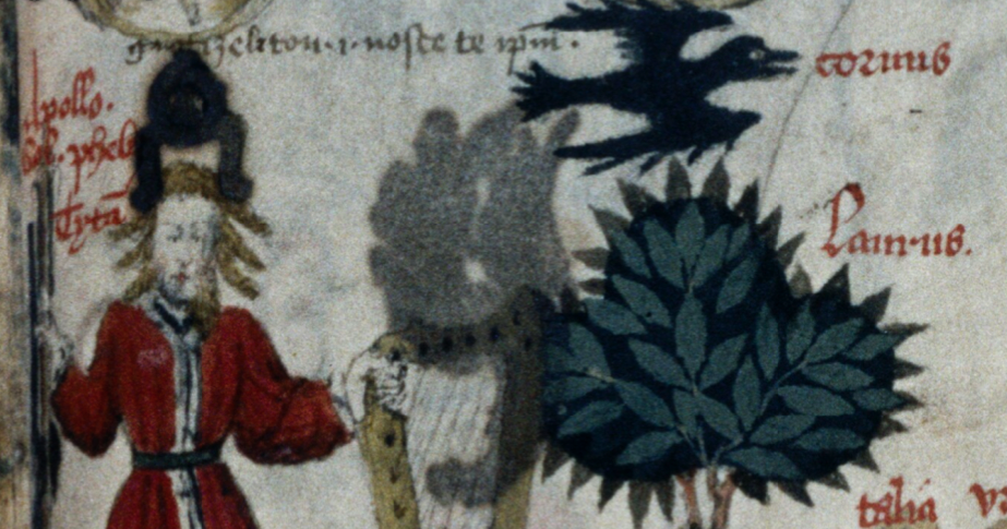
Next to the laurel is a bevy of females, with muses Talia (comedy) and Urania (astronomy) standing out from the crowd. You might notice that Urania is drawn in an appealing way, similar to a few of the VMS nymphs who were drawn with an extra dose of charisma:
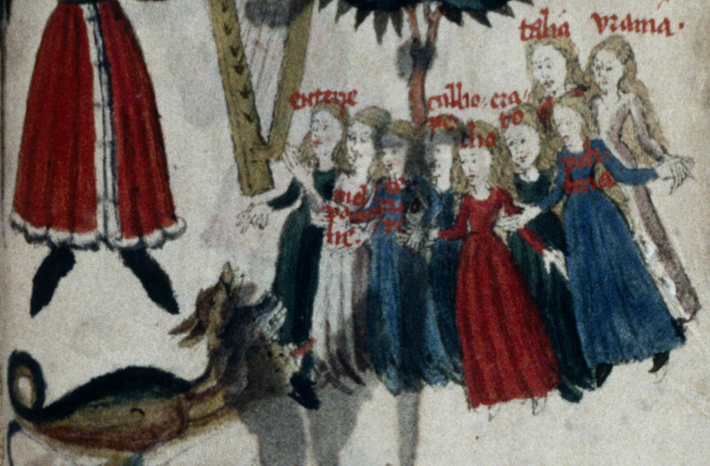
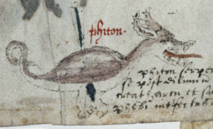
Under this is Phiton, a dragon with long ears and somewhat vague wings that reminds me, once again, of the critter in the VMS that is nibbling on a large plant. At first I wondered if this was an animal version of Phaeton (the charioteer), but it turns out it might be a python, and the marginalia mentions “Phiton serpens”. In medieval bestiaries, as illustrated in the previous blog, serpents were often depicted with legs and ears. There are numerous references to serpents in the Metamorphoses.
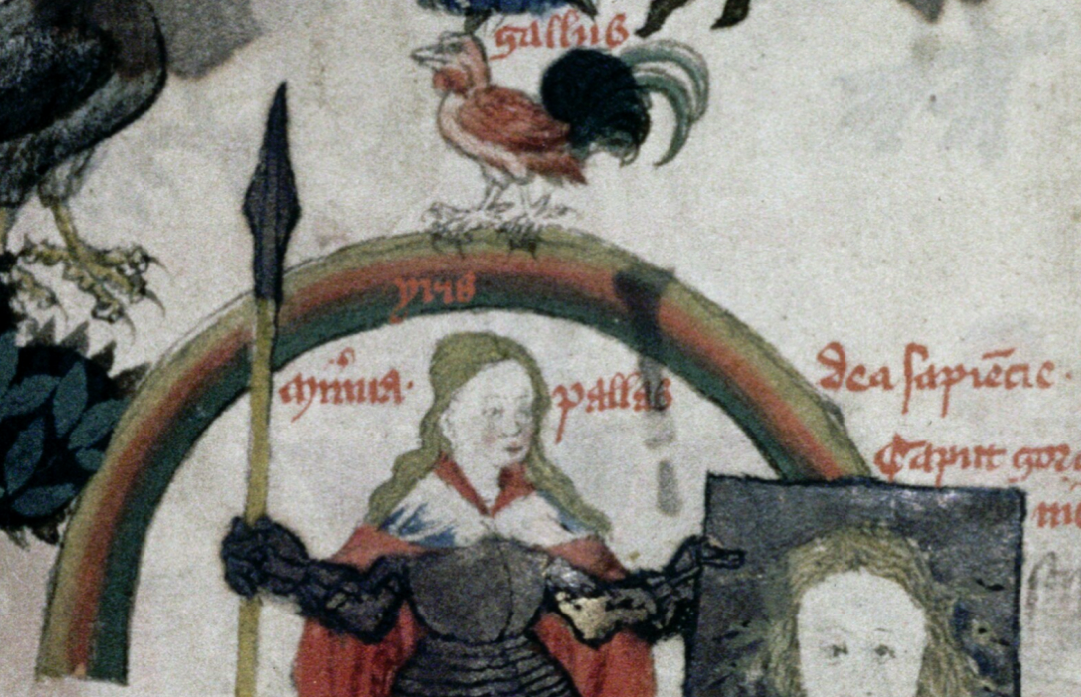
The following folio has another complex scene in which Venus takes center stage, standing in water, flanked on the left by three naked nymphs. The next page shows Diana with a bow, next to several unlabeled nymphs modestly dressed. Below this, is a rainbow framing Pallas (Minerva). In her hand is a head on a shield labeled “Caput gorgonum” (Gorgon’s head):
Following this is Iuno/Juno with her sight obscured by a cloudband (perhaps at the moment when Jupiter turns into a heifer). She is standing behind another rainbow, flanked by “pavones” (peacocks) whose tails memorialize the hundred eyes of Argus after he was decapitated by Mercury:
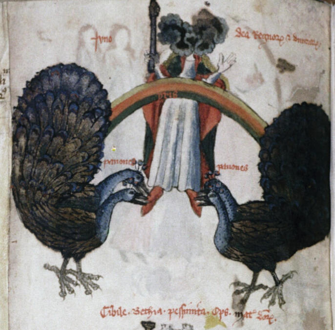

Below this, Sybil Bethia rides in a cart.

A Change of Style
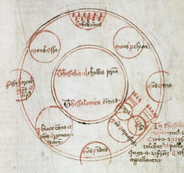
And then the lushly colored illustrations revert to something that could easily be mistaken for a cosmology or geometry chart, but which is labeled with Grecian landmarks, including Mount Pindus, Mount Pelyon (Pelion), and Mount Ossa. These are north of the Greek Islands, as one travels toward Macedonia. It’s a map, in a style quite different from modern maps and more similar to early eastern maps than those of northern Europe.

After the map, is a drawing that looks vaguely cosmological, but reading the labels tells us it is about literature and philosophy, listing Virgil, Omer, and Ovid, along with muses and poets, somewhat in the manner of Lullian diagrams.

Back to the VMS

This line-up is quite interesting… nymphs, rainbows, a map in a slightly unconventional style, charts of elements and literature that might be hard to interpret if the labels were in a strange script, and an unusual biological reference that I wrongly assumed was unique to the VMS. When I saw the drawing of Venus in Rawl. B. 214, it instantly reminded me of the VMS drawing on folio 77v, which has always looked to me like a nymph standing in testicles above an ejaculating penis:
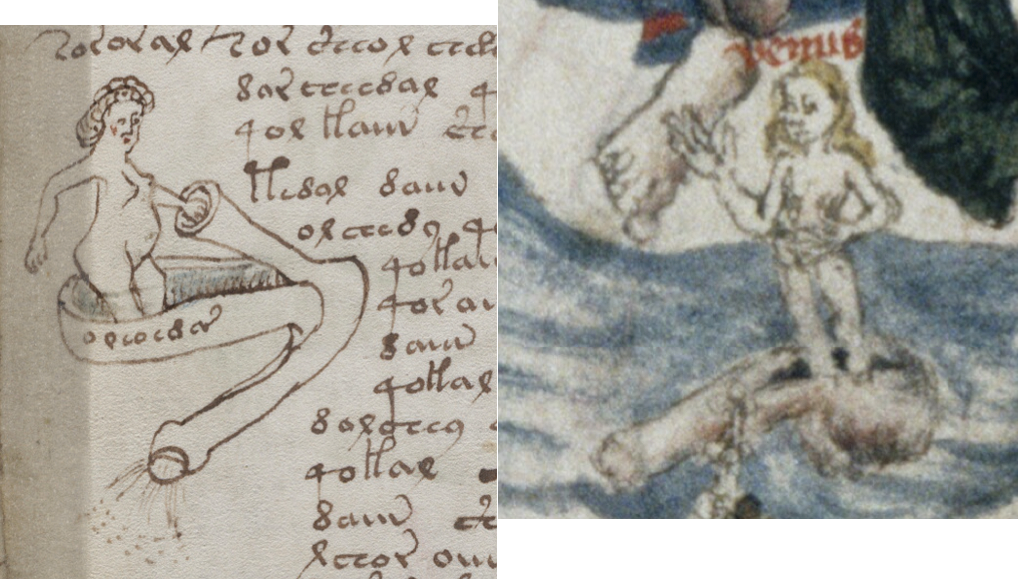
It seems unlikely that the Rawl. Venus-in-testes was copied from the Voynich Manuscript, it was created in the mid-1400s, but it could be the other way around, IF the VMS text and drawings were added a few decades after the parchment was processed. But, assuming the VMS drawings were added early in the 15th century, then an earlier textual or visual source might have inspired the explicit drawing.

And then I had an aha! moment…

A nymph standing in gonads. Of course! It’s the classical story of Venus born of the foam of her father’s severed genitals. It might seem a far-fetched way to interpret the VMS nymph if it weren’t for the Rawl. Venus being clearly labeled, clearly standing in a testical-boat, and clearly placed within the context of classical myth.

Can we go one step further? Might there also be an astrological interpretation, as suggested by K. Gheuen’s Konstellations? Maybe. Not only were the classical gods deeply associated with stars and planets, but classical poets were fond of creating alternate stories…

Accounts of how the newly born Venus reached shore vary, but here is one version…

When her father’s godly froth hit the sea and Venus was born, she was aided by fishes, who ferried her safely to the beach and guaranteed their place in history by reigning over her in the sky. The following image may be intended to reflect the environment in which Venus was born, rather than the story of the fishes, but it helps us visualize Venus’s birth. Note the cherub handing her the mirror that became her attribute:
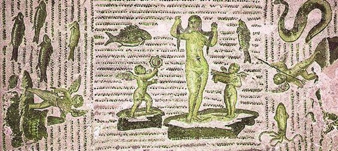
Birth of Aphrodite mosaic

The birth of Aphrodite from a Roman mosaic in the Bardo National Museum, Tunis.

In the Iliad, Aphrodite (Venus) is associated with sexual intercourse, which would make her an appropriate symbol for a biological description of sexual organs or the sexual act. It is thought by some that Hesiod (c. 700 BCE) added or adapted the story of the severed genitals.

But is 77v a clinical description of sex and sexual organs dressed up with classical imagery, or is it classical imagery in the context of ancient myths (without the clinical component)? The difference would influence how one interprets the text.

My personal suspicion, until we know more, is that the drawings on this folio are meant to express biology, with classical myths as mnemonics. I lean this way because plants, astrology, biology, and therapeutic bathing (especially bathing in thermal spas), are all important medieval medical subjects.

Wresting Meaning Out of an Obscure Drawing

The VMS is not exactly like the Rawlinson drawing. It has an extra detail. There is a “tube” by the nymph’s hand. I thought it might be the connection between the seminiferous tubules and the penis long before I realized there might be a connection to classical literature. If there is, then the VMS drawing makes a more direct reference to the biological path for the “froth” by which Venus (Aphrodite) was born (the Greek word αφρός/aphros means “foam” and can also be interpreted as semen).
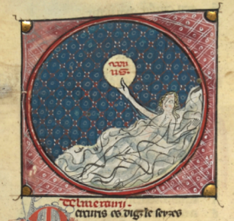
Usually we see sanitized versions of Venus’s birth (albeit some lovely ones like Boticelli’s). Here is a much simpler 14th-century drawing (right), from an Occitan manuscript—Venus in the surf, holding her mirror attribute. An ancient depiction, from a Pompeiian fresco, shows her lying in a large shell, with a stylus or small scepter, with drapery overhead. In fact, they aren’t necessarily sanitized, they are probably alternate versions in which the semen falls to the sea without the father losing his family jewels. The tradition that explicitly talks about castration diverges from Homer.

The Cringe-Worthy Version

William Sale suggested in 1961 that the castration myth traces back to the Cyprians, as expressed in a Corinthian terracotta figure of Aphrodite arising from a genital sac, but I had trouble finding examples online, and was hoping to find exemplars more accessible to a medieval manuscript illustrator.

There are gruesome drawings of Cronos castrating his father Uranus, and some where the victim just stares in another direction as though it’s no big deal for your son to whack off your privates (e.g., Bodleian MS Douce 195).

It doesn’t seem necessary to post dozens of examples (which can be found in ceramics, sculpture, manuscript art, and also in tarot cards), as there appear to be three main kinds:

  • Cronos/Jupiter castrating his father with no inclusion of Venus,
  • Cronos castrating his father with Venus nearby, often in water,
  • Venus born from the castrated genitals of her father (as in Rawl. B 214 and possibly the VMS).

Here are examples of what appear to be typical variations, with the less common Rawl. drawing included for reference:
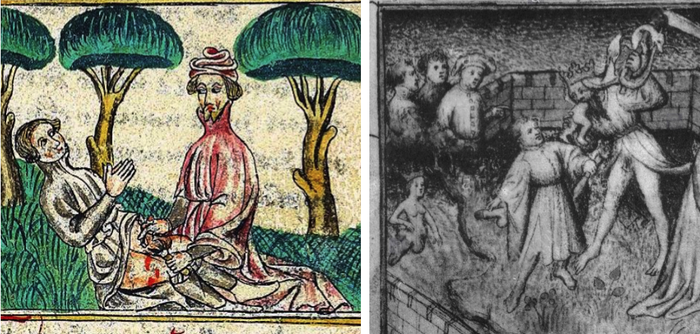
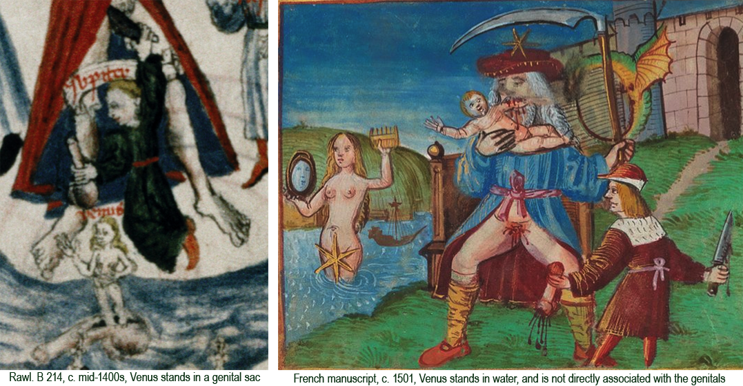
Castration of Uranus

Summary

I was eager to find a possible exemplar for the VMS but one never knows how long it will take. Most of the more common depictions are of French or English origin, but there may be other sources for a theme that dates back to ancient Greece.

If additional images of Venus standing in her father’s genitals were found, or even just one that predates the VMS, it could be a key link in unraveling which predecessors may have influenced its construction.

J.K. Petersen

© Copyright 2018, All Rights Reserve

Tracing Long-Necked Taurus

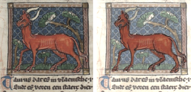
I posted a blog on long-necked Taurus in April 2016, but was reluctant to add a specific picture of a red bull with a strikingly long neck. My focus was zodiac symbols and I didn’t want to include dozens of bulls that were not in zodiacs. I’ve decided to post this one, because the manuscript does have a zodiac series and the bull (which is in a different section) is so strikingly similar to the VMS.
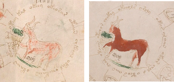
There are two drawings of bulls in the VMS, one painted a little darker than the other. The placement of eyes and style of the nose differ, but their bodies are essentially the same shape:

In another manuscript that predates the VMS by about half a century, we find this drawing of a bull. It’s not a zodiac symbol, it’s in the bestiary section, but it is labeled “Taurus”:

I lightened the background (right) to make it easier to see the shape and pose. Note the long neck, long white curved horns, raised front leg, reddish coloration, very long tail, narrow pointed penis, and landscape background. Even though the background is rectangular and more ornate, the bull is very similar to the lighter VMS Taurus, including the angle of the head.

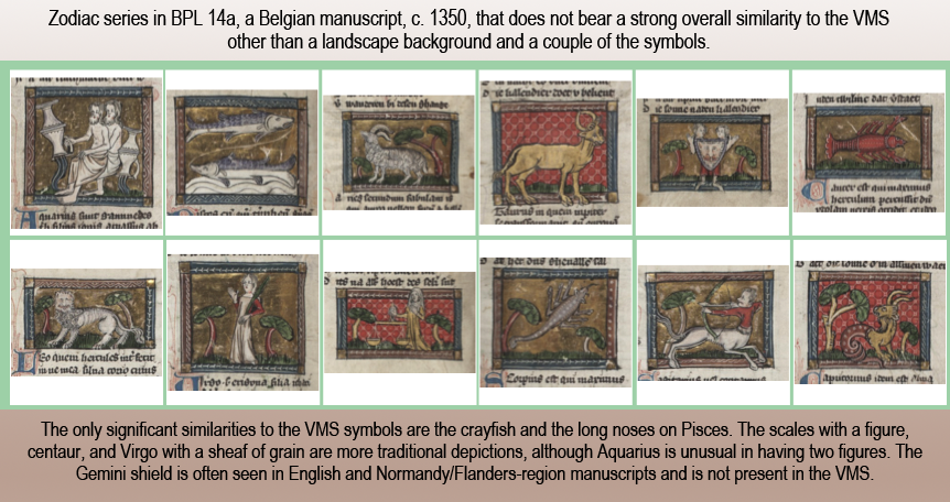
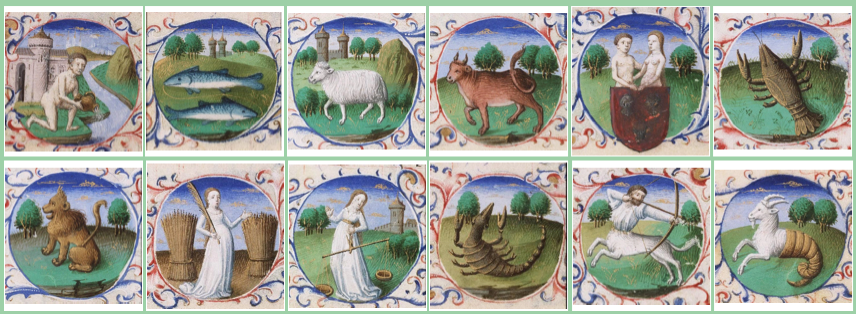
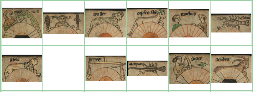
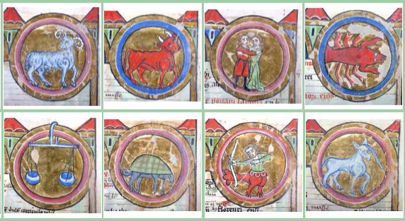
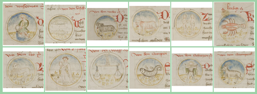
This drawing is more similar to the VMS bull than the one in the zodiac section. The zodiac Taurus is amber and faces the other way (and doesn’t have the front leg raised). The rest of the zodiac is based on traditional symbols and differs from the VMS in a number of ways—Sagittarius is a centaur, Leo has a man-face, the scorpion is more-or-less naturalistic, and the Libra scales are held by a female figure. It fits in with the H 437 tradition in the previous blog. The only significant commonalities with the VMS are the crayfish and the long noses on Pisces.

Are the similarities between the VMS zodiac bull and the bestiary bull coincidental? Why would these two long-necked bulls look so much alike when the zodiac drawings have little in common?

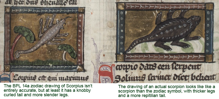
Maybe it’s not entirely a coincidence. If we look at Scorpius in BPL 14a, it is roughly like a scorpion, and yet the scorpion in the bestiary section (right), with fatter legs and body and snake-like tail, leans more toward medieval drawings of lizards and tarasques than a scorpion. Even though it’s drawn at a different angle, in some ways the bestiary critter is more similar to lizard-style Scorpiuses than the slightly more realistic one in the zodiac:

It seems possible that the illustrators of BPL 14a were consulting different sources when drawing the zodiac versus the bestiary. What’s even more puzzling is that the description next to the lizardly scorpion in the bestiary describes the stinger and knobby tail of a real scorpion, and yet these features are not in the drawing.

Crayfish, Centaur, and Libra-with-Figure

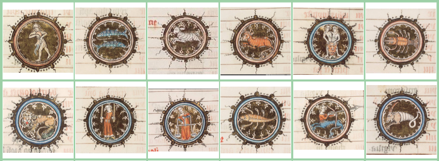
BPL 14a expresses themes that were common to the region, and which continued well into the 15th century, as illustrated by these two examples, one from the southern Netherlands (c. 1360) and a later, similar one in a 1455 Book of Hours (both now in The Hague).

Note how these differ from BPL 14a in colors and the shape that encloses the symbols, but they are the same basic themes: Virgo with grain, Libra with figure, somewhat naturalistic scorpion, shield Gemini, centaur-Sagittarius, and crayfish:

pic of s. Netherlands zodiac

KB 74 zodiac series

Like BPL 14a, the KB zodiac has Gemini shield, crayfish, Virgo with grain, Libra with a figure, a real scorpion, and centaur Sagittarius. Except for Aquarius and Leo, it’s clearly the same basic template.

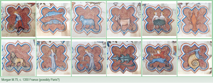
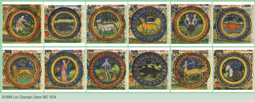
Some of the Parisian and Castilian zodiacs follow this template, as well, except that Gemini does not have a shield, as in Egerton 1070, and BL Add 18851 and Add 38126.

Is there a match for Pisces in the bestiary?

Is there a pattern? Can we find evidence that VMS zodiac animals were taken from bestiaries?

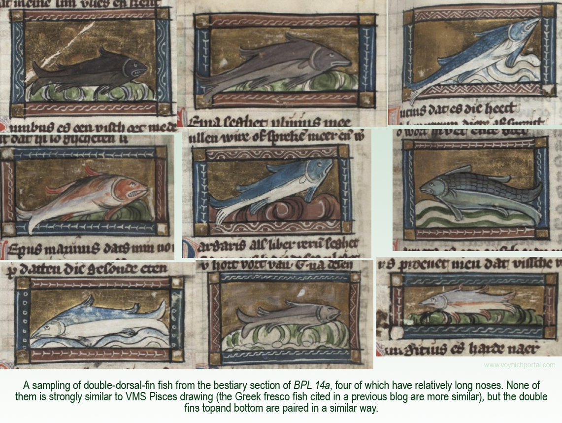
It turns out that the fish section in BPL 14a is fairly extensive, and several drawings have long noses and double dorsal fins. Here are some examples, four of which have notably long snouts:

But… I don’t think they match the VMS as well as the Greek fresco fish mentioned in a previous blog.

What about Leo?

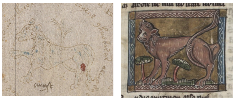
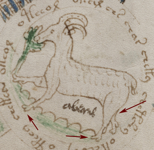
VMS Leo is distinctive for having a long neck (as do several of the other critters), only a hint of a mane, and possibly a furry coat. It has been suggested this might be a panther/leopard rather than a lion, but young lions are shaggy, with spots, and do not yet have manes, so even a cat with skimpy mane could represent a young or female lion.

This drawing in the feline section of the BPL 14a bestiary caught my eye, with the tilted head and its tail through its leg, but it is explicitly labeled “pardus” (abbreviated p[er]dus), so it is intended to be in the leopard rather than the lion family. It’s not posed quite like the VMS, either, but I thought I would include it for reference:

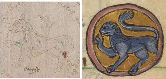
Note the faint suggestion of blue on the VMS lion.

There are a few zodiac and bestiary lions that are blue. Most of them originate in England or northern France/Normandy. The one in Walters W.37 has its tail through its leg, but has a distinctive mane. Trinity B-10-9 has a man-face and Morgan M.729 is posed quite differently (although it should be noted that Scorpius is rather tarasque-like and Gemini is an affectionate couple). Add MS 21926  (below) has a blue lion with one leg raised and only the hint of a mane:

The blue lion in Cotton MS Galba A XVIII (below) might be one of the earliest zodiacs with a blue lion (c. 9th century). It is facing the other way, but interestingly, several of the animals are standing on bumpy terrains, as are some of the VMS critters, and Sagittarius is a human.

It has been noticed by several researchers that the crayfish in this zodiac appears to have two heads. However, the zodiac also differs from the VMS in that the twins are male warriors, and Libra is held by a figure. Scorpius appears to be a two-headed serpent, a fairly unique depiction:
But getting back to the blue lion, what does it have to do with bestiaries?

I think it was Ellie Velinska who first brought this to my attention, but there’s a bluish-gray bestiary feline with a suggestion of fur or spots, a sparse mane, a raised paw, and its tail through its leg that is more similar to the VMS Leo than anything I’ve seen in a zodiac. Note also the very rounded shoulder joint on both the VMS and the bestiary lion:

Glancing through the bestiary, I noticed one other thing related to VMS critters in general…

In the serpent/dragon section of BPL 14a are a number of dragon-like critters that reminded me of the critter nosing a big plant in the VMS, in the sense of being vague and hard to figure out. These all are named, some of them with the names of real snakes (like “boa”), but they do not resemble snakes in any way. Sometimes it’s impossible to identify medieval creatures without the captions:

So what does all this mean?

I’m not sure yet, there’s still much work to be done… the VMS is consistent with a certain branch of zodiac illustrative traditions, as I hope I’ve demonstrated in previous blogs, and yet it’s possible the details, the animals and figures, were drawn from other sources. The VMS illustrator may have studied the zodiac motifs and then plugged in content from somewhere else.

I know that’s easy to say, but not so easy to prove, even if the resemblance of VMS Taurus to the bestiary bull is quite striking. It’s probably a good idea to keep in mind that VMS exemplars might be less obvious than assumed.

J.K. Petersen

© Copyright 2018  All Rights Reserved


Catching the Crayfish

Crayfish are on the Voynich zodiac menu these days, so I thought I would cross-reference some of my previously posted maps and point out additional details about traditions that may have inspired the crayfish symbols in the VMS. Crayfish are quite prevalent in medieval and early Renaissance zodiac art (about 40%), with the rest being crabs.

In February 2016, I posted a blog about the unusual placement of legs on the crayfish tail, and also included naturalistic drawings of crayfish, showing how different species have different numbers of legs.

In that blog, I pointed out that some zodiacs have a pair of cee shapes on the backs of crayfish/lobsters and some don’t. I’d like to discuss this detail in more depth.

The Lines that Define

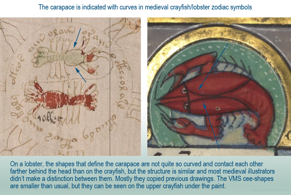
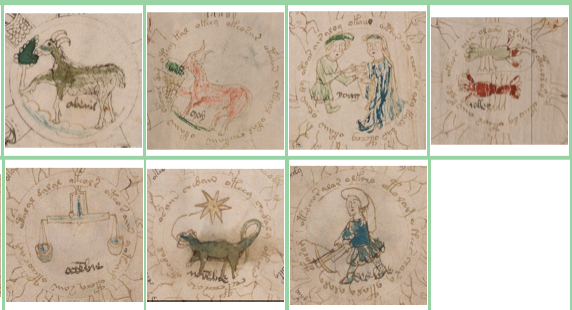
You can see the double semi-circles or “cee shapes” on the greenish VMS crayfish on the left and on the medieval calendar-zodiac crayfish on the right:

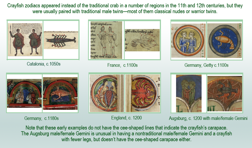
The crayfish above-right is from Würtzburg (c. 1240s). It is not the earliest example of a crayfish zodiac (an earlier one from Catalonia was described in the previous blog), but it may be one of the earliest to indicate the carapace with curved lines. It has four sets of spindly legs, like the VMS crayfish, but they are correctly placed on the body, not on the tail.

The earliest crayfish zodiacs emerged around the 11th and 12th centuries, in church architecture and manuscript art, but unlike the VMS, the crayfish was typically paired with traditional male Gemini twins.

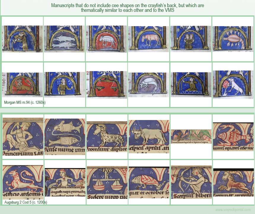
There are no cee shapes on the crayfish symbols below. Instead, there was sometimes a line running from head to tail. The cee shapes were not yet a popular crayfish motif.

Some details are added by illustrators according to whim, and color (or the direction the figures are facing) is not always a defining feature, but the cee shapes provide an interesting glimpse into zodiac traditions. They appear to have emerged sometime around the 13th century.

Charting the Crayfish’s Carapace

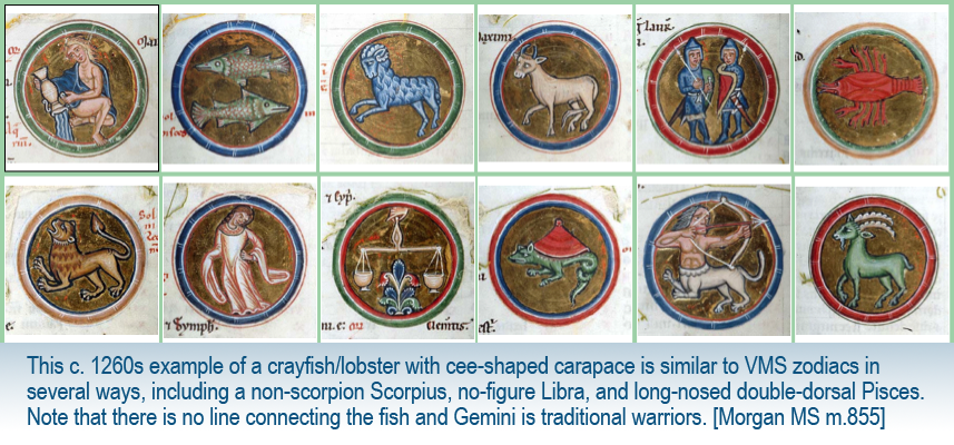
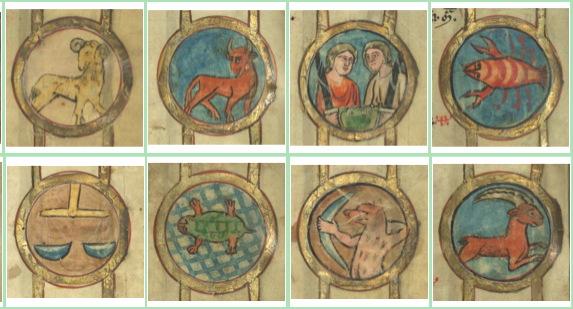
After the c. 1240s Würtsburg symbol, there is a cee-shaped crayfish (c. 1260s) thought to be from Austria. It does not include a romantic Gemini or human Sagittarius, but is similar to the VMS in other ways (non-scorpion Scorpius, no-figure Libra, long-nosed Pisces) and might be considered a “cousin” in terms of motif:

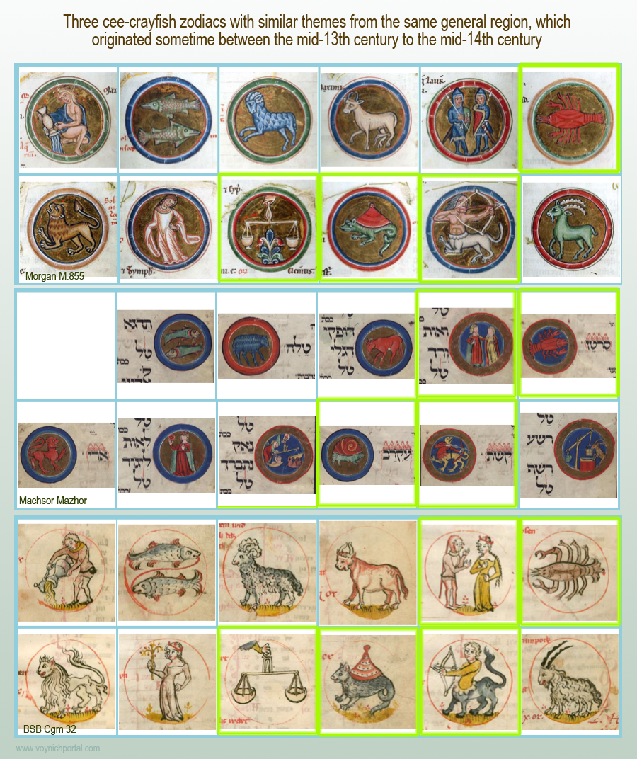
Crayfish with cee shapes are sometimes found in Hebrew manuscripts, such as the Machsor Mazhor (which also has a non-scorpion Scorpius and male/female Gemini). The Machsor Mazhor, in turn, has similarities to Morgan M.855 and BSB Cgm 32. All three were created in the same general region (Austria, or possibly Germany) from c. late 1200s to c. 1340:

Geolocating the Crayfish Tradition

In March 2017, I posted a map of the origins of zodiacs that have a crayfish rather than a crab. Unfortunately, I wasn’t able to fit all the examples (some dots are on top of each other), but hopefully there are enough to show that crayfish follow similar patterns to other VMS zodiac symbols, with notable clusters in northeast France and southern Germany, but the examples above suggest there may have been a convergence of traditions a couple of centuries after the earliest examples.

Cee-Shape Crayfish Paired with a More Lizardly Scorpius

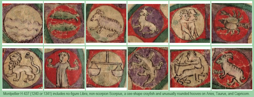
The three previous examples have the turtle/tarasque style of Scorpius. The following zodiac is thought to be from France (possibly Provençal, c. 1340). It has a lizard-like scorpion and an interesting detail that is not especially common… Aries, Taurus, and Capricorn have rounded “paws” that aren’t very hoof-like, just as the VMS has unusually rounded hooves. The poses are also similar—note how Aries’s head is drawn from the side and Taurus from a higher perspective so both eyes and horns are visible:

While we’re on the subject of anatomy, look at Aries’s nose. It’s not a very common way to draw it, indistinct and very rounded, so I thought I would post this zodiac from Libr. pict. A 92 (possibly from Germany, c. 1400), which is one of the few that has animals with similarly drawn snouts. They’re not exactly the same, the mouths are more deeply indented, but they are worth noting, since it looks like the hooves on Capricorn might be somewhat rounded, as well:

Variations on Cee-Shape Themes

The following zodiacs, also from France, have similar themes to H 437 (traditional nude twins, a lizardlike Scorpius, centaur Sagittarius, and cee-shaped crayfish) but differ in having a figure holding the scales. Despite the differences in palette and style, they are thematically very similar to each other but, in a sense, one step farther from the VMS. Quite a few northern zodiacs had elaborate frames and traditional nude Gemini behind bushes or behind a shield:

Pairing the Crayfish with Human Sagittarius

The previous zodiacs all have Sagittarius as centaur or satyr. The earliest one I could find that has a cee-shape crayfish and a human archer is Vindo. Pal. 1850 from Prague (c. 1405). Unfortunately, the twins are traditional nude males, and the scorpion is naturalistic, so it’s not quite in the VMS ballpark, but it does have a no-figure Libra:

This 16th-century zodiac from Nuremberg (Cod. Pal. germ 833) has only minor differences and clearly comes from the same tradition as Vindo. Pal. 1850:

False Alarms

It’s easy to get excited about individual images when one first sees them. For example BSB Clm 826 (c. 1390) has a leg-tail Leo with its tongue sticking out, but I was reluctant to post it until I had done more research… I discovered that leg-tail lions are extremely common in medieval art, plus other aspects of Clm 826 are quite different from the VMS. It’s a real scorpion, Virgo has wings, Sagittarius is a satyr, and Taurus is a half-bull emerging from a cloudband. It seems unlikely that the VMS illustrator would copy Leo and completely ignore the other symbols when there are quite a few zodiacs that match the VMS quite well.

Summary

This all adds up to some interesting patterns. The VMS chiefly differs from other cee-shape-crayfish zodiacs in having affectionate male-female Gemini rather than the traditional male twins, yet is more similar overall to zodiacs that don’t include the cee shapes on the crayfish’s back, such as these, thought to be from Augsburg and Cologne:

As can be seen from the above examples, two of the better matches, in terms of motifs, are Morgan MS m.94, which has a line down the crayfish’s back, and Augsburg 2 Cod 5, which has an unusually ornate, decorated crayfish.

Part of the challenge of tracing these traditions is sorting out which details are significant, and which ones are not.

J.K. Petersen

© Copyright 2018, All Rights Reserved


From Brotherly Love to Otherly Love

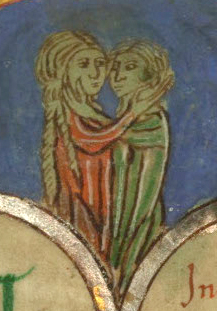
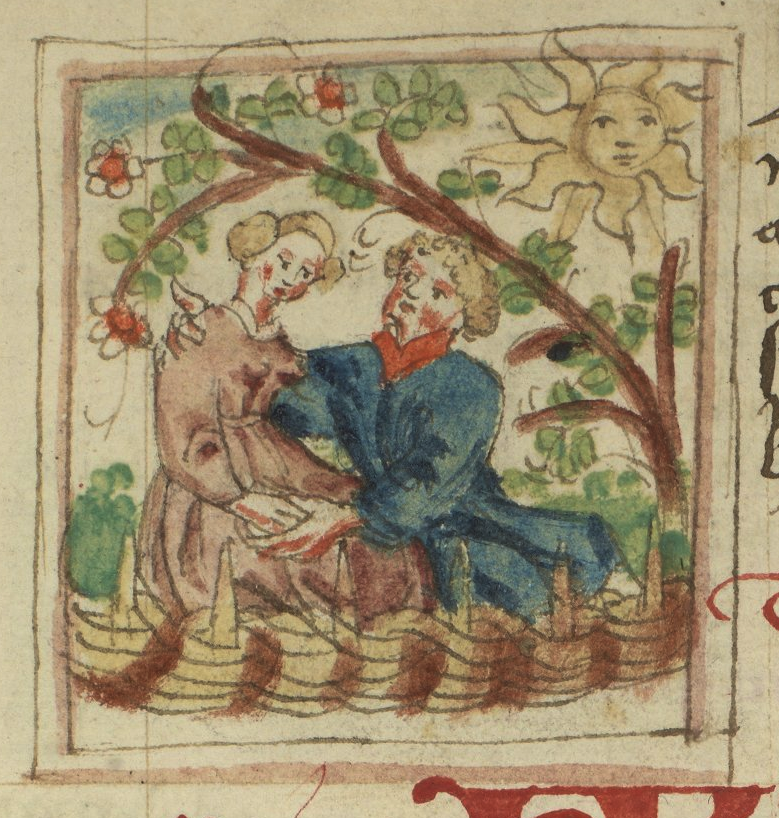
In May 2016, as part of a VMS zodiac series, I posted a blog about Gemini symbols evolving from twin brothers to affectionate siblings to the “otherly” love usually associated with romantic couples. I noted that the Claricia Psalter is one of the earliest depictions of male/female Gemini in an affectionate embrace. If you haven’t read it already, I suggest you at least scan the second half of the previous blog.

Germini from Claricia PsalterI chose the Claricia Psalter for a number of reasons—it is one of the first zodiacs to unambiguously show the twins as different genders, and is possibly one of the earliest zodiac images of “otherly” love (c. 1200s or earlier). It’s difficult to know if the figures are fraternal twins or a romantic couple, but the fact that they are male/female is a departure from classical images of Castor and Pollux, and also different from medieval images of the twins as warriors.

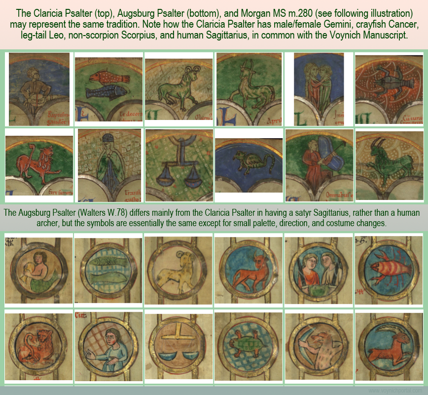
But there is more… it is also, in a sense, a “template” for zodiac cycles with the same cast of characters as the Voynich Manuscript.

Background

I’ve already described classical zodiacs a few times, but here is one from the 9th century to make it easier to see the differences between this and later zodiacs that resemble the VMS zodiac. Note the girdle on Aries, the nude, male warrior twins, Cancer as a crab, a real scorpion, and Sagittarius as a centaur:

The Claricia Psalter (Walters W.26) was created about three centuries later, probably in the southern HRE about midway between Bohemia and the Alsace, and is distinctly different in a number of ways that are relevant to the VMS.

The Claricia Psalter was created for an Augsburg abbey (possibly commissioned) and yet is rather crudely drawn and painted, not much higher in general skill level than the VMS. The palette is also similar, although the Claricia is enhanced with some highlights in gold, and the shade of red is a little more orange than the VMS and used with more frequency.

Here is the Claricia zodiac together with the Augsburg Psalter (which is very similar in subject matter, and contained within roundels like the VMS):

Is There a Traceable Zodiacal Tradition?

Is it possible to pin down the VMS to a specific illustrative tradition?

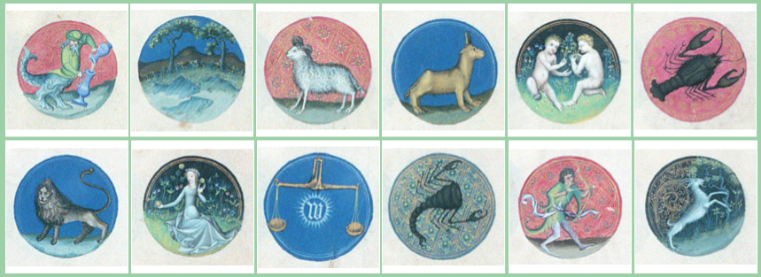
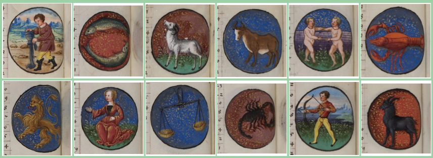
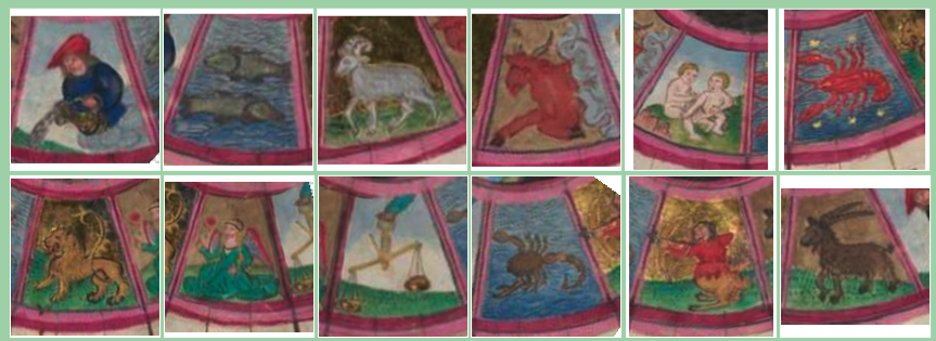
When I search through my database of more than 500 medieval zodiacs, I find fewer than 40 (only 6% of the total) that have this particular combination:

  • male/female Gemini,
  • Libra scales with no associated human-like figure, and
  • Cancer as a crayfish/lobster.

What is even more significant about this combination-search is that quite a number of the hits also have a non-scorpion Scorpius (in the form of a turtle/tarasque, dragon, or reptile/amphibian)—another commonality with the VMS—as in this example from the 13th century, created a few decades after the Claricia Psalter. Note also that the zodiacs are contained within roundels, like the Augsburg Psalter and the VMS:

To push the comparison with the VMS beyond the realm of coincidence, some of them also have Sagittarius with legs and Leo with his tail threaded through his legs.

I can’t quite tell if Cod. Vindo. Pal. 1982 (14th century) is male and female or two males, but it otherwise fits in this group, with a no-hand Libra, Cancer-crayfish, human Sagittarius, and tarasque-Scorpius.

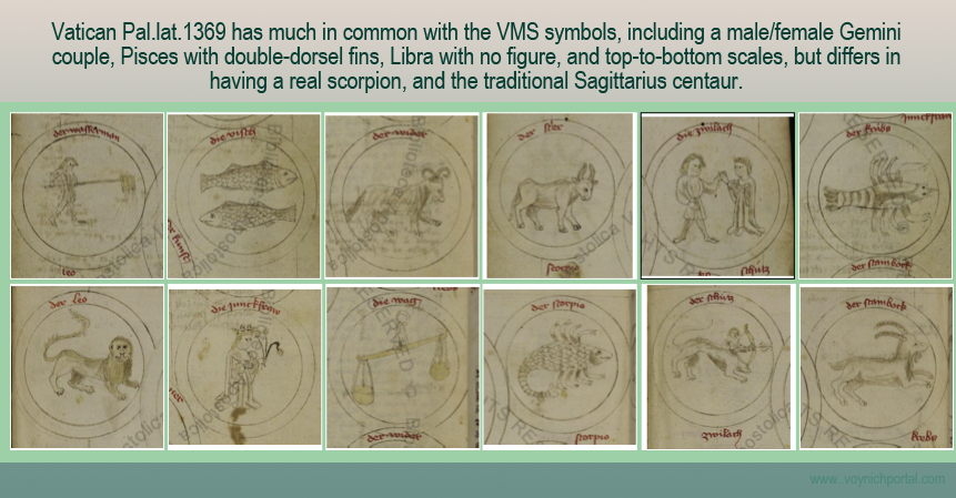
Even though it is roughly drawn, and colored only with a bit of amber wash, the zodiac symbols in BAV Pal.lat.1369 (c. 1400s) have much in common with this tradition, as well. The couple is male/female, Cancer is a crayfish, and the scales have no figure. But this is a scientific compilation with many charts, and a number of volvelles, and the illustrator drew the zodiacs with the traditional centaur and a more-or-less real scorpion.

Note the clothing, which is very similar to the VMS, including unembellished round necklines. The symbols are contained within roundels and the labels are in German, but German was used in many places, including eastern Switzerland, Germany, parts of Bohemia, and parts of Lombardy, so the language doesn’t specifically pin down the localality:

This combination is first seen around the 1100s or 1200s and continues until the early 1500s. If we eliminate Sagittarius as a centaur, then we are left with those originating around the time of the Claricia Psalter until the 1470s. Specifying a human Sagittarius eliminates Hildegard von Bingen’s zodiac, a 13th-century zodiac from Stuttgart, Ludwig VIII 3, Codex Sang. 42, and the Augsburg Psalter, but I was curious to see which ones had the greatest similarity to the VMS symbols.

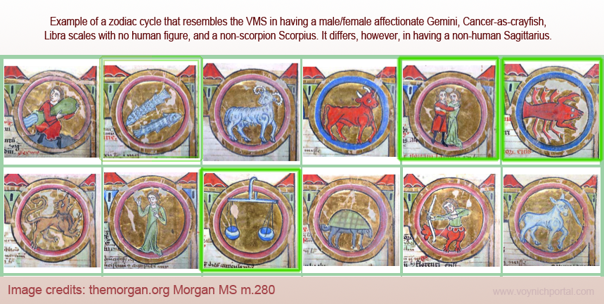
Morgan MS M.280 is very similar in format to Walters W.78 (the Augsburg Psalter). It has roundels with a clasping couple, crayfish, no-figure scale, and tarasque-Scorpius, but lacks the human Sagittarius:

Morgan M.280 and Walters W.78 demonstrate how two different illustrators can draw essentially the same things in quite different ways simply by changing the direction of a head or tail, or adding a detail or two:

Even though it has twists of its own, like the double-crayfish and the added stars, in terms of subject matter and chronology, the VMS zodiac fits quite well with this group. You can almost guess that Aquarius would probably be a mostly-clothed male with a single jug rather than two, and that Capricorn would be a running or walking goat rather than a mythical goatfish or a goat next to a water-well:

Another Transition

By the 1460s, another change was unfolding… a number of zodiac illustrators who closely followed the above patterns, including leg-tail tongue-Leo, reverted back to the traditional nude male twins and naturalistic scorpion, as in Codex Pal. Germ 298 (which also has a crossbowman) and LJS 449.

Zodiacs in Pal.Germ 298

Dating to approximately the mid-15th century, Codex Pal. germ 298 includes roundels with crayfish-Cancer, leg-tail Leo, no-figure Libra, and the famous crossbowman, in keeping with zodiacs already mentioned, but like LJS 449, Gemini has been drawn as traditional nude twins rather than as a romantic couple in fine clothing.

But wait… LJS 449 has two zodiac sets (the second one incomplete) and in the second (which is the signs associated with their ruling planets), the symbols are contained within roundels, and Sagittarius is a human. Separate from the zodiacs, under a tree in a garden, we see an amorous couple. LJS 449 also has some medical topics, including an illustration of urine specimens.

Ludwig XII 8 also seems to fit within this group, with no-figure Libra, crayfish-Cancer, romantic-looking Gemini, a slightly dragony Scorpius, and a human archer. BSB CGM 7269 is similar, as well, and includes a crossbowman. The twins are of both sexes, holding hands, and sharing a bath (the “in” thing to do at the time was to dine together while bathing).

Cod. VIndo. Pal. 1951 (c. mid-1400s from France?) converts the bowman back into a satyr. Morgan MS G.1 (c. 1450s) has a lizardly Scorpius but Sagittarius is a centaur, and the twins are youthful nudes. It seems that by the later-1400s, some illustrators were reverting to traditional forms (as in Vat. Barb.lat.487 and Walters W.428), with the exception of Cancer, which remained a crayfish into the 16th century.

Summary

Can we geolocate the closest matches?

Even though the non-scorpion Scorpius may have originated in NE France, the manuscripts that combine it with male/female affectionate Gemini and crayfish-Cancer seem to be mostly from southern Germany, especially around Augsburg, with one from Basel, Switzerland (14th century).

This survey is restricted, of course, to digitized examples available on the Web, there may be treasures hiding in dusty libraries, but at least it gives a reasonably good picture of a specific approach to zodiacs that is consistent with the VMS.

J.K. Petersen

© Copyright 2018, All Rights Reserved